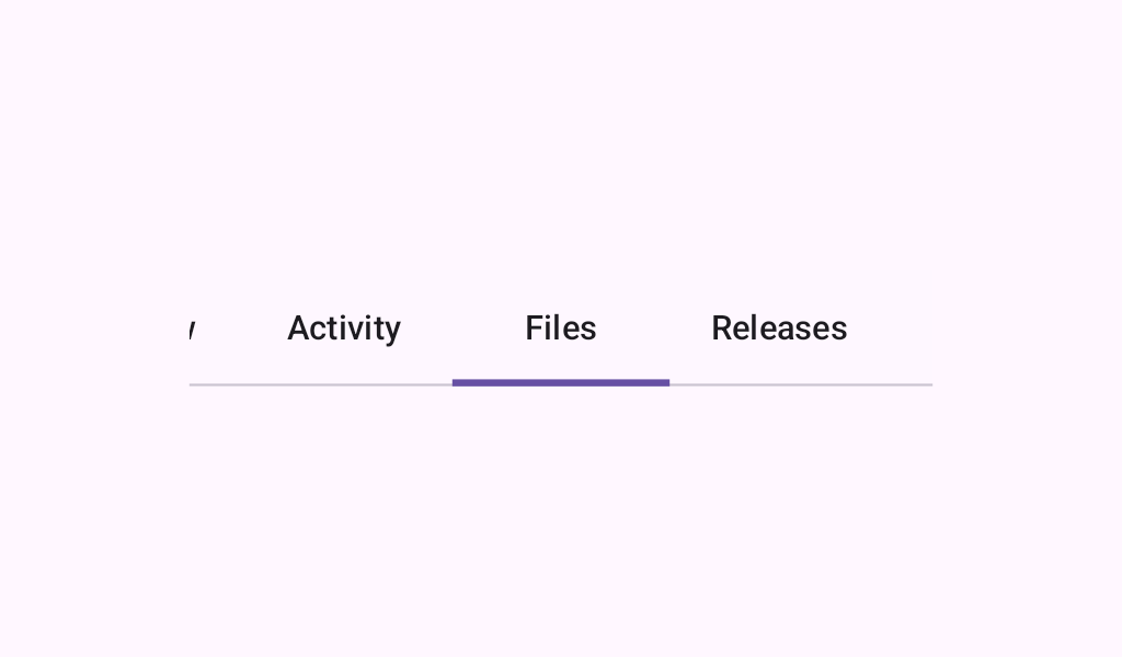
SecondaryScrollableTabRow
Source set: Common
@Composable
fun SecondaryScrollableTabRow(
    selectedTabIndex: Int,
    modifier: Modifier = Modifier,
    scrollState: ScrollState = rememberScrollState(),
    containerColor: Color = TabRowDefaults.secondaryContainerColor,
    contentColor: Color = TabRowDefaults.secondaryContentColor,
    edgePadding: Dp = TabRowDefaults.ScrollableTabRowEdgeStartPadding,
    indicator: @Composable TabIndicatorScope.() -> Unit =
        @Composable {
            TabRowDefaults.SecondaryIndicator(
                Modifier.tabIndicatorOffset(selectedTabIndex, matchContentSize = false)
            )
        },
    divider: @Composable () -> Unit = @Composable { HorizontalDivider() },
    minTabWidth: Dp = TabRowDefaults.ScrollableTabRowMinTabWidth,
    tabs: @Composable () -> Unit,
)
Parameters
| selectedTabIndex | the index of the currently selected tab |
| modifier | the Modifier to be applied to this tab row |
| scrollState | the ScrollState of this tab row |
| containerColor | the color used for the background of this tab row. Use Color.Transparent to have no color. |
| contentColor | the preferred color for content inside this tab row. Defaults to either the matching content color for containerColor, or to the current LocalContentColor if containerColor is not a color from the theme. |
| edgePadding | the padding between the starting and ending edge of the scrollable tab row, and the tabs inside the row. This padding helps inform the user that this tab row can be scrolled, unlike a TabRow. |
| indicator | the indicator that represents which tab is currently selected. By default this will be a TabRowDefaults.SecondaryIndicator, using a TabRowDefaults.tabIndicatorOffset modifier to animate its position. Note that this indicator will be forced to fill up the entire tab row, so you should use TabRowDefaults.tabIndicatorOffset or similar to animate the actual drawn indicator inside this space, and provide an offset from the start. |
| divider | the divider displayed at the bottom of the tab row. This provides a layer of separation between the tab row and the content displayed underneath. |
| minTabWidth | the minimum width for a Tab in this tab row regardless of content size. |
| tabs | the tabs inside this tab row. Typically this will be multiple Tabs. Each element inside this lambda will be measured and placed evenly across the row, each taking up equal space. |
SecondaryScrollableTabRow
Deprecated
Maintained for Binary Compatibility.
Source set: Common
@Composable
fun SecondaryScrollableTabRow(
    selectedTabIndex: Int,
    modifier: Modifier = Modifier,
    scrollState: ScrollState = rememberScrollState(),
    containerColor: Color = TabRowDefaults.secondaryContainerColor,
    contentColor: Color = TabRowDefaults.secondaryContentColor,
    edgePadding: Dp = TabRowDefaults.ScrollableTabRowEdgeStartPadding,
    indicator: @Composable TabIndicatorScope.() -> Unit =
        @Composable {
            TabRowDefaults.SecondaryIndicator(
                Modifier.tabIndicatorOffset(selectedTabIndex, matchContentSize = false)
            )
        },
    divider: @Composable () -> Unit = @Composable { HorizontalDivider() },
    tabs: @Composable () -> Unit,
) =
    SecondaryScrollableTabRow(
        selectedTabIndex = selectedTabIndex,
        modifier = modifier,
        scrollState = scrollState,
        containerColor = containerColor,
        contentColor = contentColor,
        edgePadding = edgePadding,
        indicator = indicator,
        divider = divider,
        minTabWidth = TabRowDefaults.ScrollableTabRowMinTabWidth,
        tabs = tabs,
    )