Filled text fields have more visual emphasis than outlined text fields, making them stand out when surrounded by other content and components.
SimpleTextFieldSample
@Composable
fun SimpleTextFieldSample() {
    TextField(
        state = rememberTextFieldState(),
        label = { Text("Label") },
        lineLimits = TextFieldLineLimits.SingleLine,
    )
}
TextFieldWithErrorState
@Composable
fun TextFieldWithErrorState() {
    val state = rememberTextFieldState()
    var isError by rememberSaveable { mutableStateOf(false) }
    fun validate(text: CharSequence) {
        val atIndex = text.indexOf('@')
        isError = atIndex < 0 || text.indexOf('.', startIndex = atIndex) < 0
    }
    LaunchedEffect(Unit) {
        snapshotFlow { state.text }
            .collect {
                // Do something whenever text field value changes
                isError = false
            }
    }
    TextField(
        state = state,
        lineLimits = TextFieldLineLimits.SingleLine,
        label = { Text(if (isError) "Email*" else "Email") },
        isError = isError,
        keyboardOptions = KeyboardOptions(keyboardType = KeyboardType.Email),
        onKeyboardAction = { validate(state.text) },
        modifier =
            Modifier.semantics {
                // Provide localized description of the error
                if (isError) error("Email format is invalid.")
            },
    )
}
TextFieldWithHelperMessage
@Composable
fun TextFieldWithHelperMessage() {
    Column {
        TextField(
            state = rememberTextFieldState(),
            label = { Text("Label") },
            lineLimits = TextFieldLineLimits.SingleLine,
        )
        Text(
            text = "Helper message",
            color = MaterialTheme.colors.onSurface.copy(alpha = ContentAlpha.medium),
            style = MaterialTheme.typography.caption,
            modifier = Modifier.padding(start = 16.dp),
        )
    }
}
TextFieldWithHideKeyboardOnImeAction
@Composable
fun TextFieldWithHideKeyboardOnImeAction() {
    val keyboardController = LocalSoftwareKeyboardController.current
    TextField(
        state = rememberTextFieldState(),
        label = { Text("Label") },
        keyboardOptions = KeyboardOptions(imeAction = ImeAction.Done),
        onKeyboardAction = { keyboardController?.hide() },
    )
}
TextFieldWithIcons
@Composable
fun TextFieldWithIcons() {
    val state = rememberTextFieldState()
    TextField(
        state = state,
        lineLimits = TextFieldLineLimits.SingleLine,
        placeholder = { Text("placeholder") },
        leadingIcon = { Icon(Icons.Filled.Favorite, contentDescription = null) },
        trailingIcon = {
            IconButton(onClick = { state.clearText() }) {
                Icon(Icons.Filled.Clear, contentDescription = "Clear text")
            }
        },
    )
}
TextFieldWithInitialValueAndSelection
@Composable
fun TextFieldWithInitialValueAndSelection() {
    val state = rememberTextFieldState("Initial text", TextRange(0, 12))
    TextField(state = state, label = { Text("Label") }, lineLimits = TextFieldLineLimits.SingleLine)
}
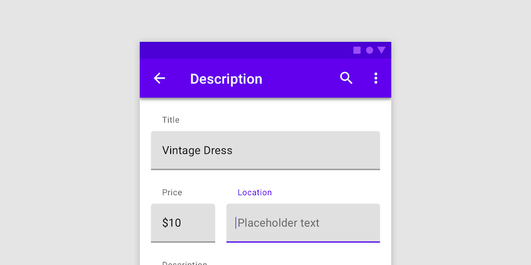
TextFieldWithPlaceholder
@Composable
fun TextFieldWithPlaceholder() {
    TextField(
        state = rememberTextFieldState(),
        lineLimits = TextFieldLineLimits.SingleLine,
        label = { Text("Email") },
        placeholder = { Text("[email protected]") },
    )
}