Pairel
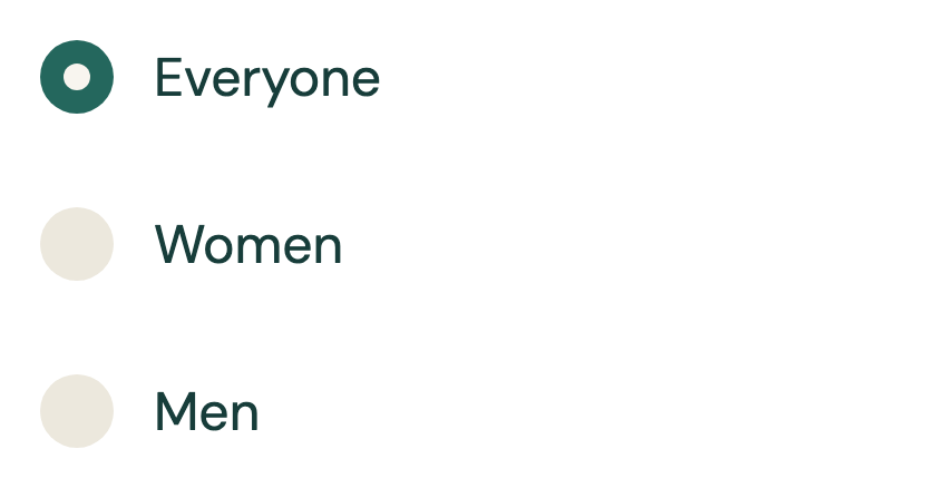
Checkbox
package com.composables.pairel.components

import androidx.compose.animation.animateColorAsState
import androidx.compose.animation.fadeIn
import androidx.compose.animation.fadeOut
import androidx.compose.animation.scaleIn
import androidx.compose.animation.scaleOut
import androidx.compose.foundation.background
import androidx.compose.foundation.interaction.MutableInteractionSource
import androidx.compose.foundation.layout.Arrangement
import androidx.compose.foundation.layout.Box
import androidx.compose.foundation.layout.Row
import androidx.compose.foundation.layout.size
import androidx.compose.runtime.Composable
import androidx.compose.runtime.getValue
import androidx.compose.runtime.mutableStateOf
import androidx.compose.runtime.remember
import androidx.compose.runtime.setValue
import androidx.compose.ui.Alignment
import androidx.compose.ui.Modifier
import androidx.compose.ui.draw.clip
import androidx.compose.ui.unit.dp
import com.composables.compose.ripple.rememberRippleIndication
import com.composables.pairel.theme.Check
import com.composables.pairel.theme.Icons
import com.composables.pairel.theme.Space
import com.composables.pairel.theme.Theme
import com.composeunstyled.CheckedIndicator
import com.composeunstyled.UnstyledCheckbox

@Composable
fun Checkbox(
    label: String,
    initialChecked: Boolean,
    onCheckedChange: (Boolean) -> Unit,
    modifier: Modifier = Modifier,
    enabled: Boolean = true,
) {
    var checked by remember(initialChecked) { mutableStateOf(initialChecked) }
    val boxColor by
        animateColorAsState(
            if (checked) Theme.colors.accent else Theme.colors.surfaceVariant,
            label = "Checkbox color",
        )
    val interactionSource = remember { MutableInteractionSource() }
    UnstyledCheckbox(
        checked = checked,
        onCheckedChange = {
            checked = it
            onCheckedChange(it)
        },
        enabled = enabled,
        modifier = modifier.clip(Theme.shapes.small),
        accessibilityLabel = label,
        interactionSource = interactionSource,
        indication = rememberRippleIndication(color = Theme.colors.accent),
    ) {
        Row(
            verticalAlignment = Alignment.CenterVertically,
            horizontalArrangement = Arrangement.spacedBy(Space * 3),
        ) {
            Box(Modifier.size(24.dp).clip(Theme.shapes.small).background(boxColor)) {
                CheckedIndicator(
                    modifier = Modifier.size(24.dp),
                    enter = fadeIn() + scaleIn(),
                    exit = fadeOut() + scaleOut(),
                ) {
                    Icon(Icons.Check, contentDescription = null, tint = Theme.colors.onAccent)
                }
            }
            Text(
                label,
                color = if (enabled) Theme.colors.onSurface else Theme.colors.onBackgroundMuted,
            )
        }
    }
}
package com.composables.pairel.components

import androidx.compose.runtime.Composable
import androidx.compose.ui.Modifier
import androidx.compose.ui.graphics.Color
import androidx.compose.ui.graphics.isSpecified
import androidx.compose.ui.graphics.vector.ImageVector
import com.composables.pairel.theme.LocalContentColor
import com.composeunstyled.UnstyledIcon

@Composable
fun Icon(
    imageVector: ImageVector,
    contentDescription: String?,
    modifier: Modifier = Modifier,
    tint: Color = LocalContentColor.current,
) {
    val resolvedTint = if (tint.isSpecified) tint else LocalContentColor.current
    UnstyledIcon(
        imageVector = imageVector,
        contentDescription = contentDescription,
        modifier = modifier,
        tint = resolvedTint,
    )
}
package com.composables.pairel.components

import androidx.compose.foundation.text.BasicText
import androidx.compose.runtime.Composable
import androidx.compose.ui.Modifier
import androidx.compose.ui.graphics.Color
import androidx.compose.ui.graphics.isSpecified
import androidx.compose.ui.text.TextStyle
import androidx.compose.ui.text.style.TextOverflow
import com.composables.pairel.theme.LocalContentColor
import com.composables.pairel.theme.LocalTextStyle

@Composable
fun Text(
    text: String,
    modifier: Modifier = Modifier,
    color: Color = Color.Unspecified,
    style: TextStyle = LocalTextStyle.current,
    overflow: TextOverflow = TextOverflow.Clip,
    softWrap: Boolean = true,
    maxLines: Int = Int.MAX_VALUE,
) {
    val resolvedColor =
        when {
            color.isSpecified -> color
            style.color.isSpecified -> style.color
            else -> LocalContentColor.current
        }
    BasicText(
        text = text,
        modifier = modifier,
        style = LocalTextStyle.current.merge(style).copy(color = resolvedColor),
        overflow = overflow,
        softWrap = softWrap,
        maxLines = maxLines,
    )
}
package com.composables.pairel.theme
/*
* Icon from Lucide (lucide).
* License: ISC
*
* ISC License
*
* Copyright (c) 2026 Lucide Icons and Contributors
*
* Permission to use, copy, modify, and/or distribute this software for any
* purpose with or without fee is hereby granted, provided that the above
* copyright notice and this permission notice appear in all copies.
*
* THE SOFTWARE IS PROVIDED "AS IS" AND THE AUTHOR DISCLAIMS ALL WARRANTIES
* WITH REGARD TO THIS SOFTWARE INCLUDING ALL IMPLIED WARRANTIES OF
* MERCHANTABILITY AND FITNESS. IN NO EVENT SHALL THE AUTHOR BE LIABLE FOR
* ANY SPECIAL, DIRECT, INDIRECT, OR CONSEQUENTIAL DAMAGES OR ANY DAMAGES
* WHATSOEVER RESULTING FROM LOSS OF USE, DATA OR PROFITS, WHETHER IN AN
* ACTION OF CONTRACT, NEGLIGENCE OR OTHER TORTIOUS ACTION, ARISING OUT OF
* OR IN CONNECTION WITH THE USE OR PERFORMANCE OF THIS SOFTWARE.
*
* ---
*
* The following Lucide icons are derived from the Feather project:
*
* airplay, alert-circle, alert-octagon, alert-triangle, aperture, arrow-down-circle, arrow-down-left, arrow-down-right, arrow-down, arrow-left-circle, arrow-left, arrow-right-circle, arrow-right, arrow-up-circle, arrow-up-left, arrow-up-right, arrow-up, at-sign, calendar, cast, check, chevron-down, chevron-left, chevron-right, chevron-up, chevrons-down, chevrons-left, chevrons-right, chevrons-up, circle, clipboard, clock, code, columns, command, compass, corner-down-left, corner-down-right, corner-left-down, corner-left-up, corner-right-down, corner-right-up, corner-up-left, corner-up-right, crosshair, database, divide-circle, divide-square, dollar-sign, download, external-link, feather, frown, hash, headphones, help-circle, info, italic, key, layout, life-buoy, link-2, link, loader, lock, log-in, log-out, maximize, meh, minimize, minimize-2, minus-circle, minus-square, minus, monitor, moon, more-horizontal, more-vertical, move, music, navigation-2, navigation, octagon, pause-circle, percent, plus-circle, plus-square, plus, power, radio, rss, search, server, share, shopping-bag, sidebar, smartphone, smile, square, table-2, tablet, target, terminal, trash-2, trash, triangle, tv, type, upload, x-circle, x-octagon, x-square, x, zoom-in, zoom-out
*
* The MIT License (MIT) (for the icons listed above)
*
* Copyright (c) 2013-present Cole Bemis
*
* Permission is hereby granted, free of charge, to any person obtaining a copy
* of this software and associated documentation files (the "Software"), to deal
* in the Software without restriction, including without limitation the rights
* to use, copy, modify, merge, publish, distribute, sublicense, and/or sell
* copies of the Software, and to permit persons to whom the Software is
* furnished to do so, subject to the following conditions:
*
* The above copyright notice and this permission notice shall be included in all
* copies or substantial portions of the Software.
*
* THE SOFTWARE IS PROVIDED "AS IS", WITHOUT WARRANTY OF ANY KIND, EXPRESS OR
* IMPLIED, INCLUDING BUT NOT LIMITED TO THE WARRANTIES OF MERCHANTABILITY,
* FITNESS FOR A PARTICULAR PURPOSE AND NONINFRINGEMENT. IN NO EVENT SHALL THE
* AUTHORS OR COPYRIGHT HOLDERS BE LIABLE FOR ANY CLAIM, DAMAGES OR OTHER
* LIABILITY, WHETHER IN AN ACTION OF CONTRACT, TORT OR OTHERWISE, ARISING FROM,
* OUT OF OR IN CONNECTION WITH THE SOFTWARE OR THE USE OR OTHER DEALINGS IN THE
* SOFTWARE.
*/
import androidx.compose.ui.graphics.Color
import androidx.compose.ui.graphics.SolidColor
import androidx.compose.ui.graphics.StrokeCap
import androidx.compose.ui.graphics.StrokeJoin
import androidx.compose.ui.graphics.vector.ImageVector
import androidx.compose.ui.graphics.vector.path
import androidx.compose.ui.unit.dp
object Icons
val Icons.ArrowLeft: ImageVector
get() {
if (_ArrowLeft != null) return _ArrowLeft!!
_ArrowLeft =
ImageVector.Builder(
name = "arrow-left",
defaultWidth = 24.dp,
defaultHeight = 24.dp,
viewportWidth = 24f,
viewportHeight = 24f,
)
.apply {
path(
fill = SolidColor(Color.Transparent),
stroke = SolidColor(Color.Black),
strokeLineWidth = 2f,
strokeLineCap = StrokeCap.Round,
strokeLineJoin = StrokeJoin.Round,
) {
moveTo(12f, 19f)
lineToRelative(-7f, -7f)
lineToRelative(7f, -7f)
}
path(
fill = SolidColor(Color.Transparent),
stroke = SolidColor(Color.Black),
strokeLineWidth = 2f,
strokeLineCap = StrokeCap.Round,
strokeLineJoin = StrokeJoin.Round,
) {
moveTo(19f, 12f)
horizontalLineTo(5f)
}
}
.build()
return _ArrowLeft!!
}
private var _ArrowLeft: ImageVector? = null
val Icons.X: ImageVector
get() {
if (_X != null) return _X!!
_X =
ImageVector.Builder(
name = "x",
defaultWidth = 24.dp,
defaultHeight = 24.dp,
viewportWidth = 24f,
viewportHeight = 24f,
)
.apply {
path(
fill = SolidColor(Color.Transparent),
stroke = SolidColor(Color.Black),
strokeLineWidth = 2f,
strokeLineCap = StrokeCap.Round,
strokeLineJoin = StrokeJoin.Round,
) {
moveTo(18f, 6f)
lineTo(6f, 18f)
}
path(
fill = SolidColor(Color.Transparent),
stroke = SolidColor(Color.Black),
strokeLineWidth = 2f,
strokeLineCap = StrokeCap.Round,
strokeLineJoin = StrokeJoin.Round,
) {
moveTo(6f, 6f)
lineToRelative(12f, 12f)
}
}
.build()
return _X!!
}
private var _X: ImageVector? = null
val Icons.Check: ImageVector
get() {
if (_Check != null) return _Check!!
_Check =
ImageVector.Builder(
name = "check",
defaultWidth = 24.dp,
defaultHeight = 24.dp,
viewportWidth = 24f,
viewportHeight = 24f,
)
.apply {
path(
fill = SolidColor(Color.Transparent),
stroke = SolidColor(Color.Black),
strokeLineWidth = 2f,
strokeLineCap = StrokeCap.Round,
strokeLineJoin = StrokeJoin.Round,
) {
moveTo(20f, 6f)
lineTo(9f, 17f)
lineToRelative(-5f, -5f)
}
}
.build()
return _Check!!
}
private var _Check: ImageVector? = null
val Icons.Heart: ImageVector
get() {
if (_Heart != null) return _Heart!!
_Heart =
ImageVector.Builder(
name = "heart",
defaultWidth = 24.dp,
defaultHeight = 24.dp,
viewportWidth = 24f,
viewportHeight = 24f,
)
.apply {
path(
fill = SolidColor(Color.Transparent),
stroke = SolidColor(Color.Black),
strokeLineWidth = 2f,
strokeLineCap = StrokeCap.Round,
strokeLineJoin = StrokeJoin.Round,
) {
moveTo(2f, 9.5f)
arcToRelative(5.5f, 5.5f, 0f, false, true, 9.591f, -3.676f)
arcToRelative(0.56f, 0.56f, 0f, false, false, 0.818f, 0f)
arcTo(5.49f, 5.49f, 0f, false, true, 22f, 9.5f)
curveToRelative(0f, 2.29f, -1.5f, 4f, -3f, 5.5f)
lineToRelative(-5.492f, 5.313f)
arcToRelative(2f, 2f, 0f, false, true, -3f, 0.019f)
lineTo(5f, 15f)
curveToRelative(-1.5f, -1.5f, -3f, -3.2f, -3f, -5.5f)
}
}
.build()
return _Heart!!
}
private var _Heart: ImageVector? = null
val Icons.Ellipsis: ImageVector
get() {
if (_Ellipsis != null) return _Ellipsis!!
_Ellipsis =
ImageVector.Builder(
name = "ellipsis",
defaultWidth = 24.dp,
defaultHeight = 24.dp,
viewportWidth = 24f,
viewportHeight = 24f,
)
.apply {
for (x in listOf(5f, 12f, 19f)) {
path(
fill = SolidColor(Color.Transparent),
stroke = SolidColor(Color.Black),
strokeLineWidth = 2f,
strokeLineCap = StrokeCap.Round,
strokeLineJoin = StrokeJoin.Round,
) {
moveTo(x + 1f, 12f)
arcTo(1f, 1f, 0f, false, true, x, 13f)
arcTo(1f, 1f, 0f, false, true, x - 1f, 12f)
arcTo(1f, 1f, 0f, false, true, x + 1f, 12f)
close()
}
}
}
.build()
return _Ellipsis!!
}
private var _Ellipsis: ImageVector? = null
val Icons.SendHorizontal: ImageVector
get() {
if (_SendHorizontal != null) return _SendHorizontal!!
_SendHorizontal =
ImageVector.Builder(
name = "send-horizontal",
defaultWidth = 24.dp,
defaultHeight = 24.dp,
viewportWidth = 24f,
viewportHeight = 24f,
)
.apply {
path(
fill = SolidColor(Color.Transparent),
stroke = SolidColor(Color.Black),
strokeLineWidth = 2f,
strokeLineCap = StrokeCap.Round,
strokeLineJoin = StrokeJoin.Round,
) {
moveTo(3.714f, 3.048f)
arcToRelative(0.498f, 0.498f, 0f, false, false, -0.683f, 0.627f)
lineToRelative(2.843f, 7.627f)
arcToRelative(2f, 2f, 0f, false, true, 0f, 1.396f)
lineToRelative(-2.842f, 7.627f)
arcToRelative(0.498f, 0.498f, 0f, false, false, 0.682f, 0.627f)
lineToRelative(18f, -8.5f)
arcToRelative(0.5f, 0.5f, 0f, false, false, 0f, -0.904f)
close()
}
path(
fill = SolidColor(Color.Transparent),
stroke = SolidColor(Color.Black),
strokeLineWidth = 2f,
strokeLineCap = StrokeCap.Round,
strokeLineJoin = StrokeJoin.Round,
) {
moveTo(6f, 12f)
horizontalLineToRelative(16f)
}
}
.build()
return _SendHorizontal!!
}
private var _SendHorizontal: ImageVector? = null
val Icons.SlidersHorizontal: ImageVector
get() {
if (_SlidersHorizontal != null) return _SlidersHorizontal!!
_SlidersHorizontal =
ImageVector.Builder(
name = "sliders-horizontal",
defaultWidth = 24.dp,
defaultHeight = 24.dp,
viewportWidth = 24f,
viewportHeight = 24f,
)
.apply {
path(
fill = SolidColor(Color.Transparent),
stroke = SolidColor(Color.Black),
strokeLineWidth = 2f,
strokeLineCap = StrokeCap.Round,
strokeLineJoin = StrokeJoin.Round,
) {
moveTo(10f, 5f)
horizontalLineTo(3f)
}
path(
fill = SolidColor(Color.Transparent),
stroke = SolidColor(Color.Black),
strokeLineWidth = 2f,
strokeLineCap = StrokeCap.Round,
strokeLineJoin = StrokeJoin.Round,
) {
moveTo(12f, 19f)
horizontalLineTo(3f)
}
path(
fill = SolidColor(Color.Transparent),
stroke = SolidColor(Color.Black),
strokeLineWidth = 2f,
strokeLineCap = StrokeCap.Round,
strokeLineJoin = StrokeJoin.Round,
) {
moveTo(14f, 3f)
verticalLineToRelative(4f)
}
path(
fill = SolidColor(Color.Transparent),
stroke = SolidColor(Color.Black),
strokeLineWidth = 2f,
strokeLineCap = StrokeCap.Round,
strokeLineJoin = StrokeJoin.Round,
) {
moveTo(16f, 17f)
verticalLineToRelative(4f)
}
path(
fill = SolidColor(Color.Transparent),
stroke = SolidColor(Color.Black),
strokeLineWidth = 2f,
strokeLineCap = StrokeCap.Round,
strokeLineJoin = StrokeJoin.Round,
) {
moveTo(21f, 12f)
horizontalLineToRelative(-9f)
}
path(
fill = SolidColor(Color.Transparent),
stroke = SolidColor(Color.Black),
strokeLineWidth = 2f,
strokeLineCap = StrokeCap.Round,
strokeLineJoin = StrokeJoin.Round,
) {
moveTo(21f, 19f)
horizontalLineToRelative(-5f)
}
path(
fill = SolidColor(Color.Transparent),
stroke = SolidColor(Color.Black),
strokeLineWidth = 2f,
strokeLineCap = StrokeCap.Round,
strokeLineJoin = StrokeJoin.Round,
) {
moveTo(21f, 5f)
horizontalLineToRelative(-7f)
}
path(
fill = SolidColor(Color.Transparent),
stroke = SolidColor(Color.Black),
strokeLineWidth = 2f,
strokeLineCap = StrokeCap.Round,
strokeLineJoin = StrokeJoin.Round,
) {
moveTo(8f, 10f)
verticalLineToRelative(4f)
}
path(
fill = SolidColor(Color.Transparent),
stroke = SolidColor(Color.Black),
strokeLineWidth = 2f,
strokeLineCap = StrokeCap.Round,
strokeLineJoin = StrokeJoin.Round,
) {
moveTo(8f, 12f)
horizontalLineTo(3f)
}
}
.build()
return _SlidersHorizontal!!
}
private var _SlidersHorizontal: ImageVector? = null
val Icons.Compass: ImageVector
get() {
if (_Compass != null) return _Compass!!
_Compass =
ImageVector.Builder(
name = "compass",
defaultWidth = 24.dp,
defaultHeight = 24.dp,
viewportWidth = 24f,
viewportHeight = 24f,
)
.apply {
path(
fill = SolidColor(Color.Transparent),
stroke = SolidColor(Color.Black),
strokeLineWidth = 2f,
strokeLineCap = StrokeCap.Round,
strokeLineJoin = StrokeJoin.Round,
) {
moveTo(22f, 12f)
arcTo(10f, 10f, 0f, false, true, 12f, 22f)
arcTo(10f, 10f, 0f, false, true, 2f, 12f)
arcTo(10f, 10f, 0f, false, true, 22f, 12f)
close()
}
path(
fill = SolidColor(Color.Transparent),
stroke = SolidColor(Color.Black),
strokeLineWidth = 2f,
strokeLineCap = StrokeCap.Round,
strokeLineJoin = StrokeJoin.Round,
) {
moveTo(16.24f, 7.76f)
lineToRelative(-1.804f, 5.411f)
arcToRelative(2f, 2f, 0f, false, true, -1.265f, 1.265f)
lineTo(7.76f, 16.24f)
lineToRelative(1.804f, -5.411f)
arcToRelative(2f, 2f, 0f, false, true, 1.265f, -1.265f)
close()
}
}
.build()
return _Compass!!
}
private var _Compass: ImageVector? = null
val Icons.User: ImageVector
get() {
if (_User != null) return _User!!
_User =
ImageVector.Builder(
name = "user",
defaultWidth = 24.dp,
defaultHeight = 24.dp,
viewportWidth = 24f,
viewportHeight = 24f,
)
.apply {
path(
fill = SolidColor(Color.Transparent),
stroke = SolidColor(Color.Black),
strokeLineWidth = 2f,
strokeLineCap = StrokeCap.Round,
strokeLineJoin = StrokeJoin.Round,
) {
moveTo(19f, 21f)
verticalLineToRelative(-2f)
arcToRelative(4f, 4f, 0f, false, false, -4f, -4f)
horizontalLineTo(9f)
arcToRelative(4f, 4f, 0f, false, false, -4f, 4f)
verticalLineToRelative(2f)
}
path(
fill = SolidColor(Color.Transparent),
stroke = SolidColor(Color.Black),
strokeLineWidth = 2f,
strokeLineCap = StrokeCap.Round,
strokeLineJoin = StrokeJoin.Round,
) {
moveTo(16f, 7f)
arcTo(4f, 4f, 0f, false, true, 12f, 11f)
arcTo(4f, 4f, 0f, false, true, 8f, 7f)
arcTo(4f, 4f, 0f, false, true, 16f, 7f)
close()
}
}
.build()
return _User!!
}
private var _User: ImageVector? = null
val Icons.ChevronRight: ImageVector
get() {
if (_ChevronRight != null) return _ChevronRight!!
_ChevronRight =
ImageVector.Builder(
name = "chevron-right",
defaultWidth = 24.dp,
defaultHeight = 24.dp,
viewportWidth = 24f,
viewportHeight = 24f,
)
.apply {
path(
fill = SolidColor(Color.Transparent),
stroke = SolidColor(Color.Black),
strokeLineWidth = 2f,
strokeLineCap = StrokeCap.Round,
strokeLineJoin = StrokeJoin.Round,
) {
moveTo(9f, 18f)
lineToRelative(6f, -6f)
lineToRelative(-6f, -6f)
}
}
.build()
return _ChevronRight!!
}
private var _ChevronRight: ImageVector? = null
val Icons.Plus: ImageVector
get() {
if (_Plus != null) return _Plus!!
_Plus =
ImageVector.Builder(
name = "plus",
defaultWidth = 24.dp,
defaultHeight = 24.dp,
viewportWidth = 24f,
viewportHeight = 24f,
)
.apply {
path(
fill = SolidColor(Color.Transparent),
stroke = SolidColor(Color.Black),
strokeLineWidth = 2f,
strokeLineCap = StrokeCap.Round,
strokeLineJoin = StrokeJoin.Round,
) {
moveTo(5f, 12f)
horizontalLineToRelative(14f)
}
path(
fill = SolidColor(Color.Transparent),
stroke = SolidColor(Color.Black),
strokeLineWidth = 2f,
strokeLineCap = StrokeCap.Round,
strokeLineJoin = StrokeJoin.Round,
) {
moveTo(12f, 5f)
verticalLineToRelative(14f)
}
}
.build()
return _Plus!!
}
private var _Plus: ImageVector? = null
package com.composables.pairel.theme

import androidx.compose.foundation.isSystemInDarkTheme
import androidx.compose.foundation.shape.RoundedCornerShape
import androidx.compose.foundation.text.selection.LocalTextSelectionColors
import androidx.compose.foundation.text.selection.TextSelectionColors
import androidx.compose.runtime.*
import androidx.compose.runtime.Composable
import androidx.compose.runtime.CompositionLocalProvider
import androidx.compose.runtime.compositionLocalOf
import androidx.compose.runtime.staticCompositionLocalOf
import androidx.compose.ui.graphics.*
import androidx.compose.ui.graphics.Color
import androidx.compose.ui.text.*
import androidx.compose.ui.text.TextStyle
import androidx.compose.ui.text.font.*
import androidx.compose.ui.unit.*
import androidx.compose.ui.unit.Dp
import androidx.compose.ui.unit.dp
import com.composables.googlefonts.rememberGoogleFontFamily

@Immutable
data class ThemeColors(
    val `background`: Color = Color(0xFFF8F5EF),
    val `onBackground`: Color = Color(0xFF173D3A),
    val `surface`: Color = Color(0xFFFFFFFF),
    val `onSurface`: Color = Color(0xFF173D3A),
    val `surfaceVariant`: Color = Color(0xFFECE8DD),
    val `onSurfaceVariant`: Color = Color(0xFF173D3A),
    val `primary`: Color = Color(0xFFF58C76),
    val `onPrimary`: Color = Color(0xFF173D3A),
    val `accent`: Color = Color(0xFF24675D),
    val `onAccent`: Color = Color(0xFFF8F5EF),
    val `textSelection`: Color = Color(0x6624675D),
    val `onBackgroundMuted`: Color = Color(0xFF5A6B67),
    val `onSurfaceInactive`: Color = Color(0xFF5A6B67),
    val `border`: Color = Color(0xFFDCDDD4),
    val `destructive`: Color = Color(0xFFB42318),
)

@Immutable
data class ThemeTypography(
    val `display`: TextStyle =
        TextStyle(
            fontFamily = FontFamily.SansSerif,
            fontSize = 46.sp,
            lineHeight = 52.sp,
            fontWeight = FontWeight(700),
        ),
    val `headline`: TextStyle =
        TextStyle(
            fontFamily = FontFamily.SansSerif,
            fontSize = 32.sp,
            lineHeight = 38.sp,
            fontWeight = FontWeight(700),
        ),
    val `title`: TextStyle =
        TextStyle(
            fontFamily = FontFamily.SansSerif,
            fontSize = 22.sp,
            lineHeight = 28.sp,
            fontWeight = FontWeight(700),
        ),
    val `quote`: TextStyle =
        TextStyle(
            fontFamily = FontFamily.SansSerif,
            fontSize = 23.sp,
            lineHeight = 31.sp,
            fontWeight = FontWeight(400),
        ),
    val `body`: TextStyle =
        TextStyle(
            fontFamily = FontFamily.SansSerif,
            fontSize = 16.sp,
            lineHeight = 24.sp,
            fontWeight = FontWeight(400),
        ),
    val `label`: TextStyle =
        TextStyle(
            fontFamily = FontFamily.SansSerif,
            fontSize = 16.sp,
            lineHeight = 20.sp,
            fontWeight = FontWeight(700),
        ),
    val `caption`: TextStyle =
        TextStyle(
            fontFamily = FontFamily.SansSerif,
            fontSize = 12.sp,
            lineHeight = 16.sp,
            fontWeight = FontWeight(700),
        ),
)

@Immutable
data class ThemeShapes(
    val `small`: Shape = RoundedCornerShape(12.dp),
    val `large`: Shape = RoundedCornerShape(24.dp),
    val `fullyRounded`: Shape = RoundedCornerShape(50),
)

fun themeColors(dark: Boolean = false): ThemeColors = ThemeColors()

@Composable
fun resolveThemeTypography(typography: ThemeTypography = ThemeTypography()): ThemeTypography {
    val font0 = rememberGoogleFontFamily("Fraunces", weights = intArrayOf(400, 700))
    val font1 = rememberGoogleFontFamily("DM Sans", weights = intArrayOf(400, 700))
    return typography.copy(
        `display` = typography.`display`.copy(fontFamily = font0),
        `headline` = typography.`headline`.copy(fontFamily = font1),
        `title` = typography.`title`.copy(fontFamily = font1),
        `quote` = typography.`quote`.copy(fontFamily = font0),
        `body` = typography.`body`.copy(fontFamily = font1),
        `label` = typography.`label`.copy(fontFamily = font1),
        `caption` = typography.`caption`.copy(fontFamily = font1),
    )
}

private val LocalColors = staticCompositionLocalOf<ThemeColors> { error("Theme is missing") }
private val LocalTypography =
    staticCompositionLocalOf<ThemeTypography> { error("Theme is missing") }
private val LocalSpace = staticCompositionLocalOf { 4.dp }
private val LocalShapes = staticCompositionLocalOf<ThemeShapes> { error("Theme is missing") }

val LocalContentColor = compositionLocalOf<Color> { error("Theme is missing") }
val LocalTextStyle = compositionLocalOf<TextStyle> { error("Theme is missing") }

object Theme {
    val colors: ThemeColors
        @Composable get() = LocalColors.current

    val typography: ThemeTypography
        @Composable get() = LocalTypography.current

    val shapes: ThemeShapes
        @Composable get() = LocalShapes.current
}

val Space: Dp
    @Composable get() = LocalSpace.current

@Composable
fun PairelTheme(
    colors: ThemeColors = themeColors(isSystemInDarkTheme()),
    typography: ThemeTypography = resolveThemeTypography(),
    space: Dp = 4.dp,
    shapes: ThemeShapes = ThemeShapes(),
    contentColor: Color = colors.onBackground,
    textStyle: TextStyle = typography.body,
    content: @Composable () -> Unit,
) {
    CompositionLocalProvider(
        LocalColors provides colors,
        LocalTypography provides typography,
        LocalSpace provides space,
        LocalShapes provides shapes,
        LocalContentColor provides contentColor,
        LocalTextStyle provides textStyle,
        LocalTextSelectionColors provides
            TextSelectionColors(
                handleColor = colors.accent,
                backgroundColor = colors.textSelection,
            ),
        content = content,
    )
}

@Composable
fun ProvideContentColor(color: Color, content: @Composable () -> Unit) {
    CompositionLocalProvider(LocalContentColor provides color, content = content)
}

@Composable
fun ProvideTextStyle(style: TextStyle, content: @Composable () -> Unit) {
    CompositionLocalProvider(
        LocalTextStyle provides LocalTextStyle.current.merge(style),
        content = content,
    )
}
More components from Pairel