Tally
Manage habits
package com.composables.tally

import androidx.compose.foundation.background
import androidx.compose.foundation.interaction.MutableInteractionSource
import androidx.compose.foundation.layout.Arrangement
import androidx.compose.foundation.layout.Box
import androidx.compose.foundation.layout.Column
import androidx.compose.foundation.layout.PaddingValues
import androidx.compose.foundation.layout.Row
import androidx.compose.foundation.layout.WindowInsets
import androidx.compose.foundation.layout.WindowInsetsSides
import androidx.compose.foundation.layout.fillMaxSize
import androidx.compose.foundation.layout.fillMaxWidth
import androidx.compose.foundation.layout.only
import androidx.compose.foundation.layout.padding
import androidx.compose.foundation.layout.safeDrawing
import androidx.compose.foundation.layout.size
import androidx.compose.foundation.layout.statusBars
import androidx.compose.foundation.layout.union
import androidx.compose.foundation.layout.widthIn
import androidx.compose.foundation.layout.windowInsetsPadding
import androidx.compose.foundation.rememberScrollState
import androidx.compose.foundation.verticalScroll
import androidx.compose.runtime.Composable
import androidx.compose.runtime.LaunchedEffect
import androidx.compose.runtime.getValue
import androidx.compose.runtime.mutableStateOf
import androidx.compose.runtime.remember
import androidx.compose.runtime.setValue
import androidx.compose.ui.Alignment
import androidx.compose.ui.Modifier
import androidx.compose.ui.draw.clip
import androidx.compose.ui.unit.dp
import com.composables.compose.ripple.rememberRippleIndication
import com.composables.tally.components.AlertDialog
import com.composables.tally.components.Button
import com.composables.tally.components.ButtonVariant
import com.composables.tally.components.Destination
import com.composables.tally.components.Icon
import com.composables.tally.components.IconButton
import com.composables.tally.components.MainNavigationScaffold
import com.composables.tally.components.ModalBottomSheet
import com.composables.tally.components.OptionGroup
import com.composables.tally.components.OptionRow
import com.composables.tally.components.OptionToggle
import com.composables.tally.components.Page
import com.composables.tally.components.Section
import com.composables.tally.components.SegmentedControl
import com.composables.tally.components.Text
import com.composables.tally.components.TextField
import com.composables.tally.components.Toast
import com.composables.tally.theme.ArrowCounterClockwise
import com.composables.tally.theme.Bell
import com.composables.tally.theme.CalendarBlank
import com.composables.tally.theme.CaretRight
import com.composables.tally.theme.ChatCircle
import com.composables.tally.theme.Crown
import com.composables.tally.theme.FileText
import com.composables.tally.theme.Icons
import com.composables.tally.theme.ListChecks
import com.composables.tally.theme.Plus
import com.composables.tally.theme.ShieldCheck
import com.composables.tally.theme.SignOut
import com.composables.tally.theme.Space
import com.composables.tally.theme.SpeakerHigh
import com.composables.tally.theme.Theme
import com.composables.tally.theme.Trash
import com.composeunstyled.UnstyledButton
import kotlinx.coroutines.delay
import kotlinx.datetime.DayOfWeek

@Composable
fun SettingsScreen(
    navigateToAccount: () -> Unit,
    navigateToManageHabits: () -> Unit,
    navigateToPro: () -> Unit,
    navigateToHelp: () -> Unit,
    navigateToPrivacyPolicy: () -> Unit,
    navigateToTerms: () -> Unit,
    navigateToHome: () -> Unit,
    navigateToProgress: () -> Unit,
    modifier: Modifier = Modifier,
) {
    MainNavigationScaffold(
        selected = Destination.Settings,
        navigateToHome = navigateToHome,
        navigateToProgress = navigateToProgress,
        navigateToSettings = {},
        modifier = modifier,
    ) { contentPadding ->
        SettingsContent(
            navigateToAccount,
            navigateToManageHabits,
            navigateToPro,
            navigateToHelp,
            navigateToPrivacyPolicy,
            navigateToTerms,
            contentPadding,
        )
    }
}

@Composable
fun SettingsContent(
    navigateToAccount: () -> Unit,
    navigateToManageHabits: () -> Unit,
    navigateToPro: () -> Unit,
    navigateToHelp: () -> Unit,
    navigateToPrivacyPolicy: () -> Unit,
    navigateToTerms: () -> Unit,
    contentPadding: PaddingValues,
    modifier: Modifier = Modifier,
) {
    var reminders by remember { mutableStateOf(true) }
    var sounds by remember { mutableStateOf(true) }
    var weekStart by remember { mutableStateOf(DayOfWeek.MONDAY) }
    var choosingWeekStart by remember { mutableStateOf(false) }
    var toast by remember { mutableStateOf<String?>(null) }
    LaunchedEffect(toast) {
        if (toast != null) {
            delay(2000)
            toast = null
        }
    }

    fun setReminders(on: Boolean) {
        // save the reminder preference here
        reminders = on
    }

    fun setSounds(on: Boolean) {
        // save the sound preference here
        sounds = on
    }

    fun setWeekStart(day: DayOfWeek) {
        // save the first day of the week here
        weekStart = day
        choosingWeekStart = false
    }

    fun restorePurchases() {
        // restore purchases here
        toast = "Purchases restored"
    }

    Box(modifier.fillMaxSize()) {
        Column(
            Modifier.fillMaxSize()
                .verticalScroll(rememberScrollState())
                .windowInsetsPadding(
                    WindowInsets.statusBars.union(
                        WindowInsets.safeDrawing.only(WindowInsetsSides.Horizontal)
                    )
                )
                .padding(bottom = contentPadding.calculateBottomPadding()),
            horizontalAlignment = Alignment.CenterHorizontally,
        ) {
            Column(
                Modifier.widthIn(max = 560.dp)
                    .fillMaxWidth()
                    .padding(horizontal = Space * 4, vertical = Space * 4),
                verticalArrangement = Arrangement.spacedBy(Space * 6),
            ) {
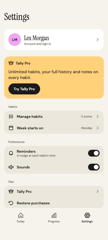
                Text("Settings", style = Theme.typography.display)
                ProfileCard(onClick = navigateToAccount)
                ProCard(onClick = navigateToPro)
                Section("Habits") {
                    OptionRow(
                        "Manage habits",
                        onClick = navigateToManageHabits,
                        icon = Icons.ListChecks,
                        value = "${sampleHabits.size} active",
                        navigates = true,
                    )
                    OptionRow(
                        "Week starts on",
                        onClick = { choosingWeekStart = true },
                        icon = Icons.CalendarBlank,
                        value = weekStart.name.lowercase().replaceFirstChar { it.uppercase() },
                        navigates = true,
                    )
                }
                Section("Preferences") {
                    OptionToggle(
                        "Reminders",
                        reminders,
                        ::setReminders,
                        description = "A nudge at each habit's time",
                        icon = Icons.Bell,
                    )
                    OptionToggle("Sounds", sounds, ::setSounds, icon = Icons.SpeakerHigh)
                }
                Section("Plan") {
                    OptionRow(
                        "Tally Pro",
                        onClick = navigateToPro,
                        icon = Icons.Crown,
                        navigates = true,
                    )
                    OptionRow(
                        "Restore purchases",
                        onClick = ::restorePurchases,
                        icon = Icons.ArrowCounterClockwise,
                    )
                }
                Section("Support", footer = "Tally 1.0") {
                    OptionRow(
                        "Help and feedback",
                        onClick = navigateToHelp,
                        icon = Icons.ChatCircle,
                        navigates = true,
                    )
                    OptionRow(
                        "Privacy policy",
                        onClick = navigateToPrivacyPolicy,
                        icon = Icons.ShieldCheck,
                        navigates = true,
                    )
                    OptionRow(
                        "Terms of use",
                        onClick = navigateToTerms,
                        icon = Icons.FileText,
                        navigates = true,
                    )
                }
            }
        }
        Toast(
            visible = toast != null,
            message = toast.orEmpty(),
            modifier =
                Modifier.align(Alignment.BottomCenter)
                    .padding(bottom = contentPadding.calculateBottomPadding() + Space * 4),
        )
        ModalBottomSheet(
            visible = choosingWeekStart,
            onDismiss = { choosingWeekStart = false },
            title = "Week starts on",
        ) {
            OptionGroup {
                listOf(DayOfWeek.MONDAY, DayOfWeek.SUNDAY).forEach { day ->
                    OptionRow(
                        day.name.lowercase().replaceFirstChar { it.uppercase() },
                        onClick = { setWeekStart(day) },
                        selected = day == weekStart,
                    )
                }
            }
        }
    }
}

@Composable
private fun ProfileCard(onClick: () -> Unit) {
    UnstyledButton(
        onClick = onClick,
        modifier =
            Modifier.fillMaxWidth().clip(Theme.shapes.medium).background(Theme.colors.surface),
        contentPadding = PaddingValues(Space * 4),
        indication = rememberRippleIndication(color = Theme.colors.onSurface),
        interactionSource = remember { MutableInteractionSource() },
    ) {
        Row(
            verticalAlignment = Alignment.CenterVertically,
            horizontalArrangement = Arrangement.spacedBy(Space * 3),
        ) {
            Avatar(Account.name)
            Column(Modifier.weight(1f)) {
                Text(Account.name, style = Theme.typography.title, color = Theme.colors.onSurface)
                Text(
                    "Account and sign in",
                    style = Theme.typography.caption,
                    color = Theme.colors.onBackgroundMuted,
                )
            }
            Icon(
                Icons.CaretRight,
                contentDescription = null,
                modifier = Modifier.size(16.dp),
                tint = Theme.colors.onBackgroundMuted,
            )
        }
    }
}

@Composable
private fun ProCard(onClick: () -> Unit) {
    Column(
        Modifier.fillMaxWidth()
            .clip(Theme.shapes.medium)
            .background(Theme.colors.amberLight)
            .padding(Space * 4),
        verticalArrangement = Arrangement.spacedBy(Space * 3),
    ) {
        Row(
            verticalAlignment = Alignment.CenterVertically,
            horizontalArrangement = Arrangement.spacedBy(Space * 2),
        ) {
            Icon(
                Icons.Crown,
                contentDescription = null,
                modifier = Modifier.size(20.dp),
                tint = Theme.colors.onBackground,
            )
            Text("Tally Pro", style = Theme.typography.label, color = Theme.colors.onBackground)
        }
        Text(
            "Unlimited habits, your full history and notes on every habit.",
            color = Theme.colors.onBackground,
        )
        Button(onClick = onClick) { Text("Try Tally Pro") }
    }
}

@Composable
private fun Avatar(name: String, large: Boolean = false) {
    Box(
        Modifier.size(if (large) 72.dp else 48.dp)
            .clip(Theme.shapes.fullyRounded)
            .background(Theme.colors.orchidLight),
        contentAlignment = Alignment.Center,
    ) {
        Text(
            name.split(" ").mapNotNull { it.firstOrNull() }.take(2).joinToString(""),
            style = if (large) Theme.typography.title else Theme.typography.label,
            color = Theme.colors.onBackground,
        )
    }
}

@Composable
fun AccountScreen(
    navigateBack: () -> Unit,
    navigateToWelcome: () -> Unit,
    modifier: Modifier = Modifier,
) {
    var name by remember { mutableStateOf(Account.name) }
    var confirm by remember { mutableStateOf<AccountAction?>(null) }

    fun signOut() {
        // sign out here
        navigateToWelcome()
    }

    fun resetData() {
        // reset the habit data here
        navigateBack()
    }

    fun deleteAccount() {
        // delete the account here
        navigateToWelcome()
    }

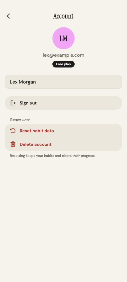
    Page(
        title = "Account",
        onBack = navigateBack,
        modifier = modifier,
        overlay = {
            val action = confirm
            AlertDialog(
                visible = action != null,
                title = action?.title.orEmpty(),
                message = action?.message.orEmpty(),
                onDismissRequest = { confirm = null },
            ) {
                Button(
                    onClick = {
                        confirm = null
                        when (action) {
                            AccountAction.SignOut -> signOut()
                            AccountAction.Reset -> resetData()
                            AccountAction.Delete -> deleteAccount()
                            null -> {}
                        }
                    },
                    variant =
                        if (action == AccountAction.SignOut) ButtonVariant.Primary
                        else ButtonVariant.Destructive,
                    modifier = Modifier.fillMaxWidth(),
                ) {
                    Text(action?.confirm.orEmpty())
                }
                Button(
                    onClick = { confirm = null },
                    variant = ButtonVariant.Secondary,
                    modifier = Modifier.fillMaxWidth(),
                ) {
                    Text("Cancel")
                }
            }
        },
    ) {
        Column(
            Modifier.fillMaxWidth(),
            horizontalAlignment = Alignment.CenterHorizontally,
            verticalArrangement = Arrangement.spacedBy(Space * 2),
        ) {
            Avatar(name, large = true)
            Text(Account.email, color = Theme.colors.onBackgroundMuted)
            Text(
                "Free plan",
                style = Theme.typography.caption,
                color = Theme.colors.onPrimary,
                modifier =
                    Modifier.clip(Theme.shapes.fullyRounded)
                        .background(Theme.colors.primary)
                        .padding(horizontal = Space * 3, vertical = Space),
            )
        }
        TextField(value = name, onValueChange = { name = it }, label = "Name")
        Section(null) {
            OptionRow(
                "Sign out",
                onClick = { confirm = AccountAction.SignOut },
                icon = Icons.SignOut,
            )
        }
        Section("Danger zone", footer = "Resetting keeps your habits and clears their progress.") {
            OptionRow(
                "Reset habit data",
                onClick = { confirm = AccountAction.Reset },
                icon = Icons.ArrowCounterClockwise,
                destructive = true,
            )
            OptionRow(
                "Delete account",
                onClick = { confirm = AccountAction.Delete },
                icon = Icons.Trash,
                destructive = true,
            )
        }
    }
}

private enum class AccountAction(val title: String, val message: String, val confirm: String) {
    SignOut(
        "Sign out of Tally?",
        "Your habits stay in your account for when you sign back in.",
        "Sign out",
    ),
    Reset(
        "Reset habit data?",
        "Every streak, check-in and note is cleared. Your habits stay.",
        "Reset",
    ),
    Delete(
        "Delete your account?",
        "This deletes your habits and their history. It can't be undone.",
        "Delete account",
    ),
}

@Composable
fun ManageHabitsScreen(
    navigateBack: () -> Unit,
    navigateToEditHabit: (habitId: Int) -> Unit,
    navigateToNewHabit: () -> Unit,
    modifier: Modifier = Modifier,
) {
    var tab by remember { mutableStateOf(0) }
    val habits = if (tab == 0) sampleHabits else archivedHabits
    Page(
        title = "Manage habits",
        onBack = navigateBack,
        modifier = modifier,
        actions = {
            IconButton(onClick = navigateToNewHabit, contentDescription = "New habit") {
                Icon(Icons.Plus, contentDescription = null, modifier = Modifier.size(22.dp))
            }
        },
    ) {
        SegmentedControl(
            options = listOf("Active (${sampleHabits.size})", "Archived (${archivedHabits.size})"),
            selected = tab,
            onSelect = { tab = it },
        )
        OptionGroup {
            habits.forEach { habit ->
                OptionRow(
                    habit.name,
                    onClick = { navigateToEditHabit(habit.id) },
                    description = habit.scheduleLabel,
                    navigates = true,
                )
            }
        }
    }
}
package com.composables.tally

import androidx.compose.runtime.Composable
import androidx.compose.runtime.mutableStateMapOf
import androidx.compose.ui.graphics.Color
import com.composables.tally.theme.Theme
import kotlin.time.Clock
import kotlinx.datetime.DatePeriod
import kotlinx.datetime.DayOfWeek
import kotlinx.datetime.LocalDate
import kotlinx.datetime.LocalTime
import kotlinx.datetime.TimeZone
import kotlinx.datetime.daysUntil
import kotlinx.datetime.minus
import kotlinx.datetime.plus
import kotlinx.datetime.todayIn

enum class TimeOfDay(val label: String) {
    AnyTime("Any time"),
    Morning("Morning"),
    Afternoon("Afternoon"),
    Evening("Evening"),
}

enum class HabitColor {
    Amber,
    Ember,
    Orchid,
    Sky,
    Meadow,
}

val HabitColor.color: Color
    @Composable
    get() =
        when (this) {
            HabitColor.Amber -> Theme.colors.amber
            HabitColor.Ember -> Theme.colors.ember
            HabitColor.Orchid -> Theme.colors.orchid
            HabitColor.Sky -> Theme.colors.sky
            HabitColor.Meadow -> Theme.colors.meadow
        }

val HabitColor.lightColor: Color
    @Composable
    get() =
        when (this) {
            HabitColor.Amber -> Theme.colors.amberLight
            HabitColor.Ember -> Theme.colors.emberLight
            HabitColor.Orchid -> Theme.colors.orchidLight
            HabitColor.Sky -> Theme.colors.skyLight
            HabitColor.Meadow -> Theme.colors.meadowLight
        }

sealed interface Repeat {
    data class Weekly(val days: Set<DayOfWeek>) : Repeat

    data class Interval(val days: Int) : Repeat

    companion object {
        val EveryDay = Weekly(DayOfWeek.entries.toSet())
    }
}

val Repeat.label: String
    get() =
        when (this) {
            is Repeat.Interval -> "Every $days days"
            is Repeat.Weekly ->
                when (days) {
                    DayOfWeek.entries.toSet() -> "Every day"
                    DayOfWeek.entries.take(5).toSet() -> "Weekdays"
                    DayOfWeek.entries.takeLast(2).toSet() -> "Weekends"
                    else -> DayOfWeek.entries.filter { it in days }.joinToString { it.shortName }
                }
        }

val DayOfWeek.shortName: String
    get() = name.take(3).lowercase().replaceFirstChar { it.uppercase() }

data class Habit(
    val id: Int,
    val name: String,
    val goal: Int,
    val unit: String,
    val timeOfDay: TimeOfDay,
    val color: HabitColor,
    val repeat: Repeat = Repeat.EveryDay,
    val reminder: LocalTime? = null,
)

val Habit.goalLabel: String
    get() = "$goal $unit per day"

data class HabitNote(val habitId: Int, val date: LocalDate, val text: String)

class HabitLog {
    private val counts = mutableStateMapOf<Pair<Int, LocalDate>, Int>()

    fun count(habit: Habit, date: LocalDate) = counts[habit.id to date] ?: 0

    fun isDone(habit: Habit, date: LocalDate) = count(habit, date) >= habit.goal

    fun checkIn(habit: Habit, date: LocalDate) {
        counts[habit.id to date] = minOf(habit.goal, count(habit, date) + 1)
    }

    fun complete(habit: Habit, date: LocalDate) {
        counts[habit.id to date] = habit.goal
    }

    fun clear(habit: Habit, date: LocalDate) {
        counts.remove(habit.id to date)
    }

    fun streak(habit: Habit, date: LocalDate): Int {
        var day = if (isDone(habit, date)) date else date.minus(DatePeriod(days = 1))
        var streak = 0
        while (isDone(habit, day)) {
            streak++
            day = day.minus(DatePeriod(days = 1))
        }
        return streak
    }

    fun streaks(habit: Habit, from: LocalDate, until: LocalDate): List<ClosedRange<LocalDate>> {
        val runs = mutableListOf<ClosedRange<LocalDate>>()
        var start: LocalDate? = null
        days(from, until).forEach { day ->
            val done = isDone(habit, day)
            if (done && start == null) start = day
            if (!done && start != null) {
                runs += start..day.minus(DatePeriod(days = 1))
                start = null
            }
        }
        start?.let { runs += it..until }
        return runs.sortedByDescending { it.length }
    }

    fun doneDays(habit: Habit, from: LocalDate, until: LocalDate) =
        days(from, until).count { isDone(habit, it) }
}

val ClosedRange<LocalDate>.length: Int
    get() = start.daysUntil(endInclusive) + 1

fun days(from: LocalDate, until: LocalDate): List<LocalDate> =
    (0..from.daysUntil(until)).map { from.plus(DatePeriod(days = it)) }

fun today(): LocalDate = Clock.System.todayIn(TimeZone.currentSystemDefault())

val LocalTime.label: String
    get() {
        val hour12 = if (hour % 12 == 0) 12 else hour % 12
        return "$hour12:${minute.toString().padStart(2, '0')} ${if (hour < 12) "AM" else "PM"}"
    }

val Habit.scheduleLabel: String
    get() = listOfNotNull(repeat.label, reminder?.label).joinToString(" · ")
package com.composables.tally

import androidx.compose.ui.graphics.vector.ImageVector
import com.composables.tally.theme.Barbell
import com.composables.tally.theme.BookOpen
import com.composables.tally.theme.Drop
import com.composables.tally.theme.FlowerLotus
import com.composables.tally.theme.Icons
import com.composables.tally.theme.Leaf
import com.composables.tally.theme.Moon
import com.composables.tally.theme.NotePencil
import com.composables.tally.theme.PersonSimpleRun
import com.composables.tally.theme.PersonSimpleWalk
import com.composables.tally.theme.Sun
import kotlinx.datetime.DatePeriod
import kotlinx.datetime.DayOfWeek
import kotlinx.datetime.LocalDate
import kotlinx.datetime.LocalTime
import kotlinx.datetime.minus

internal object Account {
    const val name = "Lex Morgan"
    const val email = "[email protected]"
}

internal val sampleHabits =
    listOf(
        Habit(
            1,
            "Meditate",
            1,
            "time",
            TimeOfDay.Morning,
            HabitColor.Orchid,
            reminder = LocalTime(7, 0),
        ),
        Habit(2, "Drink water", 8, "glasses", TimeOfDay.Morning, HabitColor.Sky),
        Habit(
            3,
            "Walk 15 minutes",
            1,
            "time",
            TimeOfDay.Afternoon,
            HabitColor.Meadow,
            repeat = Repeat.Weekly(DayOfWeek.entries.take(5).toSet()),
            reminder = LocalTime(12, 30),
        ),
        Habit(
            4,
            "Read 20 pages",
            1,
            "time",
            TimeOfDay.Evening,
            HabitColor.Ember,
            reminder = LocalTime(21, 30),
        ),
        Habit(
            5,
            "Stretch",
            1,
            "time",
            TimeOfDay.Evening,
            HabitColor.Amber,
            repeat = Repeat.Interval(2),
        ),
    )

internal val archivedHabits =
    listOf(Habit(6, "No sugar", 1, "time", TimeOfDay.AnyTime, HabitColor.Ember))

internal fun habitById(id: Int) = (sampleHabits + archivedHabits).first { it.id == id }

internal fun sampleLog(today: LocalDate): HabitLog {
    val log = HabitLog()
    val currentStreaks = mapOf(1 to 12, 2 to 3, 3 to 5, 4 to 9, 5 to 0)
    sampleHabits.forEach { habit ->
        val streak = currentStreaks.getValue(habit.id)
        (1..60).forEach { daysAgo ->
            val done =
                when {
                    daysAgo <= streak -> true
                    daysAgo == streak + 1 -> false
                    else -> (daysAgo + habit.id * 3) % 4 != 0
                }
            if (done) log.complete(habit, today.minus(DatePeriod(days = daysAgo)))
        }
    }
    log.complete(sampleHabits[0], today)
    repeat(3) { log.checkIn(sampleHabits[1], today) }
    return log
}

internal fun sampleNotes(today: LocalDate) =
    listOf(
        HabitNote(1, today.minus(DatePeriod(days = 1)), "Ten minutes felt easy today."),
        HabitNote(1, today.minus(DatePeriod(days = 4)), "Tried the breathing exercise first."),
        HabitNote(4, today.minus(DatePeriod(days = 2)), "Finished the first part of the book."),
    )

data class HabitTemplate(
    val name: String,
    val goal: Int,
    val unit: String,
    val timeOfDay: TimeOfDay,
    val color: HabitColor,
    val icon: ImageVector,
)

internal val popularTemplates =
    listOf(
        HabitTemplate(
            "Meditate",
            1,
            "time",
            TimeOfDay.Morning,
            HabitColor.Orchid,
            Icons.FlowerLotus,
        ),
        HabitTemplate("Drink water", 8, "glasses", TimeOfDay.AnyTime, HabitColor.Sky, Icons.Drop),
        HabitTemplate("Read", 20, "pages", TimeOfDay.Evening, HabitColor.Ember, Icons.BookOpen),
        HabitTemplate("Journal", 1, "time", TimeOfDay.Evening, HabitColor.Amber, Icons.NotePencil),
        HabitTemplate("Sleep early", 1, "time", TimeOfDay.Evening, HabitColor.Orchid, Icons.Moon),
        HabitTemplate(
            "Eat greens",
            2,
            "servings",
            TimeOfDay.AnyTime,
            HabitColor.Meadow,
            Icons.Leaf,
        ),
    )

internal val activeTemplates =
    listOf(
        HabitTemplate(
            "Walk",
            15,
            "minutes",
            TimeOfDay.Afternoon,
            HabitColor.Meadow,
            Icons.PersonSimpleWalk,
        ),
        HabitTemplate("Run", 1, "time", TimeOfDay.Morning, HabitColor.Ember, Icons.PersonSimpleRun),
        HabitTemplate("Work out", 30, "minutes", TimeOfDay.AnyTime, HabitColor.Sky, Icons.Barbell),
        HabitTemplate("Morning sun", 10, "minutes", TimeOfDay.Morning, HabitColor.Amber, Icons.Sun),
    )
package com.composables.tally.components

import androidx.compose.animation.fadeIn
import androidx.compose.animation.fadeOut
import androidx.compose.animation.scaleIn
import androidx.compose.animation.scaleOut
import androidx.compose.foundation.background
import androidx.compose.foundation.layout.Arrangement
import androidx.compose.foundation.layout.Box
import androidx.compose.foundation.layout.Column
import androidx.compose.foundation.layout.ColumnScope
import androidx.compose.foundation.layout.fillMaxSize
import androidx.compose.foundation.layout.fillMaxWidth
import androidx.compose.foundation.layout.padding
import androidx.compose.foundation.layout.widthIn
import androidx.compose.runtime.Composable
import androidx.compose.ui.Alignment
import androidx.compose.ui.Modifier
import androidx.compose.ui.draw.clip
import androidx.compose.ui.graphics.Color
import androidx.compose.ui.unit.dp
import com.composables.tally.theme.ProvideContentColor
import com.composables.tally.theme.Space
import com.composables.tally.theme.Theme
import com.composeunstyled.DialogPanel
import com.composeunstyled.Scrim
import com.composeunstyled.UnstyledDialog

@Composable
fun AlertDialog(
    visible: Boolean,
    title: String,
    message: String,
    onDismissRequest: () -> Unit,
    modifier: Modifier = Modifier,
    actions: @Composable ColumnScope.() -> Unit,
) {
    UnstyledDialog(
        visible = visible,
        onDismissRequest = onDismissRequest,
        overlay = {
            Scrim(scrimColor = Color.Black.copy(alpha = 0.6f), enter = fadeIn(), exit = fadeOut())
        },
    ) {
        Box(Modifier.fillMaxSize(), contentAlignment = Alignment.Center) {
            DialogPanel(
                modifier =
                    modifier
                        .padding(Space * 6)
                        .widthIn(max = 400.dp)
                        .clip(Theme.shapes.large)
                        .background(Theme.colors.surface),
                paneTitle = title,
                enter = scaleIn(initialScale = 0.94f) + fadeIn(),
                exit = scaleOut(targetScale = 0.94f) + fadeOut(),
            ) {
                ProvideContentColor(Theme.colors.onSurface) {
                    Column(Modifier.padding(Space * 6)) {
                        Text(title, style = Theme.typography.title)
                        Text(
                            message,
                            color = Theme.colors.onBackgroundMuted,
                            modifier = Modifier.padding(top = Space * 2),
                        )
                        Column(
                            Modifier.fillMaxWidth().padding(top = Space * 6),
                            verticalArrangement = Arrangement.spacedBy(Space * 2),
                            content = actions,
                        )
                    }
                }
            }
        }
    }
}
package com.composables.tally.components

import androidx.compose.foundation.background
import androidx.compose.foundation.layout.Arrangement
import androidx.compose.foundation.layout.Box
import androidx.compose.foundation.layout.Row
import androidx.compose.foundation.layout.RowScope
import androidx.compose.foundation.layout.WindowInsets
import androidx.compose.foundation.layout.WindowInsetsSides
import androidx.compose.foundation.layout.fillMaxWidth
import androidx.compose.foundation.layout.height
import androidx.compose.foundation.layout.only
import androidx.compose.foundation.layout.padding
import androidx.compose.foundation.layout.safeDrawing
import androidx.compose.foundation.layout.statusBars
import androidx.compose.foundation.layout.union
import androidx.compose.foundation.layout.windowInsetsPadding
import androidx.compose.runtime.Composable
import androidx.compose.ui.Alignment
import androidx.compose.ui.Modifier
import androidx.compose.ui.input.pointer.pointerInput
import androidx.compose.ui.layout.Layout
import androidx.compose.ui.unit.Constraints
import androidx.compose.ui.unit.dp
import com.composables.tally.theme.ProvideTextStyle
import com.composables.tally.theme.Space
import com.composables.tally.theme.Theme

@Composable
fun AppBar(
    modifier: Modifier = Modifier,
    navigation: @Composable () -> Unit = {},
    title: @Composable () -> Unit = {},
    actions: @Composable RowScope.() -> Unit = {},
) {
    val gap = Space * 2
    Layout(
        content = {
            Box { navigation() }
            Box { ProvideTextStyle(Theme.typography.title, title) }
            Row(
                horizontalArrangement = Arrangement.spacedBy(Space),
                verticalAlignment = Alignment.CenterVertically,
            ) {
                actions()
            }
        },
        modifier =
            modifier
                .fillMaxWidth()
                .background(Theme.colors.background)
                .blockTouchesToContentBehind()
                .windowInsetsPadding(
                    WindowInsets.statusBars.union(
                        WindowInsets.safeDrawing.only(WindowInsetsSides.Horizontal)
                    )
                )
                .height(56.dp)
                .padding(horizontal = Space * 2),
    ) { (navigationSlot, titleSlot, actionsSlot), constraints ->
        val loose = constraints.copy(minWidth = 0, minHeight = 0)
        val navigationPlaceable = navigationSlot.measure(loose)
        val actionsPlaceable = actionsSlot.measure(loose)
        val side = maxOf(navigationPlaceable.width, actionsPlaceable.width) + gap.roundToPx()
        val titleWidth = (constraints.maxWidth - side * 2).coerceAtLeast(0)
        val titlePlaceable =
            titleSlot.measure(Constraints(maxWidth = titleWidth, maxHeight = constraints.maxHeight))
        val height = constraints.maxHeight
        layout(constraints.maxWidth, height) {
            navigationPlaceable.place(0, (height - navigationPlaceable.height) / 2)
            titlePlaceable.place(
                (constraints.maxWidth - titlePlaceable.width) / 2,
                (height - titlePlaceable.height) / 2,
            )
            actionsPlaceable.place(
                constraints.maxWidth - actionsPlaceable.width,
                (height - actionsPlaceable.height) / 2,
            )
        }
    }
}

private fun Modifier.blockTouchesToContentBehind() = pointerInput(Unit) {}
package com.composables.tally.components

import androidx.compose.foundation.background
import androidx.compose.foundation.interaction.MutableInteractionSource
import androidx.compose.foundation.layout.PaddingValues
import androidx.compose.runtime.Composable
import androidx.compose.runtime.remember
import androidx.compose.ui.Modifier
import androidx.compose.ui.draw.alpha
import androidx.compose.ui.draw.clip
import androidx.compose.ui.graphics.Color
import com.composables.compose.ripple.rememberRippleIndication
import com.composables.tally.theme.ProvideContentColor
import com.composables.tally.theme.ProvideTextStyle
import com.composables.tally.theme.Space
import com.composables.tally.theme.Theme
import com.composeunstyled.UnstyledButton

enum class ButtonVariant {
    Primary,
    Secondary,
    Destructive,
    Ghost,
}

@Composable
fun Button(
    onClick: () -> Unit,
    modifier: Modifier = Modifier,
    enabled: Boolean = true,
    variant: ButtonVariant = ButtonVariant.Primary,
    content: @Composable () -> Unit,
) {
    val (container, contentColor) =
        when (variant) {
            ButtonVariant.Secondary -> Theme.colors.surfaceVariant to Theme.colors.onSurfaceVariant
            ButtonVariant.Destructive -> Theme.colors.destructive to Theme.colors.onDestructive
            ButtonVariant.Ghost -> Color.Transparent to Theme.colors.primary
            else -> Theme.colors.primary to Theme.colors.onPrimary
        }
    UnstyledButton(
        onClick = onClick,
        enabled = enabled,
        modifier =
            modifier
                .alpha(if (enabled) 1f else 0.4f)
                .clip(Theme.shapes.fullyRounded)
                .background(container),
        contentPadding = PaddingValues(horizontal = Space * 5, vertical = Space * 3),
        indication = rememberRippleIndication(color = contentColor),
        interactionSource = remember { MutableInteractionSource() },
    ) {
        ProvideContentColor(contentColor) { ProvideTextStyle(Theme.typography.label, content) }
    }
}
package com.composables.tally.components

import androidx.compose.runtime.Composable
import androidx.compose.ui.Modifier
import androidx.compose.ui.graphics.Color
import androidx.compose.ui.graphics.isSpecified
import androidx.compose.ui.graphics.vector.ImageVector
import com.composables.tally.theme.LocalContentColor
import com.composeunstyled.UnstyledIcon

@Composable
fun Icon(
    imageVector: ImageVector,
    contentDescription: String?,
    modifier: Modifier = Modifier,
    tint: Color = LocalContentColor.current,
) {
    val resolvedTint = if (tint.isSpecified) tint else LocalContentColor.current
    UnstyledIcon(
        imageVector = imageVector,
        contentDescription = contentDescription,
        modifier = modifier,
        tint = resolvedTint,
    )
}
package com.composables.tally.components

import androidx.compose.foundation.background
import androidx.compose.foundation.interaction.MutableInteractionSource
import androidx.compose.foundation.layout.size
import androidx.compose.runtime.Composable
import androidx.compose.runtime.remember
import androidx.compose.ui.Modifier
import androidx.compose.ui.draw.alpha
import androidx.compose.ui.draw.clip
import androidx.compose.ui.graphics.Color
import androidx.compose.ui.semantics.contentDescription
import androidx.compose.ui.semantics.semantics
import androidx.compose.ui.unit.dp
import com.composables.compose.ripple.rememberRippleIndication
import com.composables.tally.theme.LocalContentColor
import com.composables.tally.theme.ProvideContentColor
import com.composables.tally.theme.Theme
import com.composeunstyled.UnstyledButton

enum class IconButtonVariant {
    Ghost,
    Filled,
    Tonal,
}

enum class IconButtonSize {
    Small,
    Medium,
}

@Composable
fun IconButton(
    onClick: () -> Unit,
    contentDescription: String,
    modifier: Modifier = Modifier,
    enabled: Boolean = true,
    variant: IconButtonVariant = IconButtonVariant.Ghost,
    size: IconButtonSize = IconButtonSize.Medium,
    content: @Composable () -> Unit,
) {
    val (container, contentColor) =
        when {
            variant == IconButtonVariant.Filled && !enabled ->
                Theme.colors.surfaceVariant to Theme.colors.onBackgroundMuted
            variant == IconButtonVariant.Filled -> Theme.colors.primary to Theme.colors.onPrimary
            variant == IconButtonVariant.Tonal ->
                Theme.colors.surfaceVariant to Theme.colors.onSurfaceVariant
            else -> Color.Transparent to LocalContentColor.current
        }
    UnstyledButton(
        onClick = onClick,
        enabled = enabled,
        modifier =
            modifier
                .alpha(if (enabled || variant == IconButtonVariant.Filled) 1f else 0.4f)
                .size(if (size == IconButtonSize.Small) 32.dp else 40.dp)
                .clip(Theme.shapes.fullyRounded)
                .background(container)
                .semantics { this.contentDescription = contentDescription },
        indication = rememberRippleIndication(color = contentColor),
        interactionSource = remember { MutableInteractionSource() },
    ) {
        ProvideContentColor(contentColor, content)
    }
}
package com.composables.tally.components

import androidx.compose.foundation.background
import androidx.compose.foundation.interaction.MutableInteractionSource
import androidx.compose.foundation.layout.Arrangement
import androidx.compose.foundation.layout.Column
import androidx.compose.foundation.layout.PaddingValues
import androidx.compose.foundation.layout.Row
import androidx.compose.foundation.layout.WindowInsets
import androidx.compose.foundation.layout.WindowInsetsSides
import androidx.compose.foundation.layout.fillMaxWidth
import androidx.compose.foundation.layout.navigationBars
import androidx.compose.foundation.layout.only
import androidx.compose.foundation.layout.padding
import androidx.compose.foundation.layout.safeDrawing
import androidx.compose.foundation.layout.size
import androidx.compose.foundation.layout.union
import androidx.compose.foundation.layout.windowInsetsPadding
import androidx.compose.foundation.selection.selectable
import androidx.compose.runtime.Composable
import androidx.compose.runtime.remember
import androidx.compose.ui.Alignment
import androidx.compose.ui.Modifier
import androidx.compose.ui.draw.clip
import androidx.compose.ui.graphics.vector.ImageVector
import androidx.compose.ui.semantics.Role
import androidx.compose.ui.unit.dp
import com.composables.compose.ripple.rememberRippleIndication
import com.composables.tally.theme.ChartBar
import com.composables.tally.theme.GearSix
import com.composables.tally.theme.House
import com.composables.tally.theme.Icons
import com.composables.tally.theme.Space
import com.composables.tally.theme.Theme

enum class Destination(val label: String, val icon: ImageVector) {
    Today("Today", Icons.House),
    Progress("Progress", Icons.ChartBar),
    Settings("Settings", Icons.GearSix),
}

@Composable
fun MainNavigation(
    selected: Destination,
    onSelect: (Destination) -> Unit,
    modifier: Modifier = Modifier,
) {
    Row(
        modifier
            .fillMaxWidth()
            .background(Theme.colors.background)
            .windowInsetsPadding(
                WindowInsets.navigationBars.union(
                    WindowInsets.safeDrawing.only(WindowInsetsSides.Horizontal)
                )
            )
            .padding(horizontal = Space * 4, vertical = Space * 2),
        horizontalArrangement = Arrangement.SpaceEvenly,
    ) {
        Destination.entries.forEach { destination ->
            val isSelected = destination == selected
            val tint = if (isSelected) Theme.colors.primary else Theme.colors.onBackgroundMuted
            Column(
                Modifier.weight(1f)
                    .clip(Theme.shapes.small)
                    .selectable(
                        selected = isSelected,
                        onClick = { onSelect(destination) },
                        role = Role.Tab,
                        interactionSource = remember { MutableInteractionSource() },
                        indication = rememberRippleIndication(color = Theme.colors.primary),
                    )
                    .padding(vertical = Space * 2),
                horizontalAlignment = Alignment.CenterHorizontally,
                verticalArrangement = Arrangement.spacedBy(Space),
            ) {
                Icon(
                    destination.icon,
                    contentDescription = null,
                    modifier = Modifier.size(24.dp),
                    tint = tint,
                )
                Text(destination.label, style = Theme.typography.caption, color = tint)
            }
        }
    }
}

@Composable
fun MainNavigationScaffold(
    selected: Destination,
    navigateToHome: () -> Unit,
    navigateToProgress: () -> Unit,
    navigateToSettings: () -> Unit,
    modifier: Modifier = Modifier,
    content: @Composable (contentPadding: PaddingValues) -> Unit,
) {
    ScreenScaffold(
        modifier = modifier,
        bottomBar = {
            MainNavigation(
                selected = selected,
                onSelect = { destination ->
                    when (destination) {
                        selected -> Unit
                        Destination.Today -> navigateToHome()
                        Destination.Progress -> navigateToProgress()
                        Destination.Settings -> navigateToSettings()
                    }
                },
            )
        },
    ) { contentPadding ->
        content(contentPadding)
    }
}
package com.composables.tally.components

import androidx.compose.animation.animateContentSize
import androidx.compose.animation.fadeIn
import androidx.compose.animation.fadeOut
import androidx.compose.foundation.background
import androidx.compose.foundation.layout.Arrangement
import androidx.compose.foundation.layout.Box
import androidx.compose.foundation.layout.Column
import androidx.compose.foundation.layout.ColumnScope
import androidx.compose.foundation.layout.WindowInsets
import androidx.compose.foundation.layout.WindowInsetsSides
import androidx.compose.foundation.layout.fillMaxSize
import androidx.compose.foundation.layout.fillMaxWidth
import androidx.compose.foundation.layout.heightIn
import androidx.compose.foundation.layout.ime
import androidx.compose.foundation.layout.navigationBars
import androidx.compose.foundation.layout.only
import androidx.compose.foundation.layout.padding
import androidx.compose.foundation.layout.safeDrawing
import androidx.compose.foundation.layout.size
import androidx.compose.foundation.layout.statusBars
import androidx.compose.foundation.layout.union
import androidx.compose.foundation.layout.widthIn
import androidx.compose.foundation.layout.windowInsetsPadding
import androidx.compose.foundation.rememberScrollState
import androidx.compose.foundation.shape.RoundedCornerShape
import androidx.compose.foundation.verticalScroll
import androidx.compose.runtime.Composable
import androidx.compose.runtime.LaunchedEffect
import androidx.compose.runtime.remember
import androidx.compose.ui.Alignment
import androidx.compose.ui.Modifier
import androidx.compose.ui.draw.clip
import androidx.compose.ui.graphics.Color
import androidx.compose.ui.unit.dp
import com.composables.tally.theme.Icons
import com.composables.tally.theme.ProvideContentColor
import com.composables.tally.theme.Space
import com.composables.tally.theme.Theme
import com.composables.tally.theme.X
import com.composeunstyled.DrawerPlacement
import com.composeunstyled.DrawerPresentation
import com.composeunstyled.DrawerSnapPoint
import com.composeunstyled.DrawerSnapPoints
import com.composeunstyled.Overlay
import com.composeunstyled.Panel
import com.composeunstyled.UnstyledDrawer
import com.composeunstyled.UnstyledDrawerState
import com.composeunstyled.Viewport

@Composable
fun ModalBottomSheet(
    visible: Boolean,
    onDismiss: () -> Unit,
    title: String,
    modifier: Modifier = Modifier,
    content: @Composable ColumnScope.() -> Unit,
) {
    val drawer = remember {
        UnstyledDrawerState(
            initialValue = if (visible) SheetPosition.Open else SheetPosition.Closed,
            snapPoints =
                DrawerSnapPoints {
                    SheetPosition.Closed at DrawerSnapPoint.Zero
                    SheetPosition.Open at DrawerSnapPoint.ContentSize
                },
        )
    }
    LaunchedEffect(visible) {
        drawer.targetValue = if (visible) SheetPosition.Open else SheetPosition.Closed
    }
    val shape = RoundedCornerShape(topStart = 28.dp, topEnd = 28.dp)
    UnstyledDrawer(
        state = drawer,
        modifier = modifier,
        placement = DrawerPlacement.Bottom,
        presentation = DrawerPresentation.Modal,
        dismissOnClickOutside = true,
        onDismissed = { onDismiss() },
        overlay = {
            Overlay(
                Modifier.fillMaxSize().background(Color.Black.copy(alpha = 0.6f)),
                enter = fadeIn(),
                exit = fadeOut(),
            )
        },
    ) {
        // The overlay draws inside the viewport, so the viewport stays edge to edge and the panel
        // keeps clear of the status bar.
        Viewport(Modifier.fillMaxSize()) {
            Panel(
                Modifier.windowInsetsPadding(WindowInsets.statusBars)
                    .padding(top = Space * 2)
                    .widthIn(max = 640.dp)
                    .fillMaxWidth()
                    .clip(shape)
                    .background(Theme.colors.surface)
                    .windowInsetsPadding(
                        WindowInsets.navigationBars
                            .union(WindowInsets.ime)
                            .union(WindowInsets.safeDrawing.only(WindowInsetsSides.Horizontal))
                    )
            ) {
                // Unstyled keeps a closed sheet laid out, so its content would stay reachable by
                // screen readers.
                val showContent =
                    visible ||
                        drawer.currentValue != SheetPosition.Closed ||
                        drawer.targetValue != SheetPosition.Closed
                if (showContent)
                    ProvideContentColor(Theme.colors.onSurface) {
                        Column(Modifier.fillMaxWidth()) {
                            Box(
                                Modifier.align(Alignment.CenterHorizontally)
                                    .padding(top = Space * 2)
                                    .size(width = 36.dp, height = 4.dp)
                                    .clip(Theme.shapes.fullyRounded)
                                    .background(Theme.colors.border)
                            )
                            Box(
                                Modifier.fillMaxWidth()
                                    .padding(horizontal = Space * 3, vertical = Space * 2)
                            ) {
                                IconButton(
                                    onClick = onDismiss,
                                    contentDescription = "Close",
                                    variant = IconButtonVariant.Tonal,
                                    size = IconButtonSize.Small,
                                    modifier = Modifier.align(Alignment.CenterStart),
                                ) {
                                    Icon(
                                        Icons.X,
                                        contentDescription = null,
                                        modifier = Modifier.size(16.dp),
                                    )
                                }
                                Text(
                                    title,
                                    style = Theme.typography.title,
                                    modifier = Modifier.align(Alignment.Center),
                                )
                            }
                            Column(
                                Modifier.fillMaxWidth()
                                    .animateContentSize()
                                    .heightIn(max = 560.dp)
                                    .verticalScroll(rememberScrollState())
                                    .padding(
                                        start = Space * 4,
                                        end = Space * 4,
                                        top = Space,
                                        bottom = Space * 6,
                                    ),
                                verticalArrangement = Arrangement.spacedBy(Space * 3),
                                content = content,
                            )
                        }
                    }
            }
        }
    }
}

private enum class SheetPosition {
    Closed,
    Open,
}
package com.composables.tally.components

import androidx.compose.foundation.background
import androidx.compose.foundation.layout.Column
import androidx.compose.foundation.layout.ColumnScope
import androidx.compose.foundation.layout.fillMaxWidth
import androidx.compose.runtime.Composable
import androidx.compose.ui.Modifier
import androidx.compose.ui.draw.clip
import com.composables.tally.theme.ProvideContentColor
import com.composables.tally.theme.Theme

@Composable
fun OptionGroup(
    modifier: Modifier = Modifier,
    content: @Composable ColumnScope.() -> Unit,
) {
    Column(
        modifier.fillMaxWidth().clip(Theme.shapes.medium).background(Theme.colors.surfaceVariant)
    ) {
        ProvideContentColor(Theme.colors.onSurfaceVariant) { content() }
    }
}
package com.composables.tally.components

import androidx.compose.foundation.background
import androidx.compose.foundation.interaction.MutableInteractionSource
import androidx.compose.foundation.layout.Arrangement
import androidx.compose.foundation.layout.Column
import androidx.compose.foundation.layout.PaddingValues
import androidx.compose.foundation.layout.Row
import androidx.compose.foundation.layout.fillMaxWidth
import androidx.compose.foundation.layout.padding
import androidx.compose.foundation.layout.size
import androidx.compose.runtime.Composable
import androidx.compose.runtime.remember
import androidx.compose.ui.Alignment
import androidx.compose.ui.Modifier
import androidx.compose.ui.draw.alpha
import androidx.compose.ui.draw.clip
import androidx.compose.ui.graphics.vector.ImageVector
import androidx.compose.ui.semantics.selected
import androidx.compose.ui.semantics.semantics
import androidx.compose.ui.unit.dp
import com.composables.compose.ripple.rememberRippleIndication
import com.composables.tally.theme.CaretRight
import com.composables.tally.theme.Check
import com.composables.tally.theme.Icons
import com.composables.tally.theme.LocalContentColor
import com.composables.tally.theme.ProvideContentColor
import com.composables.tally.theme.Space
import com.composables.tally.theme.Theme
import com.composeunstyled.UnstyledButton

@Composable
fun OptionRow(
    title: String,
    onClick: () -> Unit,
    modifier: Modifier = Modifier,
    description: String? = null,
    icon: ImageVector? = null,
    badge: String? = null,
    selected: Boolean = false,
    enabled: Boolean = true,
    destructive: Boolean = false,
    value: String? = null,
    navigates: Boolean = false,
) {
    UnstyledButton(
        onClick = onClick,
        enabled = enabled,
        modifier =
            modifier.fillMaxWidth().alpha(if (enabled) 1f else 0.45f).semantics {
                this.selected = selected
            },
        contentPadding = PaddingValues(horizontal = Space * 4, vertical = Space * 3),
        contentAlignment = Alignment.CenterStart,
        indication = rememberRippleIndication(color = LocalContentColor.current),
        interactionSource = remember { MutableInteractionSource() },
    ) {
        if (destructive)
            ProvideContentColor(Theme.colors.destructive) {
                OptionLayout(title, description, icon, badge) {}
            }
        else
            OptionLayout(title, description, icon, badge) {
                if (value != null)
                    Text(
                        value,
                        style = Theme.typography.caption,
                        color = Theme.colors.onBackgroundMuted,
                        maxLines = 1,
                    )
                if (selected)
                    Icon(
                        Icons.Check,
                        contentDescription = null,
                        modifier = Modifier.size(20.dp),
                        tint = Theme.colors.primary,
                    )
                if (navigates)
                    Icon(
                        Icons.CaretRight,
                        contentDescription = null,
                        modifier = Modifier.size(16.dp),
                        tint = Theme.colors.onBackgroundMuted,
                    )
            }
    }
}

@Composable
internal fun OptionLayout(
    title: String,
    description: String?,
    icon: ImageVector?,
    badge: String?,
    modifier: Modifier = Modifier,
    trailing: @Composable () -> Unit,
) {
    Row(
        modifier.fillMaxWidth(),
        verticalAlignment = Alignment.CenterVertically,
        horizontalArrangement = Arrangement.spacedBy(Space * 3),
    ) {
        if (icon != null) Icon(icon, contentDescription = null, modifier = Modifier.size(20.dp))
        Column(Modifier.weight(1f)) {
            Row(
                verticalAlignment = Alignment.CenterVertically,
                horizontalArrangement = Arrangement.spacedBy(Space * 2),
            ) {
                Text(title, style = Theme.typography.label)
                if (badge != null) {
                    Text(
                        badge,
                        style = Theme.typography.caption,
                        color = Theme.colors.onPrimary,
                        modifier =
                            Modifier.clip(Theme.shapes.fullyRounded)
                                .background(Theme.colors.primary)
                                .padding(horizontal = Space * 2, vertical = 1.dp),
                    )
                }
            }
            if (description != null)
                Text(
                    description,
                    style = Theme.typography.caption,
                    color = Theme.colors.onBackgroundMuted,
                )
        }
        trailing()
    }
}
package com.composables.tally.components

import androidx.compose.animation.animateColorAsState
import androidx.compose.animation.core.tween
import androidx.compose.foundation.background
import androidx.compose.foundation.interaction.MutableInteractionSource
import androidx.compose.foundation.layout.fillMaxWidth
import androidx.compose.foundation.layout.padding
import androidx.compose.foundation.layout.size
import androidx.compose.runtime.Composable
import androidx.compose.runtime.getValue
import androidx.compose.runtime.remember
import androidx.compose.ui.Modifier
import androidx.compose.ui.draw.clip
import androidx.compose.ui.graphics.vector.ImageVector
import androidx.compose.ui.unit.dp
import com.composables.compose.ripple.rememberRippleIndication
import com.composables.tally.theme.LocalContentColor
import com.composables.tally.theme.Space
import com.composables.tally.theme.Theme
import com.composeunstyled.Thumb
import com.composeunstyled.Track
import com.composeunstyled.UnstyledSwitch

@Composable
fun OptionToggle(
    title: String,
    checked: Boolean,
    onCheckedChange: (Boolean) -> Unit,
    modifier: Modifier = Modifier,
    description: String? = null,
    icon: ImageVector? = null,
) {
    val track by
        animateColorAsState(
            if (checked) Theme.colors.primary else Theme.colors.border,
            tween(180),
            label = "Track",
        )
    val thumb by
        animateColorAsState(
            if (checked) Theme.colors.onPrimary else Theme.colors.onBackgroundMuted,
            tween(180),
            label = "Thumb",
        )
    UnstyledSwitch(
        checked = checked,
        onCheckedChange = onCheckedChange,
        modifier = modifier.fillMaxWidth(),
        interactionSource = remember { MutableInteractionSource() },
        indication = rememberRippleIndication(color = LocalContentColor.current),
        accessibilityLabel = title,
    ) {
        OptionLayout(
            title,
            description,
            icon,
            badge = null,
            modifier = Modifier.padding(horizontal = Space * 4, vertical = Space * 3),
        ) {
            Track(
                Modifier.size(width = 44.dp, height = 26.dp)
                    .clip(Theme.shapes.fullyRounded)
                    .background(track)
            ) {
                Thumb(
                    animationSpec = tween(180),
                    modifier =
                        Modifier.padding(4.dp)
                            .size(18.dp)
                            .clip(Theme.shapes.fullyRounded)
                            .background(thumb),
                )
            }
        }
    }
}
package com.composables.tally.components

import androidx.compose.foundation.layout.Arrangement
import androidx.compose.foundation.layout.Box
import androidx.compose.foundation.layout.BoxScope
import androidx.compose.foundation.layout.Column
import androidx.compose.foundation.layout.ColumnScope
import androidx.compose.foundation.layout.RowScope
import androidx.compose.foundation.layout.WindowInsets
import androidx.compose.foundation.layout.WindowInsetsSides
import androidx.compose.foundation.layout.fillMaxSize
import androidx.compose.foundation.layout.fillMaxWidth
import androidx.compose.foundation.layout.ime
import androidx.compose.foundation.layout.navigationBars
import androidx.compose.foundation.layout.only
import androidx.compose.foundation.layout.padding
import androidx.compose.foundation.layout.safeDrawing
import androidx.compose.foundation.layout.size
import androidx.compose.foundation.layout.union
import androidx.compose.foundation.layout.widthIn
import androidx.compose.foundation.layout.windowInsetsPadding
import androidx.compose.foundation.rememberScrollState
import androidx.compose.foundation.verticalScroll
import androidx.compose.runtime.Composable
import androidx.compose.ui.Alignment
import androidx.compose.ui.Modifier
import androidx.compose.ui.graphics.vector.ImageVector
import androidx.compose.ui.unit.dp
import com.composables.tally.theme.CaretLeft
import com.composables.tally.theme.Icons
import com.composables.tally.theme.Space

internal val PageWidth = 640.dp

@Composable
fun Page(
    title: String,
    onBack: () -> Unit,
    modifier: Modifier = Modifier,
    backIcon: ImageVector = Icons.CaretLeft,
    backLabel: String = "Back",
    actions: @Composable RowScope.() -> Unit = {},
    bottomBar: (@Composable () -> Unit)? = null,
    overlay: @Composable BoxScope.() -> Unit = {},
    content: @Composable ColumnScope.() -> Unit,
) {
    val horizontalSafe = WindowInsets.safeDrawing.only(WindowInsetsSides.Horizontal)
    ScreenScaffold(modifier) {
        Column(Modifier.fillMaxSize()) {
            AppBar(
                navigation = {
                    IconButton(onClick = onBack, contentDescription = backLabel) {
                        Icon(backIcon, contentDescription = null, modifier = Modifier.size(22.dp))
                    }
                },
                title = { Text(title, maxLines = 1) },
                actions = actions,
            )
            Box(Modifier.weight(1f).fillMaxWidth(), contentAlignment = Alignment.TopCenter) {
                Column(
                    Modifier.fillMaxSize()
                        .verticalScroll(rememberScrollState())
                        .windowInsetsPadding(
                            horizontalSafe.union(
                                if (bottomBar == null) WindowInsets.navigationBars
                                else WindowInsets.safeDrawing.only(WindowInsetsSides.Horizontal)
                            )
                        )
                        .padding(horizontal = Space * 4, vertical = Space * 2)
                        .padding(bottom = Space * 6),
                    horizontalAlignment = Alignment.CenterHorizontally,
                ) {
                    Column(
                        Modifier.widthIn(max = PageWidth).fillMaxWidth(),
                        verticalArrangement = Arrangement.spacedBy(Space * 6),
                        content = content,
                    )
                }
            }
            if (bottomBar != null) {
                Box(
                    Modifier.fillMaxWidth()
                        .windowInsetsPadding(
                            WindowInsets.navigationBars
                                .union(WindowInsets.ime)
                                .union(horizontalSafe)
                        )
                        .padding(horizontal = Space * 4, vertical = Space * 3),
                    contentAlignment = Alignment.Center,
                ) {
                    Box(Modifier.widthIn(max = PageWidth).fillMaxWidth()) { bottomBar() }
                }
            }
        }
        overlay()
    }
}
package com.composables.tally.components

import androidx.compose.foundation.background
import androidx.compose.foundation.layout.Box
import androidx.compose.foundation.layout.BoxScope
import androidx.compose.foundation.layout.PaddingValues
import androidx.compose.foundation.layout.fillMaxSize
import androidx.compose.runtime.Composable
import androidx.compose.ui.Modifier
import androidx.compose.ui.graphics.Color
import androidx.compose.ui.graphics.luminance
import androidx.compose.ui.layout.SubcomposeLayout
import com.composables.systembars.SystemBarContent
import com.composables.systembars.SystemBars
import com.composables.tally.theme.ProvideContentColor
import com.composables.tally.theme.Theme
import com.composeunstyled.DialogHost

@Composable
fun ScreenScaffold(
    modifier: Modifier = Modifier,
    bottomBar: @Composable () -> Unit = {},
    content: @Composable BoxScope.(contentPadding: PaddingValues) -> Unit,
) {
    SystemBars(all = systemBarContentOn(Theme.colors.background))
    DialogHost(modifier.fillMaxSize()) {
        ProvideContentColor(Theme.colors.onBackground) {
            SubcomposeLayout(Modifier.fillMaxSize().background(Theme.colors.background)) {
                constraints ->
                val bar =
                    subcompose(Slot.BottomBar, bottomBar).map {
                        it.measure(constraints.copy(minHeight = 0))
                    }
                val barHeight = bar.maxOfOrNull { it.height } ?: 0
                val body =
                    subcompose(Slot.Content) {
                            Box(Modifier.fillMaxSize()) {
                                content(PaddingValues(bottom = barHeight.toDp()))
                            }
                        }
                        .map { it.measure(constraints) }
                layout(constraints.maxWidth, constraints.maxHeight) {
                    body.forEach { it.place(0, 0) }
                    bar.forEach { it.place(0, constraints.maxHeight - it.height) }
                }
            }
        }
    }
}

private enum class Slot {
    BottomBar,
    Content,
}

private fun systemBarContentOn(background: Color): SystemBarContent =
    if (background.luminance() > 0.5f) SystemBarContent.Dark else SystemBarContent.Light
package com.composables.tally.components

import androidx.compose.foundation.layout.Arrangement
import androidx.compose.foundation.layout.Column
import androidx.compose.foundation.layout.ColumnScope
import androidx.compose.foundation.layout.fillMaxWidth
import androidx.compose.foundation.layout.padding
import androidx.compose.runtime.Composable
import androidx.compose.ui.Modifier
import androidx.compose.ui.semantics.heading
import androidx.compose.ui.semantics.semantics
import com.composables.tally.theme.Space
import com.composables.tally.theme.Theme

@Composable
fun Section(
    title: String?,
    modifier: Modifier = Modifier,
    footer: String? = null,
    content: @Composable ColumnScope.() -> Unit,
) {
    Column(modifier.fillMaxWidth(), verticalArrangement = Arrangement.spacedBy(Space * 2)) {
        if (title != null) {
            Text(
                title,
                style = Theme.typography.caption,
                color = Theme.colors.onBackgroundMuted,
                modifier = Modifier.padding(horizontal = Space * 4).semantics { heading() },
            )
        }
        OptionGroup(content = content)
        if (footer != null) {
            Text(
                footer,
                style = Theme.typography.caption,
                color = Theme.colors.onBackgroundMuted,
                modifier = Modifier.padding(horizontal = Space * 4),
            )
        }
    }
}
package com.composables.tally.components

import androidx.compose.animation.animateColorAsState
import androidx.compose.animation.core.tween
import androidx.compose.foundation.background
import androidx.compose.foundation.interaction.MutableInteractionSource
import androidx.compose.foundation.layout.Box
import androidx.compose.foundation.layout.Row
import androidx.compose.foundation.layout.fillMaxWidth
import androidx.compose.foundation.layout.heightIn
import androidx.compose.foundation.layout.padding
import androidx.compose.foundation.selection.selectable
import androidx.compose.foundation.selection.selectableGroup
import androidx.compose.runtime.Composable
import androidx.compose.runtime.getValue
import androidx.compose.runtime.remember
import androidx.compose.ui.Alignment
import androidx.compose.ui.Modifier
import androidx.compose.ui.draw.clip
import androidx.compose.ui.semantics.Role
import androidx.compose.ui.unit.dp
import com.composables.compose.ripple.rememberRippleIndication
import com.composables.tally.theme.Space
import com.composables.tally.theme.Theme

@Composable
fun SegmentedControl(
    options: List<String>,
    selected: Int,
    onSelect: (Int) -> Unit,
    modifier: Modifier = Modifier,
) {
    Row(
        modifier
            .fillMaxWidth()
            .clip(Theme.shapes.fullyRounded)
            .background(Theme.colors.surfaceVariant)
            .padding(Space)
            .selectableGroup()
    ) {
        options.forEachIndexed { index, option ->
            val isSelected = index == selected
            val container by
                animateColorAsState(
                    if (isSelected) Theme.colors.surface else Theme.colors.surfaceVariant,
                    tween(150),
                    label = "Segment",
                )
            Box(
                Modifier.weight(1f)
                    .heightIn(min = 44.dp)
                    .clip(Theme.shapes.fullyRounded)
                    .background(container)
                    .selectable(
                        selected = isSelected,
                        onClick = { onSelect(index) },
                        role = Role.Tab,
                        interactionSource = remember { MutableInteractionSource() },
                        indication = rememberRippleIndication(color = Theme.colors.onSurface),
                    )
                    .padding(horizontal = Space * 2),
                contentAlignment = Alignment.Center,
            ) {
                Text(
                    option,
                    style = Theme.typography.label,
                    color =
                        if (isSelected) Theme.colors.onSurface else Theme.colors.onBackgroundMuted,
                    maxLines = 1,
                )
            }
        }
    }
}
package com.composables.tally.components

import androidx.compose.foundation.text.BasicText
import androidx.compose.runtime.Composable
import androidx.compose.ui.Modifier
import androidx.compose.ui.graphics.Color
import androidx.compose.ui.graphics.isSpecified
import androidx.compose.ui.text.TextStyle
import androidx.compose.ui.text.style.TextAlign
import androidx.compose.ui.text.style.TextOverflow
import com.composables.tally.theme.LocalContentColor
import com.composables.tally.theme.LocalTextStyle

@Composable
fun Text(
    text: String,
    modifier: Modifier = Modifier,
    color: Color = Color.Unspecified,
    style: TextStyle = LocalTextStyle.current,
    textAlign: TextAlign = TextAlign.Unspecified,
    overflow: TextOverflow = TextOverflow.Clip,
    softWrap: Boolean = true,
    maxLines: Int = Int.MAX_VALUE,
) {
    val resolvedColor =
        when {
            color.isSpecified -> color
            style.color.isSpecified -> style.color
            else -> LocalContentColor.current
        }
    BasicText(
        text = text,
        modifier = modifier,
        style =
            LocalTextStyle.current.merge(style).copy(color = resolvedColor, textAlign = textAlign),
        overflow = overflow,
        softWrap = softWrap,
        maxLines = maxLines,
    )
}
package com.composables.tally.components

import androidx.compose.foundation.background
import androidx.compose.foundation.border
import androidx.compose.foundation.interaction.MutableInteractionSource
import androidx.compose.foundation.interaction.collectIsFocusedAsState
import androidx.compose.foundation.layout.Box
import androidx.compose.foundation.layout.fillMaxWidth
import androidx.compose.foundation.layout.padding
import androidx.compose.foundation.text.BasicTextField
import androidx.compose.runtime.Composable
import androidx.compose.runtime.getValue
import androidx.compose.runtime.mutableStateOf
import androidx.compose.runtime.remember
import androidx.compose.runtime.setValue
import androidx.compose.ui.Modifier
import androidx.compose.ui.draw.clip
import androidx.compose.ui.graphics.SolidColor
import androidx.compose.ui.semantics.contentDescription
import androidx.compose.ui.semantics.semantics
import androidx.compose.ui.text.TextRange
import androidx.compose.ui.text.input.TextFieldValue
import androidx.compose.ui.unit.dp
import com.composables.tally.theme.Space
import com.composables.tally.theme.Theme

@Composable
fun TextField(
    value: String,
    onValueChange: (String) -> Unit,
    label: String,
    modifier: Modifier = Modifier,
    minLines: Int = 1,
) {
    val interactionSource = remember { MutableInteractionSource() }
    val focused by interactionSource.collectIsFocusedAsState()
    var field by remember { mutableStateOf(TextFieldValue(value, TextRange(value.length))) }
    if (field.text != value) field = TextFieldValue(value, TextRange(value.length))
    BasicTextField(
        value = field,
        onValueChange = {
            field = it
            if (it.text != value) onValueChange(it.text)
        },
        modifier =
            modifier
                .fillMaxWidth()
                .clip(Theme.shapes.small)
                .background(Theme.colors.surfaceVariant)
                .border(
                    1.dp,
                    if (focused) Theme.colors.primary else Theme.colors.border,
                    Theme.shapes.small,
                )
                .semantics { contentDescription = label },
        textStyle = Theme.typography.body.copy(color = Theme.colors.onSurfaceVariant),
        cursorBrush = SolidColor(Theme.colors.primary),
        singleLine = minLines == 1,
        minLines = minLines,
        interactionSource = interactionSource,
        decorationBox = { field ->
            Box(Modifier.padding(horizontal = Space * 4, vertical = Space * 3)) {
                if (value.isEmpty()) Text(label, color = Theme.colors.onBackgroundMuted)
                field()
            }
        },
    )
}
package com.composables.tally.components

import androidx.compose.animation.AnimatedVisibility
import androidx.compose.animation.fadeIn
import androidx.compose.animation.fadeOut
import androidx.compose.animation.slideInVertically
import androidx.compose.animation.slideOutVertically
import androidx.compose.foundation.background
import androidx.compose.foundation.border
import androidx.compose.foundation.layout.Arrangement
import androidx.compose.foundation.layout.Row
import androidx.compose.foundation.layout.padding
import androidx.compose.foundation.layout.size
import androidx.compose.runtime.Composable
import androidx.compose.runtime.getValue
import androidx.compose.runtime.mutableStateOf
import androidx.compose.runtime.remember
import androidx.compose.runtime.setValue
import androidx.compose.ui.Alignment
import androidx.compose.ui.Modifier
import androidx.compose.ui.draw.clip
import androidx.compose.ui.semantics.LiveRegionMode
import androidx.compose.ui.semantics.liveRegion
import androidx.compose.ui.semantics.semantics
import androidx.compose.ui.unit.dp
import com.composables.tally.theme.CheckCircle
import com.composables.tally.theme.Icons
import com.composables.tally.theme.Space
import com.composables.tally.theme.Theme

@Composable
fun Toast(
    visible: Boolean,
    message: String,
    modifier: Modifier = Modifier,
) {
    var lastMessage by remember { mutableStateOf(message) }
    if (visible && message.isNotEmpty()) lastMessage = message
    AnimatedVisibility(
        visible = visible,
        modifier = modifier,
        enter = slideInVertically { it } + fadeIn(),
        exit = slideOutVertically { it } + fadeOut(),
    ) {
        Row(
            Modifier.clip(Theme.shapes.fullyRounded)
                .background(Theme.colors.surfaceVariant)
                .border(1.dp, Theme.colors.border, Theme.shapes.fullyRounded)
                .padding(horizontal = Space * 4, vertical = Space * 2.5f)
                .semantics { liveRegion = LiveRegionMode.Polite },
            verticalAlignment = Alignment.CenterVertically,
            horizontalArrangement = Arrangement.spacedBy(Space * 2),
        ) {
            Icon(
                Icons.CheckCircle,
                contentDescription = null,
                modifier = Modifier.size(18.dp),
                tint = Theme.colors.primary,
            )
            Text(lastMessage, style = Theme.typography.label, color = Theme.colors.onSurfaceVariant)
        }
    }
}
package com.composables.tally.theme

/*
 * Icons from Phosphor Icons (https://phosphoricons.com), Bold weight.
 * License: MIT
 *
 * MIT License
 *
 * Copyright (c) 2023 Phosphor Icons
 *
 * Permission is hereby granted, free of charge, to any person obtaining a copy
 * of this software and associated documentation files (the "Software"), to deal
 * in the Software without restriction, including without limitation the rights
 * to use, copy, modify, merge, publish, distribute, sublicense, and/or sell
 * copies of the Software, and to permit persons to whom the Software is
 * furnished to do so, subject to the following conditions:
 *
 * The above copyright notice and this permission notice shall be included in all
 * copies or substantial portions of the Software.
 *
 * THE SOFTWARE IS PROVIDED "AS IS", WITHOUT WARRANTY OF ANY KIND, EXPRESS OR
 * IMPLIED, INCLUDING BUT NOT LIMITED TO THE WARRANTIES OF MERCHANTABILITY,
 * FITNESS FOR A PARTICULAR PURPOSE AND NONINFRINGEMENT. IN NO EVENT SHALL THE
 * AUTHORS OR COPYRIGHT HOLDERS BE LIABLE FOR ANY CLAIM, DAMAGES OR OTHER
 * LIABILITY, WHETHER IN AN ACTION OF CONTRACT, TORT OR OTHERWISE, ARISING FROM,
 * OUT OF OR IN CONNECTION WITH THE SOFTWARE OR THE USE OR OTHER DEALINGS IN THE
 * SOFTWARE.
 */

import androidx.compose.ui.graphics.Color
import androidx.compose.ui.graphics.SolidColor
import androidx.compose.ui.graphics.vector.ImageVector
import androidx.compose.ui.graphics.vector.addPathNodes
import androidx.compose.ui.unit.dp

object Icons

private fun phosphor(name: String, pathData: String) =
    ImageVector.Builder(
            name = name,
            defaultWidth = 24.dp,
            defaultHeight = 24.dp,
            viewportWidth = 256f,
            viewportHeight = 256f,
        )
        .addPath(pathData = addPathNodes(pathData), fill = SolidColor(Color.Black))
        .build()

val Icons.X: ImageVector
    get() = _x

private val _x by lazy {
    phosphor(
        "x",
        "M208.49,191.51a12,12,0,0,1-17,17L128,145,64.49,208.49a12,12,0,0,1-17-17L111,128,47.51,64.49a12,12,0,0,1,17-17L128,111l63.51-63.52a12,12,0,0,1,17,17L145,128Z",
    )
}

val Icons.Check: ImageVector
    get() = _check

private val _check by lazy {
    phosphor(
        "check",
        "M232.49,80.49l-128,128a12,12,0,0,1-17,0l-56-56a12,12,0,1,1,17-17L96,183,215.51,63.51a12,12,0,0,1,17,17Z",
    )
}

val Icons.CheckCircle: ImageVector
    get() = _checkCircle

private val _checkCircle by lazy {
    phosphor(
        "check-circle",
        "M176.49,95.51a12,12,0,0,1,0,17l-56,56a12,12,0,0,1-17,0l-24-24a12,12,0,1,1,17-17L112,143l47.51-47.52A12,12,0,0,1,176.49,95.51ZM236,128A108,108,0,1,1,128,20,108.12,108.12,0,0,1,236,128Zm-24,0a84,84,0,1,0-84,84A84.09,84.09,0,0,0,212,128Z",
    )
}

val Icons.CaretRight: ImageVector
    get() = _caretRight

private val _caretRight by lazy {
    phosphor(
        "caret-right",
        "M184.49,136.49l-80,80a12,12,0,0,1-17-17L159,128,87.51,56.49a12,12,0,1,1,17-17l80,80A12,12,0,0,1,184.49,136.49Z",
    )
}

val Icons.CaretLeft: ImageVector
    get() = _caretLeft

private val _caretLeft by lazy {
    phosphor(
        "caret-left",
        "M168.49,199.51a12,12,0,0,1-17,17l-80-80a12,12,0,0,1,0-17l80-80a12,12,0,0,1,17,17L97,128Z",
    )
}

val Icons.Plus: ImageVector
    get() = _plus

private val _plus by lazy {
    phosphor(
        "plus",
        "M228,128a12,12,0,0,1-12,12H140v76a12,12,0,0,1-24,0V140H40a12,12,0,0,1,0-24h76V40a12,12,0,0,1,24,0v76h76A12,12,0,0,1,228,128Z",
    )
}

val Icons.GearSix: ImageVector
    get() = _gearSix

private val _gearSix by lazy {
    phosphor(
        "gear-six",
        "M128,76a52,52,0,1,0,52,52A52.06,52.06,0,0,0,128,76Zm0,80a28,28,0,1,1,28-28A28,28,0,0,1,128,156Zm113.86-49.57A12,12,0,0,0,236,98.34L208.21,82.49l-.11-31.31a12,12,0,0,0-4.25-9.12,116,116,0,0,0-38-21.41,12,12,0,0,0-9.68.89L128,37.27,99.83,21.53a12,12,0,0,0-9.7-.9,116.06,116.06,0,0,0-38,21.47,12,12,0,0,0-4.24,9.1l-.14,31.34L20,98.35a12,12,0,0,0-5.85,8.11,110.7,110.7,0,0,0,0,43.11A12,12,0,0,0,20,157.66l27.82,15.85.11,31.31a12,12,0,0,0,4.25,9.12,116,116,0,0,0,38,21.41,12,12,0,0,0,9.68-.89L128,218.73l28.14,15.74a12,12,0,0,0,9.7.9,116.06,116.06,0,0,0,38-21.47,12,12,0,0,0,4.24-9.1l.14-31.34,27.81-15.81a12,12,0,0,0,5.85-8.11A110.7,110.7,0,0,0,241.86,106.43Zm-22.63,33.18-26.88,15.28a11.94,11.94,0,0,0-4.55,4.59c-.54,1-1.11,1.93-1.7,2.88a12,12,0,0,0-1.83,6.31L184.13,199a91.83,91.83,0,0,1-21.07,11.87l-27.15-15.19a12,12,0,0,0-5.86-1.53h-.29c-1.14,0-2.3,0-3.44,0a12.08,12.08,0,0,0-6.14,1.51L93,210.82A92.27,92.27,0,0,1,71.88,199l-.11-30.24a12,12,0,0,0-1.83-6.32c-.58-.94-1.16-1.91-1.7-2.88A11.92,11.92,0,0,0,63.7,155L36.8,139.63a86.53,86.53,0,0,1,0-23.24l26.88-15.28a12,12,0,0,0,4.55-4.58c.54-1,1.11-1.94,1.7-2.89a12,12,0,0,0,1.83-6.31L71.87,57A91.83,91.83,0,0,1,92.94,45.17l27.15,15.19a11.92,11.92,0,0,0,6.15,1.52c1.14,0,2.3,0,3.44,0a12.08,12.08,0,0,0,6.14-1.51L163,45.18A92.27,92.27,0,0,1,184.12,57l.11,30.24a12,12,0,0,0,1.83,6.32c.58.94,1.16,1.91,1.7,2.88A11.92,11.92,0,0,0,192.3,101l26.9,15.33A86.53,86.53,0,0,1,219.23,139.61Z",
    )
}

val Icons.ArrowCounterClockwise: ImageVector
    get() = _arrowCounterClockwise

private val _arrowCounterClockwise by lazy {
    phosphor(
        "arrow-counter-clockwise",
        "M228,128a100,100,0,0,1-98.66,100H128a99.39,99.39,0,0,1-68.62-27.29,12,12,0,0,1,16.48-17.45,76,76,0,1,0-1.57-109c-.13.13-.25.25-.39.37L54.89,92H72a12,12,0,0,1,0,24H24a12,12,0,0,1-12-12V56a12,12,0,0,1,24,0V76.72L57.48,57.06A100,100,0,0,1,228,128Z",
    )
}

val Icons.SkipForward: ImageVector
    get() = _skipForward

private val _skipForward by lazy {
    phosphor(
        "skip-forward",
        "M200,28a12,12,0,0,0-12,12v62l-113.45-71A20,20,0,0,0,44,47.88V208.12A20,20,0,0,0,74.55,225L188,154v62a12,12,0,0,0,24,0V40A12,12,0,0,0,200,28ZM68,200.73V55.27L184.3,128Z",
    )
}

val Icons.PencilSimple: ImageVector
    get() = _pencilSimple

private val _pencilSimple by lazy {
    phosphor(
        "pencil-simple",
        "M230.14,70.54,185.46,25.85a20,20,0,0,0-28.29,0L33.86,149.17A19.85,19.85,0,0,0,28,163.31V208a20,20,0,0,0,20,20H92.69a19.86,19.86,0,0,0,14.14-5.86L230.14,98.82a20,20,0,0,0,0-28.28ZM91,204H52V165l84-84,39,39ZM192,103,153,64l18.34-18.34,39,39Z",
    )
}

val Icons.Flame: ImageVector
    get() = _flame

private val _flame by lazy {
    phosphor(
        "flame",
        "M176.69,48.72a225,225,0,0,0-42.52-35,12,12,0,0,0-12.34,0,225,225,0,0,0-42.52,35C51,78.47,36,111.42,36,144a92,92,0,0,0,184,0C220,111.42,205,78.47,176.69,48.72ZM100,184c0-13.33,5.53-26.26,16.45-38.45A93,93,0,0,1,128,134.72a93,93,0,0,1,11.55,10.83C150.47,157.74,156,170.67,156,184a28,28,0,0,1-56,0Zm79.84,3.94c.09-1.3.16-2.61.16-3.94,0-46.26-44-73.17-45.83-74.29a12,12,0,0,0-12.34,0C120,110.83,76,137.74,76,184c0,1.33.07,2.64.16,3.94A67.68,67.68,0,0,1,60,144c0-26.52,12.21-52.86,36.28-78.3A213.07,213.07,0,0,1,128,38.39C145.82,50.86,196,90.71,196,144A67.68,67.68,0,0,1,179.84,187.94Z",
    )
}

val Icons.Trash: ImageVector
    get() = _trash

private val _trash by lazy {
    phosphor(
        "trash",
        "M216,48H180V36A28,28,0,0,0,152,8H104A28,28,0,0,0,76,36V48H40a12,12,0,0,0,0,24h4V208a20,20,0,0,0,20,20H192a20,20,0,0,0,20-20V72h4a12,12,0,0,0,0-24ZM100,36a4,4,0,0,1,4-4h48a4,4,0,0,1,4,4V48H100Zm88,168H68V72H188ZM116,104v64a12,12,0,0,1-24,0V104a12,12,0,0,1,24,0Zm48,0v64a12,12,0,0,1-24,0V104a12,12,0,0,1,24,0Z",
    )
}

val Icons.House: ImageVector
    get() = _house

private val _house by lazy {
    phosphor(
        "house",
        "M222.14,105.85l-80-80a20,20,0,0,0-28.28,0l-80,80A19.86,19.86,0,0,0,28,120v96a12,12,0,0,0,12,12h64a12,12,0,0,0,12-12V164h24v52a12,12,0,0,0,12,12h64a12,12,0,0,0,12-12V120A19.86,19.86,0,0,0,222.14,105.85ZM204,204H164V152a12,12,0,0,0-12-12H104a12,12,0,0,0-12,12v52H52V121.65l76-76,76,76Z",
    )
}

val Icons.ChartBar: ImageVector
    get() = _chartBar

private val _chartBar by lazy {
    phosphor(
        "chart-bar",
        "M224,196h-4V40a12,12,0,0,0-12-12H152a12,12,0,0,0-12,12V76H96A12,12,0,0,0,84,88v36H48a12,12,0,0,0-12,12v60H32a12,12,0,0,0,0,24H224a12,12,0,0,0,0-24ZM164,52h32V196H164Zm-56,48h32v96H108ZM60,148H84v48H60Z",
    )
}

val Icons.CaretDown: ImageVector
    get() = _caretDown

private val _caretDown by lazy {
    phosphor(
        "caret-down",
        "M216.49,104.49l-80,80a12,12,0,0,1-17,0l-80-80a12,12,0,0,1,17-17L128,159l71.51-71.52a12,12,0,0,1,17,17Z",
    )
}

val Icons.CaretUp: ImageVector
    get() = _caretUp

private val _caretUp by lazy {
    phosphor(
        "caret-up",
        "M216.49,168.49a12,12,0,0,1-17,0L128,97,56.49,168.49a12,12,0,0,1-17-17l80-80a12,12,0,0,1,17,0l80,80A12,12,0,0,1,216.49,168.49Z",
    )
}

val Icons.Bell: ImageVector
    get() = _bell

private val _bell by lazy {
    phosphor(
        "bell",
        "M225.29,165.93C216.61,151,212,129.57,212,104a84,84,0,0,0-168,0c0,25.58-4.59,47-13.27,61.93A20.08,20.08,0,0,0,30.66,186,19.77,19.77,0,0,0,48,196H84.18a44,44,0,0,0,87.64,0H208a19.77,19.77,0,0,0,17.31-10A20.08,20.08,0,0,0,225.29,165.93ZM128,212a20,20,0,0,1-19.6-16h39.2A20,20,0,0,1,128,212ZM54.66,172C63.51,154,68,131.14,68,104a60,60,0,0,1,120,0c0,27.13,4.48,50,13.33,68Z",
    )
}

val Icons.Repeat: ImageVector
    get() = _repeat

private val _repeat by lazy {
    phosphor(
        "repeat",
        "M20,128A76.08,76.08,0,0,1,96,52h99l-3.52-3.51a12,12,0,1,1,17-17l24,24a12,12,0,0,1,0,17l-24,24a12,12,0,0,1-17-17L195,76H96a52.06,52.06,0,0,0-52,52,12,12,0,0,1-24,0Zm204-12a12,12,0,0,0-12,12,52.06,52.06,0,0,1-52,52H61l3.52-3.51a12,12,0,1,0-17-17l-24,24a12,12,0,0,0,0,17l24,24a12,12,0,1,0,17-17L61,204h99a76.08,76.08,0,0,0,76-76A12,12,0,0,0,224,116Z",
    )
}

val Icons.Target: ImageVector
    get() = _target

private val _target by lazy {
    phosphor(
        "target",
        "M229.26,90.4a108,108,0,0,1-177.63,114A108,108,0,0,1,195.41,43.63l20.1-20.11a12,12,0,0,1,17,17l-96,96a12,12,0,1,1-17-17l24-24a36,36,0,1,0,19.76,39.65,12,12,0,0,1,23.53,4.74,60,60,0,1,1-25.73-62L178.3,60.74a84,84,0,1,0,28.46,38,12,12,0,1,1,22.5-8.35Z",
    )
}

val Icons.SunHorizon: ImageVector
    get() = _sunHorizon

private val _sunHorizon by lazy {
    phosphor(
        "sun-horizon",
        "M240,148H203.89c.07-1.33.11-2.66.11-4a76,76,0,0,0-152,0c0,1.34,0,2.67.11,4H16a12,12,0,0,0,0,24H240a12,12,0,0,0,0-24ZM76,144a52,52,0,0,1,104,0c0,1.34-.07,2.67-.17,4H76.17C76.07,146.67,76,145.34,76,144Zm144,56a12,12,0,0,1-12,12H48a12,12,0,0,1,0-24H208A12,12,0,0,1,220,200ZM12.62,92.21a12,12,0,0,1,15.17-7.59l12,4a12,12,0,1,1-7.58,22.77l-12-4A12,12,0,0,1,12.62,92.21Zm56-48.41a12,12,0,1,1,22.76-7.59l4,12A12,12,0,1,1,72.62,55.8Zm140,60a12,12,0,0,1,7.59-15.18l12-4a12,12,0,0,1,7.58,22.77l-12,4a12,12,0,0,1-15.17-7.59Zm-48-55.59,4-12a12,12,0,1,1,22.76,7.59l-4,12a12,12,0,1,1-22.76-7.59Z",
    )
}

val Icons.CalendarBlank: ImageVector
    get() = _calendarBlank

private val _calendarBlank by lazy {
    phosphor(
        "calendar-blank",
        "M208,28H188V24a12,12,0,0,0-24,0v4H92V24a12,12,0,0,0-24,0v4H48A20,20,0,0,0,28,48V208a20,20,0,0,0,20,20H208a20,20,0,0,0,20-20V48A20,20,0,0,0,208,28ZM68,52a12,12,0,0,0,24,0h72a12,12,0,0,0,24,0h16V76H52V52ZM52,204V100H204V204Z",
    )
}

val Icons.Archive: ImageVector
    get() = _archive

private val _archive by lazy {
    phosphor(
        "archive",
        "M224,44H32A20,20,0,0,0,12,64V88a20,20,0,0,0,16,19.6V192a20,20,0,0,0,20,20H208a20,20,0,0,0,20-20V107.6A20,20,0,0,0,244,88V64A20,20,0,0,0,224,44ZM36,68H220V84H36ZM52,188V108H204v80Zm112-52a12,12,0,0,1-12,12H104a12,12,0,0,1,0-24h48A12,12,0,0,1,164,136Z",
    )
}

val Icons.SignOut: ImageVector
    get() = _signOut

private val _signOut by lazy {
    phosphor(
        "sign-out",
        "M124,216a12,12,0,0,1-12,12H48a12,12,0,0,1-12-12V40A12,12,0,0,1,48,28h64a12,12,0,0,1,0,24H60V204h52A12,12,0,0,1,124,216Zm108.49-96.49-40-40a12,12,0,0,0-17,17L195,116H112a12,12,0,0,0,0,24h83l-19.52,19.51a12,12,0,0,0,17,17l40-40A12,12,0,0,0,232.49,119.51Z",
    )
}

val Icons.ChatCircle: ImageVector
    get() = _chatCircle

private val _chatCircle by lazy {
    phosphor(
        "chat-circle",
        "M128,20A108,108,0,0,0,31.85,177.23L21,209.66A20,20,0,0,0,46.34,235l32.43-10.81A108,108,0,1,0,128,20Zm0,192a84,84,0,0,1-42.06-11.27,12,12,0,0,0-6-1.62,12.1,12.1,0,0,0-3.8.62l-29.79,9.93,9.93-29.79a12,12,0,0,0-1-9.81A84,84,0,1,1,128,212Z",
    )
}

val Icons.ShieldCheck: ImageVector
    get() = _shieldCheck

private val _shieldCheck by lazy {
    phosphor(
        "shield-check",
        "M208,36H48A20,20,0,0,0,28,56v56c0,54.29,26.32,87.22,48.4,105.29,23.71,19.39,47.44,26,48.44,26.29a12.1,12.1,0,0,0,6.32,0c1-.28,24.73-6.9,48.44-26.29,22.08-18.07,48.4-51,48.4-105.29V56A20,20,0,0,0,208,36Zm-4,76c0,35.71-13.09,64.69-38.91,86.15A126.28,126.28,0,0,1,128,219.38a126.14,126.14,0,0,1-37.09-21.23C65.09,176.69,52,147.71,52,112V60H204ZM79.51,144.49a12,12,0,1,1,17-17L112,143l47.51-47.52a12,12,0,0,1,17,17l-56,56a12,12,0,0,1-17,0Z",
    )
}

val Icons.FileText: ImageVector
    get() = _fileText

private val _fileText by lazy {
    phosphor(
        "file-text",
        "M216.49,79.52l-56-56A12,12,0,0,0,152,20H56A20,20,0,0,0,36,40V216a20,20,0,0,0,20,20H200a20,20,0,0,0,20-20V88A12,12,0,0,0,216.49,79.52ZM160,57l23,23H160ZM60,212V44h76V92a12,12,0,0,0,12,12h48V212Zm112-80a12,12,0,0,1-12,12H96a12,12,0,0,1,0-24h64A12,12,0,0,1,172,132Zm0,40a12,12,0,0,1-12,12H96a12,12,0,0,1,0-24h64A12,12,0,0,1,172,172Z",
    )
}

val Icons.Crown: ImageVector
    get() = _crown

private val _crown by lazy {
    phosphor(
        "crown",
        "M252,80a32,32,0,1,0-60,15.45l-20.86,25.66L150.82,74.4a32,32,0,1,0-45.64,0L84.87,121.11,64,95.45a32,32,0,1,0-35,15.78l14,84.06A19.94,19.94,0,0,0,62.78,212H193.22A19.94,19.94,0,0,0,213,195.29l14-84.06A32.05,32.05,0,0,0,252,80Zm-32-8a8,8,0,1,1-8,8A8,8,0,0,1,220,72ZM128,44a8,8,0,1,1-8,8A8,8,0,0,1,128,44ZM36,72a8,8,0,1,1-8,8A8,8,0,0,1,36,72ZM189.83,188H66.17L55.29,122.78l23.4,28.79A12,12,0,0,0,88,156a12.87,12.87,0,0,0,1.63-.11,12,12,0,0,0,9.37-7.1L127.18,84l.82,0,.82,0L157,148.79a12,12,0,0,0,9.37,7.1A12.87,12.87,0,0,0,168,156a12,12,0,0,0,9.31-4.43l23.4-28.79Z",
    )
}

val Icons.AppleLogo: ImageVector
    get() = _appleLogo

private val _appleLogo by lazy {
    phosphor(
        "apple-logo",
        "M227,168a12,12,0,0,0-4.21-5.09C207.25,152.22,204,133.68,204,120c0-16.17,12.68-30.6,20.25-37.76a12,12,0,0,0,0-17.43C210.89,52.17,188.81,44,168,44a76.29,76.29,0,0,0-40,11.37,75.59,75.59,0,0,0-93.58,11A78.64,78.64,0,0,0,12,123.51,131,131,0,0,0,53.43,216,43.81,43.81,0,0,0,83.6,228h87.69a43.87,43.87,0,0,0,32.05-13.85,127.63,127.63,0,0,0,18.4-25.39c1.57-2.88,3-5.71,4.14-8.41C227.47,176.67,229.12,172.87,227,168Zm-41.23,29.82A19.78,19.78,0,0,1,171.29,204H83.6a19.85,19.85,0,0,1-13.7-5.42A107.18,107.18,0,0,1,36,122.88,54.49,54.49,0,0,1,51.5,83.28,50.86,50.86,0,0,1,88,68h.72A51.5,51.5,0,0,1,120.48,79.4a12,12,0,0,0,15,0A51.41,51.41,0,0,1,168,68a67.24,67.24,0,0,1,29.88,7.4C186.26,89.66,180,105.13,180,120c0,23.33,7.47,42.89,21.25,56.19A103.3,103.3,0,0,1,185.76,197.81ZM128.75,13A43.83,43.83,0,0,1,142.17,1.51a12,12,0,0,1,11.64,21,19.84,19.84,0,0,0-6.11,5.24A12,12,0,0,1,128.75,13Z",
    )
}

val Icons.GoogleLogo: ImageVector
    get() = _googleLogo

private val _googleLogo by lazy {
    phosphor(
        "google-logo",
        "M228,128a100,100,0,1,1-22.86-63.64,12,12,0,0,1-18.51,15.28A76,76,0,1,0,203.05,140H128a12,12,0,0,1,0-24h88A12,12,0,0,1,228,128Z",
    )
}

val Icons.PaperPlaneRight: ImageVector
    get() = _paperPlaneRight

private val _paperPlaneRight by lazy {
    phosphor(
        "paper-plane-right",
        "M233.86,110.48,65.8,14.58A20,20,0,0,0,37.15,38.64L67.33,128,37.15,217.36A20,20,0,0,0,56,244a20.1,20.1,0,0,0,9.81-2.58l.09-.06,168-96.07a20,20,0,0,0,0-34.81ZM63.19,215.26,88.61,140H144a12,12,0,0,0,0-24H88.61L63.18,40.72l152.76,87.17Z",
    )
}

val Icons.NotePencil: ImageVector
    get() = _notePencil

private val _notePencil by lazy {
    phosphor(
        "note-pencil",
        "M232.49,55.51l-32-32a12,12,0,0,0-17,0l-96,96A12,12,0,0,0,84,128v32a12,12,0,0,0,12,12h32a12,12,0,0,0,8.49-3.51l96-96A12,12,0,0,0,232.49,55.51ZM192,49l15,15L196,75,181,60Zm-69,99H108V133l56-56,15,15Zm105-7.43V208a20,20,0,0,1-20,20H48a20,20,0,0,1-20-20V48A20,20,0,0,1,48,28h67.43a12,12,0,0,1,0,24H52V204H204V140.57a12,12,0,0,1,24,0Z",
    )
}

val Icons.Minus: ImageVector
    get() = _minus

private val _minus by lazy {
    phosphor(
        "minus",
        "M228,128a12,12,0,0,1-12,12H40a12,12,0,0,1,0-24H216A12,12,0,0,1,228,128Z",
    )
}

val Icons.FlowerLotus: ImageVector
    get() = _flowerLotus

private val _flowerLotus by lazy {
    phosphor(
        "flower-lotus",
        "M249.3,119.63a19.51,19.51,0,0,0-12-9.2A76,76,0,0,0,218.92,108a92.19,92.19,0,0,0-3-42,20.15,20.15,0,0,0-23.44-13.57A88.39,88.39,0,0,0,166.3,62.8,98,98,0,0,0,140,32,20.07,20.07,0,0,0,116,32,98,98,0,0,0,89.7,62.8,88.39,88.39,0,0,0,63.55,52.42,20.15,20.15,0,0,0,40.11,66a92.19,92.19,0,0,0-3,42,76,76,0,0,0-18.41,2.43,19.51,19.51,0,0,0-12,9.2,20,20,0,0,0-2,15.31c3.55,13.16,14.4,38.16,47.14,57.72C84.16,212,112.76,212,128.08,212s43.76,0,76.07-19.34c32.74-19.56,43.59-44.56,47.14-57.72A20,20,0,0,0,249.3,119.63ZM64.16,172.05c-22.29-13.32-31.35-29.13-35-39.35a57.54,57.54,0,0,1,14.54-.46,134,134,0,0,0,8.55,17.69,142.54,142.54,0,0,0,19.59,26.32C69.3,175,66.74,173.6,64.16,172.05ZM79,147.27c-2.1-3-4.12-6-6-9.29C57.37,110.7,58.84,88.94,62,76.76A69,69,0,0,1,80.5,85.33,124.18,124.18,0,0,0,76,119.17,127.59,127.59,0,0,0,79,147.27Zm49,38c-9.72-8.07-28-28.28-28-66.13,0-37.42,18-57.7,28-66.08,10,8.38,28,28.66,28,66.08C156,157,137.72,177.23,128,185.3Zm49-38a127.59,127.59,0,0,0,3-28.1,124.18,124.18,0,0,0-4.5-33.84A69.08,69.08,0,0,1,194,76.75c3.13,12.19,4.6,34-11.06,61.23C181.1,141.23,179.08,144.32,177,147.27Zm14.86,24.78c-2.56,1.53-5.09,2.91-7.58,4.16a142.54,142.54,0,0,0,19.51-26.28,134,134,0,0,0,8.55-17.69,57.54,57.54,0,0,1,14.54.46C223.19,142.92,214.13,158.73,191.84,172.05Z",
    )
}

val Icons.Drop: ImageVector
    get() = _drop

private val _drop by lazy {
    phosphor(
        "drop",
        "M134.88,6.17a12,12,0,0,0-13.76,0,259,259,0,0,0-42.18,39C50.85,77.43,36,111.62,36,144a92,92,0,0,0,184,0C220,66.64,138.36,8.6,134.88,6.17ZM128,212a68.07,68.07,0,0,1-68-68c0-33.31,20-63.37,36.7-82.71A249.35,249.35,0,0,1,128,31.11a249.35,249.35,0,0,1,31.3,30.18C176,80.63,196,110.69,196,144A68.07,68.07,0,0,1,128,212Zm49.62-52.4a52,52,0,0,1-34,34,12.2,12.2,0,0,1-3.6.55,12,12,0,0,1-3.6-23.45,28,28,0,0,0,18.32-18.32,12,12,0,0,1,22.9,7.2Z",
    )
}

val Icons.BookOpen: ImageVector
    get() = _bookOpen

private val _bookOpen by lazy {
    phosphor(
        "book-open",
        "M232,44H160a43.86,43.86,0,0,0-32,13.85A43.86,43.86,0,0,0,96,44H24A12,12,0,0,0,12,56V200a12,12,0,0,0,12,12H96a20,20,0,0,1,20,20,12,12,0,0,0,24,0,20,20,0,0,1,20-20h72a12,12,0,0,0,12-12V56A12,12,0,0,0,232,44ZM96,188H36V68H96a20,20,0,0,1,20,20V192.81A43.79,43.79,0,0,0,96,188Zm124,0H160a43.71,43.71,0,0,0-20,4.83V88a20,20,0,0,1,20-20h60Z",
    )
}

val Icons.PersonSimpleWalk: ImageVector
    get() = _personSimpleWalk

private val _personSimpleWalk by lazy {
    phosphor(
        "person-simple-walk",
        "M152,84a36,36,0,1,0-36-36A36,36,0,0,0,152,84Zm0-48a12,12,0,1,1-12,12A12,12,0,0,1,152,36Zm68,112a12,12,0,0,1-12,12c-37,0-55.27-18.47-70-33.3-1.71-1.72-3.36-3.4-5-5l-8.63,19.85L159,166.23a12,12,0,0,1,5,9.77v56a12,12,0,0,1-24,0V182.17l-25.37-18.12L83,236.78a12,12,0,1,1-22-9.57l50.06-115.13q-10.64.75-25,8.4a159.78,159.78,0,0,0-29.83,21.23,12,12,0,0,1-16.43-17.5c2.61-2.45,64.36-59.67,104.09-25.18,3.94,3.42,7.64,7.16,11.22,10.78C168.43,123.28,181,136,208,136A12,12,0,0,1,220,148Z",
    )
}

val Icons.PersonSimpleRun: ImageVector
    get() = _personSimpleRun

private val _personSimpleRun by lazy {
    phosphor(
        "person-simple-run",
        "M152,92a36,36,0,1,0-36-36A36,36,0,0,0,152,92Zm0-48a12,12,0,1,1-12,12A12,12,0,0,1,152,44Zm76,93.4a12,12,0,0,1-7,10.91,66,66,0,0,1-21.47,3.78c-14,0-34.25-3.82-59.77-19a177,177,0,0,1-10.27,21C153.12,162.83,188,183.8,188,232a12,12,0,0,1-24,0c0-18.69-6.95-33.06-21.26-43.94-9.16-7-19.55-11-27.43-13.34-.81,1-1.64,2-2.5,2.95-20,22.87-44.82,34.76-72.25,34.76a97.33,97.33,0,0,1-9.75-.49,12,12,0,1,1,2.39-23.88c52.3,5.22,77.48-45.92,85.79-67.75C84.8,102.46,63.74,118.78,63.51,119a12,12,0,0,1-15-18.72C50.08,99,88,69.44,142.75,106.62c43.1,29.31,68.1,19.92,68.5,19.76a12,12,0,0,1,16.75,11Z",
    )
}

val Icons.Barbell: ImageVector
    get() = _barbell

private val _barbell by lazy {
    phosphor(
        "barbell",
        "M244,116V88a20,20,0,0,0-20-20H208V64a20,20,0,0,0-20-20H164a20,20,0,0,0-20,20v52H112V64A20,20,0,0,0,92,44H68A20,20,0,0,0,48,64v4H32A20,20,0,0,0,12,88v28a12,12,0,0,0,0,24v28a20,20,0,0,0,20,20H48v4a20,20,0,0,0,20,20H92a20,20,0,0,0,20-20V140h32v52a20,20,0,0,0,20,20h24a20,20,0,0,0,20-20v-4h16a20,20,0,0,0,20-20V140a12,12,0,0,0,0-24ZM36,164V92H48v72Zm52,24H72V68H88Zm96,0H168V68h16Zm36-24H208V92h12Z",
    )
}

val Icons.Moon: ImageVector
    get() = _moon

private val _moon by lazy {
    phosphor(
        "moon",
        "M236.37,139.4a12,12,0,0,0-12-3A84.07,84.07,0,0,1,119.6,31.59a12,12,0,0,0-15-15A108.86,108.86,0,0,0,49.69,55.07,108,108,0,0,0,136,228a107.09,107.09,0,0,0,64.93-21.69,108.86,108.86,0,0,0,38.44-54.94A12,12,0,0,0,236.37,139.4Zm-49.88,47.74A84,84,0,0,1,68.86,69.51,84.93,84.93,0,0,1,92.27,48.29Q92,52.13,92,56A108.12,108.12,0,0,0,200,164q3.87,0,7.71-.27A84.79,84.79,0,0,1,186.49,187.14Z",
    )
}

val Icons.Sun: ImageVector
    get() = _sun

private val _sun by lazy {
    phosphor(
        "sun",
        "M116,36V20a12,12,0,0,1,24,0V36a12,12,0,0,1-24,0Zm80,92a68,68,0,1,1-68-68A68.07,68.07,0,0,1,196,128Zm-24,0a44,44,0,1,0-44,44A44.05,44.05,0,0,0,172,128ZM51.51,68.49a12,12,0,1,0,17-17l-12-12a12,12,0,0,0-17,17Zm0,119-12,12a12,12,0,0,0,17,17l12-12a12,12,0,1,0-17-17ZM196,72a12,12,0,0,0,8.49-3.51l12-12a12,12,0,0,0-17-17l-12,12A12,12,0,0,0,196,72Zm8.49,115.51a12,12,0,0,0-17,17l12,12a12,12,0,0,0,17-17ZM48,128a12,12,0,0,0-12-12H20a12,12,0,0,0,0,24H36A12,12,0,0,0,48,128Zm80,80a12,12,0,0,0-12,12v16a12,12,0,0,0,24,0V220A12,12,0,0,0,128,208Zm108-92H220a12,12,0,0,0,0,24h16a12,12,0,0,0,0-24Z",
    )
}

val Icons.Leaf: ImageVector
    get() = _leaf

private val _leaf by lazy {
    phosphor(
        "leaf",
        "M227.42,39.86a12,12,0,0,0-11.28-11.28c-39.6-2.33-74.59,2.34-104,13.87C84,53.48,62.31,70.58,49.39,91.9c-17.62,29.11-17.66,64.45-.45,98.19L31.51,207.52a12,12,0,0,0,17,17l17.43-17.43c16.74,8.54,33.88,12.85,50.45,12.85a91.31,91.31,0,0,0,47.74-13.3c21.32-12.92,38.42-34.62,49.45-62.75C225.08,114.46,229.75,79.46,227.42,39.86ZM151.66,186.08C131.57,198.25,108,199.17,83.94,189l84.54-84.54a12,12,0,1,0-17-17L67,172.06c-10.14-24-9.22-47.63,3-67.72,20.91-34.53,70.54-53.72,134-52.25C205.38,115.53,186.19,165.17,151.66,186.08Z",
    )
}

val Icons.SpeakerHigh: ImageVector
    get() = _speakerHigh

private val _speakerHigh by lazy {
    phosphor(
        "speaker-high",
        "M157.27,21.22a12,12,0,0,0-12.64,1.31L75.88,76H32A20,20,0,0,0,12,96v64a20,20,0,0,0,20,20H75.88l68.75,53.47A12,12,0,0,0,164,224V32A12,12,0,0,0,157.27,21.22ZM36,100H68v56H36Zm104,99.46L92,162.13V93.87l48-37.33ZM212,128a44,44,0,0,1-11,29.11,12,12,0,1,1-18-15.88,20,20,0,0,0,0-26.43,12,12,0,0,1,18-15.86A43.94,43.94,0,0,1,212,128Zm40,0a83.87,83.87,0,0,1-21.39,56,12,12,0,0,1-17.89-16,60,60,0,0,0,0-80,12,12,0,1,1,17.88-16A83.87,83.87,0,0,1,252,128Z",
    )
}

val Icons.ListChecks: ImageVector
    get() = _listChecks

private val _listChecks by lazy {
    phosphor(
        "list-checks",
        "M228,128a12,12,0,0,1-12,12H128a12,12,0,0,1,0-24h88A12,12,0,0,1,228,128ZM128,76h88a12,12,0,0,0,0-24H128a12,12,0,0,0,0,24Zm88,104H128a12,12,0,0,0,0,24h88a12,12,0,0,0,0-24ZM79.51,39.51,56,63l-7.51-7.52a12,12,0,0,0-17,17l16,16a12,12,0,0,0,17,0l32-32a12,12,0,0,0-17-17Zm0,64L56,127l-7.51-7.52a12,12,0,1,0-17,17l16,16a12,12,0,0,0,17,0l32-32a12,12,0,0,0-17-17Zm0,64L56,191l-7.51-7.52a12,12,0,1,0-17,17l16,16a12,12,0,0,0,17,0l32-32a12,12,0,0,0-17-17Z",
    )
}
package com.composables.tally.theme

import androidx.compose.foundation.isSystemInDarkTheme
import androidx.compose.foundation.shape.RoundedCornerShape
import androidx.compose.foundation.text.selection.LocalTextSelectionColors
import androidx.compose.foundation.text.selection.TextSelectionColors
import androidx.compose.runtime.*
import androidx.compose.runtime.Composable
import androidx.compose.runtime.CompositionLocalProvider
import androidx.compose.runtime.compositionLocalOf
import androidx.compose.runtime.staticCompositionLocalOf
import androidx.compose.ui.graphics.*
import androidx.compose.ui.graphics.Color
import androidx.compose.ui.text.*
import androidx.compose.ui.text.TextStyle
import androidx.compose.ui.text.font.*
import androidx.compose.ui.unit.*
import androidx.compose.ui.unit.Dp
import androidx.compose.ui.unit.dp
import com.composables.googlefonts.rememberGoogleFontFamily

@Immutable
data class ThemeColors(
    val `background`: Color = Color(0xFFF6F3EC),
    val `onBackground`: Color = Color(0xFF1C1B19),
    val `surface`: Color = Color(0xFFFFFFFF),
    val `onSurface`: Color = Color(0xFF1C1B19),
    val `surfaceVariant`: Color = Color(0xFFECE7DC),
    val `onSurfaceVariant`: Color = Color(0xFF1C1B19),
    val `onBackgroundMuted`: Color = Color(0xFF6B665C),
    val `primary`: Color = Color(0xFF1C1B19),
    val `onPrimary`: Color = Color(0xFFFFFFFF),
    val `border`: Color = Color(0xFFE2DCCF),
    val `textSelection`: Color = Color(0x661C1B19),
    val `destructive`: Color = Color(0xFFB3261E),
    val `onDestructive`: Color = Color(0xFFFFFFFF),
    val `amberLight`: Color = Color(0xFFFFD27A),
    val `amber`: Color = Color(0xFFFF9F2E),
    val `emberLight`: Color = Color(0xFFFFA273),
    val `ember`: Color = Color(0xFFF25A2B),
    val `orchidLight`: Color = Color(0xFFF0A6F5),
    val `orchid`: Color = Color(0xFFC05CE6),
    val `skyLight`: Color = Color(0xFF9EDCFF),
    val `sky`: Color = Color(0xFF3FA2F2),
    val `meadowLight`: Color = Color(0xFFB6EE9A),
    val `meadow`: Color = Color(0xFF4CC46A),
)

@Immutable
data class ThemeTypography(
    val `display`: TextStyle =
        TextStyle(
            fontFamily = FontFamily.SansSerif,
            fontSize = 36.sp,
            lineHeight = 40.sp,
            fontWeight = FontWeight(400),
        ),
    val `title`: TextStyle =
        TextStyle(
            fontFamily = FontFamily.SansSerif,
            fontSize = 24.sp,
            lineHeight = 30.sp,
            fontWeight = FontWeight(400),
        ),
    val `body`: TextStyle =
        TextStyle(
            fontFamily = FontFamily.SansSerif,
            fontSize = 16.sp,
            lineHeight = 22.sp,
            fontWeight = FontWeight(400),
        ),
    val `label`: TextStyle =
        TextStyle(
            fontFamily = FontFamily.SansSerif,
            fontSize = 14.sp,
            lineHeight = 18.sp,
            fontWeight = FontWeight(600),
        ),
    val `caption`: TextStyle =
        TextStyle(
            fontFamily = FontFamily.SansSerif,
            fontSize = 11.sp,
            lineHeight = 14.sp,
            fontWeight = FontWeight(500),
        ),
)

@Immutable
data class ThemeShapes(
    val `small`: Shape = RoundedCornerShape(12.dp),
    val `medium`: Shape = RoundedCornerShape(20.dp),
    val `large`: Shape = RoundedCornerShape(28.dp),
    val `fullyRounded`: Shape = RoundedCornerShape(50),
)

fun themeColors(dark: Boolean = false): ThemeColors = ThemeColors()

@Composable
fun resolveThemeTypography(typography: ThemeTypography = ThemeTypography()): ThemeTypography {
    val font0 = rememberGoogleFontFamily("Instrument Serif", weights = intArrayOf(400))
    val font1 = rememberGoogleFontFamily("DM Sans", weights = intArrayOf(400, 500, 600))
    return typography.copy(
        `display` = typography.`display`.copy(fontFamily = font0),
        `title` = typography.`title`.copy(fontFamily = font0),
        `body` = typography.`body`.copy(fontFamily = font1),
        `label` = typography.`label`.copy(fontFamily = font1),
        `caption` = typography.`caption`.copy(fontFamily = font1),
    )
}

private val LocalColors = staticCompositionLocalOf<ThemeColors> { error("Theme is missing") }
private val LocalTypography =
    staticCompositionLocalOf<ThemeTypography> { error("Theme is missing") }
private val LocalSpace = staticCompositionLocalOf { 4.dp }
private val LocalShapes = staticCompositionLocalOf<ThemeShapes> { error("Theme is missing") }

val LocalContentColor = compositionLocalOf<Color> { error("Theme is missing") }
val LocalTextStyle = compositionLocalOf<TextStyle> { error("Theme is missing") }

object Theme {
    val colors: ThemeColors
        @Composable get() = LocalColors.current

    val typography: ThemeTypography
        @Composable get() = LocalTypography.current

    val shapes: ThemeShapes
        @Composable get() = LocalShapes.current
}

val Space: Dp
    @Composable get() = LocalSpace.current

@Composable
fun TallyTheme(
    colors: ThemeColors = themeColors(isSystemInDarkTheme()),
    typography: ThemeTypography = resolveThemeTypography(),
    space: Dp = 4.dp,
    shapes: ThemeShapes = ThemeShapes(),
    contentColor: Color = colors.onBackground,
    textStyle: TextStyle = typography.body,
    content: @Composable () -> Unit,
) {
    CompositionLocalProvider(
        LocalColors provides colors,
        LocalTypography provides typography,
        LocalSpace provides space,
        LocalShapes provides shapes,
        LocalContentColor provides contentColor,
        LocalTextStyle provides textStyle,
        LocalTextSelectionColors provides
            TextSelectionColors(
                handleColor = colors.primary,
                backgroundColor = colors.textSelection,
            ),
        content = content,
    )
}

@Composable
fun ProvideContentColor(color: Color, content: @Composable () -> Unit) {
    CompositionLocalProvider(LocalContentColor provides color, content = content)
}

@Composable
fun ProvideTextStyle(style: TextStyle, content: @Composable () -> Unit) {
    CompositionLocalProvider(
        LocalTextStyle provides LocalTextStyle.current.merge(style),
        content = content,
    )
}