Pairel
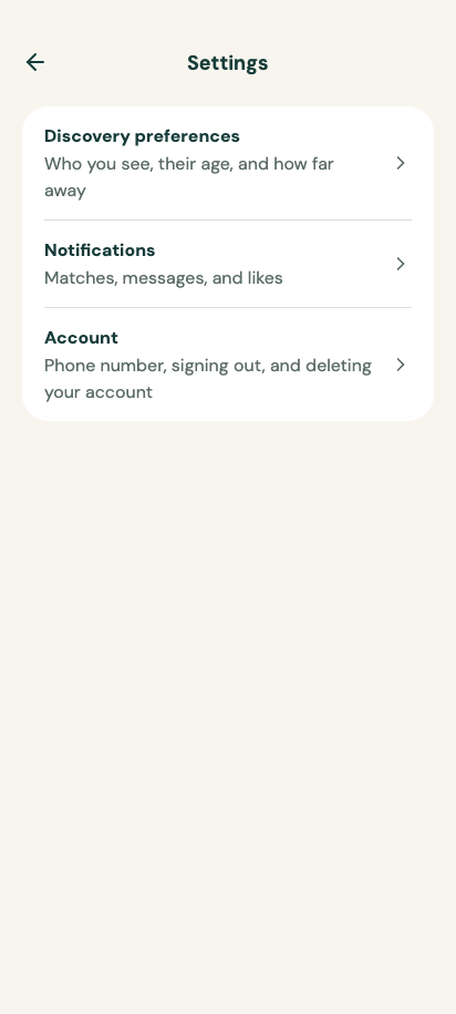
Discovery preferences
package com.composables.pairel

import androidx.compose.foundation.background
import androidx.compose.foundation.layout.Arrangement
import androidx.compose.foundation.layout.Box
import androidx.compose.foundation.layout.Column
import androidx.compose.foundation.layout.Row
import androidx.compose.foundation.layout.WindowInsets
import androidx.compose.foundation.layout.fillMaxSize
import androidx.compose.foundation.layout.fillMaxWidth
import androidx.compose.foundation.layout.height
import androidx.compose.foundation.layout.navigationBars
import androidx.compose.foundation.layout.padding
import androidx.compose.foundation.layout.size
import androidx.compose.foundation.layout.windowInsetsPadding
import androidx.compose.foundation.rememberScrollState
import androidx.compose.foundation.shape.CircleShape
import androidx.compose.foundation.verticalScroll
import androidx.compose.runtime.Composable
import androidx.compose.runtime.getValue
import androidx.compose.runtime.mutableStateOf
import androidx.compose.runtime.remember
import androidx.compose.runtime.setValue
import androidx.compose.ui.Modifier
import androidx.compose.ui.draw.clip
import androidx.compose.ui.platform.testTag
import androidx.compose.ui.semantics.contentDescription
import androidx.compose.ui.semantics.semantics
import androidx.compose.ui.unit.dp
import com.composables.pairel.components.Card
import com.composables.pairel.components.CenteredAppBar
import com.composables.pairel.components.ChoiceButton
import com.composables.pairel.components.Icon
import com.composables.pairel.components.IconButton
import com.composables.pairel.components.PreferenceToggle
import com.composables.pairel.components.ScreenScaffold
import com.composables.pairel.components.Text
import com.composables.pairel.theme.ArrowLeft
import com.composables.pairel.theme.Icons
import com.composables.pairel.theme.Theme
import com.composeunstyled.UnstyledSlider
import kotlin.math.roundToInt

sealed interface WhoToSee {
    data object Men : WhoToSee

    data object Women : WhoToSee

    data object Everyone : WhoToSee
}

sealed interface DatingIntent {
    data object LongTerm : DatingIntent

    data object OpenToEither : DatingIntent

    data object Casual : DatingIntent
}

data class DiscoveryPreferences(
    val minimumAge: Int = 26,
    val maximumAge: Int = 38,
    val maximumDistanceKm: Int = 40,
    val whoToSee: WhoToSee = WhoToSee.Women,
    val datingIntent: DatingIntent = DatingIntent.OpenToEither,
    val broadenAge: Boolean = true,
    val broadenDistance: Boolean = true,
)

@Composable
fun DiscoveryPreferencesScreen(
    navigateBack: () -> Unit,
    modifier: Modifier = Modifier,
    initialPreferences: DiscoveryPreferences = DiscoveryPreferences(),
) {
    var preferences by remember(initialPreferences) { mutableStateOf(initialPreferences) }

    ScreenScaffold(
        modifier = modifier,
        topBar = {
            CenteredAppBar(
                title = { Text("Preferences") },
                navigation = {
                    IconButton(
                        onClick = navigateBack,
                        modifier = Modifier.testTag("preferences-back"),
                    ) {
                        Icon(
                            Icons.ArrowLeft,
                            contentDescription = "Back",
                            modifier = Modifier.size(24.dp),
                        )
                    }
                },
            )
        },
    ) {
        Column(
            Modifier.fillMaxSize()
                .verticalScroll(rememberScrollState())
                .padding(top = 20.dp, bottom = 24.dp)
                .windowInsetsPadding(WindowInsets.navigationBars)
                .padding(horizontal = 20.dp),
            verticalArrangement = Arrangement.spacedBy(16.dp),
        ) {
            Text("A little more you", style = Theme.typography.headline)
            Text(
                "Choose who you'd like to meet. You can change these anytime.",
                color = Theme.colors.onBackgroundMuted,
            )

            DiscoveryPreferencesForm(
                preferences = preferences,
                onPreferencesChange = { preferences = it },
                modifier = Modifier.fillMaxWidth(),
            )
        }
    }
}

@Composable
private fun PreferenceSlider(
    label: String,
    value: Int,
    range: ClosedFloatingPointRange<Float>,
    onValueChange: (Int) -> Unit,
    modifier: Modifier = Modifier,
) {
    Column(modifier) {
        Text(label, style = Theme.typography.caption, color = Theme.colors.onBackgroundMuted)
        UnstyledSlider(
            value = value.toFloat(),
            onValueChange = { onValueChange(it.roundToInt()) },
            valueRange = range,
            modifier =
                Modifier.fillMaxWidth()
                    .padding(top = 8.dp)
                    .semantics { contentDescription = "$label: $value" }
                    .testTag(label.lowercase().replace(' ', '-')),
            track = { state ->
                Box(
                    Modifier.fillMaxWidth()
                        .height(4.dp)
                        .clip(CircleShape)
                        .background(Theme.colors.surfaceVariant)
                ) {
                    Box(
                        Modifier.fillMaxWidth(state.fraction)
                            .height(4.dp)
                            .background(Theme.colors.accent)
                    )
                }
            },
            thumb = { Box(Modifier.size(24.dp).clip(CircleShape).background(Theme.colors.accent)) },
        )
    }
}

@Composable
internal fun DiscoveryPreferencesForm(
    preferences: DiscoveryPreferences,
    onPreferencesChange: (DiscoveryPreferences) -> Unit,
    modifier: Modifier = Modifier,
    includeDatingIntent: Boolean = true,
) {
    Column(modifier, verticalArrangement = Arrangement.spacedBy(16.dp)) {
        Card(Modifier.fillMaxWidth()) {
            Text("Who would you like to see?", style = Theme.typography.label)
            Row(
                Modifier.fillMaxWidth().padding(top = 16.dp),
                horizontalArrangement = Arrangement.spacedBy(8.dp),
            ) {
                for ((choice, label) in
                    listOf(
                        WhoToSee.Men to "Men",
                        WhoToSee.Women to "Women",
                        WhoToSee.Everyone to "Everyone",
                    )) {
                    ChoiceButton(
                        selected = preferences.whoToSee == choice,
                        onClick = { onPreferencesChange(preferences.copy(whoToSee = choice)) },
                        modifier = Modifier.weight(1f),
                    ) {
                        Text(label)
                    }
                }
            }
        }

        Card(Modifier.fillMaxWidth()) {
            Text("Age range", style = Theme.typography.label)
            Text(
                "${preferences.minimumAge} to ${preferences.maximumAge}",
                modifier = Modifier.padding(top = 4.dp),
                color = Theme.colors.onBackgroundMuted,
            )
            PreferenceSlider(
                label = "Minimum age",
                value = preferences.minimumAge,
                range = 18f..(preferences.maximumAge - 1).toFloat(),
                onValueChange = { onPreferencesChange(preferences.copy(minimumAge = it)) },
                modifier = Modifier.fillMaxWidth().padding(top = 16.dp),
            )
            PreferenceSlider(
                label = "Maximum age",
                value = preferences.maximumAge,
                range = (preferences.minimumAge + 1).toFloat()..70f,
                onValueChange = { onPreferencesChange(preferences.copy(maximumAge = it)) },
                modifier = Modifier.fillMaxWidth().padding(top = 12.dp),
            )
            PreferenceToggle(
                label = "Show people slightly outside this range",
                initialChecked = preferences.broadenAge,
                onCheckedChange = { onPreferencesChange(preferences.copy(broadenAge = it)) },
                modifier = Modifier.fillMaxWidth().padding(top = 20.dp),
            )
        }

        Card(Modifier.fillMaxWidth()) {
            Text("Distance", style = Theme.typography.label)
            Text(
                "Up to ${preferences.maximumDistanceKm} km away",
                modifier = Modifier.padding(top = 4.dp),
                color = Theme.colors.onBackgroundMuted,
            )
            PreferenceSlider(
                label = "Maximum distance",
                value = preferences.maximumDistanceKm,
                range = 5f..100f,
                onValueChange = { onPreferencesChange(preferences.copy(maximumDistanceKm = it)) },
                modifier = Modifier.fillMaxWidth().padding(top = 16.dp),
            )
            PreferenceToggle(
                label = "Show people farther away if I run out",
                initialChecked = preferences.broadenDistance,
                onCheckedChange = { onPreferencesChange(preferences.copy(broadenDistance = it)) },
                modifier = Modifier.fillMaxWidth().padding(top = 20.dp),
            )
        }

        if (includeDatingIntent) {
            Card(Modifier.fillMaxWidth()) {
                Text("What are you looking for?", style = Theme.typography.label)
                Column(
                    Modifier.fillMaxWidth().padding(top = 16.dp),
                    verticalArrangement = Arrangement.spacedBy(8.dp),
                ) {
                    for ((choice, label) in
                        listOf(
                            DatingIntent.LongTerm to "A long-term relationship",
                            DatingIntent.OpenToEither to "Open to seeing where it goes",
                            DatingIntent.Casual to "Something casual",
                        )) {
                        ChoiceButton(
                            selected = preferences.datingIntent == choice,
                            onClick = {
                                onPreferencesChange(preferences.copy(datingIntent = choice))
                            },
                            modifier = Modifier.fillMaxWidth(),
                        ) {
                            Text(label)
                        }
                    }
                }
            }
        }
    }
}
package com.composables.pairel.components

import androidx.compose.foundation.background
import androidx.compose.foundation.layout.Box
import androidx.compose.foundation.layout.Row
import androidx.compose.foundation.layout.RowScope
import androidx.compose.foundation.layout.WindowInsets
import androidx.compose.foundation.layout.WindowInsetsSides
import androidx.compose.foundation.layout.fillMaxWidth
import androidx.compose.foundation.layout.height
import androidx.compose.foundation.layout.heightIn
import androidx.compose.foundation.layout.offset
import androidx.compose.foundation.layout.only
import androidx.compose.foundation.layout.padding
import androidx.compose.foundation.layout.safeDrawing
import androidx.compose.foundation.layout.statusBars
import androidx.compose.foundation.layout.union
import androidx.compose.foundation.layout.windowInsetsPadding
import androidx.compose.runtime.Composable
import androidx.compose.ui.Alignment
import androidx.compose.ui.Modifier
import androidx.compose.ui.input.pointer.pointerInput
import androidx.compose.ui.unit.dp
import androidx.compose.ui.unit.sp
import com.composables.pairel.theme.ProvideContentColor
import com.composables.pairel.theme.ProvideTextStyle
import com.composables.pairel.theme.Space
import com.composables.pairel.theme.Theme

val AppBarHeight = 64.dp

@Composable
fun AppBar(
    title: @Composable () -> Unit,
    navigation: @Composable () -> Unit = {},
    actions: @Composable RowScope.() -> Unit = {},
    modifier: Modifier = Modifier,
) {
    ProvideContentColor(Theme.colors.onBackground) {
        Row(
            modifier =
                modifier
                    .fillMaxWidth()
                    .background(Theme.colors.background)
                    .pointerInput(Unit) {
                        awaitPointerEventScope { while (true) awaitPointerEvent() }
                    }
                    .windowInsetsPadding(
                        WindowInsets.statusBars.union(
                            WindowInsets.safeDrawing.only(WindowInsetsSides.Horizontal)
                        )
                    )
                    .height(AppBarHeight)
                    .padding(horizontal = 20.dp),
            verticalAlignment = Alignment.CenterVertically,
        ) {
            Box(Modifier.offset(x = -(Space * 3))) { navigation() }
            Box(Modifier.weight(1f), contentAlignment = Alignment.CenterStart) {
                Box(Modifier.heightIn(min = 48.dp), contentAlignment = Alignment.CenterStart) {
                    ProvideTextStyle(
                        Theme.typography.title.copy(fontSize = 26.sp, lineHeight = 38.sp),
                        title,
                    )
                }
            }
            Row(verticalAlignment = Alignment.CenterVertically, content = actions)
        }
    }
}
package com.composables.pairel.components

import androidx.compose.foundation.background
import androidx.compose.foundation.layout.Column
import androidx.compose.foundation.layout.ColumnScope
import androidx.compose.foundation.layout.padding
import androidx.compose.runtime.Composable
import androidx.compose.ui.Modifier
import androidx.compose.ui.draw.clip
import com.composables.pairel.theme.ProvideContentColor
import com.composables.pairel.theme.Space
import com.composables.pairel.theme.Theme

@Composable
fun Card(modifier: Modifier = Modifier, content: @Composable ColumnScope.() -> Unit) {
    Column(modifier.clip(Theme.shapes.large).background(Theme.colors.surface).padding(Space * 6)) {
        ProvideContentColor(Theme.colors.onSurface) { content() }
    }
}
package com.composables.pairel.components

import androidx.compose.foundation.background
import androidx.compose.foundation.layout.Box
import androidx.compose.foundation.layout.Row
import androidx.compose.foundation.layout.RowScope
import androidx.compose.foundation.layout.WindowInsets
import androidx.compose.foundation.layout.WindowInsetsSides
import androidx.compose.foundation.layout.fillMaxWidth
import androidx.compose.foundation.layout.height
import androidx.compose.foundation.layout.heightIn
import androidx.compose.foundation.layout.offset
import androidx.compose.foundation.layout.only
import androidx.compose.foundation.layout.padding
import androidx.compose.foundation.layout.safeDrawing
import androidx.compose.foundation.layout.statusBars
import androidx.compose.foundation.layout.union
import androidx.compose.foundation.layout.windowInsetsPadding
import androidx.compose.runtime.Composable
import androidx.compose.ui.Alignment
import androidx.compose.ui.Modifier
import androidx.compose.ui.input.pointer.pointerInput
import androidx.compose.ui.layout.Layout
import androidx.compose.ui.unit.Constraints
import androidx.compose.ui.unit.dp
import androidx.compose.ui.unit.sp
import com.composables.pairel.theme.ProvideContentColor
import com.composables.pairel.theme.ProvideTextStyle
import com.composables.pairel.theme.Space
import com.composables.pairel.theme.Theme

@Composable
fun CenteredAppBar(
    title: @Composable () -> Unit,
    modifier: Modifier = Modifier,
    navigation: @Composable () -> Unit = {},
    actions: @Composable RowScope.() -> Unit = {},
) {
    ProvideContentColor(Theme.colors.onBackground) {
        Layout(
            content = {
                Box(contentAlignment = Alignment.CenterStart) {
                    Box(Modifier.offset(x = -(Space * 3))) { navigation() }
                }
                Box(contentAlignment = Alignment.Center) {
                    Box(Modifier.heightIn(min = 48.dp), contentAlignment = Alignment.Center) {
                        ProvideTextStyle(
                            Theme.typography.title.copy(fontSize = 18.sp, lineHeight = 20.sp),
                            title,
                        )
                    }
                }
                Row(
                    verticalAlignment = Alignment.CenterVertically,
                    content = actions,
                )
            },
            modifier =
                modifier
                    .fillMaxWidth()
                    .background(Theme.colors.background)
                    .pointerInput(Unit) {
                        awaitPointerEventScope { while (true) awaitPointerEvent() }
                    }
                    .windowInsetsPadding(
                        WindowInsets.statusBars.union(
                            WindowInsets.safeDrawing.only(WindowInsetsSides.Horizontal)
                        )
                    )
                    .height(AppBarHeight)
                    .padding(horizontal = 20.dp),
        ) { measurables, constraints ->
            val loose = constraints.copy(minWidth = 0, minHeight = 0)
            val leading = measurables[0].measure(loose)
            val trailing = measurables[2].measure(loose)
            val sideWidth = maxOf(leading.width, trailing.width)
            val titleWidth =
                if (constraints.hasBoundedWidth) {
                    (constraints.maxWidth - sideWidth * 2).coerceAtLeast(0)
                } else {
                    Constraints.Infinity
                }
            val center = measurables[1].measure(loose.copy(maxWidth = titleWidth))
            val width =
                (if (constraints.hasBoundedWidth) constraints.maxWidth
                    else leading.width + center.width + trailing.width)
                    .coerceIn(constraints.minWidth, constraints.maxWidth)
            val height =
                maxOf(leading.height, center.height, trailing.height)
                    .coerceIn(constraints.minHeight, constraints.maxHeight)

            layout(width, height) {
                leading.placeRelative(0, (height - leading.height) / 2)
                center.placeRelative((width - center.width) / 2, (height - center.height) / 2)
                trailing.placeRelative(width - trailing.width, (height - trailing.height) / 2)
            }
        }
    }
}
package com.composables.pairel.components

import androidx.compose.foundation.background
import androidx.compose.foundation.interaction.MutableInteractionSource
import androidx.compose.foundation.layout.PaddingValues
import androidx.compose.runtime.Composable
import androidx.compose.runtime.remember
import androidx.compose.ui.Modifier
import androidx.compose.ui.draw.clip
import androidx.compose.ui.semantics.selected
import androidx.compose.ui.semantics.semantics
import androidx.compose.ui.unit.dp
import androidx.compose.ui.unit.sp
import com.composables.compose.ripple.rememberRippleIndication
import com.composables.pairel.theme.ProvideContentColor
import com.composables.pairel.theme.ProvideTextStyle
import com.composables.pairel.theme.Theme
import com.composeunstyled.UnstyledButton

@Composable
fun ChoiceButton(
    selected: Boolean,
    onClick: () -> Unit,
    modifier: Modifier = Modifier,
    content: @Composable () -> Unit,
) {
    val contentColor = if (selected) Theme.colors.onAccent else Theme.colors.onSurface
    UnstyledButton(
        onClick = onClick,
        modifier =
            modifier
                .clip(Theme.shapes.fullyRounded)
                .background(if (selected) Theme.colors.accent else Theme.colors.surfaceVariant)
                .semantics { this.selected = selected },
        contentPadding = PaddingValues(horizontal = 14.dp, vertical = 12.dp),
        indication = rememberRippleIndication(color = contentColor),
        interactionSource = remember { MutableInteractionSource() },
    ) {
        ProvideContentColor(contentColor) {
            ProvideTextStyle(Theme.typography.label.copy(fontSize = 14.sp), content)
        }
    }
}
package com.composables.pairel.components

import androidx.compose.runtime.Composable
import androidx.compose.ui.Modifier
import androidx.compose.ui.graphics.Color
import androidx.compose.ui.graphics.isSpecified
import androidx.compose.ui.graphics.vector.ImageVector
import com.composables.pairel.theme.LocalContentColor
import com.composeunstyled.UnstyledIcon

@Composable
fun Icon(
    imageVector: ImageVector,
    contentDescription: String?,
    modifier: Modifier = Modifier,
    tint: Color = LocalContentColor.current,
) {
    val resolvedTint = if (tint.isSpecified) tint else LocalContentColor.current
    UnstyledIcon(
        imageVector = imageVector,
        contentDescription = contentDescription,
        modifier = modifier,
        tint = resolvedTint,
    )
}
package com.composables.pairel.components

import androidx.compose.foundation.background
import androidx.compose.foundation.interaction.MutableInteractionSource
import androidx.compose.foundation.layout.PaddingValues
import androidx.compose.foundation.layout.size
import androidx.compose.runtime.Composable
import androidx.compose.runtime.remember
import androidx.compose.ui.Modifier
import androidx.compose.ui.draw.alpha
import androidx.compose.ui.draw.clip
import com.composables.compose.ripple.rememberRippleIndication
import com.composables.pairel.theme.ProvideContentColor
import com.composables.pairel.theme.Space
import com.composables.pairel.theme.Theme
import com.composeunstyled.UnstyledButton

enum class IconButtonVariant {
    Neutral,
    Primary,
}

@Composable
fun IconButton(
    onClick: () -> Unit,
    modifier: Modifier = Modifier,
    enabled: Boolean = true,
    variant: IconButtonVariant = IconButtonVariant.Neutral,
    content: @Composable () -> Unit,
) {
    val interactionSource = remember { MutableInteractionSource() }
    val primary = variant == IconButtonVariant.Primary && enabled
    val background = if (primary) Theme.colors.primary else Theme.colors.background
    val contentColor = if (primary) Theme.colors.onPrimary else Theme.colors.onBackground
    UnstyledButton(
        onClick = onClick,
        enabled = enabled,
        modifier =
            modifier
                .alpha(if (enabled) 1f else 0.45f)
                .size(Space * 12)
                .clip(Theme.shapes.fullyRounded)
                .background(background),
        contentPadding = PaddingValues(Space * 3),
        indication = rememberRippleIndication(color = contentColor),
        interactionSource = interactionSource,
    ) {
        ProvideContentColor(contentColor, content)
    }
}
package com.composables.pairel.components

import androidx.compose.runtime.Composable
import androidx.compose.runtime.CompositionLocalProvider
import androidx.compose.runtime.staticCompositionLocalOf
import androidx.compose.ui.Modifier
import com.composeunstyled.DialogHost

private val LocalHasDialogHost = staticCompositionLocalOf { false }

@Composable
internal fun PairelDialogHost(modifier: Modifier = Modifier, content: @Composable () -> Unit) {
    if (LocalHasDialogHost.current) {
        content()
    } else {
        CompositionLocalProvider(LocalHasDialogHost provides true) {
            DialogHost(modifier = modifier, content = content)
        }
    }
}
package com.composables.pairel.components

import androidx.compose.animation.animateColorAsState
import androidx.compose.animation.core.tween
import androidx.compose.foundation.background
import androidx.compose.foundation.interaction.MutableInteractionSource
import androidx.compose.foundation.layout.Arrangement
import androidx.compose.foundation.layout.Row
import androidx.compose.foundation.layout.padding
import androidx.compose.foundation.layout.size
import androidx.compose.foundation.shape.CircleShape
import androidx.compose.runtime.Composable
import androidx.compose.runtime.getValue
import androidx.compose.runtime.mutableStateOf
import androidx.compose.runtime.remember
import androidx.compose.runtime.setValue
import androidx.compose.ui.Alignment
import androidx.compose.ui.Modifier
import androidx.compose.ui.draw.clip
import androidx.compose.ui.unit.dp
import androidx.compose.ui.unit.sp
import com.composables.compose.ripple.rememberRippleIndication
import com.composables.pairel.theme.Theme
import com.composeunstyled.Thumb
import com.composeunstyled.Track
import com.composeunstyled.UnstyledSwitch

@Composable
fun PreferenceToggle(
    label: String,
    initialChecked: Boolean,
    onCheckedChange: (Boolean) -> Unit,
    modifier: Modifier = Modifier,
) {
    val interactionSource = remember { MutableInteractionSource() }
    var checked by remember(initialChecked) { mutableStateOf(initialChecked) }
    val trackColor by
        animateColorAsState(
            targetValue = if (checked) Theme.colors.accent else Theme.colors.surfaceVariant,
            animationSpec = tween(durationMillis = 180),
            label = "Toggle track",
        )

    UnstyledSwitch(
        checked = checked,
        onCheckedChange = {
            checked = it
            onCheckedChange(it)
        },
        modifier = modifier.clip(Theme.shapes.small).background(Theme.colors.surface),
        interactionSource = interactionSource,
        indication = rememberRippleIndication(color = Theme.colors.onSurface),
        accessibilityLabel = label,
    ) {
        Row(
            Modifier.padding(vertical = 8.dp),
            verticalAlignment = Alignment.CenterVertically,
            horizontalArrangement = Arrangement.spacedBy(12.dp),
        ) {
            Text(
                label,
                modifier = Modifier.weight(1f),
                style = Theme.typography.body.copy(fontSize = 14.sp),
            )
            Track(
                modifier =
                    Modifier.size(width = 44.dp, height = 26.dp)
                        .clip(CircleShape)
                        .background(trackColor)
            ) {
                Thumb(
                    animationSpec = tween(durationMillis = 180),
                    modifier =
                        Modifier.padding(3.dp)
                            .size(20.dp)
                            .clip(CircleShape)
                            .background(Theme.colors.surface),
                )
            }
        }
    }
}
package com.composables.pairel.components

import androidx.compose.foundation.background
import androidx.compose.foundation.layout.Box
import androidx.compose.foundation.layout.BoxScope
import androidx.compose.foundation.layout.Column
import androidx.compose.foundation.layout.fillMaxSize
import androidx.compose.foundation.layout.fillMaxWidth
import androidx.compose.runtime.Composable
import androidx.compose.ui.Alignment
import androidx.compose.ui.Modifier
import androidx.compose.ui.graphics.Color
import androidx.compose.ui.graphics.luminance
import com.composables.pairel.theme.ProvideContentColor
import com.composables.pairel.theme.Theme
import com.composables.systembars.SystemBarContent
import com.composables.systembars.SystemBars
import com.composeunstyled.DrawerHost
import com.composeunstyled.TooltipHost

enum class ScreenBackground {
    Paper,
    Surface,
}

@Composable
fun ScreenScaffold(
    modifier: Modifier = Modifier,
    background: ScreenBackground = ScreenBackground.Paper,
    topBar: @Composable () -> Unit = {},
    bottomBar: @Composable () -> Unit = {},
    overlay: @Composable BoxScope.() -> Unit = {},
    content: @Composable BoxScope.() -> Unit,
) {
    val backgroundColor =
        when (background) {
            ScreenBackground.Paper -> Theme.colors.background
            ScreenBackground.Surface -> Theme.colors.surface
        }
    SystemBars(all = systemBarContentOn(backgroundColor))
    val contentColor =
        when (background) {
            ScreenBackground.Paper -> Theme.colors.onBackground
            ScreenBackground.Surface -> Theme.colors.onSurface
        }
    DrawerHost(modifier = modifier.fillMaxSize()) {
        PairelDialogHost(Modifier.fillMaxSize()) {
            TooltipHost(Modifier.fillMaxSize()) {
                Box(Modifier.fillMaxSize().background(backgroundColor)) {
                    ProvideContentColor(contentColor) {
                        Column(Modifier.fillMaxSize()) {
                            topBar()
                            Box(Modifier.weight(1f).fillMaxWidth(), content = content)
                        }
                        Box(Modifier.align(Alignment.BottomCenter)) { bottomBar() }
                        overlay()
                    }
                }
            }
        }
    }
}

private fun systemBarContentOn(background: Color): SystemBarContent =
    if (background.luminance() > 0.5f) SystemBarContent.Dark else SystemBarContent.Light
package com.composables.pairel.components

import androidx.compose.foundation.text.BasicText
import androidx.compose.runtime.Composable
import androidx.compose.ui.Modifier
import androidx.compose.ui.graphics.Color
import androidx.compose.ui.graphics.isSpecified
import androidx.compose.ui.text.TextStyle
import androidx.compose.ui.text.style.TextOverflow
import com.composables.pairel.theme.LocalContentColor
import com.composables.pairel.theme.LocalTextStyle

@Composable
fun Text(
    text: String,
    modifier: Modifier = Modifier,
    color: Color = Color.Unspecified,
    style: TextStyle = LocalTextStyle.current,
    overflow: TextOverflow = TextOverflow.Clip,
    softWrap: Boolean = true,
    maxLines: Int = Int.MAX_VALUE,
) {
    val resolvedColor =
        when {
            color.isSpecified -> color
            style.color.isSpecified -> style.color
            else -> LocalContentColor.current
        }
    BasicText(
        text = text,
        modifier = modifier,
        style = LocalTextStyle.current.merge(style).copy(color = resolvedColor),
        overflow = overflow,
        softWrap = softWrap,
        maxLines = maxLines,
    )
}
package com.composables.pairel.theme
/*
* Icon from Lucide (lucide).
* License: ISC
*
* ISC License
*
* Copyright (c) 2026 Lucide Icons and Contributors
*
* Permission to use, copy, modify, and/or distribute this software for any
* purpose with or without fee is hereby granted, provided that the above
* copyright notice and this permission notice appear in all copies.
*
* THE SOFTWARE IS PROVIDED "AS IS" AND THE AUTHOR DISCLAIMS ALL WARRANTIES
* WITH REGARD TO THIS SOFTWARE INCLUDING ALL IMPLIED WARRANTIES OF
* MERCHANTABILITY AND FITNESS. IN NO EVENT SHALL THE AUTHOR BE LIABLE FOR
* ANY SPECIAL, DIRECT, INDIRECT, OR CONSEQUENTIAL DAMAGES OR ANY DAMAGES
* WHATSOEVER RESULTING FROM LOSS OF USE, DATA OR PROFITS, WHETHER IN AN
* ACTION OF CONTRACT, NEGLIGENCE OR OTHER TORTIOUS ACTION, ARISING OUT OF
* OR IN CONNECTION WITH THE USE OR PERFORMANCE OF THIS SOFTWARE.
*
* ---
*
* The following Lucide icons are derived from the Feather project:
*
* airplay, alert-circle, alert-octagon, alert-triangle, aperture, arrow-down-circle, arrow-down-left, arrow-down-right, arrow-down, arrow-left-circle, arrow-left, arrow-right-circle, arrow-right, arrow-up-circle, arrow-up-left, arrow-up-right, arrow-up, at-sign, calendar, cast, check, chevron-down, chevron-left, chevron-right, chevron-up, chevrons-down, chevrons-left, chevrons-right, chevrons-up, circle, clipboard, clock, code, columns, command, compass, corner-down-left, corner-down-right, corner-left-down, corner-left-up, corner-right-down, corner-right-up, corner-up-left, corner-up-right, crosshair, database, divide-circle, divide-square, dollar-sign, download, external-link, feather, frown, hash, headphones, help-circle, info, italic, key, layout, life-buoy, link-2, link, loader, lock, log-in, log-out, maximize, meh, minimize, minimize-2, minus-circle, minus-square, minus, monitor, moon, more-horizontal, more-vertical, move, music, navigation-2, navigation, octagon, pause-circle, percent, plus-circle, plus-square, plus, power, radio, rss, search, server, share, shopping-bag, sidebar, smartphone, smile, square, table-2, tablet, target, terminal, trash-2, trash, triangle, tv, type, upload, x-circle, x-octagon, x-square, x, zoom-in, zoom-out
*
* The MIT License (MIT) (for the icons listed above)
*
* Copyright (c) 2013-present Cole Bemis
*
* Permission is hereby granted, free of charge, to any person obtaining a copy
* of this software and associated documentation files (the "Software"), to deal
* in the Software without restriction, including without limitation the rights
* to use, copy, modify, merge, publish, distribute, sublicense, and/or sell
* copies of the Software, and to permit persons to whom the Software is
* furnished to do so, subject to the following conditions:
*
* The above copyright notice and this permission notice shall be included in all
* copies or substantial portions of the Software.
*
* THE SOFTWARE IS PROVIDED "AS IS", WITHOUT WARRANTY OF ANY KIND, EXPRESS OR
* IMPLIED, INCLUDING BUT NOT LIMITED TO THE WARRANTIES OF MERCHANTABILITY,
* FITNESS FOR A PARTICULAR PURPOSE AND NONINFRINGEMENT. IN NO EVENT SHALL THE
* AUTHORS OR COPYRIGHT HOLDERS BE LIABLE FOR ANY CLAIM, DAMAGES OR OTHER
* LIABILITY, WHETHER IN AN ACTION OF CONTRACT, TORT OR OTHERWISE, ARISING FROM,
* OUT OF OR IN CONNECTION WITH THE SOFTWARE OR THE USE OR OTHER DEALINGS IN THE
* SOFTWARE.
*/
import androidx.compose.ui.graphics.Color
import androidx.compose.ui.graphics.SolidColor
import androidx.compose.ui.graphics.StrokeCap
import androidx.compose.ui.graphics.StrokeJoin
import androidx.compose.ui.graphics.vector.ImageVector
import androidx.compose.ui.graphics.vector.path
import androidx.compose.ui.unit.dp
object Icons
val Icons.ArrowLeft: ImageVector
get() {
if (_ArrowLeft != null) return _ArrowLeft!!
_ArrowLeft =
ImageVector.Builder(
name = "arrow-left",
defaultWidth = 24.dp,
defaultHeight = 24.dp,
viewportWidth = 24f,
viewportHeight = 24f,
)
.apply {
path(
fill = SolidColor(Color.Transparent),
stroke = SolidColor(Color.Black),
strokeLineWidth = 2f,
strokeLineCap = StrokeCap.Round,
strokeLineJoin = StrokeJoin.Round,
) {
moveTo(12f, 19f)
lineToRelative(-7f, -7f)
lineToRelative(7f, -7f)
}
path(
fill = SolidColor(Color.Transparent),
stroke = SolidColor(Color.Black),
strokeLineWidth = 2f,
strokeLineCap = StrokeCap.Round,
strokeLineJoin = StrokeJoin.Round,
) {
moveTo(19f, 12f)
horizontalLineTo(5f)
}
}
.build()
return _ArrowLeft!!
}
private var _ArrowLeft: ImageVector? = null
val Icons.X: ImageVector
get() {
if (_X != null) return _X!!
_X =
ImageVector.Builder(
name = "x",
defaultWidth = 24.dp,
defaultHeight = 24.dp,
viewportWidth = 24f,
viewportHeight = 24f,
)
.apply {
path(
fill = SolidColor(Color.Transparent),
stroke = SolidColor(Color.Black),
strokeLineWidth = 2f,
strokeLineCap = StrokeCap.Round,
strokeLineJoin = StrokeJoin.Round,
) {
moveTo(18f, 6f)
lineTo(6f, 18f)
}
path(
fill = SolidColor(Color.Transparent),
stroke = SolidColor(Color.Black),
strokeLineWidth = 2f,
strokeLineCap = StrokeCap.Round,
strokeLineJoin = StrokeJoin.Round,
) {
moveTo(6f, 6f)
lineToRelative(12f, 12f)
}
}
.build()
return _X!!
}
private var _X: ImageVector? = null
val Icons.Check: ImageVector
get() {
if (_Check != null) return _Check!!
_Check =
ImageVector.Builder(
name = "check",
defaultWidth = 24.dp,
defaultHeight = 24.dp,
viewportWidth = 24f,
viewportHeight = 24f,
)
.apply {
path(
fill = SolidColor(Color.Transparent),
stroke = SolidColor(Color.Black),
strokeLineWidth = 2f,
strokeLineCap = StrokeCap.Round,
strokeLineJoin = StrokeJoin.Round,
) {
moveTo(20f, 6f)
lineTo(9f, 17f)
lineToRelative(-5f, -5f)
}
}
.build()
return _Check!!
}
private var _Check: ImageVector? = null
val Icons.Heart: ImageVector
get() {
if (_Heart != null) return _Heart!!
_Heart =
ImageVector.Builder(
name = "heart",
defaultWidth = 24.dp,
defaultHeight = 24.dp,
viewportWidth = 24f,
viewportHeight = 24f,
)
.apply {
path(
fill = SolidColor(Color.Transparent),
stroke = SolidColor(Color.Black),
strokeLineWidth = 2f,
strokeLineCap = StrokeCap.Round,
strokeLineJoin = StrokeJoin.Round,
) {
moveTo(2f, 9.5f)
arcToRelative(5.5f, 5.5f, 0f, false, true, 9.591f, -3.676f)
arcToRelative(0.56f, 0.56f, 0f, false, false, 0.818f, 0f)
arcTo(5.49f, 5.49f, 0f, false, true, 22f, 9.5f)
curveToRelative(0f, 2.29f, -1.5f, 4f, -3f, 5.5f)
lineToRelative(-5.492f, 5.313f)
arcToRelative(2f, 2f, 0f, false, true, -3f, 0.019f)
lineTo(5f, 15f)
curveToRelative(-1.5f, -1.5f, -3f, -3.2f, -3f, -5.5f)
}
}
.build()
return _Heart!!
}
private var _Heart: ImageVector? = null
val Icons.Ellipsis: ImageVector
get() {
if (_Ellipsis != null) return _Ellipsis!!
_Ellipsis =
ImageVector.Builder(
name = "ellipsis",
defaultWidth = 24.dp,
defaultHeight = 24.dp,
viewportWidth = 24f,
viewportHeight = 24f,
)
.apply {
for (x in listOf(5f, 12f, 19f)) {
path(
fill = SolidColor(Color.Transparent),
stroke = SolidColor(Color.Black),
strokeLineWidth = 2f,
strokeLineCap = StrokeCap.Round,
strokeLineJoin = StrokeJoin.Round,
) {
moveTo(x + 1f, 12f)
arcTo(1f, 1f, 0f, false, true, x, 13f)
arcTo(1f, 1f, 0f, false, true, x - 1f, 12f)
arcTo(1f, 1f, 0f, false, true, x + 1f, 12f)
close()
}
}
}
.build()
return _Ellipsis!!
}
private var _Ellipsis: ImageVector? = null
val Icons.SendHorizontal: ImageVector
get() {
if (_SendHorizontal != null) return _SendHorizontal!!
_SendHorizontal =
ImageVector.Builder(
name = "send-horizontal",
defaultWidth = 24.dp,
defaultHeight = 24.dp,
viewportWidth = 24f,
viewportHeight = 24f,
)
.apply {
path(
fill = SolidColor(Color.Transparent),
stroke = SolidColor(Color.Black),
strokeLineWidth = 2f,
strokeLineCap = StrokeCap.Round,
strokeLineJoin = StrokeJoin.Round,
) {
moveTo(3.714f, 3.048f)
arcToRelative(0.498f, 0.498f, 0f, false, false, -0.683f, 0.627f)
lineToRelative(2.843f, 7.627f)
arcToRelative(2f, 2f, 0f, false, true, 0f, 1.396f)
lineToRelative(-2.842f, 7.627f)
arcToRelative(0.498f, 0.498f, 0f, false, false, 0.682f, 0.627f)
lineToRelative(18f, -8.5f)
arcToRelative(0.5f, 0.5f, 0f, false, false, 0f, -0.904f)
close()
}
path(
fill = SolidColor(Color.Transparent),
stroke = SolidColor(Color.Black),
strokeLineWidth = 2f,
strokeLineCap = StrokeCap.Round,
strokeLineJoin = StrokeJoin.Round,
) {
moveTo(6f, 12f)
horizontalLineToRelative(16f)
}
}
.build()
return _SendHorizontal!!
}
private var _SendHorizontal: ImageVector? = null
val Icons.SlidersHorizontal: ImageVector
get() {
if (_SlidersHorizontal != null) return _SlidersHorizontal!!
_SlidersHorizontal =
ImageVector.Builder(
name = "sliders-horizontal",
defaultWidth = 24.dp,
defaultHeight = 24.dp,
viewportWidth = 24f,
viewportHeight = 24f,
)
.apply {
path(
fill = SolidColor(Color.Transparent),
stroke = SolidColor(Color.Black),
strokeLineWidth = 2f,
strokeLineCap = StrokeCap.Round,
strokeLineJoin = StrokeJoin.Round,
) {
moveTo(10f, 5f)
horizontalLineTo(3f)
}
path(
fill = SolidColor(Color.Transparent),
stroke = SolidColor(Color.Black),
strokeLineWidth = 2f,
strokeLineCap = StrokeCap.Round,
strokeLineJoin = StrokeJoin.Round,
) {
moveTo(12f, 19f)
horizontalLineTo(3f)
}
path(
fill = SolidColor(Color.Transparent),
stroke = SolidColor(Color.Black),
strokeLineWidth = 2f,
strokeLineCap = StrokeCap.Round,
strokeLineJoin = StrokeJoin.Round,
) {
moveTo(14f, 3f)
verticalLineToRelative(4f)
}
path(
fill = SolidColor(Color.Transparent),
stroke = SolidColor(Color.Black),
strokeLineWidth = 2f,
strokeLineCap = StrokeCap.Round,
strokeLineJoin = StrokeJoin.Round,
) {
moveTo(16f, 17f)
verticalLineToRelative(4f)
}
path(
fill = SolidColor(Color.Transparent),
stroke = SolidColor(Color.Black),
strokeLineWidth = 2f,
strokeLineCap = StrokeCap.Round,
strokeLineJoin = StrokeJoin.Round,
) {
moveTo(21f, 12f)
horizontalLineToRelative(-9f)
}
path(
fill = SolidColor(Color.Transparent),
stroke = SolidColor(Color.Black),
strokeLineWidth = 2f,
strokeLineCap = StrokeCap.Round,
strokeLineJoin = StrokeJoin.Round,
) {
moveTo(21f, 19f)
horizontalLineToRelative(-5f)
}
path(
fill = SolidColor(Color.Transparent),
stroke = SolidColor(Color.Black),
strokeLineWidth = 2f,
strokeLineCap = StrokeCap.Round,
strokeLineJoin = StrokeJoin.Round,
) {
moveTo(21f, 5f)
horizontalLineToRelative(-7f)
}
path(
fill = SolidColor(Color.Transparent),
stroke = SolidColor(Color.Black),
strokeLineWidth = 2f,
strokeLineCap = StrokeCap.Round,
strokeLineJoin = StrokeJoin.Round,
) {
moveTo(8f, 10f)
verticalLineToRelative(4f)
}
path(
fill = SolidColor(Color.Transparent),
stroke = SolidColor(Color.Black),
strokeLineWidth = 2f,
strokeLineCap = StrokeCap.Round,
strokeLineJoin = StrokeJoin.Round,
) {
moveTo(8f, 12f)
horizontalLineTo(3f)
}
}
.build()
return _SlidersHorizontal!!
}
private var _SlidersHorizontal: ImageVector? = null
val Icons.Compass: ImageVector
get() {
if (_Compass != null) return _Compass!!
_Compass =
ImageVector.Builder(
name = "compass",
defaultWidth = 24.dp,
defaultHeight = 24.dp,
viewportWidth = 24f,
viewportHeight = 24f,
)
.apply {
path(
fill = SolidColor(Color.Transparent),
stroke = SolidColor(Color.Black),
strokeLineWidth = 2f,
strokeLineCap = StrokeCap.Round,
strokeLineJoin = StrokeJoin.Round,
) {
moveTo(22f, 12f)
arcTo(10f, 10f, 0f, false, true, 12f, 22f)
arcTo(10f, 10f, 0f, false, true, 2f, 12f)
arcTo(10f, 10f, 0f, false, true, 22f, 12f)
close()
}
path(
fill = SolidColor(Color.Transparent),
stroke = SolidColor(Color.Black),
strokeLineWidth = 2f,
strokeLineCap = StrokeCap.Round,
strokeLineJoin = StrokeJoin.Round,
) {
moveTo(16.24f, 7.76f)
lineToRelative(-1.804f, 5.411f)
arcToRelative(2f, 2f, 0f, false, true, -1.265f, 1.265f)
lineTo(7.76f, 16.24f)
lineToRelative(1.804f, -5.411f)
arcToRelative(2f, 2f, 0f, false, true, 1.265f, -1.265f)
close()
}
}
.build()
return _Compass!!
}
private var _Compass: ImageVector? = null
val Icons.User: ImageVector
get() {
if (_User != null) return _User!!
_User =
ImageVector.Builder(
name = "user",
defaultWidth = 24.dp,
defaultHeight = 24.dp,
viewportWidth = 24f,
viewportHeight = 24f,
)
.apply {
path(
fill = SolidColor(Color.Transparent),
stroke = SolidColor(Color.Black),
strokeLineWidth = 2f,
strokeLineCap = StrokeCap.Round,
strokeLineJoin = StrokeJoin.Round,
) {
moveTo(19f, 21f)
verticalLineToRelative(-2f)
arcToRelative(4f, 4f, 0f, false, false, -4f, -4f)
horizontalLineTo(9f)
arcToRelative(4f, 4f, 0f, false, false, -4f, 4f)
verticalLineToRelative(2f)
}
path(
fill = SolidColor(Color.Transparent),
stroke = SolidColor(Color.Black),
strokeLineWidth = 2f,
strokeLineCap = StrokeCap.Round,
strokeLineJoin = StrokeJoin.Round,
) {
moveTo(16f, 7f)
arcTo(4f, 4f, 0f, false, true, 12f, 11f)
arcTo(4f, 4f, 0f, false, true, 8f, 7f)
arcTo(4f, 4f, 0f, false, true, 16f, 7f)
close()
}
}
.build()
return _User!!
}
private var _User: ImageVector? = null
val Icons.ChevronRight: ImageVector
get() {
if (_ChevronRight != null) return _ChevronRight!!
_ChevronRight =
ImageVector.Builder(
name = "chevron-right",
defaultWidth = 24.dp,
defaultHeight = 24.dp,
viewportWidth = 24f,
viewportHeight = 24f,
)
.apply {
path(
fill = SolidColor(Color.Transparent),
stroke = SolidColor(Color.Black),
strokeLineWidth = 2f,
strokeLineCap = StrokeCap.Round,
strokeLineJoin = StrokeJoin.Round,
) {
moveTo(9f, 18f)
lineToRelative(6f, -6f)
lineToRelative(-6f, -6f)
}
}
.build()
return _ChevronRight!!
}
private var _ChevronRight: ImageVector? = null
val Icons.Plus: ImageVector
get() {
if (_Plus != null) return _Plus!!
_Plus =
ImageVector.Builder(
name = "plus",
defaultWidth = 24.dp,
defaultHeight = 24.dp,
viewportWidth = 24f,
viewportHeight = 24f,
)
.apply {
path(
fill = SolidColor(Color.Transparent),
stroke = SolidColor(Color.Black),
strokeLineWidth = 2f,
strokeLineCap = StrokeCap.Round,
strokeLineJoin = StrokeJoin.Round,
) {
moveTo(5f, 12f)
horizontalLineToRelative(14f)
}
path(
fill = SolidColor(Color.Transparent),
stroke = SolidColor(Color.Black),
strokeLineWidth = 2f,
strokeLineCap = StrokeCap.Round,
strokeLineJoin = StrokeJoin.Round,
) {
moveTo(12f, 5f)
verticalLineToRelative(14f)
}
}
.build()
return _Plus!!
}
private var _Plus: ImageVector? = null
package com.composables.pairel.theme

import androidx.compose.foundation.isSystemInDarkTheme
import androidx.compose.foundation.shape.RoundedCornerShape
import androidx.compose.foundation.text.selection.LocalTextSelectionColors
import androidx.compose.foundation.text.selection.TextSelectionColors
import androidx.compose.runtime.*
import androidx.compose.runtime.Composable
import androidx.compose.runtime.CompositionLocalProvider
import androidx.compose.runtime.compositionLocalOf
import androidx.compose.runtime.staticCompositionLocalOf
import androidx.compose.ui.graphics.*
import androidx.compose.ui.graphics.Color
import androidx.compose.ui.text.*
import androidx.compose.ui.text.TextStyle
import androidx.compose.ui.text.font.*
import androidx.compose.ui.unit.*
import androidx.compose.ui.unit.Dp
import androidx.compose.ui.unit.dp
import com.composables.googlefonts.rememberGoogleFontFamily

@Immutable
data class ThemeColors(
    val `background`: Color = Color(0xFFF8F5EF),
    val `onBackground`: Color = Color(0xFF173D3A),
    val `surface`: Color = Color(0xFFFFFFFF),
    val `onSurface`: Color = Color(0xFF173D3A),
    val `surfaceVariant`: Color = Color(0xFFECE8DD),
    val `onSurfaceVariant`: Color = Color(0xFF173D3A),
    val `primary`: Color = Color(0xFFF58C76),
    val `onPrimary`: Color = Color(0xFF173D3A),
    val `accent`: Color = Color(0xFF24675D),
    val `onAccent`: Color = Color(0xFFF8F5EF),
    val `textSelection`: Color = Color(0x6624675D),
    val `onBackgroundMuted`: Color = Color(0xFF5A6B67),
    val `onSurfaceInactive`: Color = Color(0xFF5A6B67),
    val `border`: Color = Color(0xFFDCDDD4),
    val `destructive`: Color = Color(0xFFB42318),
)

@Immutable
data class ThemeTypography(
    val `display`: TextStyle =
        TextStyle(
            fontFamily = FontFamily.SansSerif,
            fontSize = 46.sp,
            lineHeight = 52.sp,
            fontWeight = FontWeight(700),
        ),
    val `headline`: TextStyle =
        TextStyle(
            fontFamily = FontFamily.SansSerif,
            fontSize = 32.sp,
            lineHeight = 38.sp,
            fontWeight = FontWeight(700),
        ),
    val `title`: TextStyle =
        TextStyle(
            fontFamily = FontFamily.SansSerif,
            fontSize = 22.sp,
            lineHeight = 28.sp,
            fontWeight = FontWeight(700),
        ),
    val `quote`: TextStyle =
        TextStyle(
            fontFamily = FontFamily.SansSerif,
            fontSize = 23.sp,
            lineHeight = 31.sp,
            fontWeight = FontWeight(400),
        ),
    val `body`: TextStyle =
        TextStyle(
            fontFamily = FontFamily.SansSerif,
            fontSize = 16.sp,
            lineHeight = 24.sp,
            fontWeight = FontWeight(400),
        ),
    val `label`: TextStyle =
        TextStyle(
            fontFamily = FontFamily.SansSerif,
            fontSize = 16.sp,
            lineHeight = 20.sp,
            fontWeight = FontWeight(700),
        ),
    val `caption`: TextStyle =
        TextStyle(
            fontFamily = FontFamily.SansSerif,
            fontSize = 12.sp,
            lineHeight = 16.sp,
            fontWeight = FontWeight(700),
        ),
)

@Immutable
data class ThemeShapes(
    val `small`: Shape = RoundedCornerShape(12.dp),
    val `large`: Shape = RoundedCornerShape(24.dp),
    val `fullyRounded`: Shape = RoundedCornerShape(50),
)

fun themeColors(dark: Boolean = false): ThemeColors = ThemeColors()

@Composable
fun resolveThemeTypography(typography: ThemeTypography = ThemeTypography()): ThemeTypography {
    val font0 = rememberGoogleFontFamily("Fraunces", weights = intArrayOf(400, 700))
    val font1 = rememberGoogleFontFamily("DM Sans", weights = intArrayOf(400, 700))
    return typography.copy(
        `display` = typography.`display`.copy(fontFamily = font0),
        `headline` = typography.`headline`.copy(fontFamily = font1),
        `title` = typography.`title`.copy(fontFamily = font1),
        `quote` = typography.`quote`.copy(fontFamily = font0),
        `body` = typography.`body`.copy(fontFamily = font1),
        `label` = typography.`label`.copy(fontFamily = font1),
        `caption` = typography.`caption`.copy(fontFamily = font1),
    )
}

private val LocalColors = staticCompositionLocalOf<ThemeColors> { error("Theme is missing") }
private val LocalTypography =
    staticCompositionLocalOf<ThemeTypography> { error("Theme is missing") }
private val LocalSpace = staticCompositionLocalOf { 4.dp }
private val LocalShapes = staticCompositionLocalOf<ThemeShapes> { error("Theme is missing") }

val LocalContentColor = compositionLocalOf<Color> { error("Theme is missing") }
val LocalTextStyle = compositionLocalOf<TextStyle> { error("Theme is missing") }

object Theme {
    val colors: ThemeColors
        @Composable get() = LocalColors.current

    val typography: ThemeTypography
        @Composable get() = LocalTypography.current

    val shapes: ThemeShapes
        @Composable get() = LocalShapes.current
}

val Space: Dp
    @Composable get() = LocalSpace.current

@Composable
fun PairelTheme(
    colors: ThemeColors = themeColors(isSystemInDarkTheme()),
    typography: ThemeTypography = resolveThemeTypography(),
    space: Dp = 4.dp,
    shapes: ThemeShapes = ThemeShapes(),
    contentColor: Color = colors.onBackground,
    textStyle: TextStyle = typography.body,
    content: @Composable () -> Unit,
) {
    CompositionLocalProvider(
        LocalColors provides colors,
        LocalTypography provides typography,
        LocalSpace provides space,
        LocalShapes provides shapes,
        LocalContentColor provides contentColor,
        LocalTextStyle provides textStyle,
        LocalTextSelectionColors provides
            TextSelectionColors(
                handleColor = colors.accent,
                backgroundColor = colors.textSelection,
            ),
        content = content,
    )
}

@Composable
fun ProvideContentColor(color: Color, content: @Composable () -> Unit) {
    CompositionLocalProvider(LocalContentColor provides color, content = content)
}

@Composable
fun ProvideTextStyle(style: TextStyle, content: @Composable () -> Unit) {
    CompositionLocalProvider(
        LocalTextStyle provides LocalTextStyle.current.merge(style),
        content = content,
    )
}