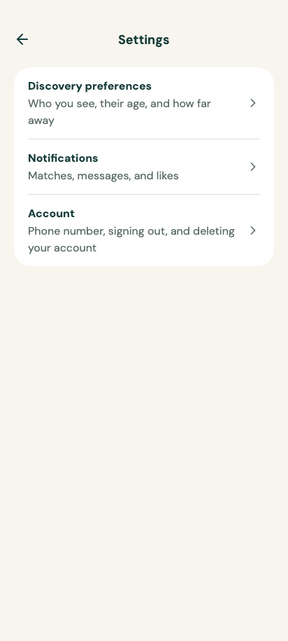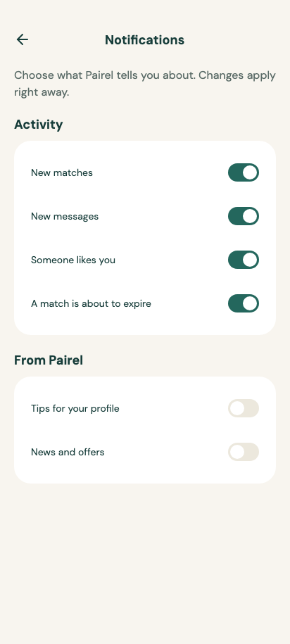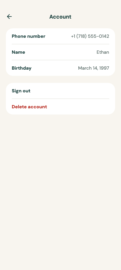
Pairel
My profile
package com.composables.pairel

import androidx.compose.foundation.background
import androidx.compose.foundation.clickable
import androidx.compose.foundation.interaction.MutableInteractionSource
import androidx.compose.foundation.layout.Arrangement
import androidx.compose.foundation.layout.Column
import androidx.compose.foundation.layout.FlowRow
import androidx.compose.foundation.layout.PaddingValues
import androidx.compose.foundation.layout.Row
import androidx.compose.foundation.layout.Spacer
import androidx.compose.foundation.layout.WindowInsets
import androidx.compose.foundation.layout.WindowInsetsSides
import androidx.compose.foundation.layout.fillMaxSize
import androidx.compose.foundation.layout.fillMaxWidth
import androidx.compose.foundation.layout.height
import androidx.compose.foundation.layout.only
import androidx.compose.foundation.layout.padding
import androidx.compose.foundation.layout.safeDrawing
import androidx.compose.foundation.layout.size
import androidx.compose.foundation.layout.width
import androidx.compose.foundation.layout.widthIn
import androidx.compose.foundation.layout.windowInsetsPadding
import androidx.compose.foundation.lazy.LazyColumn
import androidx.compose.runtime.Composable
import androidx.compose.runtime.remember
import androidx.compose.ui.Alignment
import androidx.compose.ui.Modifier
import androidx.compose.ui.draw.clip
import androidx.compose.ui.layout.ContentScale
import androidx.compose.ui.unit.dp
import androidx.compose.ui.unit.sp
import com.composables.compose.ripple.rememberRippleIndication
import com.composables.pairel.components.AppBar
import com.composables.pairel.components.Avatar
import com.composables.pairel.components.Button
import com.composables.pairel.components.Card
import com.composables.pairel.components.Icon
import com.composables.pairel.components.ProgressIndicator
import com.composables.pairel.components.ScreenScaffold
import com.composables.pairel.components.Separator
import com.composables.pairel.components.SeparatorOrientation
import com.composables.pairel.components.Tag
import com.composables.pairel.components.TagVariant
import com.composables.pairel.components.Text
import com.composables.pairel.theme.ChevronRight
import com.composables.pairel.theme.Icons
import com.composables.pairel.theme.ProvideContentColor
import com.composables.pairel.theme.Theme
import com.composables.uripainter.rememberUriPainter
import kotlin.math.roundToInt
import kotlin.time.Duration.Companion.milliseconds

private const val ProfileCompletion = 0.7f

@Composable
fun MyProfileScreen(
    navigateToProfileDetails: () -> Unit,
    navigateToMembership: () -> Unit,
    navigateToSettings: () -> Unit,
    navigateToDiscover: () -> Unit,
    navigateToMatches: () -> Unit,
    modifier: Modifier = Modifier,
) {
    MainNavigationLayout(
        navigationBar = {
            MainNavigationBar(
                selected = MainDestination.MyProfile,
                navigateToDiscover = navigateToDiscover,
                navigateToMatches = navigateToMatches,
                navigateToMyProfile = {},
            )
        },
        modifier = modifier,
    ) { contentPadding ->
        MyProfileDestination(
            navigateToProfileDetails,
            navigateToMembership,
            navigateToSettings,
            contentPadding = contentPadding,
        )
    }
}

@Composable
fun MyProfileDestination(
    navigateToProfileDetails: () -> Unit,
    navigateToMembership: () -> Unit,
    navigateToSettings: () -> Unit,
    contentPadding: PaddingValues,
    modifier: Modifier = Modifier,
) {
    val bottomPadding = contentPadding.calculateBottomPadding()

    ScreenScaffold(
        modifier = modifier,
        topBar = { AppBar(title = { Text("My profile") }) },
    ) {
        LazyColumn(
            modifier =
                Modifier.fillMaxSize()
                    .windowInsetsPadding(
                        WindowInsets.safeDrawing.only(WindowInsetsSides.Horizontal)
                    ),
            contentPadding =
                PaddingValues(
                    start = 20.dp,
                    end = 20.dp,
                    top = 8.dp,
                    bottom = bottomPadding + 24.dp,
                ),
            verticalArrangement = Arrangement.spacedBy(16.dp),
            horizontalAlignment = Alignment.CenterHorizontally,
        ) {
            item(key = "profile") {
                Card(Modifier.widthIn(max = 560.dp).fillMaxWidth()) {
                    Row(verticalAlignment = Alignment.CenterVertically) {
                        Avatar(
                            initials = "M",
                            contentDescription = "Your photo",
                            painter =
                                rememberUriPainter(
                                    YourPhotoUrl,
                                    crossfade = 300.milliseconds,
                                    contentScale = ContentScale.Crop,
                                ),
                            modifier = Modifier.size(72.dp),
                        )
                        Spacer(Modifier.width(16.dp))
                        Column(verticalArrangement = Arrangement.spacedBy(4.dp)) {
                            Text(
                                "Ethan, 31",
                                style =
                                    Theme.typography.title.copy(
                                        fontSize = 24.sp,
                                        lineHeight = 30.sp,
                                    ),
                            )
                            Text("Brooklyn, New York", color = Theme.colors.onBackgroundMuted)
                        }
                    }
                    FlowRow(
                        modifier = Modifier.padding(top = 16.dp),
                        horizontalArrangement = Arrangement.spacedBy(8.dp),
                        verticalArrangement = Arrangement.spacedBy(8.dp),
                    ) {
                        for (interest in yourInterests) {
                            Tag(TagVariant.Neutral) { Text("${interest.emoji} ${interest.label}") }
                        }
                    }
                    Spacer(Modifier.height(24.dp))
                    Row(Modifier.fillMaxWidth()) {
                        Text(
                            "Profile strength",
                            style = Theme.typography.label,
                            modifier = Modifier.weight(1f),
                        )
                        Text(
                            "${(ProfileCompletion * 100).roundToInt()}%",
                            style = Theme.typography.label,
                        )
                    }
                    ProgressIndicator(ProfileCompletion, Modifier.padding(top = 10.dp))
                    Text(
                        "Add one more interest so people have more to talk about.",
                        color = Theme.colors.onBackgroundMuted,
                        modifier = Modifier.padding(top = 10.dp),
                    )
                    Button(
                        onClick = navigateToProfileDetails,
                        modifier = Modifier.fillMaxWidth().padding(top = 20.dp),
                    ) {
                        Text("Complete profile")
                    }
                }
            }
            item(key = "membership") {
                Column(
                    Modifier.widthIn(max = 560.dp)
                        .fillMaxWidth()
                        .clip(Theme.shapes.large)
                        .background(Theme.colors.accent)
                        .padding(24.dp)
                ) {
                    ProvideContentColor(Theme.colors.onAccent) {
                        Text(
                            "Pairel Plus".uppercase(),
                            style = Theme.typography.caption.copy(letterSpacing = 1.sp),
                        )
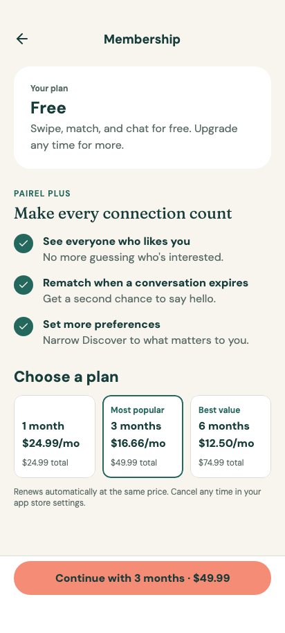
                        Text(
                            "Make every connection count",
                            style = Theme.typography.quote,
                            modifier = Modifier.padding(top = 8.dp),
                        )
                        Text(
                            "See everyone who likes you, rematch when a conversation expires, and set more preferences.",
                            modifier = Modifier.padding(top = 8.dp),
                        )
                        Button(
                            onClick = navigateToMembership,
                            modifier = Modifier.fillMaxWidth().padding(top = 20.dp),
                        ) {
                            Text("See plans")
                        }
                    }
                }
            }
            item(key = "destinations") {
                Column(
                    Modifier.widthIn(max = 560.dp)
                        .fillMaxWidth()
                        .clip(Theme.shapes.large)
                        .background(Theme.colors.surface)
                ) {
                    ProfileRow(
                        title = "Profile details",
                        description = "Photos, bio, height, and interests",
                        onClick = navigateToProfileDetails,
                    )
                    Separator(
                        SeparatorOrientation.Horizontal,
                        Modifier.padding(horizontal = 20.dp),
                    )
                    ProfileRow(
                        title = "Membership",
                        description = "Free plan",
                        onClick = navigateToMembership,
                    )
                    Separator(
                        SeparatorOrientation.Horizontal,
                        Modifier.padding(horizontal = 20.dp),
                    )
                    ProfileRow(
                        title = "Settings",
                        description = "Preferences, notifications, and account",
                        onClick = navigateToSettings,
                    )
                }
            }
        }
    }
}

@Composable
private fun ProfileRow(
    title: String,
    description: String,
    onClick: () -> Unit,
    modifier: Modifier = Modifier,
) {
    Row(
        modifier =
            modifier
                .fillMaxWidth()
                .clickable(
                    interactionSource = remember { MutableInteractionSource() },
                    indication = rememberRippleIndication(color = Theme.colors.onSurface),
                    onClick = onClick,
                )
                .padding(horizontal = 20.dp, vertical = 16.dp),
        verticalAlignment = Alignment.CenterVertically,
    ) {
        Column(Modifier.weight(1f), verticalArrangement = Arrangement.spacedBy(4.dp)) {
            Text(title, style = Theme.typography.label, color = Theme.colors.onSurface)
            Text(description, color = Theme.colors.onBackgroundMuted)
        }
        Spacer(Modifier.width(12.dp))
        Icon(
            Icons.ChevronRight,
            contentDescription = null,
            tint = Theme.colors.onBackgroundMuted,
            modifier = Modifier.size(20.dp),
        )
    }
}
package com.composables.pairel

data class Interest(val emoji: String, val label: String)

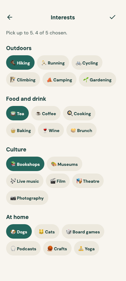
internal val interestGroups =
    listOf(
        "Outdoors" to
            listOf(
                Interest("🥾", "Hiking"),
                Interest("🏃", "Running"),
                Interest("🚲", "Cycling"),
                Interest("🧗", "Climbing"),
                Interest("⛺", "Camping"),
                Interest("🌱", "Gardening"),
            ),
        "Food and drink" to
            listOf(
                Interest("🍵", "Tea"),
                Interest("☕", "Coffee"),
                Interest("🍳", "Cooking"),
                Interest("🧁", "Baking"),
                Interest("🍷", "Wine"),
                Interest("🥞", "Brunch"),
            ),
        "Culture" to
            listOf(
                Interest("📚", "Bookshops"),
                Interest("🎨", "Museums"),
                Interest("🎶", "Live music"),
                Interest("🎬", "Film"),
                Interest("🎭", "Theatre"),
                Interest("📷", "Photography"),
            ),
        "At home" to
            listOf(
                Interest("🐶", "Dogs"),
                Interest("🐱", "Cats"),
                Interest("🎲", "Board games"),
                Interest("🎧", "Podcasts"),
                Interest("🧶", "Crafts"),
                Interest("🧘", "Yoga"),
            ),
    )

internal fun interests(vararg labels: String): List<Interest> {
    val all = interestGroups.flatMap { it.second }
    return labels.map { label -> all.first { it.label == label } }
}
package com.composables.pairel

import androidx.compose.foundation.layout.Box
import androidx.compose.foundation.layout.PaddingValues
import androidx.compose.foundation.layout.WindowInsets
import androidx.compose.foundation.layout.asPaddingValues
import androidx.compose.foundation.layout.fillMaxSize
import androidx.compose.foundation.layout.navigationBars
import androidx.compose.foundation.layout.size
import androidx.compose.runtime.Composable
import androidx.compose.ui.Alignment
import androidx.compose.ui.Modifier
import androidx.compose.ui.unit.dp
import com.composables.pairel.components.BottomBar
import com.composables.pairel.components.BottomBarHeight
import com.composables.pairel.components.BottomBarItem
import com.composables.pairel.components.Icon
import com.composables.pairel.components.PairelDialogHost
import com.composables.pairel.components.Text
import com.composables.pairel.theme.Compass
import com.composables.pairel.theme.Heart
import com.composables.pairel.theme.Icons
import com.composables.pairel.theme.User

internal val MainNavigationBarHeight = BottomBarHeight

@Composable
internal fun mainNavigationContentPadding(): PaddingValues =
    PaddingValues(
        bottom =
            MainNavigationBarHeight +
                WindowInsets.navigationBars.asPaddingValues().calculateBottomPadding()
    )

@Composable
internal fun MainNavigationLayout(
    navigationBar: @Composable () -> Unit,
    modifier: Modifier = Modifier,
    content: @Composable (contentPadding: PaddingValues) -> Unit,
) {
    PairelDialogHost(modifier.fillMaxSize()) {
        Box(Modifier.fillMaxSize()) {
            content(mainNavigationContentPadding())
            Box(Modifier.align(Alignment.BottomCenter)) { navigationBar() }
        }
    }
}

enum class MainDestination {
    Discover,
    Matches,
    MyProfile,
}

@Composable
internal fun MainNavigationBar(
    selected: MainDestination,
    navigateToDiscover: () -> Unit,
    navigateToMatches: () -> Unit,
    navigateToMyProfile: () -> Unit,
    modifier: Modifier = Modifier,
) {
    BottomBar(modifier = modifier) {
        BottomBarItem(
            selected = selected == MainDestination.Matches,
            onClick = { if (selected != MainDestination.Matches) navigateToMatches() },
            icon = {
                Icon(Icons.Heart, contentDescription = null, modifier = Modifier.size(24.dp))
            },
            label = { Text("Matches") },
        )
        BottomBarItem(
            selected = selected == MainDestination.Discover,
            onClick = { if (selected != MainDestination.Discover) navigateToDiscover() },
            icon = {
                Icon(Icons.Compass, contentDescription = null, modifier = Modifier.size(24.dp))
            },
            label = { Text("Discover") },
        )
        BottomBarItem(
            selected = selected == MainDestination.MyProfile,
            onClick = { if (selected != MainDestination.MyProfile) navigateToMyProfile() },
            icon = { Icon(Icons.User, contentDescription = null, modifier = Modifier.size(24.dp)) },
            label = { Text("My profile") },
        )
    }
}
package com.composables.pairel

internal const val YourPhotoUrl =
    "https://images.unsplash.com/photo-1492562080023-ab3db95bfbce?fit=crop&w=700&h=900&q=85"

data class Person(
    val name: String,
    val age: Int,
    val photoUrl: String,
    val bio: String,
    val interests: List<Interest>,
)

internal val people =
    listOf(
        Person(
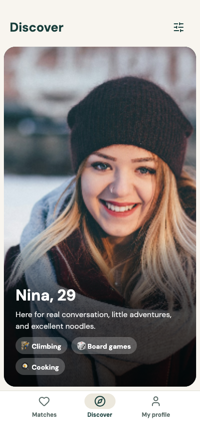
            "Nina",
            29,
            "https://images.unsplash.com/photo-1487412720507-e7ab37603c6f?fit=crop&w=900&h=1350&q=85",
            "Here for real conversation, little adventures, and excellent noodles.",
            interests("Climbing", "Board games", "Cooking"),
        ),
        Person(
            "Chloe",
            30,
            "https://images.unsplash.com/photo-1567532939604-b6b5b0db2604?fit=crop&w=900&h=1350&q=85",
            "A curious cook who likes slow mornings and last-minute plans.",
            interests("Cooking", "Brunch", "Coffee"),
        ),
        Person(
            "Sofia",
            31,
            "https://images.unsplash.com/photo-1772989665252-7cb41ae759cc?fit=crop&w=900&h=1350&q=85",
            "Usually looking for a new place to walk, a good bookshop, or both.",
            interests("Bookshops", "Cooking", "Coffee"),
        ),
        Person(
            "Ivy",
            27,
            "https://images.unsplash.com/photo-1489424731084-a5d8b219a5bb?fit=crop&w=900&h=1350&q=85",
            "Big on live music, kind people, and getting outside.",
            interests("Live music", "Hiking", "Cycling"),
        ),
        Person(
            "Amara",
            33,
            "https://images.unsplash.com/photo-1531123897727-8f129e1688ce?fit=crop&w=900&h=1350&q=85",
            "Designer by day, enthusiastic home cook by night.",
            interests("Cooking", "Photography", "Museums"),
        ),
    )
package com.composables.pairel

import androidx.compose.foundation.background
import androidx.compose.foundation.clickable
import androidx.compose.foundation.interaction.MutableInteractionSource
import androidx.compose.foundation.layout.Arrangement
import androidx.compose.foundation.layout.Column
import androidx.compose.foundation.layout.ColumnScope
import androidx.compose.foundation.layout.Row
import androidx.compose.foundation.layout.Spacer
import androidx.compose.foundation.layout.WindowInsets
import androidx.compose.foundation.layout.WindowInsetsSides
import androidx.compose.foundation.layout.fillMaxSize
import androidx.compose.foundation.layout.fillMaxWidth
import androidx.compose.foundation.layout.navigationBars
import androidx.compose.foundation.layout.only
import androidx.compose.foundation.layout.padding
import androidx.compose.foundation.layout.safeDrawing
import androidx.compose.foundation.layout.size
import androidx.compose.foundation.layout.union
import androidx.compose.foundation.layout.width
import androidx.compose.foundation.layout.widthIn
import androidx.compose.foundation.layout.windowInsetsPadding
import androidx.compose.foundation.rememberScrollState
import androidx.compose.foundation.verticalScroll
import androidx.compose.runtime.Composable
import androidx.compose.runtime.mutableStateListOf
import androidx.compose.runtime.remember
import androidx.compose.ui.Alignment
import androidx.compose.ui.Modifier
import androidx.compose.ui.draw.clip
import androidx.compose.ui.text.style.TextOverflow
import androidx.compose.ui.unit.dp
import androidx.compose.ui.unit.sp
import com.composables.compose.ripple.rememberRippleIndication
import com.composables.pairel.components.CenteredAppBar
import com.composables.pairel.components.Icon
import com.composables.pairel.components.IconButton
import com.composables.pairel.components.ScreenScaffold
import com.composables.pairel.components.Separator
import com.composables.pairel.components.SeparatorOrientation
import com.composables.pairel.components.Text
import com.composables.pairel.theme.ArrowLeft
import com.composables.pairel.theme.ChevronRight
import com.composables.pairel.theme.Icons
import com.composables.pairel.theme.Theme

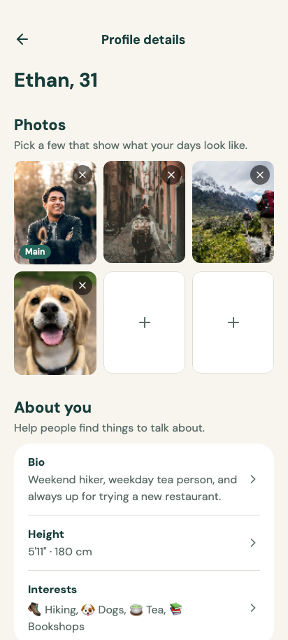
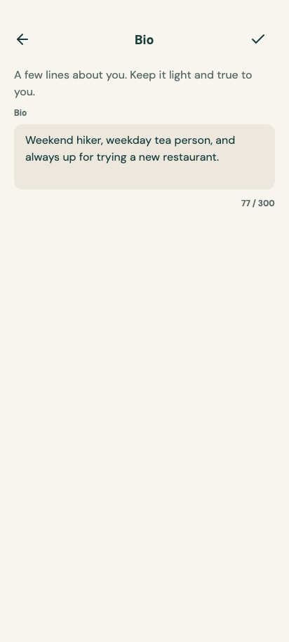
internal const val YourBio =
    "Weekend hiker, weekday tea person, and always up for trying a new restaurant."
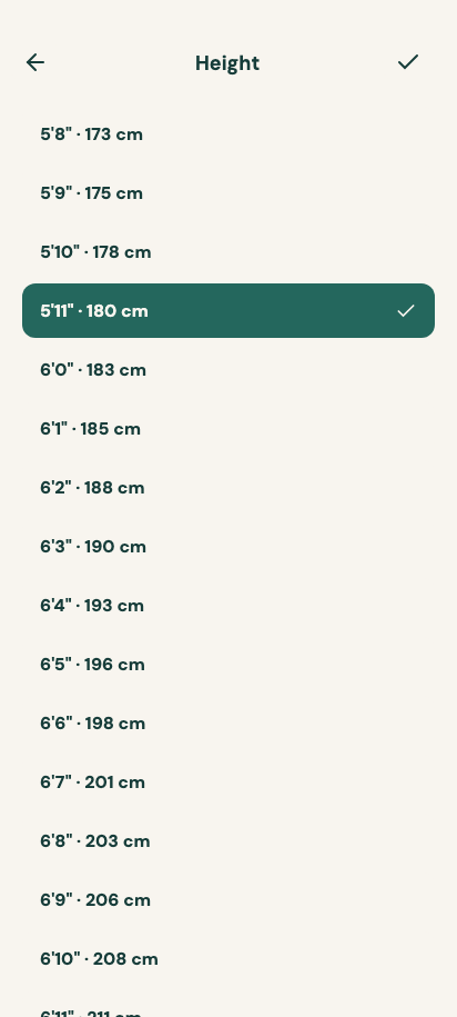
internal const val YourHeightCm = 180
internal val yourInterests = interests("Hiking", "Dogs", "Tea", "Bookshops")

private val yourPhotos =
    listOf(
        Photo.Remote(YourPhotoUrl),
        Photo.Remote(
            "https://images.unsplash.com/photo-1527631746610-bca00a040d60?fit=crop&w=600&h=750&q=85"
        ),
        Photo.Remote(
            "https://images.unsplash.com/photo-1551632811-561732d1e306?fit=crop&w=600&h=750&q=85"
        ),
        Photo.Remote(
            "https://images.unsplash.com/photo-1543466835-00a7907e9de1?fit=crop&w=600&h=750&q=85"
        ),
    )

@Composable
fun ProfileDetailsScreen(
    navigateBack: () -> Unit,
    navigateToEditBio: () -> Unit,
    navigateToEditHeight: () -> Unit,
    navigateToEditInterests: () -> Unit,
    modifier: Modifier = Modifier,
) {
    val photos = remember { mutableStateListOf<Photo>(*yourPhotos.toTypedArray()) }

    ScreenScaffold(
        modifier = modifier,
        topBar = {
            CenteredAppBar(
                title = { Text("Profile details") },
                navigation = {
                    IconButton(onClick = navigateBack) {
                        Icon(
                            Icons.ArrowLeft,
                            contentDescription = "Back",
                            modifier = Modifier.size(24.dp),
                        )
                    }
                },
            )
        },
    ) {
        Column(
            Modifier.fillMaxSize()
                .verticalScroll(rememberScrollState())
                .padding(top = 8.dp, bottom = 24.dp)
                .windowInsetsPadding(
                    WindowInsets.navigationBars.union(
                        WindowInsets.safeDrawing.only(WindowInsetsSides.Horizontal)
                    )
                )
                .padding(horizontal = 20.dp),
            horizontalAlignment = Alignment.CenterHorizontally,
        ) {
            Column(
                Modifier.widthIn(max = 560.dp).fillMaxWidth(),
                verticalArrangement = Arrangement.spacedBy(32.dp),
            ) {
                Text(
                    "Ethan, 31",
                    style = Theme.typography.headline.copy(fontSize = 28.sp, lineHeight = 34.sp),
                )

                Section(
                    title = "Photos",
                    description = "Pick a few that show what your days look like.",
                ) {
                    EditablePhotoGrid(photos = photos)
                }

                Section(
                    title = "About you",
                    description = "Help people find things to talk about.",
                ) {
                    Column(
                        Modifier.fillMaxWidth()
                            .clip(Theme.shapes.large)
                            .background(Theme.colors.surface)
                    ) {
                        DetailRow(label = "Bio", value = YourBio, onClick = navigateToEditBio)
                        Separator(
                            SeparatorOrientation.Horizontal,
                            Modifier.padding(horizontal = 20.dp),
                        )
                        DetailRow(
                            label = "Height",
                            value = formatHeight(YourHeightCm),
                            onClick = navigateToEditHeight,
                        )
                        Separator(
                            SeparatorOrientation.Horizontal,
                            Modifier.padding(horizontal = 20.dp),
                        )
                        DetailRow(
                            label = "Interests",
                            value = yourInterests.joinToString(", ") { "${it.emoji} ${it.label}" },
                            onClick = navigateToEditInterests,
                        )
                    }
                }
            }
        }
    }
}

internal fun formatHeight(cm: Int): String {
    val inches = (cm / 2.54).let { kotlin.math.round(it).toInt() }
    return "${inches / 12}'${inches % 12}\" · $cm cm"
}

@Composable
private fun Section(
    title: String,
    description: String,
    modifier: Modifier = Modifier,
    content: @Composable ColumnScope.() -> Unit,
) {
    Column(modifier, verticalArrangement = Arrangement.spacedBy(12.dp)) {
        Column(verticalArrangement = Arrangement.spacedBy(4.dp)) {
            Text(title, style = Theme.typography.title)
            Text(description, color = Theme.colors.onBackgroundMuted)
        }
        content()
    }
}

@Composable
private fun DetailRow(
    label: String,
    value: String,
    onClick: () -> Unit,
    modifier: Modifier = Modifier,
) {
    Row(
        modifier =
            modifier
                .fillMaxWidth()
                .clickable(
                    interactionSource = remember { MutableInteractionSource() },
                    indication = rememberRippleIndication(color = Theme.colors.onSurface),
                    onClickLabel = "Edit ${label.lowercase()}",
                    onClick = onClick,
                )
                .padding(horizontal = 20.dp, vertical = 16.dp),
        verticalAlignment = Alignment.CenterVertically,
    ) {
        Column(Modifier.weight(1f), verticalArrangement = Arrangement.spacedBy(4.dp)) {
            Text(label, style = Theme.typography.label, color = Theme.colors.onSurface)
            Text(
                value,
                color = Theme.colors.onBackgroundMuted,
                maxLines = 2,
                overflow = TextOverflow.Ellipsis,
            )
        }
        Spacer(Modifier.width(12.dp))
        Icon(
            Icons.ChevronRight,
            contentDescription = null,
            tint = Theme.colors.onBackgroundMuted,
            modifier = Modifier.size(20.dp),
        )
    }
}
package com.composables.pairel

import androidx.compose.foundation.Image
import androidx.compose.foundation.background
import androidx.compose.foundation.border
import androidx.compose.foundation.interaction.MutableInteractionSource
import androidx.compose.foundation.layout.Arrangement
import androidx.compose.foundation.layout.Box
import androidx.compose.foundation.layout.Column
import androidx.compose.foundation.layout.PaddingValues
import androidx.compose.foundation.layout.Row
import androidx.compose.foundation.layout.aspectRatio
import androidx.compose.foundation.layout.fillMaxSize
import androidx.compose.foundation.layout.padding
import androidx.compose.foundation.layout.size
import androidx.compose.foundation.shape.CircleShape
import androidx.compose.runtime.Composable
import androidx.compose.runtime.remember
import androidx.compose.runtime.rememberCoroutineScope
import androidx.compose.ui.Alignment
import androidx.compose.ui.Modifier
import androidx.compose.ui.draw.clip
import androidx.compose.ui.graphics.Color
import androidx.compose.ui.graphics.ImageBitmap
import androidx.compose.ui.graphics.painter.BitmapPainter
import androidx.compose.ui.layout.ContentScale
import androidx.compose.ui.unit.dp
import com.composables.compose.ripple.rememberRippleIndication
import com.composables.pairel.components.Icon
import com.composables.pairel.components.Text
import com.composables.pairel.theme.Icons
import com.composables.pairel.theme.Plus
import com.composables.pairel.theme.Theme
import com.composables.pairel.theme.X
import com.composables.uripainter.rememberUriPainter
import com.composeunstyled.UnstyledButton
import io.github.vinceglb.filekit.dialogs.FileKitMode
import io.github.vinceglb.filekit.dialogs.FileKitType
import io.github.vinceglb.filekit.dialogs.compose.rememberFilePickerLauncher
import io.github.vinceglb.filekit.dialogs.compose.util.toImageBitmap
import kotlin.time.Duration.Companion.milliseconds
import kotlinx.coroutines.launch

internal const val PhotoSlots = 6

sealed interface Photo {
    data class Remote(val url: String) : Photo

    class Picked(val image: ImageBitmap) : Photo
}

@Composable
internal fun EditablePhotoGrid(photos: MutableList<Photo>, modifier: Modifier = Modifier) {
    val scope = rememberCoroutineScope()
    val picker =
        rememberFilePickerLauncher(
            type = FileKitType.Image,
            mode = FileKitMode.Multiple(maxItems = (PhotoSlots - photos.size).coerceAtLeast(1)),
        ) { files ->
            if (files == null) return@rememberFilePickerLauncher
            scope.launch {
                for (file in files) {
                    if (photos.size >= PhotoSlots) break
                    photos.add(Photo.Picked(file.toImageBitmap()))
                }
            }
        }
    Column(modifier, verticalArrangement = Arrangement.spacedBy(10.dp)) {
        for (row in (0 until PhotoSlots).chunked(3)) {
            Row(horizontalArrangement = Arrangement.spacedBy(10.dp)) {
                for (index in row) {
                    val photo = photos.getOrNull(index)
                    val slotModifier = Modifier.weight(1f).aspectRatio(4f / 5f)
                    if (photo != null) {
                        PhotoTile(
                            photo = photo,
                            main = index == 0,
                            onRemove = { photos.remove(photo) },
                            modifier = slotModifier,
                        )
                    } else {
                        EmptyPhotoSlot(onClick = { picker.launch() }, modifier = slotModifier)
                    }
                }
            }
        }
    }
}

@Composable
private fun PhotoTile(
    photo: Photo,
    main: Boolean,
    onRemove: () -> Unit,
    modifier: Modifier = Modifier,
) {
    Box(modifier.clip(Theme.shapes.small).background(Theme.colors.surfaceVariant)) {
        Image(
            painter =
                when (photo) {
                    is Photo.Remote ->
                        rememberUriPainter(
                            photo.url,
                            crossfade = 300.milliseconds,
                            contentScale = ContentScale.Crop,
                        )
                    is Photo.Picked -> remember(photo) { BitmapPainter(photo.image) }
                },
            contentDescription = if (main) "Your main photo" else "Your photo",
            contentScale = ContentScale.Crop,
            modifier = Modifier.fillMaxSize(),
        )
        if (main) {
            Text(
                "Main",
                style = Theme.typography.caption,
                color = Theme.colors.onAccent,
                modifier =
                    Modifier.align(Alignment.BottomStart)
                        .padding(8.dp)
                        .clip(Theme.shapes.fullyRounded)
                        .background(Theme.colors.accent)
                        .padding(horizontal = 8.dp, vertical = 2.dp),
            )
        }
        UnstyledButton(
            onClick = onRemove,
            modifier =
                Modifier.align(Alignment.TopEnd)
                    .padding(6.dp)
                    .size(28.dp)
                    .clip(CircleShape)
                    .background(Color.Black.copy(alpha = 0.55f)),
            contentPadding = PaddingValues(6.dp),
            indication = rememberRippleIndication(color = Color.White),
            interactionSource = remember { MutableInteractionSource() },
        ) {
            Icon(
                Icons.X,
                contentDescription = "Remove photo",
                tint = Color.White,
                modifier = Modifier.size(16.dp),
            )
        }
    }
}

@Composable
private fun EmptyPhotoSlot(onClick: () -> Unit, modifier: Modifier = Modifier) {
    UnstyledButton(
        onClick = onClick,
        modifier =
            modifier
                .clip(Theme.shapes.small)
                .background(Theme.colors.surface)
                .border(1.dp, Theme.colors.border, Theme.shapes.small),
        indication = rememberRippleIndication(color = Theme.colors.onSurface),
        interactionSource = remember { MutableInteractionSource() },
    ) {
        Icon(
            Icons.Plus,
            contentDescription = "Add photos",
            tint = Theme.colors.onBackgroundMuted,
            modifier = Modifier.size(24.dp),
        )
    }
}
package com.composables.pairel.components

import androidx.compose.foundation.background
import androidx.compose.foundation.layout.Box
import androidx.compose.foundation.layout.Row
import androidx.compose.foundation.layout.RowScope
import androidx.compose.foundation.layout.WindowInsets
import androidx.compose.foundation.layout.WindowInsetsSides
import androidx.compose.foundation.layout.fillMaxWidth
import androidx.compose.foundation.layout.height
import androidx.compose.foundation.layout.heightIn
import androidx.compose.foundation.layout.offset
import androidx.compose.foundation.layout.only
import androidx.compose.foundation.layout.padding
import androidx.compose.foundation.layout.safeDrawing
import androidx.compose.foundation.layout.statusBars
import androidx.compose.foundation.layout.union
import androidx.compose.foundation.layout.windowInsetsPadding
import androidx.compose.runtime.Composable
import androidx.compose.ui.Alignment
import androidx.compose.ui.Modifier
import androidx.compose.ui.input.pointer.pointerInput
import androidx.compose.ui.unit.dp
import androidx.compose.ui.unit.sp
import com.composables.pairel.theme.ProvideContentColor
import com.composables.pairel.theme.ProvideTextStyle
import com.composables.pairel.theme.Space
import com.composables.pairel.theme.Theme

val AppBarHeight = 64.dp

@Composable
fun AppBar(
    title: @Composable () -> Unit,
    navigation: @Composable () -> Unit = {},
    actions: @Composable RowScope.() -> Unit = {},
    modifier: Modifier = Modifier,
) {
    ProvideContentColor(Theme.colors.onBackground) {
        Row(
            modifier =
                modifier
                    .fillMaxWidth()
                    .background(Theme.colors.background)
                    .pointerInput(Unit) {
                        awaitPointerEventScope { while (true) awaitPointerEvent() }
                    }
                    .windowInsetsPadding(
                        WindowInsets.statusBars.union(
                            WindowInsets.safeDrawing.only(WindowInsetsSides.Horizontal)
                        )
                    )
                    .height(AppBarHeight)
                    .padding(horizontal = 20.dp),
            verticalAlignment = Alignment.CenterVertically,
        ) {
            Box(Modifier.offset(x = -(Space * 3))) { navigation() }
            Box(Modifier.weight(1f), contentAlignment = Alignment.CenterStart) {
                Box(Modifier.heightIn(min = 48.dp), contentAlignment = Alignment.CenterStart) {
                    ProvideTextStyle(
                        Theme.typography.title.copy(fontSize = 26.sp, lineHeight = 38.sp),
                        title,
                    )
                }
            }
            Row(verticalAlignment = Alignment.CenterVertically, content = actions)
        }
    }
}
package com.composables.pairel.components

import androidx.compose.foundation.background
import androidx.compose.foundation.border
import androidx.compose.foundation.layout.size
import androidx.compose.foundation.shape.CircleShape
import androidx.compose.runtime.Composable
import androidx.compose.ui.Modifier
import androidx.compose.ui.draw.clip
import androidx.compose.ui.graphics.painter.Painter
import androidx.compose.ui.layout.ContentScale
import androidx.compose.ui.unit.dp
import com.composables.pairel.theme.Theme
import com.composeunstyled.UnstyledAvatar

@Composable
fun Avatar(
    initials: String,
    contentDescription: String,
    modifier: Modifier = Modifier,
    painter: Painter? = null,
) {
    UnstyledAvatar(
        painter = painter,
        contentDescription = contentDescription,
        contentScale = ContentScale.Crop,
        modifier =
            modifier
                .size(48.dp)
                .clip(CircleShape)
                .background(Theme.colors.surfaceVariant)
                .border(1.dp, Theme.colors.border, CircleShape),
        underlay = {
            Text(initials, color = Theme.colors.onSurfaceVariant, style = Theme.typography.label)
        },
    )
}
package com.composables.pairel.components

import androidx.compose.foundation.background
import androidx.compose.foundation.layout.Arrangement
import androidx.compose.foundation.layout.Row
import androidx.compose.foundation.layout.RowScope
import androidx.compose.foundation.layout.WindowInsets
import androidx.compose.foundation.layout.WindowInsetsSides
import androidx.compose.foundation.layout.fillMaxWidth
import androidx.compose.foundation.layout.height
import androidx.compose.foundation.layout.navigationBars
import androidx.compose.foundation.layout.only
import androidx.compose.foundation.layout.padding
import androidx.compose.foundation.layout.safeDrawing
import androidx.compose.foundation.layout.union
import androidx.compose.foundation.layout.windowInsetsPadding
import androidx.compose.runtime.Composable
import androidx.compose.ui.Alignment
import androidx.compose.ui.Modifier
import androidx.compose.ui.draw.drawBehind
import androidx.compose.ui.geometry.Offset
import androidx.compose.ui.input.pointer.pointerInput
import androidx.compose.ui.unit.dp
import com.composables.pairel.theme.Theme

val BottomBarHeight = 64.dp

@Composable
fun BottomBar(
    modifier: Modifier = Modifier,
    content: @Composable RowScope.() -> Unit,
) {
    val borderColor = Theme.colors.border
    Row(
        modifier =
            modifier
                .fillMaxWidth()
                .background(Theme.colors.surface)
                .drawBehind {
                    val stroke = 1.dp.toPx()
                    drawLine(
                        borderColor,
                        Offset(0f, stroke / 2),
                        Offset(size.width, stroke / 2),
                        stroke,
                    )
                }
                .pointerInput(Unit) { awaitPointerEventScope { while (true) awaitPointerEvent() } }
                .windowInsetsPadding(
                    WindowInsets.navigationBars.union(
                        WindowInsets.safeDrawing.only(WindowInsetsSides.Horizontal)
                    )
                )
                .height(BottomBarHeight)
                .padding(horizontal = 20.dp),
        horizontalArrangement = Arrangement.SpaceEvenly,
        verticalAlignment = Alignment.CenterVertically,
        content = content,
    )
}
package com.composables.pairel.components

import androidx.compose.animation.animateColorAsState
import androidx.compose.animation.core.animateFloatAsState
import androidx.compose.foundation.background
import androidx.compose.foundation.indication
import androidx.compose.foundation.interaction.MutableInteractionSource
import androidx.compose.foundation.layout.Arrangement
import androidx.compose.foundation.layout.Box
import androidx.compose.foundation.layout.Column
import androidx.compose.foundation.layout.padding
import androidx.compose.foundation.selection.selectable
import androidx.compose.runtime.Composable
import androidx.compose.runtime.getValue
import androidx.compose.runtime.remember
import androidx.compose.ui.Alignment
import androidx.compose.ui.Modifier
import androidx.compose.ui.draw.clip
import androidx.compose.ui.semantics.Role
import androidx.compose.ui.unit.dp
import com.composables.compose.ripple.rememberRippleIndication
import com.composables.pairel.theme.ProvideContentColor
import com.composables.pairel.theme.ProvideTextStyle
import com.composables.pairel.theme.Theme

@Composable
fun BottomBarItem(
    selected: Boolean,
    onClick: () -> Unit,
    icon: @Composable () -> Unit,
    label: @Composable () -> Unit,
    modifier: Modifier = Modifier,
) {
    val interactionSource = remember { MutableInteractionSource() }
    val contentColor by
        animateColorAsState(
            if (selected) Theme.colors.onSurface else Theme.colors.onSurfaceInactive,
            label = "Bottom bar item content",
        )
    val indicatorAlpha by
        animateFloatAsState(
            if (selected) 1f else 0f,
            label = "Bottom bar item indicator",
        )
    Column(
        modifier =
            modifier
                .clip(Theme.shapes.small)
                .selectable(
                    selected = selected,
                    onClick = onClick,
                    role = Role.Tab,
                    interactionSource = interactionSource,
                    indication = null,
                )
                .padding(horizontal = 12.dp, vertical = 6.dp),
        horizontalAlignment = Alignment.CenterHorizontally,
        verticalArrangement = Arrangement.spacedBy(4.dp),
    ) {
        ProvideContentColor(contentColor) {
            Box(
                Modifier.clip(Theme.shapes.fullyRounded)
                    .background(
                        Theme.colors.surfaceVariant.copy(alpha = indicatorAlpha.coerceIn(0f, 1f))
                    )
                    .indication(
                        interactionSource = interactionSource,
                        indication =
                            rememberRippleIndication(
                                color = Theme.colors.onSurface,
                                bounded = false,
                            ),
                    )
                    .padding(horizontal = 20.dp, vertical = 4.dp),
                contentAlignment = Alignment.Center,
            ) {
                icon()
            }
            ProvideTextStyle(Theme.typography.caption, label)
        }
    }
}
package com.composables.pairel.components

import androidx.compose.foundation.background
import androidx.compose.foundation.interaction.MutableInteractionSource
import androidx.compose.foundation.layout.PaddingValues
import androidx.compose.runtime.Composable
import androidx.compose.runtime.remember
import androidx.compose.ui.Modifier
import androidx.compose.ui.draw.alpha
import androidx.compose.ui.draw.clip
import com.composables.compose.ripple.rememberRippleIndication
import com.composables.pairel.theme.ProvideContentColor
import com.composables.pairel.theme.ProvideTextStyle
import com.composables.pairel.theme.Space
import com.composables.pairel.theme.Theme
import com.composeunstyled.UnstyledButton

@Composable
fun Button(
    onClick: () -> Unit,
    modifier: Modifier = Modifier,
    enabled: Boolean = true,
    content: @Composable () -> Unit,
) {
    val interactionSource = remember { MutableInteractionSource() }
    UnstyledButton(
        onClick = onClick,
        enabled = enabled,
        modifier =
            modifier
                .alpha(if (enabled) 1f else 0.45f)
                .clip(Theme.shapes.large)
                .background(Theme.colors.primary),
        contentPadding = PaddingValues(horizontal = Space * 6, vertical = Space * 3.5f),
        indication = rememberRippleIndication(color = Theme.colors.onPrimary),
        interactionSource = interactionSource,
    ) {
        ProvideContentColor(Theme.colors.onPrimary) {
            ProvideTextStyle(Theme.typography.label, content)
        }
    }
}
package com.composables.pairel.components

import androidx.compose.foundation.background
import androidx.compose.foundation.layout.Column
import androidx.compose.foundation.layout.ColumnScope
import androidx.compose.foundation.layout.padding
import androidx.compose.runtime.Composable
import androidx.compose.ui.Modifier
import androidx.compose.ui.draw.clip
import com.composables.pairel.theme.ProvideContentColor
import com.composables.pairel.theme.Space
import com.composables.pairel.theme.Theme

@Composable
fun Card(modifier: Modifier = Modifier, content: @Composable ColumnScope.() -> Unit) {
    Column(modifier.clip(Theme.shapes.large).background(Theme.colors.surface).padding(Space * 6)) {
        ProvideContentColor(Theme.colors.onSurface) { content() }
    }
}
package com.composables.pairel.components

import androidx.compose.foundation.background
import androidx.compose.foundation.layout.Box
import androidx.compose.foundation.layout.Row
import androidx.compose.foundation.layout.RowScope
import androidx.compose.foundation.layout.WindowInsets
import androidx.compose.foundation.layout.WindowInsetsSides
import androidx.compose.foundation.layout.fillMaxWidth
import androidx.compose.foundation.layout.height
import androidx.compose.foundation.layout.heightIn
import androidx.compose.foundation.layout.offset
import androidx.compose.foundation.layout.only
import androidx.compose.foundation.layout.padding
import androidx.compose.foundation.layout.safeDrawing
import androidx.compose.foundation.layout.statusBars
import androidx.compose.foundation.layout.union
import androidx.compose.foundation.layout.windowInsetsPadding
import androidx.compose.runtime.Composable
import androidx.compose.ui.Alignment
import androidx.compose.ui.Modifier
import androidx.compose.ui.input.pointer.pointerInput
import androidx.compose.ui.layout.Layout
import androidx.compose.ui.unit.Constraints
import androidx.compose.ui.unit.dp
import androidx.compose.ui.unit.sp
import com.composables.pairel.theme.ProvideContentColor
import com.composables.pairel.theme.ProvideTextStyle
import com.composables.pairel.theme.Space
import com.composables.pairel.theme.Theme

@Composable
fun CenteredAppBar(
    title: @Composable () -> Unit,
    modifier: Modifier = Modifier,
    navigation: @Composable () -> Unit = {},
    actions: @Composable RowScope.() -> Unit = {},
) {
    ProvideContentColor(Theme.colors.onBackground) {
        Layout(
            content = {
                Box(contentAlignment = Alignment.CenterStart) {
                    Box(Modifier.offset(x = -(Space * 3))) { navigation() }
                }
                Box(contentAlignment = Alignment.Center) {
                    Box(Modifier.heightIn(min = 48.dp), contentAlignment = Alignment.Center) {
                        ProvideTextStyle(
                            Theme.typography.title.copy(fontSize = 18.sp, lineHeight = 20.sp),
                            title,
                        )
                    }
                }
                Row(
                    verticalAlignment = Alignment.CenterVertically,
                    content = actions,
                )
            },
            modifier =
                modifier
                    .fillMaxWidth()
                    .background(Theme.colors.background)
                    .pointerInput(Unit) {
                        awaitPointerEventScope { while (true) awaitPointerEvent() }
                    }
                    .windowInsetsPadding(
                        WindowInsets.statusBars.union(
                            WindowInsets.safeDrawing.only(WindowInsetsSides.Horizontal)
                        )
                    )
                    .height(AppBarHeight)
                    .padding(horizontal = 20.dp),
        ) { measurables, constraints ->
            val loose = constraints.copy(minWidth = 0, minHeight = 0)
            val leading = measurables[0].measure(loose)
            val trailing = measurables[2].measure(loose)
            val sideWidth = maxOf(leading.width, trailing.width)
            val titleWidth =
                if (constraints.hasBoundedWidth) {
                    (constraints.maxWidth - sideWidth * 2).coerceAtLeast(0)
                } else {
                    Constraints.Infinity
                }
            val center = measurables[1].measure(loose.copy(maxWidth = titleWidth))
            val width =
                (if (constraints.hasBoundedWidth) constraints.maxWidth
                    else leading.width + center.width + trailing.width)
                    .coerceIn(constraints.minWidth, constraints.maxWidth)
            val height =
                maxOf(leading.height, center.height, trailing.height)
                    .coerceIn(constraints.minHeight, constraints.maxHeight)

            layout(width, height) {
                leading.placeRelative(0, (height - leading.height) / 2)
                center.placeRelative((width - center.width) / 2, (height - center.height) / 2)
                trailing.placeRelative(width - trailing.width, (height - trailing.height) / 2)
            }
        }
    }
}
package com.composables.pairel.components

import androidx.compose.runtime.Composable
import androidx.compose.ui.Modifier
import androidx.compose.ui.graphics.Color
import androidx.compose.ui.graphics.isSpecified
import androidx.compose.ui.graphics.vector.ImageVector
import com.composables.pairel.theme.LocalContentColor
import com.composeunstyled.UnstyledIcon

@Composable
fun Icon(
    imageVector: ImageVector,
    contentDescription: String?,
    modifier: Modifier = Modifier,
    tint: Color = LocalContentColor.current,
) {
    val resolvedTint = if (tint.isSpecified) tint else LocalContentColor.current
    UnstyledIcon(
        imageVector = imageVector,
        contentDescription = contentDescription,
        modifier = modifier,
        tint = resolvedTint,
    )
}
package com.composables.pairel.components

import androidx.compose.foundation.background
import androidx.compose.foundation.interaction.MutableInteractionSource
import androidx.compose.foundation.layout.PaddingValues
import androidx.compose.foundation.layout.size
import androidx.compose.runtime.Composable
import androidx.compose.runtime.remember
import androidx.compose.ui.Modifier
import androidx.compose.ui.draw.alpha
import androidx.compose.ui.draw.clip
import com.composables.compose.ripple.rememberRippleIndication
import com.composables.pairel.theme.ProvideContentColor
import com.composables.pairel.theme.Space
import com.composables.pairel.theme.Theme
import com.composeunstyled.UnstyledButton

enum class IconButtonVariant {
    Neutral,
    Primary,
}

@Composable
fun IconButton(
    onClick: () -> Unit,
    modifier: Modifier = Modifier,
    enabled: Boolean = true,
    variant: IconButtonVariant = IconButtonVariant.Neutral,
    content: @Composable () -> Unit,
) {
    val interactionSource = remember { MutableInteractionSource() }
    val primary = variant == IconButtonVariant.Primary && enabled
    val background = if (primary) Theme.colors.primary else Theme.colors.background
    val contentColor = if (primary) Theme.colors.onPrimary else Theme.colors.onBackground
    UnstyledButton(
        onClick = onClick,
        enabled = enabled,
        modifier =
            modifier
                .alpha(if (enabled) 1f else 0.45f)
                .size(Space * 12)
                .clip(Theme.shapes.fullyRounded)
                .background(background),
        contentPadding = PaddingValues(Space * 3),
        indication = rememberRippleIndication(color = contentColor),
        interactionSource = interactionSource,
    ) {
        ProvideContentColor(contentColor, content)
    }
}
package com.composables.pairel.components

import androidx.compose.runtime.Composable
import androidx.compose.runtime.CompositionLocalProvider
import androidx.compose.runtime.staticCompositionLocalOf
import androidx.compose.ui.Modifier
import com.composeunstyled.DialogHost

private val LocalHasDialogHost = staticCompositionLocalOf { false }

@Composable
internal fun PairelDialogHost(modifier: Modifier = Modifier, content: @Composable () -> Unit) {
    if (LocalHasDialogHost.current) {
        content()
    } else {
        CompositionLocalProvider(LocalHasDialogHost provides true) {
            DialogHost(modifier = modifier, content = content)
        }
    }
}
package com.composables.pairel.components

import androidx.compose.animation.core.animateFloatAsState
import androidx.compose.foundation.background
import androidx.compose.foundation.layout.fillMaxWidth
import androidx.compose.foundation.layout.height
import androidx.compose.runtime.Composable
import androidx.compose.runtime.getValue
import androidx.compose.ui.Modifier
import androidx.compose.ui.draw.clip
import androidx.compose.ui.unit.dp
import com.composables.pairel.theme.Theme
import com.composeunstyled.Indicator
import com.composeunstyled.UnstyledProgress

@Composable
fun ProgressIndicator(progress: Float, modifier: Modifier = Modifier) {
    val animatedProgress by animateFloatAsState(progress.coerceIn(0f, 1f), label = "Progress")
    UnstyledProgress(
        progress = animatedProgress,
        modifier =
            modifier
                .fillMaxWidth()
                .height(8.dp)
                .clip(Theme.shapes.fullyRounded)
                .background(Theme.colors.surfaceVariant),
    ) {
        Indicator(Modifier.clip(Theme.shapes.fullyRounded).background(Theme.colors.accent))
    }
}
package com.composables.pairel.components

import androidx.compose.foundation.background
import androidx.compose.foundation.layout.Box
import androidx.compose.foundation.layout.BoxScope
import androidx.compose.foundation.layout.Column
import androidx.compose.foundation.layout.fillMaxSize
import androidx.compose.foundation.layout.fillMaxWidth
import androidx.compose.runtime.Composable
import androidx.compose.ui.Alignment
import androidx.compose.ui.Modifier
import androidx.compose.ui.graphics.Color
import androidx.compose.ui.graphics.luminance
import com.composables.pairel.theme.ProvideContentColor
import com.composables.pairel.theme.Theme
import com.composables.systembars.SystemBarContent
import com.composables.systembars.SystemBars
import com.composeunstyled.DrawerHost
import com.composeunstyled.TooltipHost

enum class ScreenBackground {
    Paper,
    Surface,
}

@Composable
fun ScreenScaffold(
    modifier: Modifier = Modifier,
    background: ScreenBackground = ScreenBackground.Paper,
    topBar: @Composable () -> Unit = {},
    bottomBar: @Composable () -> Unit = {},
    overlay: @Composable BoxScope.() -> Unit = {},
    content: @Composable BoxScope.() -> Unit,
) {
    val backgroundColor =
        when (background) {
            ScreenBackground.Paper -> Theme.colors.background
            ScreenBackground.Surface -> Theme.colors.surface
        }
    SystemBars(all = systemBarContentOn(backgroundColor))
    val contentColor =
        when (background) {
            ScreenBackground.Paper -> Theme.colors.onBackground
            ScreenBackground.Surface -> Theme.colors.onSurface
        }
    DrawerHost(modifier = modifier.fillMaxSize()) {
        PairelDialogHost(Modifier.fillMaxSize()) {
            TooltipHost(Modifier.fillMaxSize()) {
                Box(Modifier.fillMaxSize().background(backgroundColor)) {
                    ProvideContentColor(contentColor) {
                        Column(Modifier.fillMaxSize()) {
                            topBar()
                            Box(Modifier.weight(1f).fillMaxWidth(), content = content)
                        }
                        Box(Modifier.align(Alignment.BottomCenter)) { bottomBar() }
                        overlay()
                    }
                }
            }
        }
    }
}

private fun systemBarContentOn(background: Color): SystemBarContent =
    if (background.luminance() > 0.5f) SystemBarContent.Dark else SystemBarContent.Light
package com.composables.pairel.components

import androidx.compose.runtime.Composable
import androidx.compose.ui.Modifier
import androidx.compose.ui.unit.dp
import com.composables.pairel.theme.Theme
import com.composeunstyled.UnstyledHorizontalSeparator
import com.composeunstyled.UnstyledVerticalSeparator

enum class SeparatorOrientation {
    Horizontal,
    Vertical,
}

@Composable
fun Separator(orientation: SeparatorOrientation, modifier: Modifier = Modifier) {
    when (orientation) {
        SeparatorOrientation.Horizontal ->
            UnstyledHorizontalSeparator(Theme.colors.border, modifier, 1.dp)
        SeparatorOrientation.Vertical ->
            UnstyledVerticalSeparator(Theme.colors.border, modifier, 1.dp)
    }
}
package com.composables.pairel.components

import androidx.compose.foundation.background
import androidx.compose.foundation.layout.Box
import androidx.compose.foundation.layout.padding
import androidx.compose.runtime.Composable
import androidx.compose.ui.Modifier
import androidx.compose.ui.draw.clip
import androidx.compose.ui.graphics.Color
import androidx.compose.ui.unit.dp
import androidx.compose.ui.unit.sp
import com.composables.pairel.theme.ProvideContentColor
import com.composables.pairel.theme.ProvideTextStyle
import com.composables.pairel.theme.Theme

enum class TagVariant {
    Neutral,
    OnPhoto,
}

@Composable
fun Tag(
    variant: TagVariant,
    modifier: Modifier = Modifier,
    content: @Composable () -> Unit,
) {
    val (background, contentColor) =
        when (variant) {
            TagVariant.Neutral -> Theme.colors.surfaceVariant to Theme.colors.onSurfaceVariant
            TagVariant.OnPhoto -> Color.White.copy(alpha = 0.22f) to Color.White
        }
    Box(
        modifier
            .clip(Theme.shapes.fullyRounded)
            .background(background)
            .padding(horizontal = 12.dp, vertical = 6.dp)
    ) {
        ProvideContentColor(contentColor) {
            ProvideTextStyle(
                Theme.typography.label.copy(fontSize = 14.sp, lineHeight = 18.sp),
                content,
            )
        }
    }
}
package com.composables.pairel.components

import androidx.compose.foundation.text.BasicText
import androidx.compose.runtime.Composable
import androidx.compose.ui.Modifier
import androidx.compose.ui.graphics.Color
import androidx.compose.ui.graphics.isSpecified
import androidx.compose.ui.text.TextStyle
import androidx.compose.ui.text.style.TextOverflow
import com.composables.pairel.theme.LocalContentColor
import com.composables.pairel.theme.LocalTextStyle

@Composable
fun Text(
    text: String,
    modifier: Modifier = Modifier,
    color: Color = Color.Unspecified,
    style: TextStyle = LocalTextStyle.current,
    overflow: TextOverflow = TextOverflow.Clip,
    softWrap: Boolean = true,
    maxLines: Int = Int.MAX_VALUE,
) {
    val resolvedColor =
        when {
            color.isSpecified -> color
            style.color.isSpecified -> style.color
            else -> LocalContentColor.current
        }
    BasicText(
        text = text,
        modifier = modifier,
        style = LocalTextStyle.current.merge(style).copy(color = resolvedColor),
        overflow = overflow,
        softWrap = softWrap,
        maxLines = maxLines,
    )
}
package com.composables.pairel.theme
/*
* Icon from Lucide (lucide).
* License: ISC
*
* ISC License
*
* Copyright (c) 2026 Lucide Icons and Contributors
*
* Permission to use, copy, modify, and/or distribute this software for any
* purpose with or without fee is hereby granted, provided that the above
* copyright notice and this permission notice appear in all copies.
*
* THE SOFTWARE IS PROVIDED "AS IS" AND THE AUTHOR DISCLAIMS ALL WARRANTIES
* WITH REGARD TO THIS SOFTWARE INCLUDING ALL IMPLIED WARRANTIES OF
* MERCHANTABILITY AND FITNESS. IN NO EVENT SHALL THE AUTHOR BE LIABLE FOR
* ANY SPECIAL, DIRECT, INDIRECT, OR CONSEQUENTIAL DAMAGES OR ANY DAMAGES
* WHATSOEVER RESULTING FROM LOSS OF USE, DATA OR PROFITS, WHETHER IN AN
* ACTION OF CONTRACT, NEGLIGENCE OR OTHER TORTIOUS ACTION, ARISING OUT OF
* OR IN CONNECTION WITH THE USE OR PERFORMANCE OF THIS SOFTWARE.
*
* ---
*
* The following Lucide icons are derived from the Feather project:
*
* airplay, alert-circle, alert-octagon, alert-triangle, aperture, arrow-down-circle, arrow-down-left, arrow-down-right, arrow-down, arrow-left-circle, arrow-left, arrow-right-circle, arrow-right, arrow-up-circle, arrow-up-left, arrow-up-right, arrow-up, at-sign, calendar, cast, check, chevron-down, chevron-left, chevron-right, chevron-up, chevrons-down, chevrons-left, chevrons-right, chevrons-up, circle, clipboard, clock, code, columns, command, compass, corner-down-left, corner-down-right, corner-left-down, corner-left-up, corner-right-down, corner-right-up, corner-up-left, corner-up-right, crosshair, database, divide-circle, divide-square, dollar-sign, download, external-link, feather, frown, hash, headphones, help-circle, info, italic, key, layout, life-buoy, link-2, link, loader, lock, log-in, log-out, maximize, meh, minimize, minimize-2, minus-circle, minus-square, minus, monitor, moon, more-horizontal, more-vertical, move, music, navigation-2, navigation, octagon, pause-circle, percent, plus-circle, plus-square, plus, power, radio, rss, search, server, share, shopping-bag, sidebar, smartphone, smile, square, table-2, tablet, target, terminal, trash-2, trash, triangle, tv, type, upload, x-circle, x-octagon, x-square, x, zoom-in, zoom-out
*
* The MIT License (MIT) (for the icons listed above)
*
* Copyright (c) 2013-present Cole Bemis
*
* Permission is hereby granted, free of charge, to any person obtaining a copy
* of this software and associated documentation files (the "Software"), to deal
* in the Software without restriction, including without limitation the rights
* to use, copy, modify, merge, publish, distribute, sublicense, and/or sell
* copies of the Software, and to permit persons to whom the Software is
* furnished to do so, subject to the following conditions:
*
* The above copyright notice and this permission notice shall be included in all
* copies or substantial portions of the Software.
*
* THE SOFTWARE IS PROVIDED "AS IS", WITHOUT WARRANTY OF ANY KIND, EXPRESS OR
* IMPLIED, INCLUDING BUT NOT LIMITED TO THE WARRANTIES OF MERCHANTABILITY,
* FITNESS FOR A PARTICULAR PURPOSE AND NONINFRINGEMENT. IN NO EVENT SHALL THE
* AUTHORS OR COPYRIGHT HOLDERS BE LIABLE FOR ANY CLAIM, DAMAGES OR OTHER
* LIABILITY, WHETHER IN AN ACTION OF CONTRACT, TORT OR OTHERWISE, ARISING FROM,
* OUT OF OR IN CONNECTION WITH THE SOFTWARE OR THE USE OR OTHER DEALINGS IN THE
* SOFTWARE.
*/
import androidx.compose.ui.graphics.Color
import androidx.compose.ui.graphics.SolidColor
import androidx.compose.ui.graphics.StrokeCap
import androidx.compose.ui.graphics.StrokeJoin
import androidx.compose.ui.graphics.vector.ImageVector
import androidx.compose.ui.graphics.vector.path
import androidx.compose.ui.unit.dp
object Icons
val Icons.ArrowLeft: ImageVector
get() {
if (_ArrowLeft != null) return _ArrowLeft!!
_ArrowLeft =
ImageVector.Builder(
name = "arrow-left",
defaultWidth = 24.dp,
defaultHeight = 24.dp,
viewportWidth = 24f,
viewportHeight = 24f,
)
.apply {
path(
fill = SolidColor(Color.Transparent),
stroke = SolidColor(Color.Black),
strokeLineWidth = 2f,
strokeLineCap = StrokeCap.Round,
strokeLineJoin = StrokeJoin.Round,
) {
moveTo(12f, 19f)
lineToRelative(-7f, -7f)
lineToRelative(7f, -7f)
}
path(
fill = SolidColor(Color.Transparent),
stroke = SolidColor(Color.Black),
strokeLineWidth = 2f,
strokeLineCap = StrokeCap.Round,
strokeLineJoin = StrokeJoin.Round,
) {
moveTo(19f, 12f)
horizontalLineTo(5f)
}
}
.build()
return _ArrowLeft!!
}
private var _ArrowLeft: ImageVector? = null
val Icons.X: ImageVector
get() {
if (_X != null) return _X!!
_X =
ImageVector.Builder(
name = "x",
defaultWidth = 24.dp,
defaultHeight = 24.dp,
viewportWidth = 24f,
viewportHeight = 24f,
)
.apply {
path(
fill = SolidColor(Color.Transparent),
stroke = SolidColor(Color.Black),
strokeLineWidth = 2f,
strokeLineCap = StrokeCap.Round,
strokeLineJoin = StrokeJoin.Round,
) {
moveTo(18f, 6f)
lineTo(6f, 18f)
}
path(
fill = SolidColor(Color.Transparent),
stroke = SolidColor(Color.Black),
strokeLineWidth = 2f,
strokeLineCap = StrokeCap.Round,
strokeLineJoin = StrokeJoin.Round,
) {
moveTo(6f, 6f)
lineToRelative(12f, 12f)
}
}
.build()
return _X!!
}
private var _X: ImageVector? = null
val Icons.Check: ImageVector
get() {
if (_Check != null) return _Check!!
_Check =
ImageVector.Builder(
name = "check",
defaultWidth = 24.dp,
defaultHeight = 24.dp,
viewportWidth = 24f,
viewportHeight = 24f,
)
.apply {
path(
fill = SolidColor(Color.Transparent),
stroke = SolidColor(Color.Black),
strokeLineWidth = 2f,
strokeLineCap = StrokeCap.Round,
strokeLineJoin = StrokeJoin.Round,
) {
moveTo(20f, 6f)
lineTo(9f, 17f)
lineToRelative(-5f, -5f)
}
}
.build()
return _Check!!
}
private var _Check: ImageVector? = null
val Icons.Heart: ImageVector
get() {
if (_Heart != null) return _Heart!!
_Heart =
ImageVector.Builder(
name = "heart",
defaultWidth = 24.dp,
defaultHeight = 24.dp,
viewportWidth = 24f,
viewportHeight = 24f,
)
.apply {
path(
fill = SolidColor(Color.Transparent),
stroke = SolidColor(Color.Black),
strokeLineWidth = 2f,
strokeLineCap = StrokeCap.Round,
strokeLineJoin = StrokeJoin.Round,
) {
moveTo(2f, 9.5f)
arcToRelative(5.5f, 5.5f, 0f, false, true, 9.591f, -3.676f)
arcToRelative(0.56f, 0.56f, 0f, false, false, 0.818f, 0f)
arcTo(5.49f, 5.49f, 0f, false, true, 22f, 9.5f)
curveToRelative(0f, 2.29f, -1.5f, 4f, -3f, 5.5f)
lineToRelative(-5.492f, 5.313f)
arcToRelative(2f, 2f, 0f, false, true, -3f, 0.019f)
lineTo(5f, 15f)
curveToRelative(-1.5f, -1.5f, -3f, -3.2f, -3f, -5.5f)
}
}
.build()
return _Heart!!
}
private var _Heart: ImageVector? = null
val Icons.Ellipsis: ImageVector
get() {
if (_Ellipsis != null) return _Ellipsis!!
_Ellipsis =
ImageVector.Builder(
name = "ellipsis",
defaultWidth = 24.dp,
defaultHeight = 24.dp,
viewportWidth = 24f,
viewportHeight = 24f,
)
.apply {
for (x in listOf(5f, 12f, 19f)) {
path(
fill = SolidColor(Color.Transparent),
stroke = SolidColor(Color.Black),
strokeLineWidth = 2f,
strokeLineCap = StrokeCap.Round,
strokeLineJoin = StrokeJoin.Round,
) {
moveTo(x + 1f, 12f)
arcTo(1f, 1f, 0f, false, true, x, 13f)
arcTo(1f, 1f, 0f, false, true, x - 1f, 12f)
arcTo(1f, 1f, 0f, false, true, x + 1f, 12f)
close()
}
}
}
.build()
return _Ellipsis!!
}
private var _Ellipsis: ImageVector? = null
val Icons.SendHorizontal: ImageVector
get() {
if (_SendHorizontal != null) return _SendHorizontal!!
_SendHorizontal =
ImageVector.Builder(
name = "send-horizontal",
defaultWidth = 24.dp,
defaultHeight = 24.dp,
viewportWidth = 24f,
viewportHeight = 24f,
)
.apply {
path(
fill = SolidColor(Color.Transparent),
stroke = SolidColor(Color.Black),
strokeLineWidth = 2f,
strokeLineCap = StrokeCap.Round,
strokeLineJoin = StrokeJoin.Round,
) {
moveTo(3.714f, 3.048f)
arcToRelative(0.498f, 0.498f, 0f, false, false, -0.683f, 0.627f)
lineToRelative(2.843f, 7.627f)
arcToRelative(2f, 2f, 0f, false, true, 0f, 1.396f)
lineToRelative(-2.842f, 7.627f)
arcToRelative(0.498f, 0.498f, 0f, false, false, 0.682f, 0.627f)
lineToRelative(18f, -8.5f)
arcToRelative(0.5f, 0.5f, 0f, false, false, 0f, -0.904f)
close()
}
path(
fill = SolidColor(Color.Transparent),
stroke = SolidColor(Color.Black),
strokeLineWidth = 2f,
strokeLineCap = StrokeCap.Round,
strokeLineJoin = StrokeJoin.Round,
) {
moveTo(6f, 12f)
horizontalLineToRelative(16f)
}
}
.build()
return _SendHorizontal!!
}
private var _SendHorizontal: ImageVector? = null
val Icons.SlidersHorizontal: ImageVector
get() {
if (_SlidersHorizontal != null) return _SlidersHorizontal!!
_SlidersHorizontal =
ImageVector.Builder(
name = "sliders-horizontal",
defaultWidth = 24.dp,
defaultHeight = 24.dp,
viewportWidth = 24f,
viewportHeight = 24f,
)
.apply {
path(
fill = SolidColor(Color.Transparent),
stroke = SolidColor(Color.Black),
strokeLineWidth = 2f,
strokeLineCap = StrokeCap.Round,
strokeLineJoin = StrokeJoin.Round,
) {
moveTo(10f, 5f)
horizontalLineTo(3f)
}
path(
fill = SolidColor(Color.Transparent),
stroke = SolidColor(Color.Black),
strokeLineWidth = 2f,
strokeLineCap = StrokeCap.Round,
strokeLineJoin = StrokeJoin.Round,
) {
moveTo(12f, 19f)
horizontalLineTo(3f)
}
path(
fill = SolidColor(Color.Transparent),
stroke = SolidColor(Color.Black),
strokeLineWidth = 2f,
strokeLineCap = StrokeCap.Round,
strokeLineJoin = StrokeJoin.Round,
) {
moveTo(14f, 3f)
verticalLineToRelative(4f)
}
path(
fill = SolidColor(Color.Transparent),
stroke = SolidColor(Color.Black),
strokeLineWidth = 2f,
strokeLineCap = StrokeCap.Round,
strokeLineJoin = StrokeJoin.Round,
) {
moveTo(16f, 17f)
verticalLineToRelative(4f)
}
path(
fill = SolidColor(Color.Transparent),
stroke = SolidColor(Color.Black),
strokeLineWidth = 2f,
strokeLineCap = StrokeCap.Round,
strokeLineJoin = StrokeJoin.Round,
) {
moveTo(21f, 12f)
horizontalLineToRelative(-9f)
}
path(
fill = SolidColor(Color.Transparent),
stroke = SolidColor(Color.Black),
strokeLineWidth = 2f,
strokeLineCap = StrokeCap.Round,
strokeLineJoin = StrokeJoin.Round,
) {
moveTo(21f, 19f)
horizontalLineToRelative(-5f)
}
path(
fill = SolidColor(Color.Transparent),
stroke = SolidColor(Color.Black),
strokeLineWidth = 2f,
strokeLineCap = StrokeCap.Round,
strokeLineJoin = StrokeJoin.Round,
) {
moveTo(21f, 5f)
horizontalLineToRelative(-7f)
}
path(
fill = SolidColor(Color.Transparent),
stroke = SolidColor(Color.Black),
strokeLineWidth = 2f,
strokeLineCap = StrokeCap.Round,
strokeLineJoin = StrokeJoin.Round,
) {
moveTo(8f, 10f)
verticalLineToRelative(4f)
}
path(
fill = SolidColor(Color.Transparent),
stroke = SolidColor(Color.Black),
strokeLineWidth = 2f,
strokeLineCap = StrokeCap.Round,
strokeLineJoin = StrokeJoin.Round,
) {
moveTo(8f, 12f)
horizontalLineTo(3f)
}
}
.build()
return _SlidersHorizontal!!
}
private var _SlidersHorizontal: ImageVector? = null
val Icons.Compass: ImageVector
get() {
if (_Compass != null) return _Compass!!
_Compass =
ImageVector.Builder(
name = "compass",
defaultWidth = 24.dp,
defaultHeight = 24.dp,
viewportWidth = 24f,
viewportHeight = 24f,
)
.apply {
path(
fill = SolidColor(Color.Transparent),
stroke = SolidColor(Color.Black),
strokeLineWidth = 2f,
strokeLineCap = StrokeCap.Round,
strokeLineJoin = StrokeJoin.Round,
) {
moveTo(22f, 12f)
arcTo(10f, 10f, 0f, false, true, 12f, 22f)
arcTo(10f, 10f, 0f, false, true, 2f, 12f)
arcTo(10f, 10f, 0f, false, true, 22f, 12f)
close()
}
path(
fill = SolidColor(Color.Transparent),
stroke = SolidColor(Color.Black),
strokeLineWidth = 2f,
strokeLineCap = StrokeCap.Round,
strokeLineJoin = StrokeJoin.Round,
) {
moveTo(16.24f, 7.76f)
lineToRelative(-1.804f, 5.411f)
arcToRelative(2f, 2f, 0f, false, true, -1.265f, 1.265f)
lineTo(7.76f, 16.24f)
lineToRelative(1.804f, -5.411f)
arcToRelative(2f, 2f, 0f, false, true, 1.265f, -1.265f)
close()
}
}
.build()
return _Compass!!
}
private var _Compass: ImageVector? = null
val Icons.User: ImageVector
get() {
if (_User != null) return _User!!
_User =
ImageVector.Builder(
name = "user",
defaultWidth = 24.dp,
defaultHeight = 24.dp,
viewportWidth = 24f,
viewportHeight = 24f,
)
.apply {
path(
fill = SolidColor(Color.Transparent),
stroke = SolidColor(Color.Black),
strokeLineWidth = 2f,
strokeLineCap = StrokeCap.Round,
strokeLineJoin = StrokeJoin.Round,
) {
moveTo(19f, 21f)
verticalLineToRelative(-2f)
arcToRelative(4f, 4f, 0f, false, false, -4f, -4f)
horizontalLineTo(9f)
arcToRelative(4f, 4f, 0f, false, false, -4f, 4f)
verticalLineToRelative(2f)
}
path(
fill = SolidColor(Color.Transparent),
stroke = SolidColor(Color.Black),
strokeLineWidth = 2f,
strokeLineCap = StrokeCap.Round,
strokeLineJoin = StrokeJoin.Round,
) {
moveTo(16f, 7f)
arcTo(4f, 4f, 0f, false, true, 12f, 11f)
arcTo(4f, 4f, 0f, false, true, 8f, 7f)
arcTo(4f, 4f, 0f, false, true, 16f, 7f)
close()
}
}
.build()
return _User!!
}
private var _User: ImageVector? = null
val Icons.ChevronRight: ImageVector
get() {
if (_ChevronRight != null) return _ChevronRight!!
_ChevronRight =
ImageVector.Builder(
name = "chevron-right",
defaultWidth = 24.dp,
defaultHeight = 24.dp,
viewportWidth = 24f,
viewportHeight = 24f,
)
.apply {
path(
fill = SolidColor(Color.Transparent),
stroke = SolidColor(Color.Black),
strokeLineWidth = 2f,
strokeLineCap = StrokeCap.Round,
strokeLineJoin = StrokeJoin.Round,
) {
moveTo(9f, 18f)
lineToRelative(6f, -6f)
lineToRelative(-6f, -6f)
}
}
.build()
return _ChevronRight!!
}
private var _ChevronRight: ImageVector? = null
val Icons.Plus: ImageVector
get() {
if (_Plus != null) return _Plus!!
_Plus =
ImageVector.Builder(
name = "plus",
defaultWidth = 24.dp,
defaultHeight = 24.dp,
viewportWidth = 24f,
viewportHeight = 24f,
)
.apply {
path(
fill = SolidColor(Color.Transparent),
stroke = SolidColor(Color.Black),
strokeLineWidth = 2f,
strokeLineCap = StrokeCap.Round,
strokeLineJoin = StrokeJoin.Round,
) {
moveTo(5f, 12f)
horizontalLineToRelative(14f)
}
path(
fill = SolidColor(Color.Transparent),
stroke = SolidColor(Color.Black),
strokeLineWidth = 2f,
strokeLineCap = StrokeCap.Round,
strokeLineJoin = StrokeJoin.Round,
) {
moveTo(12f, 5f)
verticalLineToRelative(14f)
}
}
.build()
return _Plus!!
}
private var _Plus: ImageVector? = null
package com.composables.pairel.theme

import androidx.compose.foundation.isSystemInDarkTheme
import androidx.compose.foundation.shape.RoundedCornerShape
import androidx.compose.foundation.text.selection.LocalTextSelectionColors
import androidx.compose.foundation.text.selection.TextSelectionColors
import androidx.compose.runtime.*
import androidx.compose.runtime.Composable
import androidx.compose.runtime.CompositionLocalProvider
import androidx.compose.runtime.compositionLocalOf
import androidx.compose.runtime.staticCompositionLocalOf
import androidx.compose.ui.graphics.*
import androidx.compose.ui.graphics.Color
import androidx.compose.ui.text.*
import androidx.compose.ui.text.TextStyle
import androidx.compose.ui.text.font.*
import androidx.compose.ui.unit.*
import androidx.compose.ui.unit.Dp
import androidx.compose.ui.unit.dp
import com.composables.googlefonts.rememberGoogleFontFamily

@Immutable
data class ThemeColors(
    val `background`: Color = Color(0xFFF8F5EF),
    val `onBackground`: Color = Color(0xFF173D3A),
    val `surface`: Color = Color(0xFFFFFFFF),
    val `onSurface`: Color = Color(0xFF173D3A),
    val `surfaceVariant`: Color = Color(0xFFECE8DD),
    val `onSurfaceVariant`: Color = Color(0xFF173D3A),
    val `primary`: Color = Color(0xFFF58C76),
    val `onPrimary`: Color = Color(0xFF173D3A),
    val `accent`: Color = Color(0xFF24675D),
    val `onAccent`: Color = Color(0xFFF8F5EF),
    val `textSelection`: Color = Color(0x6624675D),
    val `onBackgroundMuted`: Color = Color(0xFF5A6B67),
    val `onSurfaceInactive`: Color = Color(0xFF5A6B67),
    val `border`: Color = Color(0xFFDCDDD4),
    val `destructive`: Color = Color(0xFFB42318),
)

@Immutable
data class ThemeTypography(
    val `display`: TextStyle =
        TextStyle(
            fontFamily = FontFamily.SansSerif,
            fontSize = 46.sp,
            lineHeight = 52.sp,
            fontWeight = FontWeight(700),
        ),
    val `headline`: TextStyle =
        TextStyle(
            fontFamily = FontFamily.SansSerif,
            fontSize = 32.sp,
            lineHeight = 38.sp,
            fontWeight = FontWeight(700),
        ),
    val `title`: TextStyle =
        TextStyle(
            fontFamily = FontFamily.SansSerif,
            fontSize = 22.sp,
            lineHeight = 28.sp,
            fontWeight = FontWeight(700),
        ),
    val `quote`: TextStyle =
        TextStyle(
            fontFamily = FontFamily.SansSerif,
            fontSize = 23.sp,
            lineHeight = 31.sp,
            fontWeight = FontWeight(400),
        ),
    val `body`: TextStyle =
        TextStyle(
            fontFamily = FontFamily.SansSerif,
            fontSize = 16.sp,
            lineHeight = 24.sp,
            fontWeight = FontWeight(400),
        ),
    val `label`: TextStyle =
        TextStyle(
            fontFamily = FontFamily.SansSerif,
            fontSize = 16.sp,
            lineHeight = 20.sp,
            fontWeight = FontWeight(700),
        ),
    val `caption`: TextStyle =
        TextStyle(
            fontFamily = FontFamily.SansSerif,
            fontSize = 12.sp,
            lineHeight = 16.sp,
            fontWeight = FontWeight(700),
        ),
)

@Immutable
data class ThemeShapes(
    val `small`: Shape = RoundedCornerShape(12.dp),
    val `large`: Shape = RoundedCornerShape(24.dp),
    val `fullyRounded`: Shape = RoundedCornerShape(50),
)

fun themeColors(dark: Boolean = false): ThemeColors = ThemeColors()

@Composable
fun resolveThemeTypography(typography: ThemeTypography = ThemeTypography()): ThemeTypography {
    val font0 = rememberGoogleFontFamily("Fraunces", weights = intArrayOf(400, 700))
    val font1 = rememberGoogleFontFamily("DM Sans", weights = intArrayOf(400, 700))
    return typography.copy(
        `display` = typography.`display`.copy(fontFamily = font0),
        `headline` = typography.`headline`.copy(fontFamily = font1),
        `title` = typography.`title`.copy(fontFamily = font1),
        `quote` = typography.`quote`.copy(fontFamily = font0),
        `body` = typography.`body`.copy(fontFamily = font1),
        `label` = typography.`label`.copy(fontFamily = font1),
        `caption` = typography.`caption`.copy(fontFamily = font1),
    )
}

private val LocalColors = staticCompositionLocalOf<ThemeColors> { error("Theme is missing") }
private val LocalTypography =
    staticCompositionLocalOf<ThemeTypography> { error("Theme is missing") }
private val LocalSpace = staticCompositionLocalOf { 4.dp }
private val LocalShapes = staticCompositionLocalOf<ThemeShapes> { error("Theme is missing") }

val LocalContentColor = compositionLocalOf<Color> { error("Theme is missing") }
val LocalTextStyle = compositionLocalOf<TextStyle> { error("Theme is missing") }

object Theme {
    val colors: ThemeColors
        @Composable get() = LocalColors.current

    val typography: ThemeTypography
        @Composable get() = LocalTypography.current

    val shapes: ThemeShapes
        @Composable get() = LocalShapes.current
}

val Space: Dp
    @Composable get() = LocalSpace.current

@Composable
fun PairelTheme(
    colors: ThemeColors = themeColors(isSystemInDarkTheme()),
    typography: ThemeTypography = resolveThemeTypography(),
    space: Dp = 4.dp,
    shapes: ThemeShapes = ThemeShapes(),
    contentColor: Color = colors.onBackground,
    textStyle: TextStyle = typography.body,
    content: @Composable () -> Unit,
) {
    CompositionLocalProvider(
        LocalColors provides colors,
        LocalTypography provides typography,
        LocalSpace provides space,
        LocalShapes provides shapes,
        LocalContentColor provides contentColor,
        LocalTextStyle provides textStyle,
        LocalTextSelectionColors provides
            TextSelectionColors(
                handleColor = colors.accent,
                backgroundColor = colors.textSelection,
            ),
        content = content,
    )
}

@Composable
fun ProvideContentColor(color: Color, content: @Composable () -> Unit) {
    CompositionLocalProvider(LocalContentColor provides color, content = content)
}

@Composable
fun ProvideTextStyle(style: TextStyle, content: @Composable () -> Unit) {
    CompositionLocalProvider(
        LocalTextStyle provides LocalTextStyle.current.merge(style),
        content = content,
    )
}