Vela
Chat
package com.composables.vela
import androidx.compose.animation.AnimatedContent
import androidx.compose.animation.AnimatedVisibility
import androidx.compose.animation.animateContentSize
import androidx.compose.animation.core.animateFloatAsState
import androidx.compose.animation.core.tween
import androidx.compose.animation.fadeIn
import androidx.compose.animation.fadeOut
import androidx.compose.animation.togetherWith
import androidx.compose.foundation.Image
import androidx.compose.foundation.background
import androidx.compose.foundation.border
import androidx.compose.foundation.interaction.MutableInteractionSource
import androidx.compose.foundation.layout.Arrangement
import androidx.compose.foundation.layout.Box
import androidx.compose.foundation.layout.Column
import androidx.compose.foundation.layout.PaddingValues
import androidx.compose.foundation.layout.Row
import androidx.compose.foundation.layout.Spacer
import androidx.compose.foundation.layout.WindowInsets
import androidx.compose.foundation.layout.WindowInsetsSides
import androidx.compose.foundation.layout.fillMaxHeight
import androidx.compose.foundation.layout.fillMaxSize
import androidx.compose.foundation.layout.fillMaxWidth
import androidx.compose.foundation.layout.height
import androidx.compose.foundation.layout.heightIn
import androidx.compose.foundation.layout.ime
import androidx.compose.foundation.layout.navigationBars
import androidx.compose.foundation.layout.only
import androidx.compose.foundation.layout.padding
import androidx.compose.foundation.layout.safeDrawing
import androidx.compose.foundation.layout.size
import androidx.compose.foundation.layout.union
import androidx.compose.foundation.layout.widthIn
import androidx.compose.foundation.layout.windowInsetsPadding
import androidx.compose.foundation.lazy.LazyColumn
import androidx.compose.foundation.lazy.LazyListState
import androidx.compose.foundation.lazy.LazyRow
import androidx.compose.foundation.lazy.items
import androidx.compose.runtime.Composable
import androidx.compose.runtime.LaunchedEffect
import androidx.compose.runtime.Stable
import androidx.compose.runtime.derivedStateOf
import androidx.compose.runtime.getValue
import androidx.compose.runtime.mutableIntStateOf
import androidx.compose.runtime.mutableStateListOf
import androidx.compose.runtime.mutableStateOf
import androidx.compose.runtime.remember
import androidx.compose.runtime.rememberCoroutineScope
import androidx.compose.runtime.setValue
import androidx.compose.ui.Alignment
import androidx.compose.ui.Modifier
import androidx.compose.ui.draw.clip
import androidx.compose.ui.graphics.Brush
import androidx.compose.ui.graphics.Color
import androidx.compose.ui.graphics.graphicsLayer
import androidx.compose.ui.layout.ContentScale
import androidx.compose.ui.layout.layout
import androidx.compose.ui.layout.onSizeChanged
import androidx.compose.ui.platform.LocalClipboardManager
import androidx.compose.ui.platform.LocalDensity
import androidx.compose.ui.semantics.Role
import androidx.compose.ui.semantics.role
import androidx.compose.ui.semantics.selected
import androidx.compose.ui.semantics.semantics
import androidx.compose.ui.text.AnnotatedString
import androidx.compose.ui.text.style.TextAlign
import androidx.compose.ui.text.style.TextOverflow
import androidx.compose.ui.unit.dp
import com.composables.compose.ripple.rememberRippleIndication
import com.composables.uripainter.rememberUriPainter
import com.composables.vela.components.AlertDialog
import com.composables.vela.components.AppBar
import com.composables.vela.components.AttachmentChip
import com.composables.vela.components.Avatar
import com.composables.vela.components.Button
import com.composables.vela.components.ButtonVariant
import com.composables.vela.components.Composer
import com.composables.vela.components.DrawerItem
import com.composables.vela.components.Icon
import com.composables.vela.components.IconButton
import com.composables.vela.components.Markdown
import com.composables.vela.components.MessageActions
import com.composables.vela.components.ModalBottomSheet
import com.composables.vela.components.OptionGroup
import com.composables.vela.components.OptionRow
import com.composables.vela.components.OptionToggle
import com.composables.vela.components.Rating
import com.composables.vela.components.ScreenScaffold
import com.composables.vela.components.ScrollToLatestButton
import com.composables.vela.components.SearchField
import com.composables.vela.components.SideDrawer
import com.composables.vela.components.SuggestionCard
import com.composables.vela.components.Text
import com.composables.vela.components.TextField
import com.composables.vela.components.ThinkingIndicator
import com.composables.vela.components.Toast
import com.composables.vela.components.ToolChip
import com.composables.vela.components.UserMessage
import com.composables.vela.theme.Camera
import com.composables.vela.theme.Check
import com.composables.vela.theme.DotsThree
import com.composables.vela.theme.Export
import com.composables.vela.theme.File
import com.composables.vela.theme.Folder
import com.composables.vela.theme.Ghost
import com.composables.vela.theme.Globe
import com.composables.vela.theme.Icons
import com.composables.vela.theme.Lightbulb
import com.composables.vela.theme.Menu
import com.composables.vela.theme.NotePencil
import com.composables.vela.theme.PencilSimple
import com.composables.vela.theme.PushPin
import com.composables.vela.theme.PushPinSlash
import com.composables.vela.theme.Space
import com.composables.vela.theme.Theme
import com.composables.vela.theme.Trash
import com.composables.vela.theme.VelaMark
import com.composables.vela.theme.X
import com.composeunstyled.UnstyledButton
import kotlin.time.Duration.Companion.milliseconds
import kotlinx.coroutines.delay
import kotlinx.coroutines.launch
@Composable
fun NewChatScreen(
navigateToSettings: () -> Unit,
navigateToUpgrade: () -> Unit,
navigateToProjects: () -> Unit,
navigateToVoiceChat: () -> Unit,
modifier: Modifier = Modifier,
) {
Chat(
null,
navigateToSettings,
navigateToUpgrade,
navigateToProjects,
navigateToVoiceChat,
modifier,
)
}
@Composable
fun ChatScreen(
navigateToSettings: () -> Unit,
navigateToUpgrade: () -> Unit,
navigateToProjects: () -> Unit,
navigateToVoiceChat: () -> Unit,
modifier: Modifier = Modifier,
) {
Chat(
sampleChats.first(),
navigateToSettings,
navigateToUpgrade,
navigateToProjects,
navigateToVoiceChat,
modifier,
)
}
private val MaxReadingWidth = 720.dp
private val ComposerFadeHeight = 12.dp
private enum class Phase {
Thinking,
Streaming,
Done,
Stopped,
}
@Stable
private class Turn(
val id: Int,
val prompt: String,
val imageUris: List<String>,
val response: SampleResponse,
val thinkLonger: Boolean,
phase: Phase,
) {
var variant by mutableIntStateOf(0)
var phase by mutableStateOf(phase)
var revealed by mutableIntStateOf(if (phase == Phase.Done) response.variants[0].length else 0)
var rating by mutableStateOf(Rating.None)
var height by mutableIntStateOf(0)
var heightKeptWhileRegenerating by mutableIntStateOf(0)
val answer: String
get() = response.variants[variant % response.variants.size]
}
@Stable
private class Conversation(val id: Int, title: String, val period: String, turns: List<Turn>) {
var title by mutableStateOf(title)
var pinned by mutableStateOf(false)
var temporary by mutableStateOf(false)
val turns = mutableStateListOf<Turn>().apply { addAll(turns) }
val listState = LazyListState()
}
private fun SampleChat.toConversation(id: Int) =
Conversation(
id,
title,
period,
turns.mapIndexed { index, (prompt, response) ->
Turn(
index,
prompt,
emptyList(),
response,
thinkLonger = index == turns.lastIndex,
phase = Phase.Done,
)
},
)
@Suppress(
"DEPRECATION"
) // LocalClipboard needs platform-specific clip entries; plain text is enough here.
@Composable
private fun Chat(
initialChat: SampleChat?,
navigateToSettings: () -> Unit,
navigateToUpgrade: () -> Unit,
navigateToProjects: () -> Unit,
navigateToVoiceChat: () -> Unit,
modifier: Modifier = Modifier,
) {
fun openCamera() {
// open the camera here
}
fun pickFiles() {
// pick files to attach here
}
fun startDictation() {
// start dictating into the composer here
}
fun readAloud(text: String) {
// read the response aloud here
}
fun shareResponse(text: String) {
// share the response here
}
fun shareChat(title: String) {
// share the chat here
}
val history = remember {
mutableStateListOf<Conversation>().apply {
sampleChats.forEachIndexed { id, chat -> add(chat.toConversation(id)) }
}
}
var nextId by remember { mutableIntStateOf(sampleChats.size) }
var current by remember {
mutableStateOf(
initialChat?.let { chat -> history[sampleChats.indexOf(chat)] }
?: Conversation(nextId++, "New chat", "Today", emptyList())
)
}
val turns = current.turns
var showChats by remember { mutableStateOf(false) }
var chatForOptions by remember { mutableStateOf(current) }
var showOptions by remember { mutableStateOf(false) }
var pinnedWhenOptionsOpened by remember { mutableStateOf(false) }
var showRename by remember { mutableStateOf(false) }
var renameText by remember { mutableStateOf("") }
var showDelete by remember { mutableStateOf(false) }
var chatQuery by remember { mutableStateOf("") }
var draft by remember { mutableStateOf("") }
val attachments = remember { mutableStateListOf<RecentPhoto>() }
var model by remember { mutableStateOf(models[1]) }
var webSearch by remember { mutableStateOf(false) }
var thinkLonger by remember { mutableStateOf(false) }
var showModels by remember { mutableStateOf(false) }
var showAddToChat by remember { mutableStateOf(false) }
var toast by remember { mutableStateOf<String?>(null) }
var activeTurn by remember { mutableStateOf<Turn?>(null) }
var regenerations by remember { mutableIntStateOf(0) }
val listState = current.listState
val scope = rememberCoroutineScope()
val clipboard = LocalClipboardManager.current
val density = LocalDensity.current
var topBarHeight by remember { mutableStateOf(0.dp) }
var bottomBarHeight by remember { mutableStateOf(0.dp) }
var suggestionsHeight by remember { mutableStateOf(0.dp) }
val showScrollToLatest by remember {
derivedStateOf {
listState.firstVisibleItemIndex > 0 || listState.firstVisibleItemScrollOffset > 120
}
}
LaunchedEffect(activeTurn, regenerations) {
val turn = activeTurn ?: return@LaunchedEffect
turn.phase = Phase.Thinking
turn.revealed = 0
delay(if (turn.thinkLonger) 2400 else 700)
turn.phase = Phase.Streaming
delay(250)
val answer = turn.answer
while (turn.revealed < answer.length) {
delay(28)
// Stepping at line ends keeps each step's growth within the reserved footer space, so
// new blocks never clip.
val next =
(turn.revealed + 1 until answer.length).firstOrNull {
answer[it] == ' ' || answer[it] == '\n'
}
turn.revealed = next ?: answer.length
}
turn.phase = Phase.Done
turn.heightKeptWhileRegenerating = 0
activeTurn = null
}
LaunchedEffect(toast) {
if (toast != null) {
delay(1800)
toast = null
}
}
fun send(prompt: String) {
val turn =
Turn(
turns.size,
prompt,
attachments.map { it.uri },
responseFor(prompt, attachments.isNotEmpty()),
thinkLonger,
Phase.Thinking,
)
if (current !in history && !current.temporary) {
current.title = prompt
history.add(0, current)
}
turns += turn
draft = ""
attachments.clear()
activeTurn = turn
scope.launch { listState.animateScrollToItem(0) }
}
fun stop() {
activeTurn?.let {
it.phase = Phase.Stopped
it.heightKeptWhileRegenerating = 0
}
activeTurn = null
}
fun open(conversation: Conversation) {
stop()
showChats = false
draft = ""
attachments.clear()
current = conversation
}
fun newChat() {
if (turns.isEmpty()) {
current.temporary = false
showChats = false
} else open(Conversation(nextId++, "New chat", "Today", emptyList()))
}
fun showOptionsFor(conversation: Conversation) {
chatForOptions = conversation
pinnedWhenOptionsOpened = conversation.pinned
showOptions = true
}
fun delete(conversation: Conversation) {
history.remove(conversation)
if (conversation == current) open(Conversation(nextId++, "New chat", "Today", emptyList()))
toast = "Chat deleted"
}
fun regenerate(turn: Turn) {
stop()
turn.heightKeptWhileRegenerating = turn.height
turn.variant++
turn.rating = Rating.None
activeTurn = turn
regenerations++
}
ScreenScaffold(modifier) {
val horizontalSafe = WindowInsets.safeDrawing.only(WindowInsetsSides.Horizontal)
AnimatedContent(
targetState = current,
modifier = Modifier.fillMaxSize(),
transitionSpec = {
fadeIn(tween(220, delayMillis = 90)) togetherWith fadeOut(tween(120))
},
contentKey = { it.id },
label = "Conversation",
) { conversation ->
Box(Modifier.fillMaxSize()) {
if (conversation.turns.isEmpty()) {
Greeting(
conversation.temporary,
Modifier.fillMaxSize()
.padding(
top = topBarHeight,
bottom = bottomBarHeight + suggestionsHeight,
),
)
}
LazyColumn(
state = conversation.listState,
reverseLayout = true,
modifier =
Modifier.align(Alignment.TopCenter)
.fillMaxHeight()
.widthIn(max = MaxReadingWidth)
.fillMaxWidth()
.windowInsetsPadding(horizontalSafe),
contentPadding =
PaddingValues(
start = Space * 4,
end = Space * 4,
top = topBarHeight + Space * 2,
bottom = bottomBarHeight + Space,
),
verticalArrangement = Arrangement.spacedBy(Space * 6, Alignment.Bottom),
) {
// No placement animation: a streaming response resizes every word, and
// restarting springs made the list jitter.
conversation.turns.asReversed().forEach { turn ->
item(key = "response-${turn.id}") {
Response(
turn = turn,
latest = turn == conversation.turns.last(),
onCopy = {
clipboard.setText(AnnotatedString(turn.answer))
toast = "Copied"
},
onReadAloud = { readAloud(turn.answer) },
onRegenerate = { regenerate(turn) },
onShare = { shareResponse(turn.answer) },
modifier = Modifier.animateItem(placementSpec = null),
)
}
item(key = "prompt-${turn.id}") {
UserMessage(
turn.prompt,
imageUris = turn.imageUris,
modifier = Modifier.animateItem(placementSpec = null),
)
}
}
}
}
}
AppBar(
modifier =
Modifier.align(Alignment.TopCenter).onSizeChanged {
topBarHeight = with(density) { it.height.toDp() }
},
navigation = {
IconButton(onClick = { showChats = true }, contentDescription = "Chats") {
Icon(Icons.Menu, contentDescription = null, modifier = Modifier.size(24.dp))
}
},
title = {
if (current.temporary || turns.isNotEmpty()) {
Text(
if (current.temporary) "Temporary chat" else current.title,
maxLines = 1,
overflow = TextOverflow.Ellipsis,
)
}
},
actions = {
when {
current.temporary ->
IconButton(
onClick = {
open(Conversation(nextId++, "New chat", "Today", emptyList()))
},
contentDescription = "Leave temporary chat",
) {
Icon(
Icons.X,
contentDescription = null,
modifier = Modifier.size(22.dp),
)
}
turns.isEmpty() ->
IconButton(
onClick = { current.temporary = true },
contentDescription = "Temporary chat",
) {
Icon(
Icons.Ghost,
contentDescription = null,
modifier = Modifier.size(24.dp),
)
}
else ->
IconButton(
onClick = { showOptionsFor(current) },
contentDescription = "Chat options",
) {
Icon(
Icons.DotsThree,
contentDescription = null,
modifier = Modifier.size(24.dp),
)
}
}
if (turns.isNotEmpty() && !current.temporary) {
IconButton(onClick = ::newChat, contentDescription = "New chat") {
Icon(
Icons.NotePencil,
contentDescription = null,
modifier = Modifier.size(24.dp),
)
}
}
},
)
Toast(
toast != null,
toast.orEmpty(),
Modifier.align(Alignment.TopCenter).padding(top = topBarHeight + Space * 2),
)
Column(
Modifier.align(Alignment.BottomCenter)
.fillMaxWidth()
.onSizeChanged { bottomBarHeight = with(density) { it.height.toDp() } }
.background(
Brush.verticalGradient(
listOf(Color.Transparent, Theme.colors.background),
endY = with(density) { ComposerFadeHeight.toPx() },
)
)
.windowInsetsPadding(
WindowInsets.navigationBars.union(WindowInsets.ime).union(horizontalSafe)
)
.padding(top = ComposerFadeHeight, bottom = Space * 2),
horizontalAlignment = Alignment.CenterHorizontally,
verticalArrangement = Arrangement.spacedBy(Space * 3),
) {
Composer(
value = draft,
onValueChange = { draft = it },
model = model.name,
responding = activeTurn != null,
canSend = draft.isNotBlank() || attachments.isNotEmpty(),
onSend = { send(draft.trim()) },
onStop = ::stop,
onAddClick = { showAddToChat = true },
onModelClick = { showModels = true },
onDictateClick = ::startDictation,
onVoiceClick = navigateToVoiceChat,
modifier = Modifier.widthIn(max = MaxReadingWidth).padding(horizontal = Space * 3),
accessories =
if (attachments.isEmpty() && !webSearch && !thinkLonger) null
else {
{
attachments.forEach { photo ->
AttachmentChip(
photo.uri,
photo.description,
onRemove = { attachments.remove(photo) },
)
}
if (thinkLonger)
ToolChip(
"Think longer",
Icons.Lightbulb,
onRemove = { thinkLonger = false },
)
if (webSearch)
ToolChip("Search", Icons.Globe, onRemove = { webSearch = false })
}
},
)
}
// Outside the measured bar, so the first message doesn't move when the suggestions leave.
AnimatedVisibility(
visible = turns.isEmpty(),
modifier =
Modifier.align(Alignment.BottomCenter)
.padding(bottom = bottomBarHeight)
.onSizeChanged { suggestionsHeight = with(density) { it.height.toDp() } },
enter = fadeIn(),
exit = fadeOut(),
) {
LazyRow(
contentPadding = PaddingValues(horizontal = Space * 3),
horizontalArrangement = Arrangement.spacedBy(Space * 2),
) {
items(suggestions, key = { it.prompt }) { suggestion ->
SuggestionCard(
suggestion.title,
suggestion.description,
onClick = { send(suggestion.prompt) },
)
}
}
}
ScrollToLatestButton(
visible = showScrollToLatest,
onClick = { scope.launch { listState.animateScrollToItem(0) } },
modifier =
Modifier.align(Alignment.BottomCenter)
.padding(bottom = (bottomBarHeight - Space * 2).coerceAtLeast(0.dp)),
)
SideDrawer(visible = showChats, onDismiss = { showChats = false }) {
ChatsDrawerContent(
history = history,
current = current,
query = chatQuery,
onQueryChange = { chatQuery = it },
onNewChat = ::newChat,
onOpen = ::open,
onOptions = ::showOptionsFor,
onProfileClick = {
showChats = false
navigateToSettings()
},
onProjectsClick = {
showChats = false
navigateToProjects()
},
modifier = Modifier.weight(1f),
)
}
ModalBottomSheet(
visible = showOptions,
onDismiss = { showOptions = false },
title = chatForOptions.title,
) {
OptionGroup {
OptionRow(
title = "Rename",
icon = Icons.PencilSimple,
onClick = {
showOptions = false
renameText = chatForOptions.title
showRename = true
},
)
OptionRow(
title = if (pinnedWhenOptionsOpened) "Unpin" else "Pin",
icon = if (pinnedWhenOptionsOpened) Icons.PushPinSlash else Icons.PushPin,
onClick = {
showOptions = false
chatForOptions.pinned = !chatForOptions.pinned
toast = if (chatForOptions.pinned) "Pinned" else "Unpinned"
},
)
OptionRow(
title = "Share",
icon = Icons.Export,
onClick = {
showOptions = false
shareChat(chatForOptions.title)
},
)
}
OptionGroup {
OptionRow(
title = "Delete",
icon = Icons.Trash,
destructive = true,
onClick = {
showOptions = false
showDelete = true
},
)
}
}
ModalBottomSheet(
visible = showRename,
onDismiss = { showRename = false },
title = "Rename chat",
) {
TextField(renameText, { renameText = it }, label = "Chat name")
Button(
onClick = {
chatForOptions.title = renameText.trim()
showRename = false
toast = "Renamed"
},
enabled = renameText.isNotBlank(),
modifier = Modifier.fillMaxWidth(),
) {
Text("Save")
}
}
AlertDialog(
visible = showDelete,
title = "Delete chat?",
message =
"\u201c${chatForOptions.title}\u201d will be deleted. This can\u2019t be undone.",
onDismissRequest = { showDelete = false },
) {
Button(
onClick = {
showDelete = false
delete(chatForOptions)
},
variant = ButtonVariant.Destructive,
modifier = Modifier.fillMaxWidth(),
) {
Text("Delete")
}
Button(
onClick = { showDelete = false },
variant = ButtonVariant.Secondary,
modifier = Modifier.fillMaxWidth(),
) {
Text("Cancel")
}
}
ModalBottomSheet(
visible = showModels,
onDismiss = { showModels = false },
title = "Model",
) {
OptionGroup {
models.forEach { option ->
OptionRow(
title = option.name,
description = option.description,
badge = option.badge,
selected = option == model,
enabled = option.available,
onClick = {
showModels = false
if (option.badge != null) navigateToUpgrade() else model = option
},
)
}
}
}
ModalBottomSheet(
visible = showAddToChat,
onDismiss = { showAddToChat = false },
title = "Add to chat",
) {
PhotoStrip(
selected = attachments,
onCameraClick = {
showAddToChat = false
openCamera()
},
onPhotoClick = { photo ->
if (photo in attachments) attachments.remove(photo) else attachments += photo
},
)
OptionGroup {
OptionRow(
title = "Files",
description = "PDFs, documents and spreadsheets",
icon = Icons.File,
onClick = {
showAddToChat = false
pickFiles()
},
)
}
OptionGroup {
OptionToggle(
"Think longer",
thinkLonger,
{ thinkLonger = it },
description = "Slower, more careful answers",
icon = Icons.Lightbulb,
)
OptionToggle(
"Web search",
webSearch,
{ webSearch = it },
description = "Look up recent information",
icon = Icons.Globe,
)
}
}
}
}
@Composable
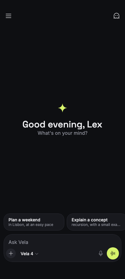
private fun Greeting(temporary: Boolean, modifier: Modifier = Modifier) {
Column(
modifier,
horizontalAlignment = Alignment.CenterHorizontally,
verticalArrangement = Arrangement.Center,
) {
if (temporary) {
Icon(Icons.Ghost, contentDescription = null, modifier = Modifier.size(36.dp))
Spacer(Modifier.height(Space * 4))
Text("Temporary chat", style = Theme.typography.display)
Text(
"This chat won't appear in your history or be used to improve Vela.",
color = Theme.colors.onBackgroundMuted,
style = Theme.typography.body.copy(textAlign = TextAlign.Center),
modifier = Modifier.widthIn(max = 300.dp),
)
} else {
Icon(
Icons.VelaMark,
contentDescription = null,
modifier = Modifier.size(36.dp),
tint = Theme.colors.primary,
)
Spacer(Modifier.height(Space * 4))
Text("Good evening, Lex", style = Theme.typography.display)
Text("What's on your mind?", color = Theme.colors.onBackgroundMuted)
}
}
}
@Composable
private fun Response(
turn: Turn,
latest: Boolean,
onCopy: () -> Unit,
onReadAloud: () -> Unit,
onRegenerate: () -> Unit,
onShare: () -> Unit,
modifier: Modifier = Modifier,
) {
var animatedHeight by remember { mutableIntStateOf(0) }
var contentHeight by remember { mutableIntStateOf(0) }
Column(
modifier
.fillMaxWidth()
.onSizeChanged { animatedHeight = it.height }
.animateContentSize()
.heightIn(min = with(LocalDensity.current) { turn.heightKeptWhileRegenerating.toDp() })
.onSizeChanged {
contentHeight = it.height
turn.height = it.height
},
verticalArrangement = Arrangement.spacedBy(Space * 3),
) {
if (turn.phase == Phase.Thinking || turn.thinkLonger) {
ThinkingIndicator(
thinking = turn.phase == Phase.Thinking,
seconds = if (turn.thinkLonger) 2 else 1,
thoughts = turn.response.thoughts,
)
}
if (turn.revealed > 0) Markdown(turn.answer.take(turn.revealed))
val responseEnded = turn.phase == Phase.Done || turn.phase == Phase.Stopped
val sizeAnimationCaughtUp = animatedHeight >= contentHeight
val showFooter = responseEnded && sizeAnimationCaughtUp
val footerAlpha by animateFloatAsState(if (showFooter) 1f else 0f, label = "Footer")
// The footer's space is reserved while streaming so newly wrapped lines land in it instead
// of being clipped.
if (turn.phase != Phase.Thinking)
Column(
Modifier.keepSpaceWhileHidden(hidden = !showFooter).graphicsLayer {
alpha = footerAlpha
},
verticalArrangement = Arrangement.spacedBy(Space * 3),
) {
MessageActions(
rating = turn.rating,
onCopy = onCopy,
onListen = onReadAloud,
onRate = { turn.rating = it },
onRegenerate = onRegenerate,
onShare = onShare,
)
if (latest || turn.phase == Phase.Stopped) {
Row(verticalAlignment = Alignment.CenterVertically) {
Icon(
Icons.VelaMark,
contentDescription = null,
modifier = Modifier.size(18.dp),
tint = Theme.colors.primary,
)
Spacer(Modifier.weight(1f))
Text(
if (turn.phase == Phase.Stopped) "You stopped this response."
else "Vela can make mistakes. Check important information.",
style = Theme.typography.caption,
color = Theme.colors.onBackgroundMuted,
)
}
}
}
}
}
private fun Modifier.keepSpaceWhileHidden(hidden: Boolean): Modifier =
if (!hidden) this
else
layout { measurable, constraints ->
val placeable = measurable.measure(constraints)
layout(placeable.width, placeable.height) {}
}
@Composable
private fun PhotoStrip(
selected: List<RecentPhoto>,
onCameraClick: () -> Unit,
onPhotoClick: (RecentPhoto) -> Unit,
modifier: Modifier = Modifier,
) {
LazyRow(modifier, horizontalArrangement = Arrangement.spacedBy(Space * 2)) {
item(key = "camera") {
UnstyledButton(
onClick = onCameraClick,
modifier =
Modifier.size(88.dp)
.clip(Theme.shapes.medium)
.background(Theme.colors.surfaceVariant),
indication = rememberRippleIndication(color = Theme.colors.onSurfaceVariant),
interactionSource = remember { MutableInteractionSource() },
) {
Column(
horizontalAlignment = Alignment.CenterHorizontally,
verticalArrangement = Arrangement.spacedBy(Space),
) {
Icon(Icons.Camera, contentDescription = null, modifier = Modifier.size(22.dp))
Text("Camera", style = Theme.typography.caption)
}
}
}
items(recentPhotos, key = { it.uri }) { photo ->
val isSelected = photo in selected
Box(
Modifier.size(88.dp)
.clip(Theme.shapes.medium)
.then(
if (isSelected)
Modifier.border(2.dp, Theme.colors.primary, Theme.shapes.medium)
else Modifier
)
.semantics {
role = Role.Checkbox
this.selected = isSelected
}
) {
UnstyledButton(
onClick = { onPhotoClick(photo) },
modifier = Modifier.fillMaxSize(),
indication = rememberRippleIndication(color = Color.White),
interactionSource = remember { MutableInteractionSource() },
) {
Image(
painter =
rememberUriPainter(
photo.uri,
crossfade = 300.milliseconds,
contentScale = ContentScale.Crop,
),
contentDescription = photo.description,
contentScale = ContentScale.Crop,
modifier = Modifier.fillMaxSize().background(Theme.colors.surfaceVariant),
)
}
if (isSelected) {
Box(
Modifier.align(Alignment.TopEnd)
.padding(Space * 1.5f)
.size(22.dp)
.clip(Theme.shapes.fullyRounded)
.background(Theme.colors.primary),
contentAlignment = Alignment.Center,
) {
Icon(
Icons.Check,
contentDescription = null,
modifier = Modifier.size(14.dp),
tint = Theme.colors.onPrimary,
)
}
}
}
}
}
}
@Composable
private fun ChatsDrawerContent(
history: List<Conversation>,
current: Conversation,
query: String,
onQueryChange: (String) -> Unit,
onNewChat: () -> Unit,
onOpen: (Conversation) -> Unit,
onOptions: (Conversation) -> Unit,
onProfileClick: () -> Unit,
onProjectsClick: () -> Unit,
modifier: Modifier = Modifier,
) {
val matches = history.filter { it.title.contains(query.trim(), ignoreCase = true) }
Column(modifier.fillMaxWidth()) {
Column(
Modifier.padding(horizontal = Space * 3).padding(top = Space * 3),
verticalArrangement = Arrangement.spacedBy(Space * 2),
) {
SearchField(query, onQueryChange, placeholder = "Search chats")
DrawerItem("New chat", onClick = onNewChat, icon = Icons.NotePencil)
DrawerItem("Projects", onClick = onProjectsClick, icon = Icons.Folder)
}
LazyColumn(
Modifier.weight(1f),
contentPadding = PaddingValues(horizontal = Space * 3, vertical = Space * 2),
) {
val sections =
listOfNotNull(
matches.filter { it.pinned }.takeIf { it.isNotEmpty() }?.let { "Pinned" to it }
) + matches.filterNot { it.pinned }.groupBy { it.period }.toList()
sections.forEach { (period, chats) ->
item(key = "period-$period") {
Text(
period,
style = Theme.typography.caption,
color = Theme.colors.onBackgroundMuted,
modifier =
Modifier.padding(start = Space * 3, top = Space * 4, bottom = Space * 2)
.animateItem(),
)
}
items(chats, key = { it.id }) { chat ->
DrawerItem(
chat.title,
onClick = { onOpen(chat) },
selected = chat == current,
onLongClick = { onOptions(chat) },
modifier = Modifier.animateItem(),
)
}
}
if (matches.isEmpty()) {
item(key = "no-matches") {
Text(
"No chats match \u201c${query.trim()}\u201d",
color = Theme.colors.onBackgroundMuted,
modifier = Modifier.padding(Space * 3).animateItem(),
)
}
}
}
Box(Modifier.fillMaxWidth().height(1.dp).background(Theme.colors.border))
UnstyledButton(
onClick = onProfileClick,
modifier = Modifier.fillMaxWidth(),
contentPadding = PaddingValues(horizontal = Space * 6, vertical = Space * 4),
contentAlignment = Alignment.CenterStart,
indication = rememberRippleIndication(color = Theme.colors.onSurface),
interactionSource = remember { MutableInteractionSource() },
) {
Row(
verticalAlignment = Alignment.CenterVertically,
horizontalArrangement = Arrangement.spacedBy(Space * 3),
) {
Avatar("Lex")
Column {
Text("Lex", style = Theme.typography.label)
Text(
"Free plan",
style = Theme.typography.caption,
color = Theme.colors.onBackgroundMuted,
)
}
}
}
}
}
package com.composables.vela

data class Model(
    val id: String,
    val name: String,
    val description: String,
    val badge: String? = null,
    val available: Boolean = true,
)

val models =
    listOf(
        Model("pro", "Vela 4 Pro", "Deepest reasoning for complex work", badge = "Pro"),
        Model("standard", "Vela 4", "Fast and capable for everyday tasks"),
        Model("mini", "Vela 4 Mini", "Quickest for short answers"),
        Model("legacy", "Vela 3.5", "Temporarily unavailable", available = false),
    )

data class RecentPhoto(val uri: String, val description: String)

val recentPhotos =
    listOf(
        RecentPhoto(
            "https://images.unsplash.com/photo-1517842645767-c639042777db?fit=crop&w=400&h=400&q=80",
            "Notebook and fountain pen",
        ),
        RecentPhoto(
            "https://images.unsplash.com/photo-1768055105012-4c53791b2877?fit=crop&w=400&h=400&q=80",
            "Handwritten to-do list",
        ),
        RecentPhoto(
            "https://images.unsplash.com/photo-1556403806-90f55c9db1e1?fit=crop&w=400&h=400&q=80",
            "Chips with lemon",
        ),
        RecentPhoto(
            "https://images.unsplash.com/photo-1765850259234-9f93380dc29d?fit=crop&w=400&h=400&q=80",
            "Food truck under trees",
        ),
        RecentPhoto(
            "https://images.unsplash.com/photo-1587951326187-c9baa4606bff?fit=crop&w=400&h=400&q=80",
            "Meadow below snowy peaks",
        ),
        RecentPhoto(
            "https://images.unsplash.com/photo-1504280317859-9c6cce36bca8?fit=crop&w=400&h=400&q=80",
            "Boardwalk toward a mountain",
        ),
    )

data class Suggestion(val title: String, val description: String, val prompt: String)

val suggestions =
    listOf(
        Suggestion(
            "Plan a weekend",
            "in Lisbon, at an easy pace",
            "Plan a relaxed 3-day weekend in Lisbon",
        ),
        Suggestion(
            "Explain a concept",
            "recursion, with a small example",
            "Explain recursion with a short Kotlin example",
        ),
        Suggestion(
            "Write an email",
            "a polite follow-up after an interview",
            "Draft a short, polite follow-up email after a job interview",
        ),
        Suggestion("Help me decide", "between two job offers", "Help me compare two job offers"),
    )

data class SampleResponse(val variants: List<String>, val thoughts: String)

internal fun responseFor(prompt: String, hasImages: Boolean): SampleResponse =
    when {
        hasImages -> photoResponse
        prompt.contains("Lisbon", ignoreCase = true) -> lisbonResponse
        prompt.contains("recursion", ignoreCase = true) -> recursionResponse
        prompt.contains("email", ignoreCase = true) -> emailResponse
        prompt.contains("pack", ignoreCase = true) -> packingResponse
        prompt.contains("offer", ignoreCase = true) -> offersResponse
        else -> generalResponse
    }

internal val lisbonResponse =
    SampleResponse(
        thoughts =
            "They want a relaxed pace, so fewer sights per day and neighbourhoods that are close together. Group by area to cut down on hills and transit.",
        variants =
            listOf(
                """
                Here's an unhurried three days, grouped by neighbourhood so you walk more and wait less.

                ## Day 1 — Alfama and the castle
                - **Morning:** Wander Alfama's lanes before the crowds, then climb to Castelo de São Jorge.
                - **Lunch:** Grilled sardines at a small tasca near Largo do Chafariz de Dentro.
                - **Evening:** Sunset at Miradouro da Senhora do Monte, then fado in Alfama.

                ## Day 2 — Belém by the river
                - **Morning:** Jerónimos Monastery, then pastéis de nata while they're warm.
                - **Afternoon:** Stroll the riverfront to the MAAT.
                - **Evening:** Dinner in Cais do Sodré.

                ## Day 3 — Slow day
                - Coffee in Príncipe Real and the Sunday market if it's on.
                - A long lunch, then tram 28 for the views rather than speed.

                Book the castle and Jerónimos tickets online — it saves the longest queues.
                """
                    .trimIndent(),
                """
                A gentle plan with one main area per day:

                1. **Alfama** — castle, viewpoints and an evening of fado.
                2. **Belém** — monastery, riverside walk and the famous custard tarts.
                3. **Príncipe Real and Chiado** — shops, gardens and a long lunch.

                Wear shoes with grip; the limestone pavements get slippery.
                """
                    .trimIndent(),
            ),
    )

internal val packingResponse =
    SampleResponse(
        thoughts =
            "Late October in Lisbon is mild with some rain. Layers and a light waterproof matter more than warm clothes.",
        variants =
            listOf(
                """
                Late October is mild — usually 15–22°C — with a chance of showers. Pack in layers:

                - **A light waterproof jacket** for passing rain.
                - **A sweater or overshirt** for evenings by the river.
                - **Comfortable shoes with grip** — the cobbles are steep and smooth.
                - **Sunglasses**; the light is still bright.

                Leave the heavy coat at home.
                """
                    .trimIndent()
            ),
    )

internal val recursionResponse =
    SampleResponse(
        thoughts =
            "Use a function that calls itself with a smaller input and a clear base case. Factorial is the clearest first example.",
        variants =
            listOf(
                """
                **Recursion** is when a function solves a problem by calling itself on a smaller version of the same problem, until it reaches a case simple enough to answer directly.

                ## Example

                ```
                fun factorial(n: Int): Int =
                    if (n <= 1) 1
                    else n * factorial(n - 1)
                ```

                Calling `factorial(4)` unfolds like this:

                1. `factorial(4)` needs `factorial(3)`
                2. `factorial(3)` needs `factorial(2)`
                3. `factorial(2)` needs `factorial(1)`, which returns `1`

                Then the answers multiply back up: 2, 6, 24.

                Every recursive function needs a **base case** — here `n <= 1` — or it never stops.
                """
                    .trimIndent()
            ),
    )

internal val emailResponse =
    SampleResponse(
        thoughts =
            "Keep it short: thanks, one specific detail from the conversation, renewed interest, and an easy close.",
        variants =
            listOf(
                """
                **Subject:** Thank you — Product Designer interview

                Hi Sam,

                Thank you for taking the time to speak with me yesterday. I enjoyed hearing how the team approaches research, and it made me even more excited about the role.

                If there's anything else you need from me, I'm happy to send it over. I look forward to hearing about next steps.

                Best regards,
                Lex
                """
                    .trimIndent(),
                """
                **Subject:** Following up on our conversation

                Hi Sam,

                Thanks again for the interview on Tuesday. I wanted to follow up and say I'm still very interested in the position. Please let me know if I can provide anything else.

                Kind regards,
                Lex
                """
                    .trimIndent(),
            ),
    )

internal val offersResponse =
    SampleResponse(
        thoughts =
            "Without details, give a structure for comparing offers and ask for the specifics.",
        variants =
            listOf(
                """
                Happy to help. Compare them on what will matter in a year, not just on day one:

                - **Pay and benefits** — base, bonus, equity, pension and leave.
                - **The work** — which role teaches you more?
                - **The people** — how did your future manager make you feel?
                - **Day to day** — commute, hours and flexibility.

                Tell me about both offers and I'll lay them side by side.
                """
                    .trimIndent()
            ),
    )

internal val photoResponse =
    SampleResponse(
        thoughts = "Describe what is visible, then offer something useful to do with it.",
        variants =
            listOf(
                """
                Here's what I can see in your photo:

                - The main subject is in sharp focus, with soft light from the left.
                - The background is simple, which keeps attention on the subject.

                Would you like a caption, a short description for alt text, or ideas for what to do next?
                """
                    .trimIndent()
            ),
    )

internal val generalResponse =
    SampleResponse(
        thoughts = "Answer briefly and offer to go deeper.",
        variants =
            listOf(
                """
                Good question. Here's the short version:

                - Start with what you already know and what you need to decide.
                - Break the problem into the smallest next step.
                - Check the result before moving on.

                Tell me a little more and I'll tailor this to your situation.
                """
                    .trimIndent()
            ),
    )

data class SampleChat(
    val title: String,
    val period: String,
    val turns: List<Pair<String, SampleResponse>>,
)

val sampleChats =
    listOf(
        SampleChat(
            "Lisbon weekend",
            "Today",
            listOf(
                "Plan a relaxed 3-day weekend in Lisbon" to lisbonResponse,
                "What should I pack for late October?" to packingResponse,
            ),
        ),
        SampleChat(
            "Recursion in Kotlin",
            "Yesterday",
            listOf("Explain recursion with a short Kotlin example" to recursionResponse),
        ),
        SampleChat(
            "Interview follow-up",
            "Previous 7 days",
            listOf("Draft a short, polite follow-up email after a job interview" to emailResponse),
        ),
        SampleChat(
            "Comparing job offers",
            "Previous 7 days",
            listOf("Help me compare two job offers" to offersResponse),
        ),
        SampleChat(
            "Sourdough starter smells sharp",
            "Previous 30 days",
            listOf(
                "My sourdough starter smells like nail polish. Is it ruined?" to generalResponse
            ),
        ),
        SampleChat(
            "Learning European Portuguese",
            "Previous 30 days",
            listOf("How should I start learning European Portuguese?" to generalResponse),
        ),
        SampleChat(
            "Gift ideas for my sister",
            "Previous 30 days",
            listOf("Gift ideas for my sister, who loves hiking and tea" to generalResponse),
        ),
    )
package com.composables.vela.components

import androidx.compose.animation.fadeIn
import androidx.compose.animation.fadeOut
import androidx.compose.animation.scaleIn
import androidx.compose.animation.scaleOut
import androidx.compose.foundation.background
import androidx.compose.foundation.layout.Arrangement
import androidx.compose.foundation.layout.Box
import androidx.compose.foundation.layout.Column
import androidx.compose.foundation.layout.ColumnScope
import androidx.compose.foundation.layout.fillMaxSize
import androidx.compose.foundation.layout.fillMaxWidth
import androidx.compose.foundation.layout.padding
import androidx.compose.foundation.layout.widthIn
import androidx.compose.runtime.Composable
import androidx.compose.ui.Alignment
import androidx.compose.ui.Modifier
import androidx.compose.ui.draw.clip
import androidx.compose.ui.graphics.Color
import androidx.compose.ui.unit.dp
import com.composables.vela.theme.ProvideContentColor
import com.composables.vela.theme.Space
import com.composables.vela.theme.Theme
import com.composeunstyled.DialogPanel
import com.composeunstyled.Scrim
import com.composeunstyled.UnstyledDialog

@Composable
fun AlertDialog(
    visible: Boolean,
    title: String,
    message: String,
    onDismissRequest: () -> Unit,
    modifier: Modifier = Modifier,
    actions: @Composable ColumnScope.() -> Unit,
) {
    UnstyledDialog(
        visible = visible,
        onDismissRequest = onDismissRequest,
        overlay = {
            Scrim(scrimColor = Color.Black.copy(alpha = 0.6f), enter = fadeIn(), exit = fadeOut())
        },
    ) {
        Box(Modifier.fillMaxSize(), contentAlignment = Alignment.Center) {
            DialogPanel(
                modifier =
                    modifier
                        .padding(Space * 6)
                        .widthIn(max = 400.dp)
                        .clip(Theme.shapes.large)
                        .background(Theme.colors.surface),
                paneTitle = title,
                enter = scaleIn(initialScale = 0.94f) + fadeIn(),
                exit = scaleOut(targetScale = 0.94f) + fadeOut(),
            ) {
                ProvideContentColor(Theme.colors.onSurface) {
                    Column(Modifier.padding(Space * 6)) {
                        Text(title, style = Theme.typography.title)
                        Text(
                            message,
                            color = Theme.colors.onBackgroundMuted,
                            modifier = Modifier.padding(top = Space * 2),
                        )
                        Column(
                            Modifier.fillMaxWidth().padding(top = Space * 6),
                            verticalArrangement = Arrangement.spacedBy(Space * 2),
                            content = actions,
                        )
                    }
                }
            }
        }
    }
}
package com.composables.vela.components

import androidx.compose.foundation.background
import androidx.compose.foundation.layout.Arrangement
import androidx.compose.foundation.layout.Box
import androidx.compose.foundation.layout.Row
import androidx.compose.foundation.layout.RowScope
import androidx.compose.foundation.layout.WindowInsets
import androidx.compose.foundation.layout.WindowInsetsSides
import androidx.compose.foundation.layout.fillMaxWidth
import androidx.compose.foundation.layout.height
import androidx.compose.foundation.layout.only
import androidx.compose.foundation.layout.padding
import androidx.compose.foundation.layout.safeDrawing
import androidx.compose.foundation.layout.statusBars
import androidx.compose.foundation.layout.union
import androidx.compose.foundation.layout.windowInsetsPadding
import androidx.compose.runtime.Composable
import androidx.compose.ui.Alignment
import androidx.compose.ui.Modifier
import androidx.compose.ui.input.pointer.pointerInput
import androidx.compose.ui.layout.Layout
import androidx.compose.ui.unit.Constraints
import androidx.compose.ui.unit.dp
import com.composables.vela.theme.ProvideTextStyle
import com.composables.vela.theme.Space
import com.composables.vela.theme.Theme

@Composable
fun AppBar(
    modifier: Modifier = Modifier,
    navigation: @Composable () -> Unit = {},
    title: @Composable () -> Unit = {},
    actions: @Composable RowScope.() -> Unit = {},
) {
    val gap = Space * 2
    Layout(
        content = {
            Box { navigation() }
            Box { ProvideTextStyle(Theme.typography.title, title) }
            Row(
                horizontalArrangement = Arrangement.spacedBy(Space),
                verticalAlignment = Alignment.CenterVertically,
            ) {
                actions()
            }
        },
        modifier =
            modifier
                .fillMaxWidth()
                .background(Theme.colors.background)
                .blockTouchesToContentBehind()
                .windowInsetsPadding(
                    WindowInsets.statusBars.union(
                        WindowInsets.safeDrawing.only(WindowInsetsSides.Horizontal)
                    )
                )
                .height(56.dp)
                .padding(horizontal = Space * 2),
    ) { (navigationSlot, titleSlot, actionsSlot), constraints ->
        val loose = constraints.copy(minWidth = 0, minHeight = 0)
        val navigationPlaceable = navigationSlot.measure(loose)
        val actionsPlaceable = actionsSlot.measure(loose)
        val side = maxOf(navigationPlaceable.width, actionsPlaceable.width) + gap.roundToPx()
        val titleWidth = (constraints.maxWidth - side * 2).coerceAtLeast(0)
        val titlePlaceable =
            titleSlot.measure(Constraints(maxWidth = titleWidth, maxHeight = constraints.maxHeight))
        val height = constraints.maxHeight
        layout(constraints.maxWidth, height) {
            navigationPlaceable.place(0, (height - navigationPlaceable.height) / 2)
            titlePlaceable.place(
                (constraints.maxWidth - titlePlaceable.width) / 2,
                (height - titlePlaceable.height) / 2,
            )
            actionsPlaceable.place(
                constraints.maxWidth - actionsPlaceable.width,
                (height - actionsPlaceable.height) / 2,
            )
        }
    }
}

private fun Modifier.blockTouchesToContentBehind() = pointerInput(Unit) {}
package com.composables.vela.components

import androidx.compose.foundation.Image
import androidx.compose.foundation.background
import androidx.compose.foundation.layout.Box
import androidx.compose.foundation.layout.offset
import androidx.compose.foundation.layout.padding
import androidx.compose.foundation.layout.size
import androidx.compose.runtime.Composable
import androidx.compose.ui.Alignment
import androidx.compose.ui.Modifier
import androidx.compose.ui.draw.clip
import androidx.compose.ui.layout.ContentScale
import androidx.compose.ui.unit.dp
import com.composables.uripainter.rememberUriPainter
import com.composables.vela.theme.Icons
import com.composables.vela.theme.Theme
import com.composables.vela.theme.X
import kotlin.time.Duration.Companion.milliseconds

@Composable
fun AttachmentChip(
    imageUri: String,
    contentDescription: String,
    onRemove: () -> Unit,
    modifier: Modifier = Modifier,
) {
    Box(modifier.padding(top = 6.dp, end = 6.dp)) {
        Image(
            painter =
                rememberUriPainter(
                    imageUri,
                    crossfade = 300.milliseconds,
                    contentScale = ContentScale.Crop,
                ),
            contentDescription = contentDescription,
            contentScale = ContentScale.Crop,
            modifier =
                Modifier.size(56.dp)
                    .clip(Theme.shapes.small)
                    .background(Theme.colors.surfaceVariant),
        )
        IconButton(
            onClick = onRemove,
            contentDescription = "Remove $contentDescription",
            variant = IconButtonVariant.Tonal,
            size = IconButtonSize.Small,
            modifier = Modifier.align(Alignment.TopEnd).offset(x = 10.dp, y = (-10).dp).size(24.dp),
        ) {
            Icon(Icons.X, contentDescription = null, modifier = Modifier.size(12.dp))
        }
    }
}
package com.composables.vela.components

import androidx.compose.foundation.background
import androidx.compose.foundation.layout.Box
import androidx.compose.foundation.layout.size
import androidx.compose.runtime.Composable
import androidx.compose.ui.Alignment
import androidx.compose.ui.Modifier
import androidx.compose.ui.draw.clip
import androidx.compose.ui.semantics.clearAndSetSemantics
import androidx.compose.ui.unit.dp
import com.composables.vela.theme.Theme

@Composable
fun Avatar(
    name: String,
    modifier: Modifier = Modifier,
) {
    Box(
        modifier
            .size(32.dp)
            .clip(Theme.shapes.fullyRounded)
            .background(Theme.colors.primary)
            .clearAndSetSemantics {},
        contentAlignment = Alignment.Center,
    ) {
        Text(
            name.take(1).uppercase(),
            style = Theme.typography.label,
            color = Theme.colors.onPrimary,
        )
    }
}
package com.composables.vela.components

import androidx.compose.foundation.background
import androidx.compose.foundation.interaction.MutableInteractionSource
import androidx.compose.foundation.layout.PaddingValues
import androidx.compose.runtime.Composable
import androidx.compose.runtime.remember
import androidx.compose.ui.Modifier
import androidx.compose.ui.draw.alpha
import androidx.compose.ui.draw.clip
import androidx.compose.ui.graphics.Color
import com.composables.compose.ripple.rememberRippleIndication
import com.composables.vela.theme.ProvideContentColor
import com.composables.vela.theme.ProvideTextStyle
import com.composables.vela.theme.Space
import com.composables.vela.theme.Theme
import com.composeunstyled.UnstyledButton

enum class ButtonVariant {
    Primary,
    Secondary,
    Destructive,
    Ghost,
}

@Composable
fun Button(
    onClick: () -> Unit,
    modifier: Modifier = Modifier,
    enabled: Boolean = true,
    variant: ButtonVariant = ButtonVariant.Primary,
    content: @Composable () -> Unit,
) {
    val (container, contentColor) =
        when (variant) {
            ButtonVariant.Secondary -> Theme.colors.surfaceVariant to Theme.colors.onSurfaceVariant
            ButtonVariant.Destructive -> Theme.colors.destructive to Theme.colors.onDestructive
            ButtonVariant.Ghost -> Color.Transparent to Theme.colors.primary
            else -> Theme.colors.primary to Theme.colors.onPrimary
        }
    UnstyledButton(
        onClick = onClick,
        enabled = enabled,
        modifier =
            modifier
                .alpha(if (enabled) 1f else 0.4f)
                .clip(Theme.shapes.fullyRounded)
                .background(container),
        contentPadding = PaddingValues(horizontal = Space * 5, vertical = Space * 3),
        indication = rememberRippleIndication(color = contentColor),
        interactionSource = remember { MutableInteractionSource() },
    ) {
        ProvideContentColor(contentColor) { ProvideTextStyle(Theme.typography.label, content) }
    }
}
package com.composables.vela.components

import androidx.compose.animation.AnimatedContent
import androidx.compose.animation.fadeIn
import androidx.compose.animation.fadeOut
import androidx.compose.animation.scaleIn
import androidx.compose.animation.scaleOut
import androidx.compose.animation.togetherWith
import androidx.compose.foundation.background
import androidx.compose.foundation.border
import androidx.compose.foundation.horizontalScroll
import androidx.compose.foundation.layout.Arrangement
import androidx.compose.foundation.layout.Box
import androidx.compose.foundation.layout.Column
import androidx.compose.foundation.layout.Row
import androidx.compose.foundation.layout.RowScope
import androidx.compose.foundation.layout.Spacer
import androidx.compose.foundation.layout.fillMaxWidth
import androidx.compose.foundation.layout.padding
import androidx.compose.foundation.layout.size
import androidx.compose.foundation.rememberScrollState
import androidx.compose.foundation.text.BasicTextField
import androidx.compose.runtime.Composable
import androidx.compose.ui.Alignment
import androidx.compose.ui.Modifier
import androidx.compose.ui.draw.clip
import androidx.compose.ui.graphics.SolidColor
import androidx.compose.ui.semantics.contentDescription
import androidx.compose.ui.semantics.semantics
import androidx.compose.ui.unit.dp
import com.composables.vela.theme.ArrowUp
import com.composables.vela.theme.Icons
import com.composables.vela.theme.Microphone
import com.composables.vela.theme.Plus
import com.composables.vela.theme.Space
import com.composables.vela.theme.Stop
import com.composables.vela.theme.Theme
import com.composables.vela.theme.Waveform

@Composable
fun Composer(
    value: String,
    onValueChange: (String) -> Unit,
    model: String,
    responding: Boolean,
    canSend: Boolean,
    onSend: () -> Unit,
    onStop: () -> Unit,
    onAddClick: () -> Unit,
    onModelClick: () -> Unit,
    onDictateClick: () -> Unit,
    onVoiceClick: () -> Unit,
    modifier: Modifier = Modifier,
    placeholder: String = "Ask Vela",
    accessories: (@Composable RowScope.() -> Unit)? = null,
) {
    Column(
        modifier
            .fillMaxWidth()
            .clip(Theme.shapes.large)
            .background(Theme.colors.surface)
            .border(1.dp, Theme.colors.border, Theme.shapes.large)
            .padding(Space * 2)
    ) {
        if (accessories != null) {
            Row(
                Modifier.fillMaxWidth()
                    .horizontalScroll(rememberScrollState())
                    .padding(horizontal = Space * 2, vertical = Space),
                horizontalArrangement = Arrangement.spacedBy(Space * 2),
                verticalAlignment = Alignment.CenterVertically,
                content = accessories,
            )
        }
        BasicTextField(
            value = value,
            onValueChange = onValueChange,
            modifier = Modifier.fillMaxWidth().semantics { contentDescription = placeholder },
            textStyle = Theme.typography.body.copy(color = Theme.colors.onSurface),
            cursorBrush = SolidColor(Theme.colors.primary),
            maxLines = 6,
            decorationBox = { field ->
                Box(Modifier.padding(horizontal = Space * 2, vertical = Space * 2)) {
                    if (value.isEmpty()) Text(placeholder, color = Theme.colors.onBackgroundMuted)
                    field()
                }
            },
        )
        Row(
            verticalAlignment = Alignment.CenterVertically,
            horizontalArrangement = Arrangement.spacedBy(Space),
        ) {
            IconButton(
                onClick = onAddClick,
                contentDescription = "Add to chat",
                variant = IconButtonVariant.Tonal,
                size = IconButtonSize.Small,
            ) {
                Icon(Icons.Plus, contentDescription = null, modifier = Modifier.size(18.dp))
            }
            ModelPill(model = model, onClick = onModelClick)
            Spacer(Modifier.weight(1f))
            if (!responding) {
                IconButton(
                    onClick = onDictateClick,
                    contentDescription = "Dictate",
                    size = IconButtonSize.Small,
                ) {
                    Icon(
                        Icons.Microphone,
                        contentDescription = null,
                        modifier = Modifier.size(20.dp),
                        tint = Theme.colors.onBackgroundMuted,
                    )
                }
            }
            AnimatedContent(
                targetState =
                    when {
                        responding -> MainAction.Stop
                        canSend -> MainAction.Send
                        else -> MainAction.Voice
                    },
                transitionSpec = {
                    (fadeIn() + scaleIn(initialScale = 0.8f)) togetherWith
                        (fadeOut() + scaleOut(targetScale = 0.8f))
                },
                label = "Send, stop or voice",
            ) { action ->
                when (action) {
                    MainAction.Stop ->
                        IconButton(
                            onClick = onStop,
                            contentDescription = "Stop response",
                            variant = IconButtonVariant.Tonal,
                        ) {
                            Icon(
                                Icons.Stop,
                                contentDescription = null,
                                modifier = Modifier.size(16.dp),
                            )
                        }
                    MainAction.Send ->
                        IconButton(
                            onClick = onSend,
                            contentDescription = "Send",
                            variant = IconButtonVariant.Filled,
                        ) {
                            Icon(
                                Icons.ArrowUp,
                                contentDescription = null,
                                modifier = Modifier.size(20.dp),
                            )
                        }
                    MainAction.Voice ->
                        IconButton(
                            onClick = onVoiceClick,
                            contentDescription = "Voice chat",
                            variant = IconButtonVariant.Filled,
                        ) {
                            Icon(
                                Icons.Waveform,
                                contentDescription = null,
                                modifier = Modifier.size(20.dp),
                            )
                        }
                }
            }
        }
    }
}

private enum class MainAction {
    Send,
    Stop,
    Voice,
}
package com.composables.vela.components

import androidx.compose.foundation.background
import androidx.compose.foundation.combinedClickable
import androidx.compose.foundation.interaction.MutableInteractionSource
import androidx.compose.foundation.layout.Arrangement
import androidx.compose.foundation.layout.Box
import androidx.compose.foundation.layout.Row
import androidx.compose.foundation.layout.fillMaxWidth
import androidx.compose.foundation.layout.padding
import androidx.compose.foundation.layout.size
import androidx.compose.runtime.Composable
import androidx.compose.runtime.remember
import androidx.compose.ui.Alignment
import androidx.compose.ui.Modifier
import androidx.compose.ui.draw.clip
import androidx.compose.ui.graphics.Color
import androidx.compose.ui.graphics.vector.ImageVector
import androidx.compose.ui.semantics.Role
import androidx.compose.ui.semantics.selected
import androidx.compose.ui.semantics.semantics
import androidx.compose.ui.text.style.TextOverflow
import androidx.compose.ui.unit.dp
import com.composables.compose.ripple.rememberRippleIndication
import com.composables.vela.theme.Space
import com.composables.vela.theme.Theme

@Composable
fun DrawerItem(
    label: String,
    onClick: () -> Unit,
    modifier: Modifier = Modifier,
    icon: ImageVector? = null,
    selected: Boolean = false,
    onLongClick: (() -> Unit)? = null,
) {
    // Foundation's combinedClickable adds the long press that UnstyledButton doesn't offer.
    Box(
        modifier
            .fillMaxWidth()
            .clip(Theme.shapes.small)
            .background(if (selected) Theme.colors.surfaceVariant else Color.Transparent)
            .combinedClickable(
                interactionSource = remember { MutableInteractionSource() },
                indication = rememberRippleIndication(color = Theme.colors.onSurface),
                role = Role.Button,
                onLongClickLabel = if (onLongClick != null) "Chat options" else null,
                onLongClick = onLongClick,
                onClick = onClick,
            )
            .semantics { this.selected = selected }
            .padding(horizontal = Space * 3, vertical = Space * 2.5f),
        contentAlignment = Alignment.CenterStart,
    ) {
        Row(
            verticalAlignment = Alignment.CenterVertically,
            horizontalArrangement = Arrangement.spacedBy(Space * 3),
        ) {
            if (icon != null) Icon(icon, contentDescription = null, modifier = Modifier.size(20.dp))
            Text(
                label,
                style = if (icon != null) Theme.typography.label else Theme.typography.body,
                maxLines = 1,
                overflow = TextOverflow.Ellipsis,
            )
        }
    }
}
package com.composables.vela.components

import androidx.compose.runtime.Composable
import androidx.compose.ui.Modifier
import androidx.compose.ui.graphics.Color
import androidx.compose.ui.graphics.isSpecified
import androidx.compose.ui.graphics.vector.ImageVector
import com.composables.vela.theme.LocalContentColor
import com.composeunstyled.UnstyledIcon

@Composable
fun Icon(
    imageVector: ImageVector,
    contentDescription: String?,
    modifier: Modifier = Modifier,
    tint: Color = LocalContentColor.current,
) {
    val resolvedTint = if (tint.isSpecified) tint else LocalContentColor.current
    UnstyledIcon(
        imageVector = imageVector,
        contentDescription = contentDescription,
        modifier = modifier,
        tint = resolvedTint,
    )
}
package com.composables.vela.components

import androidx.compose.foundation.background
import androidx.compose.foundation.interaction.MutableInteractionSource
import androidx.compose.foundation.layout.size
import androidx.compose.runtime.Composable
import androidx.compose.runtime.remember
import androidx.compose.ui.Modifier
import androidx.compose.ui.draw.alpha
import androidx.compose.ui.draw.clip
import androidx.compose.ui.graphics.Color
import androidx.compose.ui.semantics.contentDescription
import androidx.compose.ui.semantics.semantics
import androidx.compose.ui.unit.dp
import com.composables.compose.ripple.rememberRippleIndication
import com.composables.vela.theme.LocalContentColor
import com.composables.vela.theme.ProvideContentColor
import com.composables.vela.theme.Theme
import com.composeunstyled.UnstyledButton

enum class IconButtonVariant {
    Ghost,
    Filled,
    Tonal,
}

enum class IconButtonSize {
    Small,
    Medium,
}

@Composable
fun IconButton(
    onClick: () -> Unit,
    contentDescription: String,
    modifier: Modifier = Modifier,
    enabled: Boolean = true,
    variant: IconButtonVariant = IconButtonVariant.Ghost,
    size: IconButtonSize = IconButtonSize.Medium,
    content: @Composable () -> Unit,
) {
    val (container, contentColor) =
        when {
            variant == IconButtonVariant.Filled && !enabled ->
                Theme.colors.surfaceVariant to Theme.colors.onBackgroundMuted
            variant == IconButtonVariant.Filled -> Theme.colors.primary to Theme.colors.onPrimary
            variant == IconButtonVariant.Tonal ->
                Theme.colors.surfaceVariant to Theme.colors.onSurfaceVariant
            else -> Color.Transparent to LocalContentColor.current
        }
    UnstyledButton(
        onClick = onClick,
        enabled = enabled,
        modifier =
            modifier
                .alpha(if (enabled || variant == IconButtonVariant.Filled) 1f else 0.4f)
                .size(if (size == IconButtonSize.Small) 32.dp else 40.dp)
                .clip(Theme.shapes.fullyRounded)
                .background(container)
                .semantics { this.contentDescription = contentDescription },
        indication = rememberRippleIndication(color = contentColor),
        interactionSource = remember { MutableInteractionSource() },
    ) {
        ProvideContentColor(contentColor, content)
    }
}
package com.composables.vela.components

import androidx.compose.foundation.background
import androidx.compose.foundation.horizontalScroll
import androidx.compose.foundation.layout.Arrangement
import androidx.compose.foundation.layout.Column
import androidx.compose.foundation.layout.Row
import androidx.compose.foundation.layout.fillMaxWidth
import androidx.compose.foundation.layout.padding
import androidx.compose.foundation.layout.widthIn
import androidx.compose.foundation.rememberScrollState
import androidx.compose.foundation.text.BasicText
import androidx.compose.runtime.Composable
import androidx.compose.runtime.remember
import androidx.compose.ui.Modifier
import androidx.compose.ui.draw.clip
import androidx.compose.ui.text.AnnotatedString
import androidx.compose.ui.text.SpanStyle
import androidx.compose.ui.text.buildAnnotatedString
import androidx.compose.ui.text.font.FontWeight
import androidx.compose.ui.text.withStyle
import com.composables.vela.theme.LocalContentColor
import com.composables.vela.theme.Space
import com.composables.vela.theme.Theme

@Composable
fun Markdown(
    text: String,
    modifier: Modifier = Modifier,
) {
    val blocks = remember(text) { parseBlocks(text) }
    val codeStyle =
        SpanStyle(
            fontFamily = Theme.typography.code.fontFamily,
            fontSize = Theme.typography.code.fontSize,
            background = Theme.colors.surfaceVariant,
        )
    Column(modifier.fillMaxWidth(), verticalArrangement = Arrangement.spacedBy(Space * 3)) {
        blocks.forEach { block ->
            when (block) {
                is Block.Heading ->
                    Text(inline(block.text, codeStyle).text, style = Theme.typography.title)
                is Block.Paragraph -> InlineText(inline(block.text, codeStyle))
                is Block.ListItems ->
                    Column(verticalArrangement = Arrangement.spacedBy(Space * 2)) {
                        block.items.forEachIndexed { index, item ->
                            Row {
                                Text(
                                    if (block.ordered) "${index + 1}." else "•",
                                    color = Theme.colors.onBackgroundMuted,
                                    modifier = Modifier.widthIn(min = Space * 6),
                                )
                                InlineText(inline(item, codeStyle))
                            }
                        }
                    }
                is Block.Code ->
                    Text(
                        block.code,
                        style = Theme.typography.code,
                        softWrap = false,
                        modifier =
                            Modifier.fillMaxWidth()
                                .clip(Theme.shapes.small)
                                .background(Theme.colors.surface)
                                .horizontalScroll(rememberScrollState())
                                .padding(Space * 4),
                    )
            }
        }
    }
}

@Composable
private fun InlineText(text: AnnotatedString) {
    BasicText(text, style = Theme.typography.body.copy(color = LocalContentColor.current))
}

private sealed interface Block {
    data class Heading(val text: String) : Block

    data class Paragraph(val text: String) : Block

    data class ListItems(val ordered: Boolean, val items: List<String>) : Block

    data class Code(val code: String) : Block
}

private val orderedItem = Regex("""^\d+\.\s+""")

private fun parseBlocks(text: String): List<Block> {
    val blocks = mutableListOf<Block>()
    val lines = text.lines()
    var index = 0
    while (index < lines.size) {
        val line = lines[index]
        when {
            line.startsWith("```") -> {
                val code = mutableListOf<String>()
                index++
                while (index < lines.size && !lines[index].startsWith("```")) code += lines[index++]
                blocks += Block.Code(code.joinToString("\n"))
            }
            line.startsWith("#") -> blocks += Block.Heading(line.trimStart('#').trim())
            line.startsWith("- ") || orderedItem.containsMatchIn(line) -> {
                val ordered = !line.startsWith("- ")
                val items = mutableListOf<String>()
                while (
                    index < lines.size &&
                        (if (ordered) orderedItem.containsMatchIn(lines[index])
                        else lines[index].startsWith("- "))
                ) {
                    items +=
                        if (ordered) lines[index].replace(orderedItem, "")
                        else lines[index].removePrefix("- ")
                    index++
                }
                blocks += Block.ListItems(ordered, items)
                continue
            }
            line.isNotBlank() -> {
                val paragraph = mutableListOf(line)
                while (
                    index + 1 < lines.size &&
                        lines[index + 1].isNotBlank() &&
                        !startsBlock(lines[index + 1])
                ) paragraph += lines[++index]
                blocks += Block.Paragraph(paragraph.joinToString(" "))
            }
        }
        index++
    }
    return blocks
}

private fun startsBlock(line: String) =
    line.startsWith("```") ||
        line.startsWith("#") ||
        line.startsWith("- ") ||
        orderedItem.containsMatchIn(line)

private fun inline(text: String, codeStyle: SpanStyle): AnnotatedString = buildAnnotatedString {
    var index = 0
    while (index < text.length) {
        when {
            text.startsWith("**", index) -> {
                val end = text.indexOf("**", index + 2).takeIf { it >= 0 } ?: text.length
                withStyle(SpanStyle(fontWeight = FontWeight.SemiBold)) {
                    append(text.substring(index + 2, end))
                }
                index = end + 2
            }
            text[index] == '`' -> {
                val end = text.indexOf('`', index + 1).takeIf { it >= 0 } ?: text.length
                withStyle(codeStyle) { append(" ${text.substring(index + 1, end)} ") }
                index = end + 1
            }
            else -> append(text[index++])
        }
    }
}
package com.composables.vela.components

import androidx.compose.foundation.layout.Arrangement
import androidx.compose.foundation.layout.Row
import androidx.compose.foundation.layout.size
import androidx.compose.runtime.Composable
import androidx.compose.ui.Modifier
import androidx.compose.ui.graphics.vector.ImageVector
import androidx.compose.ui.unit.dp
import com.composables.vela.theme.ArrowClockwise
import com.composables.vela.theme.Copy
import com.composables.vela.theme.Export
import com.composables.vela.theme.Icons
import com.composables.vela.theme.SpeakerHigh
import com.composables.vela.theme.Theme
import com.composables.vela.theme.ThumbsDown
import com.composables.vela.theme.ThumbsDownFill
import com.composables.vela.theme.ThumbsUp
import com.composables.vela.theme.ThumbsUpFill

enum class Rating {
    None,
    Liked,
    Disliked,
}

@Composable
fun MessageActions(
    rating: Rating,
    onCopy: () -> Unit,
    onListen: () -> Unit,
    onRate: (Rating) -> Unit,
    onRegenerate: () -> Unit,
    onShare: () -> Unit,
    modifier: Modifier = Modifier,
) {
    Row(modifier, horizontalArrangement = Arrangement.spacedBy(2.dp)) {
        Action(Icons.Copy, "Copy", onCopy)
        Action(Icons.SpeakerHigh, "Read aloud", onListen)
        Action(
            if (rating == Rating.Liked) Icons.ThumbsUpFill else Icons.ThumbsUp,
            "Good response",
            { onRate(if (rating == Rating.Liked) Rating.None else Rating.Liked) },
        )
        Action(
            if (rating == Rating.Disliked) Icons.ThumbsDownFill else Icons.ThumbsDown,
            "Bad response",
            { onRate(if (rating == Rating.Disliked) Rating.None else Rating.Disliked) },
        )
        Action(Icons.ArrowClockwise, "Regenerate", onRegenerate)
        Action(Icons.Export, "Share", onShare)
    }
}

@Composable
private fun Action(
    icon: ImageVector,
    label: String,
    onClick: () -> Unit,
    modifier: Modifier = Modifier,
) {
    IconButton(
        onClick = onClick,
        contentDescription = label,
        size = IconButtonSize.Small,
        modifier = modifier,
    ) {
        Icon(
            icon,
            contentDescription = null,
            modifier = Modifier.size(18.dp),
            tint = Theme.colors.onBackgroundMuted,
        )
    }
}
package com.composables.vela.components

import androidx.compose.animation.fadeIn
import androidx.compose.animation.fadeOut
import androidx.compose.foundation.background
import androidx.compose.foundation.layout.Arrangement
import androidx.compose.foundation.layout.Box
import androidx.compose.foundation.layout.Column
import androidx.compose.foundation.layout.ColumnScope
import androidx.compose.foundation.layout.WindowInsets
import androidx.compose.foundation.layout.WindowInsetsSides
import androidx.compose.foundation.layout.fillMaxSize
import androidx.compose.foundation.layout.fillMaxWidth
import androidx.compose.foundation.layout.heightIn
import androidx.compose.foundation.layout.ime
import androidx.compose.foundation.layout.navigationBars
import androidx.compose.foundation.layout.only
import androidx.compose.foundation.layout.padding
import androidx.compose.foundation.layout.safeDrawing
import androidx.compose.foundation.layout.size
import androidx.compose.foundation.layout.statusBars
import androidx.compose.foundation.layout.union
import androidx.compose.foundation.layout.widthIn
import androidx.compose.foundation.layout.windowInsetsPadding
import androidx.compose.foundation.rememberScrollState
import androidx.compose.foundation.shape.RoundedCornerShape
import androidx.compose.foundation.verticalScroll
import androidx.compose.runtime.Composable
import androidx.compose.runtime.LaunchedEffect
import androidx.compose.runtime.remember
import androidx.compose.ui.Alignment
import androidx.compose.ui.Modifier
import androidx.compose.ui.draw.clip
import androidx.compose.ui.graphics.Color
import androidx.compose.ui.unit.dp
import com.composables.vela.theme.Icons
import com.composables.vela.theme.ProvideContentColor
import com.composables.vela.theme.Space
import com.composables.vela.theme.Theme
import com.composables.vela.theme.X
import com.composeunstyled.DrawerPlacement
import com.composeunstyled.DrawerPresentation
import com.composeunstyled.DrawerSnapPoint
import com.composeunstyled.DrawerSnapPoints
import com.composeunstyled.Overlay
import com.composeunstyled.Panel
import com.composeunstyled.UnstyledDrawer
import com.composeunstyled.UnstyledDrawerState
import com.composeunstyled.Viewport

@Composable
fun ModalBottomSheet(
    visible: Boolean,
    onDismiss: () -> Unit,
    title: String,
    modifier: Modifier = Modifier,
    content: @Composable ColumnScope.() -> Unit,
) {
    val drawer = remember {
        UnstyledDrawerState(
            initialValue = if (visible) SheetPosition.Open else SheetPosition.Closed,
            snapPoints =
                DrawerSnapPoints {
                    SheetPosition.Closed at DrawerSnapPoint.Zero
                    SheetPosition.Open at DrawerSnapPoint.ContentSize
                },
        )
    }
    LaunchedEffect(visible) {
        drawer.targetValue = if (visible) SheetPosition.Open else SheetPosition.Closed
    }
    val shape = RoundedCornerShape(topStart = 28.dp, topEnd = 28.dp)
    UnstyledDrawer(
        state = drawer,
        modifier = modifier,
        placement = DrawerPlacement.Bottom,
        // Modal opens above the side drawer and lets drags that start outside the panel move it.
        presentation = DrawerPresentation.Modal,
        dismissOnClickOutside = true,
        onDismissed = { onDismiss() },
        overlay = {
            Overlay(
                Modifier.fillMaxSize().background(Color.Black.copy(alpha = 0.6f)),
                enter = fadeIn(),
                exit = fadeOut(),
            )
        },
    ) {
        // The overlay draws inside the viewport, so the viewport stays edge to edge and the panel
        // keeps clear of the status bar.
        Viewport(Modifier.fillMaxSize()) {
            Panel(
                Modifier.windowInsetsPadding(WindowInsets.statusBars)
                    .padding(top = Space * 2)
                    .widthIn(max = 640.dp)
                    .fillMaxWidth()
                    .clip(shape)
                    .background(Theme.colors.surface)
                    .windowInsetsPadding(
                        WindowInsets.navigationBars
                            .union(WindowInsets.ime)
                            .union(WindowInsets.safeDrawing.only(WindowInsetsSides.Horizontal))
                    )
            ) {
                // Unstyled keeps a closed sheet laid out, so its content would stay reachable by
                // screen readers.
                val showContent =
                    visible ||
                        drawer.currentValue != SheetPosition.Closed ||
                        drawer.targetValue != SheetPosition.Closed
                if (showContent)
                    ProvideContentColor(Theme.colors.onSurface) {
                        Column(Modifier.fillMaxWidth()) {
                            Box(
                                Modifier.align(Alignment.CenterHorizontally)
                                    .padding(top = Space * 2)
                                    .size(width = 36.dp, height = 4.dp)
                                    .clip(Theme.shapes.fullyRounded)
                                    .background(Theme.colors.border)
                            )
                            Box(
                                Modifier.fillMaxWidth()
                                    .padding(horizontal = Space * 3, vertical = Space * 2)
                            ) {
                                IconButton(
                                    onClick = onDismiss,
                                    contentDescription = "Close",
                                    variant = IconButtonVariant.Tonal,
                                    size = IconButtonSize.Small,
                                    modifier = Modifier.align(Alignment.CenterStart),
                                ) {
                                    Icon(
                                        Icons.X,
                                        contentDescription = null,
                                        modifier = Modifier.size(16.dp),
                                    )
                                }
                                Text(
                                    title,
                                    style = Theme.typography.title,
                                    modifier = Modifier.align(Alignment.Center),
                                )
                            }
                            Column(
                                Modifier.fillMaxWidth()
                                    .heightIn(max = 560.dp)
                                    .verticalScroll(rememberScrollState())
                                    .padding(
                                        start = Space * 4,
                                        end = Space * 4,
                                        top = Space,
                                        bottom = Space * 6,
                                    ),
                                verticalArrangement = Arrangement.spacedBy(Space * 3),
                                content = content,
                            )
                        }
                    }
            }
        }
    }
}

private enum class SheetPosition {
    Closed,
    Open,
}
package com.composables.vela.components

import androidx.compose.foundation.interaction.MutableInteractionSource
import androidx.compose.foundation.layout.Arrangement
import androidx.compose.foundation.layout.PaddingValues
import androidx.compose.foundation.layout.Row
import androidx.compose.foundation.layout.size
import androidx.compose.runtime.Composable
import androidx.compose.runtime.remember
import androidx.compose.ui.Alignment
import androidx.compose.ui.Modifier
import androidx.compose.ui.draw.clip
import androidx.compose.ui.unit.dp
import com.composables.compose.ripple.rememberRippleIndication
import com.composables.vela.theme.CaretDown
import com.composables.vela.theme.Icons
import com.composables.vela.theme.Space
import com.composables.vela.theme.Theme
import com.composeunstyled.UnstyledButton

@Composable
fun ModelPill(
    model: String,
    onClick: () -> Unit,
    modifier: Modifier = Modifier,
) {
    UnstyledButton(
        onClick = onClick,
        modifier = modifier.clip(Theme.shapes.fullyRounded),
        contentPadding = PaddingValues(horizontal = Space * 3, vertical = Space * 1.5f),
        indication = rememberRippleIndication(color = Theme.colors.onSurface),
        interactionSource = remember { MutableInteractionSource() },
    ) {
        Row(
            verticalAlignment = Alignment.CenterVertically,
            horizontalArrangement = Arrangement.spacedBy(Space),
        ) {
            Text(model, style = Theme.typography.label, color = Theme.colors.onSurface)
            Icon(
                Icons.CaretDown,
                contentDescription = null,
                modifier = Modifier.size(14.dp),
                tint = Theme.colors.onBackgroundMuted,
            )
        }
    }
}
package com.composables.vela.components

import androidx.compose.foundation.background
import androidx.compose.foundation.layout.Column
import androidx.compose.foundation.layout.ColumnScope
import androidx.compose.foundation.layout.fillMaxWidth
import androidx.compose.runtime.Composable
import androidx.compose.ui.Modifier
import androidx.compose.ui.draw.clip
import com.composables.vela.theme.ProvideContentColor
import com.composables.vela.theme.Theme

@Composable
fun OptionGroup(
    modifier: Modifier = Modifier,
    content: @Composable ColumnScope.() -> Unit,
) {
    Column(
        modifier.fillMaxWidth().clip(Theme.shapes.medium).background(Theme.colors.surfaceVariant)
    ) {
        ProvideContentColor(Theme.colors.onSurfaceVariant) { content() }
    }
}
package com.composables.vela.components

import androidx.compose.foundation.background
import androidx.compose.foundation.interaction.MutableInteractionSource
import androidx.compose.foundation.layout.Arrangement
import androidx.compose.foundation.layout.Column
import androidx.compose.foundation.layout.PaddingValues
import androidx.compose.foundation.layout.Row
import androidx.compose.foundation.layout.fillMaxWidth
import androidx.compose.foundation.layout.padding
import androidx.compose.foundation.layout.size
import androidx.compose.runtime.Composable
import androidx.compose.runtime.remember
import androidx.compose.ui.Alignment
import androidx.compose.ui.Modifier
import androidx.compose.ui.draw.alpha
import androidx.compose.ui.draw.clip
import androidx.compose.ui.graphics.vector.ImageVector
import androidx.compose.ui.semantics.selected
import androidx.compose.ui.semantics.semantics
import androidx.compose.ui.unit.dp
import com.composables.compose.ripple.rememberRippleIndication
import com.composables.vela.theme.CaretRight
import com.composables.vela.theme.Check
import com.composables.vela.theme.Icons
import com.composables.vela.theme.LocalContentColor
import com.composables.vela.theme.ProvideContentColor
import com.composables.vela.theme.Space
import com.composables.vela.theme.Theme
import com.composeunstyled.UnstyledButton

@Composable
fun OptionRow(
    title: String,
    onClick: () -> Unit,
    modifier: Modifier = Modifier,
    description: String? = null,
    icon: ImageVector? = null,
    badge: String? = null,
    selected: Boolean = false,
    enabled: Boolean = true,
    destructive: Boolean = false,
    value: String? = null,
    navigates: Boolean = false,
) {
    UnstyledButton(
        onClick = onClick,
        enabled = enabled,
        modifier =
            modifier.fillMaxWidth().alpha(if (enabled) 1f else 0.45f).semantics {
                this.selected = selected
            },
        contentPadding = PaddingValues(horizontal = Space * 4, vertical = Space * 3),
        contentAlignment = Alignment.CenterStart,
        indication = rememberRippleIndication(color = LocalContentColor.current),
        interactionSource = remember { MutableInteractionSource() },
    ) {
        if (destructive)
            ProvideContentColor(Theme.colors.destructive) {
                OptionLayout(title, description, icon, badge) {}
            }
        else
            OptionLayout(title, description, icon, badge) {
                if (value != null)
                    Text(
                        value,
                        style = Theme.typography.caption,
                        color = Theme.colors.onBackgroundMuted,
                        maxLines = 1,
                    )
                if (selected)
                    Icon(
                        Icons.Check,
                        contentDescription = null,
                        modifier = Modifier.size(20.dp),
                        tint = Theme.colors.primary,
                    )
                if (navigates)
                    Icon(
                        Icons.CaretRight,
                        contentDescription = null,
                        modifier = Modifier.size(16.dp),
                        tint = Theme.colors.onBackgroundMuted,
                    )
            }
    }
}

@Composable
internal fun OptionLayout(
    title: String,
    description: String?,
    icon: ImageVector?,
    badge: String?,
    modifier: Modifier = Modifier,
    trailing: @Composable () -> Unit,
) {
    Row(
        modifier.fillMaxWidth(),
        verticalAlignment = Alignment.CenterVertically,
        horizontalArrangement = Arrangement.spacedBy(Space * 3),
    ) {
        if (icon != null) Icon(icon, contentDescription = null, modifier = Modifier.size(20.dp))
        Column(Modifier.weight(1f)) {
            Row(
                verticalAlignment = Alignment.CenterVertically,
                horizontalArrangement = Arrangement.spacedBy(Space * 2),
            ) {
                Text(title, style = Theme.typography.label)
                if (badge != null) {
                    Text(
                        badge,
                        style = Theme.typography.caption,
                        color = Theme.colors.onPrimary,
                        modifier =
                            Modifier.clip(Theme.shapes.fullyRounded)
                                .background(Theme.colors.primary)
                                .padding(horizontal = Space * 2, vertical = 1.dp),
                    )
                }
            }
            if (description != null)
                Text(
                    description,
                    style = Theme.typography.caption,
                    color = Theme.colors.onBackgroundMuted,
                )
        }
        trailing()
    }
}
package com.composables.vela.components

import androidx.compose.animation.animateColorAsState
import androidx.compose.animation.core.tween
import androidx.compose.foundation.background
import androidx.compose.foundation.interaction.MutableInteractionSource
import androidx.compose.foundation.layout.fillMaxWidth
import androidx.compose.foundation.layout.padding
import androidx.compose.foundation.layout.size
import androidx.compose.runtime.Composable
import androidx.compose.runtime.getValue
import androidx.compose.runtime.remember
import androidx.compose.ui.Modifier
import androidx.compose.ui.draw.clip
import androidx.compose.ui.graphics.vector.ImageVector
import androidx.compose.ui.unit.dp
import com.composables.compose.ripple.rememberRippleIndication
import com.composables.vela.theme.LocalContentColor
import com.composables.vela.theme.Space
import com.composables.vela.theme.Theme
import com.composeunstyled.Thumb
import com.composeunstyled.Track
import com.composeunstyled.UnstyledSwitch

@Composable
fun OptionToggle(
    title: String,
    checked: Boolean,
    onCheckedChange: (Boolean) -> Unit,
    modifier: Modifier = Modifier,
    description: String? = null,
    icon: ImageVector? = null,
) {
    val track by
        animateColorAsState(
            if (checked) Theme.colors.primary else Theme.colors.border,
            tween(180),
            label = "Track",
        )
    val thumb by
        animateColorAsState(
            if (checked) Theme.colors.onPrimary else Theme.colors.onBackgroundMuted,
            tween(180),
            label = "Thumb",
        )
    UnstyledSwitch(
        checked = checked,
        onCheckedChange = onCheckedChange,
        modifier = modifier.fillMaxWidth(),
        interactionSource = remember { MutableInteractionSource() },
        indication = rememberRippleIndication(color = LocalContentColor.current),
        accessibilityLabel = title,
    ) {
        OptionLayout(
            title,
            description,
            icon,
            badge = null,
            modifier = Modifier.padding(horizontal = Space * 4, vertical = Space * 3),
        ) {
            Track(
                Modifier.size(width = 44.dp, height = 26.dp)
                    .clip(Theme.shapes.fullyRounded)
                    .background(track)
            ) {
                Thumb(
                    animationSpec = tween(180),
                    modifier =
                        Modifier.padding(4.dp)
                            .size(18.dp)
                            .clip(Theme.shapes.fullyRounded)
                            .background(thumb),
                )
            }
        }
    }
}
package com.composables.vela.components

import androidx.compose.foundation.background
import androidx.compose.foundation.layout.Box
import androidx.compose.foundation.layout.BoxScope
import androidx.compose.foundation.layout.fillMaxSize
import androidx.compose.runtime.Composable
import androidx.compose.ui.Modifier
import androidx.compose.ui.graphics.Color
import androidx.compose.ui.graphics.luminance
import com.composables.systembars.SystemBarContent
import com.composables.systembars.SystemBars
import com.composables.vela.theme.ProvideContentColor
import com.composables.vela.theme.Theme
import com.composeunstyled.DialogHost

@Composable
fun ScreenScaffold(
    modifier: Modifier = Modifier,
    content: @Composable BoxScope.() -> Unit,
) {
    SystemBars(all = systemBarContentOn(Theme.colors.background))
    DialogHost(modifier.fillMaxSize()) {
        Box(Modifier.fillMaxSize().background(Theme.colors.background)) {
            ProvideContentColor(Theme.colors.onBackground) { content() }
        }
    }
}

private fun systemBarContentOn(background: Color): SystemBarContent =
    if (background.luminance() > 0.5f) SystemBarContent.Dark else SystemBarContent.Light
package com.composables.vela.components

import androidx.compose.animation.AnimatedVisibility
import androidx.compose.animation.fadeIn
import androidx.compose.animation.fadeOut
import androidx.compose.animation.scaleIn
import androidx.compose.animation.scaleOut
import androidx.compose.foundation.border
import androidx.compose.foundation.layout.size
import androidx.compose.runtime.Composable
import androidx.compose.ui.Modifier
import androidx.compose.ui.unit.dp
import com.composables.vela.theme.ArrowDown
import com.composables.vela.theme.Icons
import com.composables.vela.theme.Theme

@Composable
fun ScrollToLatestButton(
    visible: Boolean,
    onClick: () -> Unit,
    modifier: Modifier = Modifier,
) {
    AnimatedVisibility(
        visible,
        modifier,
        enter = fadeIn() + scaleIn(initialScale = 0.8f),
        exit = fadeOut() + scaleOut(targetScale = 0.8f),
    ) {
        IconButton(
            onClick = onClick,
            contentDescription = "Scroll to latest",
            variant = IconButtonVariant.Tonal,
            modifier = Modifier.border(1.dp, Theme.colors.border, Theme.shapes.fullyRounded),
        ) {
            Icon(Icons.ArrowDown, contentDescription = null, modifier = Modifier.size(18.dp))
        }
    }
}
package com.composables.vela.components

import androidx.compose.foundation.background
import androidx.compose.foundation.layout.Arrangement
import androidx.compose.foundation.layout.Box
import androidx.compose.foundation.layout.Row
import androidx.compose.foundation.layout.fillMaxWidth
import androidx.compose.foundation.layout.padding
import androidx.compose.foundation.layout.size
import androidx.compose.foundation.text.BasicTextField
import androidx.compose.runtime.Composable
import androidx.compose.ui.Alignment
import androidx.compose.ui.Modifier
import androidx.compose.ui.draw.clip
import androidx.compose.ui.graphics.SolidColor
import androidx.compose.ui.semantics.contentDescription
import androidx.compose.ui.semantics.semantics
import androidx.compose.ui.unit.dp
import com.composables.vela.theme.Icons
import com.composables.vela.theme.MagnifyingGlass
import com.composables.vela.theme.Space
import com.composables.vela.theme.Theme
import com.composables.vela.theme.X

@Composable
fun SearchField(
    value: String,
    onValueChange: (String) -> Unit,
    placeholder: String,
    modifier: Modifier = Modifier,
) {
    Row(
        modifier
            .fillMaxWidth()
            .clip(Theme.shapes.fullyRounded)
            .background(Theme.colors.surfaceVariant)
            .padding(start = Space * 4, end = Space),
        verticalAlignment = Alignment.CenterVertically,
        horizontalArrangement = Arrangement.spacedBy(Space * 2),
    ) {
        Icon(
            Icons.MagnifyingGlass,
            contentDescription = null,
            modifier = Modifier.size(18.dp),
            tint = Theme.colors.onBackgroundMuted,
        )
        BasicTextField(
            value = value,
            onValueChange = onValueChange,
            modifier = Modifier.weight(1f).semantics { contentDescription = placeholder },
            textStyle = Theme.typography.body.copy(color = Theme.colors.onSurfaceVariant),
            cursorBrush = SolidColor(Theme.colors.primary),
            singleLine = true,
            decorationBox = { field ->
                Box(Modifier.padding(vertical = Space * 2.5f)) {
                    if (value.isEmpty()) Text(placeholder, color = Theme.colors.onBackgroundMuted)
                    field()
                }
            },
        )
        if (value.isNotEmpty()) {
            IconButton(
                onClick = { onValueChange("") },
                contentDescription = "Clear search",
                size = IconButtonSize.Small,
            ) {
                Icon(
                    Icons.X,
                    contentDescription = null,
                    modifier = Modifier.size(14.dp),
                    tint = Theme.colors.onBackgroundMuted,
                )
            }
        }
    }
}
package com.composables.vela.components

import androidx.compose.animation.fadeIn
import androidx.compose.animation.fadeOut
import androidx.compose.foundation.background
import androidx.compose.foundation.layout.Column
import androidx.compose.foundation.layout.ColumnScope
import androidx.compose.foundation.layout.WindowInsets
import androidx.compose.foundation.layout.WindowInsetsSides
import androidx.compose.foundation.layout.fillMaxHeight
import androidx.compose.foundation.layout.fillMaxSize
import androidx.compose.foundation.layout.navigationBars
import androidx.compose.foundation.layout.only
import androidx.compose.foundation.layout.safeDrawing
import androidx.compose.foundation.layout.statusBars
import androidx.compose.foundation.layout.union
import androidx.compose.foundation.layout.windowInsetsPadding
import androidx.compose.runtime.Composable
import androidx.compose.runtime.LaunchedEffect
import androidx.compose.runtime.remember
import androidx.compose.ui.Modifier
import androidx.compose.ui.graphics.Color
import androidx.compose.ui.layout.layout
import androidx.compose.ui.unit.dp
import com.composables.vela.theme.ProvideContentColor
import com.composables.vela.theme.Theme
import com.composeunstyled.DrawerPlacement
import com.composeunstyled.DrawerPresentation
import com.composeunstyled.DrawerSnapPoint
import com.composeunstyled.DrawerSnapPoints
import com.composeunstyled.Overlay
import com.composeunstyled.Panel
import com.composeunstyled.UnstyledDrawer
import com.composeunstyled.UnstyledDrawerState
import com.composeunstyled.Viewport

private const val DrawerWidthFraction = 0.85f
private val MaxDrawerWidth = 360.dp

@Composable
fun SideDrawer(
    visible: Boolean,
    onDismiss: () -> Unit,
    modifier: Modifier = Modifier,
    content: @Composable ColumnScope.() -> Unit,
) {
    val drawer = remember {
        UnstyledDrawerState(
            initialValue = if (visible) DrawerPosition.Open else DrawerPosition.Closed,
            snapPoints =
                DrawerSnapPoints {
                    DrawerPosition.Closed at DrawerSnapPoint.Zero
                    DrawerPosition.Open at DrawerSnapPoint.ContentSize
                },
        )
    }
    LaunchedEffect(visible) {
        drawer.targetValue = if (visible) DrawerPosition.Open else DrawerPosition.Closed
    }
    UnstyledDrawer(
        state = drawer,
        modifier = modifier,
        placement = DrawerPlacement.Start,
        presentation = DrawerPresentation.Modal,
        dismissOnClickOutside = true,
        onDismissed = { onDismiss() },
        overlay = {
            Overlay(
                Modifier.fillMaxSize().background(Color.Black.copy(alpha = 0.6f)),
                enter = fadeIn(),
                exit = fadeOut(),
            )
        },
    ) {
        Viewport(Modifier.fillMaxSize()) {
            Panel(
                Modifier.fillMaxHeight()
                    .layout { measurable, constraints ->
                        val width =
                            minOf(
                                (constraints.maxWidth * DrawerWidthFraction).toInt(),
                                MaxDrawerWidth.roundToPx(),
                            )
                        val placeable =
                            measurable.measure(constraints.copy(minWidth = width, maxWidth = width))
                        layout(width, placeable.height) { placeable.place(0, 0) }
                    }
                    .background(Theme.colors.surface)
                    .windowInsetsPadding(
                        WindowInsets.statusBars
                            .union(WindowInsets.navigationBars)
                            .union(WindowInsets.safeDrawing.only(WindowInsetsSides.Start))
                    )
            ) {
                // Unstyled keeps a closed drawer laid out, so its rows would stay reachable by
                // screen readers.
                val showContent =
                    visible ||
                        drawer.currentValue != DrawerPosition.Closed ||
                        drawer.targetValue != DrawerPosition.Closed
                ProvideContentColor(Theme.colors.onSurface) {
                    Column(Modifier.fillMaxSize()) { if (showContent) content() }
                }
            }
        }
    }
}

private enum class DrawerPosition {
    Closed,
    Open,
}
package com.composables.vela.components

import androidx.compose.foundation.background
import androidx.compose.foundation.border
import androidx.compose.foundation.interaction.MutableInteractionSource
import androidx.compose.foundation.layout.Column
import androidx.compose.foundation.layout.PaddingValues
import androidx.compose.foundation.layout.width
import androidx.compose.runtime.Composable
import androidx.compose.runtime.remember
import androidx.compose.ui.Alignment
import androidx.compose.ui.Modifier
import androidx.compose.ui.draw.clip
import androidx.compose.ui.text.style.TextOverflow
import androidx.compose.ui.unit.dp
import com.composables.compose.ripple.rememberRippleIndication
import com.composables.vela.theme.Theme
import com.composeunstyled.UnstyledButton

@Composable
fun SuggestionCard(
    title: String,
    description: String,
    onClick: () -> Unit,
    modifier: Modifier = Modifier,
) {
    UnstyledButton(
        onClick = onClick,
        modifier =
            modifier
                .width(200.dp)
                .clip(Theme.shapes.medium)
                .background(Theme.colors.surface)
                .border(1.dp, Theme.colors.border, Theme.shapes.medium),
        contentPadding = PaddingValues(horizontal = 16.dp, vertical = 12.dp),
        contentAlignment = Alignment.TopStart,
        indication = rememberRippleIndication(color = Theme.colors.onSurface),
        interactionSource = remember { MutableInteractionSource() },
    ) {
        Column {
            Text(
                title,
                style = Theme.typography.label,
                color = Theme.colors.onSurface,
                maxLines = 1,
                overflow = TextOverflow.Ellipsis,
            )
            Text(
                description,
                style = Theme.typography.caption,
                color = Theme.colors.onBackgroundMuted,
                maxLines = 1,
                overflow = TextOverflow.Ellipsis,
            )
        }
    }
}
package com.composables.vela.components

import androidx.compose.foundation.text.BasicText
import androidx.compose.runtime.Composable
import androidx.compose.ui.Modifier
import androidx.compose.ui.graphics.Color
import androidx.compose.ui.graphics.isSpecified
import androidx.compose.ui.text.TextStyle
import androidx.compose.ui.text.style.TextOverflow
import com.composables.vela.theme.LocalContentColor
import com.composables.vela.theme.LocalTextStyle

@Composable
fun Text(
    text: String,
    modifier: Modifier = Modifier,
    color: Color = Color.Unspecified,
    style: TextStyle = LocalTextStyle.current,
    overflow: TextOverflow = TextOverflow.Clip,
    softWrap: Boolean = true,
    maxLines: Int = Int.MAX_VALUE,
) {
    val resolvedColor =
        when {
            color.isSpecified -> color
            style.color.isSpecified -> style.color
            else -> LocalContentColor.current
        }
    BasicText(
        text = text,
        modifier = modifier,
        style = LocalTextStyle.current.merge(style).copy(color = resolvedColor),
        overflow = overflow,
        softWrap = softWrap,
        maxLines = maxLines,
    )
}
package com.composables.vela.components

import androidx.compose.foundation.background
import androidx.compose.foundation.border
import androidx.compose.foundation.interaction.MutableInteractionSource
import androidx.compose.foundation.interaction.collectIsFocusedAsState
import androidx.compose.foundation.layout.Box
import androidx.compose.foundation.layout.fillMaxWidth
import androidx.compose.foundation.layout.padding
import androidx.compose.foundation.text.BasicTextField
import androidx.compose.runtime.Composable
import androidx.compose.runtime.getValue
import androidx.compose.runtime.mutableStateOf
import androidx.compose.runtime.remember
import androidx.compose.runtime.setValue
import androidx.compose.ui.Modifier
import androidx.compose.ui.draw.clip
import androidx.compose.ui.graphics.SolidColor
import androidx.compose.ui.semantics.contentDescription
import androidx.compose.ui.semantics.semantics
import androidx.compose.ui.text.TextRange
import androidx.compose.ui.text.input.TextFieldValue
import androidx.compose.ui.unit.dp
import com.composables.vela.theme.Space
import com.composables.vela.theme.Theme

@Composable
fun TextField(
    value: String,
    onValueChange: (String) -> Unit,
    label: String,
    modifier: Modifier = Modifier,
    minLines: Int = 1,
) {
    val interactionSource = remember { MutableInteractionSource() }
    val focused by interactionSource.collectIsFocusedAsState()
    var field by remember { mutableStateOf(TextFieldValue(value, TextRange(value.length))) }
    if (field.text != value) field = TextFieldValue(value, TextRange(value.length))
    BasicTextField(
        value = field,
        onValueChange = {
            field = it
            if (it.text != value) onValueChange(it.text)
        },
        modifier =
            modifier
                .fillMaxWidth()
                .clip(Theme.shapes.small)
                .background(Theme.colors.surfaceVariant)
                .border(
                    1.dp,
                    if (focused) Theme.colors.primary else Theme.colors.border,
                    Theme.shapes.small,
                )
                .semantics { contentDescription = label },
        textStyle = Theme.typography.body.copy(color = Theme.colors.onSurfaceVariant),
        cursorBrush = SolidColor(Theme.colors.primary),
        singleLine = minLines == 1,
        minLines = minLines,
        interactionSource = interactionSource,
        decorationBox = { field ->
            Box(Modifier.padding(horizontal = Space * 4, vertical = Space * 3)) {
                if (value.isEmpty()) Text(label, color = Theme.colors.onBackgroundMuted)
                field()
            }
        },
    )
}
package com.composables.vela.components

import androidx.compose.animation.AnimatedVisibility
import androidx.compose.animation.core.LinearEasing
import androidx.compose.animation.core.RepeatMode
import androidx.compose.animation.core.animateFloat
import androidx.compose.animation.core.infiniteRepeatable
import androidx.compose.animation.core.rememberInfiniteTransition
import androidx.compose.animation.core.tween
import androidx.compose.animation.expandVertically
import androidx.compose.animation.fadeIn
import androidx.compose.animation.fadeOut
import androidx.compose.animation.shrinkVertically
import androidx.compose.foundation.background
import androidx.compose.foundation.interaction.MutableInteractionSource
import androidx.compose.foundation.layout.Arrangement
import androidx.compose.foundation.layout.Box
import androidx.compose.foundation.layout.Column
import androidx.compose.foundation.layout.IntrinsicSize
import androidx.compose.foundation.layout.PaddingValues
import androidx.compose.foundation.layout.Row
import androidx.compose.foundation.layout.fillMaxHeight
import androidx.compose.foundation.layout.height
import androidx.compose.foundation.layout.padding
import androidx.compose.foundation.layout.size
import androidx.compose.foundation.layout.width
import androidx.compose.runtime.Composable
import androidx.compose.runtime.getValue
import androidx.compose.runtime.mutableStateOf
import androidx.compose.runtime.remember
import androidx.compose.runtime.setValue
import androidx.compose.ui.Alignment
import androidx.compose.ui.Modifier
import androidx.compose.ui.draw.clip
import androidx.compose.ui.draw.rotate
import androidx.compose.ui.graphics.lerp
import androidx.compose.ui.unit.dp
import com.composables.compose.ripple.rememberRippleIndication
import com.composables.vela.theme.CaretDown
import com.composables.vela.theme.CaretRight
import com.composables.vela.theme.Icons
import com.composables.vela.theme.Space
import com.composables.vela.theme.Theme
import com.composables.vela.theme.VelaMark
import com.composeunstyled.UnstyledButton

@Composable
fun ThinkingIndicator(
    thinking: Boolean,
    seconds: Int,
    thoughts: String,
    modifier: Modifier = Modifier,
) {
    if (thinking) {
        val transition = rememberInfiniteTransition(label = "Thinking")
        val rotation by
            transition.animateFloat(
                0f,
                360f,
                infiniteRepeatable(tween(2400, easing = LinearEasing)),
                label = "Star",
            )
        val pulse by
            transition.animateFloat(
                0f,
                1f,
                infiniteRepeatable(tween(800), RepeatMode.Reverse),
                label = "Label",
            )
        Row(
            modifier.padding(Space),
            verticalAlignment = Alignment.CenterVertically,
            horizontalArrangement = Arrangement.spacedBy(Space * 2),
        ) {
            Icon(
                Icons.VelaMark,
                contentDescription = null,
                modifier = Modifier.size(18.dp).rotate(rotation),
                tint = Theme.colors.primary,
            )
            Text(
                "Thinking",
                color = lerp(Theme.colors.onBackgroundMuted, Theme.colors.onBackground, pulse),
            )
        }
        return
    }
    var expanded by remember { mutableStateOf(false) }
    Column(modifier) {
        UnstyledButton(
            onClick = { expanded = !expanded },
            modifier = Modifier.clip(Theme.shapes.small),
            contentPadding = PaddingValues(vertical = Space, horizontal = Space),
            indication = rememberRippleIndication(color = Theme.colors.onBackground),
            interactionSource = remember { MutableInteractionSource() },
        ) {
            Row(
                verticalAlignment = Alignment.CenterVertically,
                horizontalArrangement = Arrangement.spacedBy(Space),
            ) {
                Text(
                    "Thought for $seconds ${if (seconds == 1) "second" else "seconds"}",
                    color = Theme.colors.onBackgroundMuted,
                )
                Icon(
                    if (expanded) Icons.CaretDown else Icons.CaretRight,
                    contentDescription = if (expanded) "Hide thoughts" else "Show thoughts",
                    modifier = Modifier.size(14.dp),
                    tint = Theme.colors.onBackgroundMuted,
                )
            }
        }
        AnimatedVisibility(
            expanded,
            enter = expandVertically() + fadeIn(),
            exit = shrinkVertically() + fadeOut(),
        ) {
            Row(Modifier.padding(start = Space, top = Space * 2).height(IntrinsicSize.Min)) {
                Box(Modifier.width(2.dp).fillMaxHeight().background(Theme.colors.border))
                Text(
                    thoughts,
                    color = Theme.colors.onBackgroundMuted,
                    style =
                        Theme.typography.caption.copy(
                            lineHeight = Theme.typography.body.lineHeight * 0.75f
                        ),
                    modifier = Modifier.padding(start = Space * 3),
                )
            }
        }
    }
}
package com.composables.vela.components

import androidx.compose.animation.AnimatedVisibility
import androidx.compose.animation.fadeIn
import androidx.compose.animation.fadeOut
import androidx.compose.animation.slideInVertically
import androidx.compose.animation.slideOutVertically
import androidx.compose.foundation.background
import androidx.compose.foundation.border
import androidx.compose.foundation.layout.Arrangement
import androidx.compose.foundation.layout.Row
import androidx.compose.foundation.layout.padding
import androidx.compose.foundation.layout.size
import androidx.compose.runtime.Composable
import androidx.compose.runtime.getValue
import androidx.compose.runtime.mutableStateOf
import androidx.compose.runtime.remember
import androidx.compose.runtime.setValue
import androidx.compose.ui.Alignment
import androidx.compose.ui.Modifier
import androidx.compose.ui.draw.clip
import androidx.compose.ui.semantics.LiveRegionMode
import androidx.compose.ui.semantics.liveRegion
import androidx.compose.ui.semantics.semantics
import androidx.compose.ui.unit.dp
import com.composables.vela.theme.CheckCircle
import com.composables.vela.theme.Icons
import com.composables.vela.theme.Space
import com.composables.vela.theme.Theme

@Composable
fun Toast(
    visible: Boolean,
    message: String,
    modifier: Modifier = Modifier,
) {
    var lastMessage by remember { mutableStateOf(message) }
    if (visible && message.isNotEmpty()) lastMessage = message
    AnimatedVisibility(
        visible = visible,
        modifier = modifier,
        enter = slideInVertically { -it } + fadeIn(),
        exit = slideOutVertically { -it } + fadeOut(),
    ) {
        Row(
            Modifier.clip(Theme.shapes.fullyRounded)
                .background(Theme.colors.surfaceVariant)
                .border(1.dp, Theme.colors.border, Theme.shapes.fullyRounded)
                .padding(horizontal = Space * 4, vertical = Space * 2.5f)
                .semantics { liveRegion = LiveRegionMode.Polite },
            verticalAlignment = Alignment.CenterVertically,
            horizontalArrangement = Arrangement.spacedBy(Space * 2),
        ) {
            Icon(
                Icons.CheckCircle,
                contentDescription = null,
                modifier = Modifier.size(18.dp),
                tint = Theme.colors.primary,
            )
            Text(lastMessage, style = Theme.typography.label, color = Theme.colors.onSurfaceVariant)
        }
    }
}
package com.composables.vela.components

import androidx.compose.foundation.background
import androidx.compose.foundation.interaction.MutableInteractionSource
import androidx.compose.foundation.layout.Arrangement
import androidx.compose.foundation.layout.PaddingValues
import androidx.compose.foundation.layout.Row
import androidx.compose.foundation.layout.size
import androidx.compose.runtime.Composable
import androidx.compose.runtime.remember
import androidx.compose.ui.Alignment
import androidx.compose.ui.Modifier
import androidx.compose.ui.draw.clip
import androidx.compose.ui.graphics.vector.ImageVector
import androidx.compose.ui.unit.dp
import com.composables.compose.ripple.rememberRippleIndication
import com.composables.vela.theme.Icons
import com.composables.vela.theme.Space
import com.composables.vela.theme.Theme
import com.composables.vela.theme.X
import com.composeunstyled.UnstyledButton

@Composable
fun ToolChip(
    label: String,
    icon: ImageVector,
    onRemove: () -> Unit,
    modifier: Modifier = Modifier,
) {
    UnstyledButton(
        onClick = onRemove,
        modifier = modifier.clip(Theme.shapes.fullyRounded).background(Theme.colors.surfaceVariant),
        contentPadding =
            PaddingValues(
                start = Space * 2.5f,
                end = Space * 2,
                top = Space * 1.5f,
                bottom = Space * 1.5f,
            ),
        indication = rememberRippleIndication(color = Theme.colors.onSurfaceVariant),
        interactionSource = remember { MutableInteractionSource() },
    ) {
        Row(
            verticalAlignment = Alignment.CenterVertically,
            horizontalArrangement = Arrangement.spacedBy(Space * 1.5f),
        ) {
            Icon(
                icon,
                contentDescription = null,
                modifier = Modifier.size(16.dp),
                tint = Theme.colors.primary,
            )
            Text(label, style = Theme.typography.label, color = Theme.colors.onSurfaceVariant)
            Icon(
                Icons.X,
                contentDescription = "Turn off $label",
                modifier = Modifier.size(12.dp),
                tint = Theme.colors.onBackgroundMuted,
            )
        }
    }
}
package com.composables.vela.components

import androidx.compose.foundation.Image
import androidx.compose.foundation.background
import androidx.compose.foundation.layout.Arrangement
import androidx.compose.foundation.layout.Column
import androidx.compose.foundation.layout.Row
import androidx.compose.foundation.layout.fillMaxWidth
import androidx.compose.foundation.layout.padding
import androidx.compose.foundation.layout.size
import androidx.compose.foundation.layout.widthIn
import androidx.compose.runtime.Composable
import androidx.compose.ui.Alignment
import androidx.compose.ui.Modifier
import androidx.compose.ui.draw.clip
import androidx.compose.ui.layout.ContentScale
import androidx.compose.ui.unit.dp
import com.composables.uripainter.rememberUriPainter
import com.composables.vela.theme.Space
import com.composables.vela.theme.Theme
import kotlin.time.Duration.Companion.milliseconds

@Composable
fun UserMessage(
    text: String,
    modifier: Modifier = Modifier,
    imageUris: List<String> = emptyList(),
) {
    Column(
        modifier.fillMaxWidth(),
        horizontalAlignment = Alignment.End,
        verticalArrangement = Arrangement.spacedBy(Space * 2),
    ) {
        if (imageUris.isNotEmpty()) {
            Row(horizontalArrangement = Arrangement.spacedBy(Space * 2)) {
                imageUris.forEach { uri ->
                    Image(
                        painter =
                            rememberUriPainter(
                                uri,
                                crossfade = 300.milliseconds,
                                contentScale = ContentScale.Crop,
                            ),
                        contentDescription = "Attached photo",
                        contentScale = ContentScale.Crop,
                        modifier =
                            Modifier.size(96.dp)
                                .clip(Theme.shapes.medium)
                                .background(Theme.colors.surfaceVariant),
                    )
                }
            }
        }
        if (text.isNotEmpty()) {
            Text(
                text,
                color = Theme.colors.onSurface,
                modifier =
                    Modifier.widthIn(max = 300.dp)
                        .clip(Theme.shapes.medium)
                        .background(Theme.colors.surface)
                        .padding(horizontal = Space * 4, vertical = Space * 2.5f),
            )
        }
    }
}
package com.composables.vela.theme

/*
 * Icons from Phosphor Icons (https://phosphoricons.com), Regular and Fill weights.
 * License: MIT
 *
 * MIT License
 *
 * Copyright (c) 2023 Phosphor Icons
 *
 * Permission is hereby granted, free of charge, to any person obtaining a copy
 * of this software and associated documentation files (the "Software"), to deal
 * in the Software without restriction, including without limitation the rights
 * to use, copy, modify, merge, publish, distribute, sublicense, and/or sell
 * copies of the Software, and to permit persons to whom the Software is
 * furnished to do so, subject to the following conditions:
 *
 * The above copyright notice and this permission notice shall be included in all
 * copies or substantial portions of the Software.
 *
 * THE SOFTWARE IS PROVIDED "AS IS", WITHOUT WARRANTY OF ANY KIND, EXPRESS OR
 * IMPLIED, INCLUDING BUT NOT LIMITED TO THE WARRANTIES OF MERCHANTABILITY,
 * FITNESS FOR A PARTICULAR PURPOSE AND NONINFRINGEMENT. IN NO EVENT SHALL THE
 * AUTHORS OR COPYRIGHT HOLDERS BE LIABLE FOR ANY CLAIM, DAMAGES OR OTHER
 * LIABILITY, WHETHER IN AN ACTION OF CONTRACT, TORT OR OTHERWISE, ARISING FROM,
 * OUT OF OR IN CONNECTION WITH THE SOFTWARE OR THE USE OR OTHER DEALINGS IN THE
 * SOFTWARE.
 *
 * VelaMark is Vela's own four-point star.
 */

import androidx.compose.ui.graphics.Color
import androidx.compose.ui.graphics.SolidColor
import androidx.compose.ui.graphics.vector.ImageVector
import androidx.compose.ui.graphics.vector.addPathNodes
import androidx.compose.ui.unit.dp

object Icons

private fun phosphor(name: String, pathData: String) = icon(name, 256f, pathData)

private fun icon(name: String, viewport: Float, pathData: String) =
    ImageVector.Builder(
            name = name,
            defaultWidth = 24.dp,
            defaultHeight = 24.dp,
            viewportWidth = viewport,
            viewportHeight = viewport,
        )
        .addPath(pathData = addPathNodes(pathData), fill = SolidColor(Color.Black))
        .build()

val Icons.VelaMark: ImageVector
    get() = _velaMark

private val _velaMark by lazy {
    icon(
        "vela-mark",
        24f,
        "M12,2C12.9,8.2 15.8,11.1 22,12C15.8,12.9 12.9,15.8 12,22C11.1,15.8 8.2,12.9 2,12C8.2,11.1 11.1,8.2 12,2Z",
    )
}

val Icons.Menu: ImageVector
    get() = _menu

private val _menu by lazy {
    phosphor(
        "list",
        "M224,128a8,8,0,0,1-8,8H40a8,8,0,0,1,0-16H216A8,8,0,0,1,224,128ZM40,72H216a8,8,0,0,0,0-16H40a8,8,0,0,0,0,16ZM216,184H40a8,8,0,0,0,0,16H216a8,8,0,0,0,0-16Z",
    )
}

val Icons.NotePencil: ImageVector
    get() = _notePencil

private val _notePencil by lazy {
    phosphor(
        "note-pencil",
        "M229.66,58.34l-32-32a8,8,0,0,0-11.32,0l-96,96A8,8,0,0,0,88,128v32a8,8,0,0,0,8,8h32a8,8,0,0,0,5.66-2.34l96-96A8,8,0,0,0,229.66,58.34ZM124.69,152H104V131.31l64-64L188.69,88ZM200,76.69,179.31,56,192,43.31,212.69,64ZM224,128v80a16,16,0,0,1-16,16H48a16,16,0,0,1-16-16V48A16,16,0,0,1,48,32h80a8,8,0,0,1,0,16H48V208H208V128a8,8,0,0,1,16,0Z",
    )
}

val Icons.Plus: ImageVector
    get() = _plus

private val _plus by lazy {
    phosphor(
        "plus",
        "M224,128a8,8,0,0,1-8,8H136v80a8,8,0,0,1-16,0V136H40a8,8,0,0,1,0-16h80V40a8,8,0,0,1,16,0v80h80A8,8,0,0,1,224,128Z",
    )
}

val Icons.ArrowUp: ImageVector
    get() = _arrowUp

private val _arrowUp by lazy {
    phosphor(
        "arrow-up",
        "M205.66,117.66a8,8,0,0,1-11.32,0L136,59.31V216a8,8,0,0,1-16,0V59.31L61.66,117.66a8,8,0,0,1-11.32-11.32l72-72a8,8,0,0,1,11.32,0l72,72A8,8,0,0,1,205.66,117.66Z",
    )
}

val Icons.Stop: ImageVector
    get() = _stop

private val _stop by lazy {
    phosphor(
        "stop",
        "M216,56V200a16,16,0,0,1-16,16H56a16,16,0,0,1-16-16V56A16,16,0,0,1,56,40H200A16,16,0,0,1,216,56Z",
    )
}

val Icons.Microphone: ImageVector
    get() = _microphone

private val _microphone by lazy {
    phosphor(
        "microphone",
        "M128,176a48.05,48.05,0,0,0,48-48V64a48,48,0,0,0-96,0v64A48.05,48.05,0,0,0,128,176ZM96,64a32,32,0,0,1,64,0v64a32,32,0,0,1-64,0Zm40,143.6V240a8,8,0,0,1-16,0V207.6A80.11,80.11,0,0,1,48,128a8,8,0,0,1,16,0,64,64,0,0,0,128,0,8,8,0,0,1,16,0A80.11,80.11,0,0,1,136,207.6Z",
    )
}

val Icons.Copy: ImageVector
    get() = _copy

private val _copy by lazy {
    phosphor(
        "copy",
        "M216,32H88a8,8,0,0,0-8,8V80H40a8,8,0,0,0-8,8V216a8,8,0,0,0,8,8H168a8,8,0,0,0,8-8V176h40a8,8,0,0,0,8-8V40A8,8,0,0,0,216,32ZM160,208H48V96H160Zm48-48H176V88a8,8,0,0,0-8-8H96V48H208Z",
    )
}

val Icons.SpeakerHigh: ImageVector
    get() = _speakerHigh

private val _speakerHigh by lazy {
    phosphor(
        "speaker-high",
        "M155.51,24.81a8,8,0,0,0-8.42.88L77.25,80H32A16,16,0,0,0,16,96v64a16,16,0,0,0,16,16H77.25l69.84,54.31A8,8,0,0,0,160,224V32A8,8,0,0,0,155.51,24.81ZM32,96H72v64H32ZM144,207.64,88,164.09V91.91l56-43.55Zm54-106.08a40,40,0,0,1,0,52.88,8,8,0,0,1-12-10.58,24,24,0,0,0,0-31.72,8,8,0,0,1,12-10.58ZM248,128a79.9,79.9,0,0,1-20.37,53.34,8,8,0,0,1-11.92-10.67,64,64,0,0,0,0-85.33,8,8,0,1,1,11.92-10.67A79.83,79.83,0,0,1,248,128Z",
    )
}

val Icons.ThumbsUp: ImageVector
    get() = _thumbsUp

private val _thumbsUp by lazy {
    phosphor(
        "thumbs-up",
        "M234,80.12A24,24,0,0,0,216,72H160V56a40,40,0,0,0-40-40,8,8,0,0,0-7.16,4.42L75.06,96H32a16,16,0,0,0-16,16v88a16,16,0,0,0,16,16H204a24,24,0,0,0,23.82-21l12-96A24,24,0,0,0,234,80.12ZM32,112H72v88H32ZM223.94,97l-12,96a8,8,0,0,1-7.94,7H88V105.89l36.71-73.43A24,24,0,0,1,144,56V80a8,8,0,0,0,8,8h64a8,8,0,0,1,7.94,9Z",
    )
}

val Icons.ThumbsUpFill: ImageVector
    get() = _thumbsUpFill

private val _thumbsUpFill by lazy {
    phosphor(
        "thumbs-up",
        "M234,80.12A24,24,0,0,0,216,72H160V56a40,40,0,0,0-40-40,8,8,0,0,0-7.16,4.42L75.06,96H32a16,16,0,0,0-16,16v88a16,16,0,0,0,16,16H204a24,24,0,0,0,23.82-21l12-96A24,24,0,0,0,234,80.12ZM32,112H72v88H32Z",
    )
}

val Icons.ThumbsDown: ImageVector
    get() = _thumbsDown

private val _thumbsDown by lazy {
    phosphor(
        "thumbs-down",
        "M239.82,157l-12-96A24,24,0,0,0,204,40H32A16,16,0,0,0,16,56v88a16,16,0,0,0,16,16H75.06l37.78,75.58A8,8,0,0,0,120,240a40,40,0,0,0,40-40V184h56a24,24,0,0,0,23.82-27ZM72,144H32V56H72Zm150,21.29a7.88,7.88,0,0,1-6,2.71H152a8,8,0,0,0-8,8v24a24,24,0,0,1-19.29,23.54L88,150.11V56H204a8,8,0,0,1,7.94,7l12,96A7.87,7.87,0,0,1,222,165.29Z",
    )
}

val Icons.ThumbsDownFill: ImageVector
    get() = _thumbsDownFill

private val _thumbsDownFill by lazy {
    phosphor(
        "thumbs-down",
        "M239.82,157l-12-96A24,24,0,0,0,204,40H32A16,16,0,0,0,16,56v88a16,16,0,0,0,16,16H75.06l37.78,75.58A8,8,0,0,0,120,240a40,40,0,0,0,40-40V184h56a24,24,0,0,0,23.82-27ZM72,144H32V56H72Z",
    )
}

val Icons.ArrowClockwise: ImageVector
    get() = _arrowClockwise

private val _arrowClockwise by lazy {
    phosphor(
        "arrow-clockwise",
        "M240,56v48a8,8,0,0,1-8,8H184a8,8,0,0,1,0-16H211.4L184.81,71.64l-.25-.24a80,80,0,1,0-1.67,114.78,8,8,0,0,1,11,11.63A95.44,95.44,0,0,1,128,224h-1.32A96,96,0,1,1,195.75,60L224,85.8V56a8,8,0,1,1,16,0Z",
    )
}

val Icons.Export: ImageVector
    get() = _export

private val _export by lazy {
    phosphor(
        "export",
        "M216,112v96a16,16,0,0,1-16,16H56a16,16,0,0,1-16-16V112A16,16,0,0,1,56,96H80a8,8,0,0,1,0,16H56v96H200V112H176a8,8,0,0,1,0-16h24A16,16,0,0,1,216,112ZM93.66,69.66,120,43.31V136a8,8,0,0,0,16,0V43.31l26.34,26.35a8,8,0,0,0,11.32-11.32l-40-40a8,8,0,0,0-11.32,0l-40,40A8,8,0,0,0,93.66,69.66Z",
    )
}

val Icons.ArrowDown: ImageVector
    get() = _arrowDown

private val _arrowDown by lazy {
    phosphor(
        "arrow-down",
        "M205.66,149.66l-72,72a8,8,0,0,1-11.32,0l-72-72a8,8,0,0,1,11.32-11.32L120,196.69V40a8,8,0,0,1,16,0V196.69l58.34-58.35a8,8,0,0,1,11.32,11.32Z",
    )
}

val Icons.X: ImageVector
    get() = _x

private val _x by lazy {
    phosphor(
        "x",
        "M205.66,194.34a8,8,0,0,1-11.32,11.32L128,139.31,61.66,205.66a8,8,0,0,1-11.32-11.32L116.69,128,50.34,61.66A8,8,0,0,1,61.66,50.34L128,116.69l66.34-66.35a8,8,0,0,1,11.32,11.32L139.31,128Z",
    )
}

val Icons.Check: ImageVector
    get() = _check

private val _check by lazy {
    phosphor(
        "check",
        "M229.66,77.66l-128,128a8,8,0,0,1-11.32,0l-56-56a8,8,0,0,1,11.32-11.32L96,188.69,218.34,66.34a8,8,0,0,1,11.32,11.32Z",
    )
}

val Icons.CaretDown: ImageVector
    get() = _caretDown

private val _caretDown by lazy {
    phosphor(
        "caret-down",
        "M213.66,101.66l-80,80a8,8,0,0,1-11.32,0l-80-80A8,8,0,0,1,53.66,90.34L128,164.69l74.34-74.35a8,8,0,0,1,11.32,11.32Z",
    )
}

val Icons.CaretRight: ImageVector
    get() = _caretRight

private val _caretRight by lazy {
    phosphor(
        "caret-right",
        "M181.66,133.66l-80,80a8,8,0,0,1-11.32-11.32L164.69,128,90.34,53.66a8,8,0,0,1,11.32-11.32l80,80A8,8,0,0,1,181.66,133.66Z",
    )
}

val Icons.Camera: ImageVector
    get() = _camera

private val _camera by lazy {
    phosphor(
        "camera",
        "M208,56H180.28L166.65,35.56A8,8,0,0,0,160,32H96a8,8,0,0,0-6.65,3.56L75.71,56H48A24,24,0,0,0,24,80V192a24,24,0,0,0,24,24H208a24,24,0,0,0,24-24V80A24,24,0,0,0,208,56Zm8,136a8,8,0,0,1-8,8H48a8,8,0,0,1-8-8V80a8,8,0,0,1,8-8H80a8,8,0,0,0,6.66-3.56L100.28,48h55.43l13.63,20.44A8,8,0,0,0,176,72h32a8,8,0,0,1,8,8ZM128,88a44,44,0,1,0,44,44A44.05,44.05,0,0,0,128,88Zm0,72a28,28,0,1,1,28-28A28,28,0,0,1,128,160Z",
    )
}

val Icons.Image: ImageVector
    get() = _image

private val _image by lazy {
    phosphor(
        "image",
        "M216,40H40A16,16,0,0,0,24,56V200a16,16,0,0,0,16,16H216a16,16,0,0,0,16-16V56A16,16,0,0,0,216,40Zm0,16V158.75l-26.07-26.06a16,16,0,0,0-22.63,0l-20,20-44-44a16,16,0,0,0-22.62,0L40,149.37V56ZM40,172l52-52,80,80H40Zm176,28H194.63l-36-36,20-20L216,181.38V200ZM144,100a12,12,0,1,1,12,12A12,12,0,0,1,144,100Z",
    )
}

val Icons.File: ImageVector
    get() = _file

private val _file by lazy {
    phosphor(
        "file",
        "M213.66,82.34l-56-56A8,8,0,0,0,152,24H56A16,16,0,0,0,40,40V216a16,16,0,0,0,16,16H200a16,16,0,0,0,16-16V88A8,8,0,0,0,213.66,82.34ZM160,51.31,188.69,80H160ZM200,216H56V40h88V88a8,8,0,0,0,8,8h48V216Z",
    )
}

val Icons.Globe: ImageVector
    get() = _globe

private val _globe by lazy {
    phosphor(
        "globe",
        "M128,24h0A104,104,0,1,0,232,128,104.12,104.12,0,0,0,128,24Zm88,104a87.61,87.61,0,0,1-3.33,24H174.16a157.44,157.44,0,0,0,0-48h38.51A87.61,87.61,0,0,1,216,128ZM102,168H154a115.11,115.11,0,0,1-26,45A115.27,115.27,0,0,1,102,168Zm-3.9-16a140.84,140.84,0,0,1,0-48h59.88a140.84,140.84,0,0,1,0,48ZM40,128a87.61,87.61,0,0,1,3.33-24H81.84a157.44,157.44,0,0,0,0,48H43.33A87.61,87.61,0,0,1,40,128ZM154,88H102a115.11,115.11,0,0,1,26-45A115.27,115.27,0,0,1,154,88Zm52.33,0H170.71a135.28,135.28,0,0,0-22.3-45.6A88.29,88.29,0,0,1,206.37,88ZM107.59,42.4A135.28,135.28,0,0,0,85.29,88H49.63A88.29,88.29,0,0,1,107.59,42.4ZM49.63,168H85.29a135.28,135.28,0,0,0,22.3,45.6A88.29,88.29,0,0,1,49.63,168Zm98.78,45.6a135.28,135.28,0,0,0,22.3-45.6h35.66A88.29,88.29,0,0,1,148.41,213.6Z",
    )
}

val Icons.Lightbulb: ImageVector
    get() = _lightbulb

private val _lightbulb by lazy {
    phosphor(
        "lightbulb",
        "M176,232a8,8,0,0,1-8,8H88a8,8,0,0,1,0-16h80A8,8,0,0,1,176,232Zm40-128a87.55,87.55,0,0,1-33.64,69.21A16.24,16.24,0,0,0,176,186v6a16,16,0,0,1-16,16H96a16,16,0,0,1-16-16v-6a16,16,0,0,0-6.23-12.66A87.59,87.59,0,0,1,40,104.49C39.74,56.83,78.26,17.14,125.88,16A88,88,0,0,1,216,104Zm-16,0a72,72,0,0,0-73.74-72c-39,.92-70.47,33.39-70.26,72.39a71.65,71.65,0,0,0,27.64,56.3A32,32,0,0,1,96,186v6h64v-6a32.15,32.15,0,0,1,12.47-25.35A71.65,71.65,0,0,0,200,104Zm-16.11-9.34a57.6,57.6,0,0,0-46.56-46.55,8,8,0,0,0-2.66,15.78c16.57,2.79,30.63,16.85,33.44,33.45A8,8,0,0,0,176,104a9,9,0,0,0,1.35-.11A8,8,0,0,0,183.89,94.66Z",
    )
}

val Icons.CheckCircle: ImageVector
    get() = _checkCircle

private val _checkCircle by lazy {
    phosphor(
        "check-circle",
        "M128,24A104,104,0,1,0,232,128,104.11,104.11,0,0,0,128,24Zm45.66,85.66-56,56a8,8,0,0,1-11.32,0l-24-24a8,8,0,0,1,11.32-11.32L112,148.69l50.34-50.35a8,8,0,0,1,11.32,11.32Z",
    )
}

val Icons.MagnifyingGlass: ImageVector
    get() = _magnifyingGlass

private val _magnifyingGlass by lazy {
    phosphor(
        "magnifying-glass",
        "M229.66,218.34l-50.07-50.06a88.11,88.11,0,1,0-11.31,11.31l50.06,50.07a8,8,0,0,0,11.32-11.32ZM40,112a72,72,0,1,1,72,72A72.08,72.08,0,0,1,40,112Z",
    )
}

val Icons.DotsThree: ImageVector
    get() = _dotsThree

private val _dotsThree by lazy {
    phosphor(
        "dots-three",
        "M140,128a12,12,0,1,1-12-12A12,12,0,0,1,140,128Zm56-12a12,12,0,1,0,12,12A12,12,0,0,0,196,116ZM60,116a12,12,0,1,0,12,12A12,12,0,0,0,60,116Z",
    )
}

val Icons.PencilSimple: ImageVector
    get() = _pencilSimple

private val _pencilSimple by lazy {
    phosphor(
        "pencil-simple",
        "M227.31,73.37,182.63,28.68a16,16,0,0,0-22.63,0L36.69,152A15.86,15.86,0,0,0,32,163.31V208a16,16,0,0,0,16,16H92.69A15.86,15.86,0,0,0,104,219.31L227.31,96a16,16,0,0,0,0-22.63ZM92.69,208H48V163.31l88-88L180.69,120ZM192,108.68,147.31,64l24-24L216,84.68Z",
    )
}

val Icons.PushPin: ImageVector
    get() = _pushPin

private val _pushPin by lazy {
    phosphor(
        "push-pin",
        "M235.32,81.37,174.63,20.69a16,16,0,0,0-22.63,0L98.37,74.49c-10.66-3.34-35-7.37-60.4,13.14a16,16,0,0,0-1.29,23.78L85,159.71,42.34,202.34a8,8,0,0,0,11.32,11.32L96.29,171l48.29,48.29A16,16,0,0,0,155.9,224c.38,0,.75,0,1.13,0a15.93,15.93,0,0,0,11.64-6.33c19.64-26.1,17.75-47.32,13.19-60L235.33,104A16,16,0,0,0,235.32,81.37ZM224,92.69h0l-57.27,57.46a8,8,0,0,0-1.49,9.22c9.46,18.93-1.8,38.59-9.34,48.62L48,100.08c12.08-9.74,23.64-12.31,32.48-12.31A40.13,40.13,0,0,1,96.81,91a8,8,0,0,0,9.25-1.51L163.32,32,224,92.68Z",
    )
}

val Icons.PushPinSlash: ImageVector
    get() = _pushPinSlash

private val _pushPinSlash by lazy {
    phosphor(
        "push-pin-slash",
        "M53.92,34.62A8,8,0,1,0,42.08,45.38L67.37,73.2A69.82,69.82,0,0,0,38,87.63a16,16,0,0,0-1.29,23.78L85,159.71,42.34,202.34a8,8,0,0,0,11.32,11.32L96.29,171l48.29,48.29A16,16,0,0,0,155.9,224c.38,0,.75,0,1.13,0a15.93,15.93,0,0,0,11.64-6.33,89.75,89.75,0,0,0,11.58-20.27l21.84,24a8,8,0,1,0,11.84-10.76ZM155.9,208,48,100.08C58.23,91.83,69.2,87.72,80.66,87.81l87.16,95.88C165.59,193.56,160.24,202.23,155.9,208Zm79.42-104-44.64,44.79a8,8,0,1,1-11.33-11.3L224,92.7,163.32,32,122.1,73.35a8,8,0,0,1-11.33-11.29L152,20.7a16,16,0,0,1,22.63,0l60.69,60.68A16,16,0,0,1,235.32,104Z",
    )
}

val Icons.Trash: ImageVector
    get() = _trash

private val _trash by lazy {
    phosphor(
        "trash",
        "M216,48H176V40a24,24,0,0,0-24-24H104A24,24,0,0,0,80,40v8H40a8,8,0,0,0,0,16h8V208a16,16,0,0,0,16,16H192a16,16,0,0,0,16-16V64h8a8,8,0,0,0,0-16ZM96,40a8,8,0,0,1,8-8h48a8,8,0,0,1,8,8v8H96Zm96,168H64V64H192ZM112,104v64a8,8,0,0,1-16,0V104a8,8,0,0,1,16,0Zm48,0v64a8,8,0,0,1-16,0V104a8,8,0,0,1,16,0Z",
    )
}

val Icons.Ghost: ImageVector
    get() = _ghost

private val _ghost by lazy {
    phosphor(
        "ghost",
        "M112,116a12,12,0,1,1-12-12A12,12,0,0,1,112,116Zm44-12a12,12,0,1,0,12,12A12,12,0,0,0,156,104Zm68,16v96a8,8,0,0,1-13.07,6.19l-24.26-19.85L162.4,222.19a8,8,0,0,1-10.13,0L128,202.34l-24.27,19.85a8,8,0,0,1-10.13,0L69.33,202.34,45.07,222.19A8,8,0,0,1,32,216V120a96,96,0,0,1,192,0Zm-16,0a80,80,0,0,0-160,0v79.12l16.27-13.31a8,8,0,0,1,10.13,0l24.27,19.85,24.26-19.85a8,8,0,0,1,10.14,0l24.26,19.85,24.27-19.85a8,8,0,0,1,10.13,0L208,199.12Z",
    )
}

val Icons.Waveform: ImageVector
    get() = _waveform

private val _waveform by lazy {
    phosphor(
        "waveform",
        "M56,96v64a8,8,0,0,1-16,0V96a8,8,0,0,1,16,0ZM88,24a8,8,0,0,0-8,8V224a8,8,0,0,0,16,0V32A8,8,0,0,0,88,24Zm40,32a8,8,0,0,0-8,8V192a8,8,0,0,0,16,0V64A8,8,0,0,0,128,56Zm40,32a8,8,0,0,0-8,8v64a8,8,0,0,0,16,0V96A8,8,0,0,0,168,88Zm40-16a8,8,0,0,0-8,8v96a8,8,0,0,0,16,0V80A8,8,0,0,0,208,72Z",
    )
}

val Icons.User: ImageVector
    get() = _user

private val _user by lazy {
    phosphor(
        "user",
        "M230.92,212c-15.23-26.33-38.7-45.21-66.09-54.16a72,72,0,1,0-73.66,0C63.78,166.78,40.31,185.66,25.08,212a8,8,0,1,0,13.85,8c18.84-32.56,52.14-52,89.07-52s70.23,19.44,89.07,52a8,8,0,1,0,13.85-8ZM72,96a56,56,0,1,1,56,56A56.06,56.06,0,0,1,72,96Z",
    )
}

val Icons.Sparkle: ImageVector
    get() = _sparkle

private val _sparkle by lazy {
    phosphor(
        "sparkle",
        "M197.58,129.06,146,110l-19-51.62a15.92,15.92,0,0,0-29.88,0L78,110l-51.62,19a15.92,15.92,0,0,0,0,29.88L78,178l19,51.62a15.92,15.92,0,0,0,29.88,0L146,178l51.62-19a15.92,15.92,0,0,0,0-29.88ZM137,164.22a8,8,0,0,0-4.74,4.74L112,223.85,91.78,169A8,8,0,0,0,87,164.22L32.15,144,87,123.78A8,8,0,0,0,91.78,119L112,64.15,132.22,119a8,8,0,0,0,4.74,4.74L191.85,144ZM144,40a8,8,0,0,1,8-8h16V16a8,8,0,0,1,16,0V32h16a8,8,0,0,1,0,16H184V64a8,8,0,0,1-16,0V48H152A8,8,0,0,1,144,40ZM248,88a8,8,0,0,1-8,8h-8v8a8,8,0,0,1-16,0V96h-8a8,8,0,0,1,0-16h8V72a8,8,0,0,1,16,0v8h8A8,8,0,0,1,248,88Z",
    )
}

val Icons.Bell: ImageVector
    get() = _bell

private val _bell by lazy {
    phosphor(
        "bell",
        "M221.8,175.94C216.25,166.38,208,139.33,208,104a80,80,0,1,0-160,0c0,35.34-8.26,62.38-13.81,71.94A16,16,0,0,0,48,200H88.81a40,40,0,0,0,78.38,0H208a16,16,0,0,0,13.8-24.06ZM128,216a24,24,0,0,1-22.62-16h45.24A24,24,0,0,1,128,216ZM48,184c7.7-13.24,16-43.92,16-80a64,64,0,1,1,128,0c0,36.05,8.28,66.73,16,80Z",
    )
}

val Icons.LockSimple: ImageVector
    get() = _lockSimple

private val _lockSimple by lazy {
    phosphor(
        "lock-simple",
        "M208,80H176V56a48,48,0,0,0-96,0V80H48A16,16,0,0,0,32,96V208a16,16,0,0,0,16,16H208a16,16,0,0,0,16-16V96A16,16,0,0,0,208,80ZM96,56a32,32,0,0,1,64,0V80H96ZM208,208H48V96H208V208Z",
    )
}

val Icons.SignOut: ImageVector
    get() = _signOut

private val _signOut by lazy {
    phosphor(
        "sign-out",
        "M120,216a8,8,0,0,1-8,8H48a8,8,0,0,1-8-8V40a8,8,0,0,1,8-8h64a8,8,0,0,1,0,16H56V208h56A8,8,0,0,1,120,216Zm109.66-93.66-40-40a8,8,0,0,0-11.32,11.32L204.69,120H112a8,8,0,0,0,0,16h92.69l-26.35,26.34a8,8,0,0,0,11.32,11.32l40-40A8,8,0,0,0,229.66,122.34Z",
    )
}

val Icons.Folder: ImageVector
    get() = _folder

private val _folder by lazy {
    phosphor(
        "folder",
        "M216,72H131.31L104,44.69A15.86,15.86,0,0,0,92.69,40H40A16,16,0,0,0,24,56V200.62A15.4,15.4,0,0,0,39.38,216H216.89A15.13,15.13,0,0,0,232,200.89V88A16,16,0,0,0,216,72ZM40,56H92.69l16,16H40ZM216,200H40V88H216Z",
    )
}

val Icons.FolderSimplePlus: ImageVector
    get() = _folderSimplePlus

private val _folderSimplePlus by lazy {
    phosphor(
        "folder-simple-plus",
        "M216,72H130.67L102.93,51.2a16.12,16.12,0,0,0-9.6-3.2H40A16,16,0,0,0,24,64V200a16,16,0,0,0,16,16H216.89A15.13,15.13,0,0,0,232,200.89V88A16,16,0,0,0,216,72Zm0,128H40V64H93.33L123.2,86.4A8,8,0,0,0,128,88h88Zm-56-56a8,8,0,0,1-8,8H136v16a8,8,0,0,1-16,0V152H104a8,8,0,0,1,0-16h16V120a8,8,0,0,1,16,0v16h16A8,8,0,0,1,160,144Z",
    )
}

val Icons.Sun: ImageVector
    get() = _sun

private val _sun by lazy {
    phosphor(
        "sun",
        "M120,40V16a8,8,0,0,1,16,0V40a8,8,0,0,1-16,0Zm72,88a64,64,0,1,1-64-64A64.07,64.07,0,0,1,192,128Zm-16,0a48,48,0,1,0-48,48A48.05,48.05,0,0,0,176,128ZM58.34,69.66A8,8,0,0,0,69.66,58.34l-16-16A8,8,0,0,0,42.34,53.66Zm0,116.68-16,16a8,8,0,0,0,11.32,11.32l16-16a8,8,0,0,0-11.32-11.32ZM192,72a8,8,0,0,0,5.66-2.34l16-16a8,8,0,0,0-11.32-11.32l-16,16A8,8,0,0,0,192,72Zm5.66,114.34a8,8,0,0,0-11.32,11.32l16,16a8,8,0,0,0,11.32-11.32ZM48,128a8,8,0,0,0-8-8H16a8,8,0,0,0,0,16H40A8,8,0,0,0,48,128Zm80,80a8,8,0,0,0-8,8v24a8,8,0,0,0,16,0V216A8,8,0,0,0,128,208Zm112-88H216a8,8,0,0,0,0,16h24a8,8,0,0,0,0-16Z",
    )
}

val Icons.Moon: ImageVector
    get() = _moon

private val _moon by lazy {
    phosphor(
        "moon",
        "M233.54,142.23a8,8,0,0,0-8-2,88.08,88.08,0,0,1-109.8-109.8,8,8,0,0,0-10-10,104.84,104.84,0,0,0-52.91,37A104,104,0,0,0,136,224a103.09,103.09,0,0,0,62.52-20.88,104.84,104.84,0,0,0,37-52.91A8,8,0,0,0,233.54,142.23ZM188.9,190.34A88,88,0,0,1,65.66,67.11a89,89,0,0,1,31.4-26A106,106,0,0,0,96,56,104.11,104.11,0,0,0,200,160a106,106,0,0,0,14.92-1.06A89,89,0,0,1,188.9,190.34Z",
    )
}

val Icons.DeviceMobile: ImageVector
    get() = _deviceMobile

private val _deviceMobile by lazy {
    phosphor(
        "device-mobile",
        "M176,16H80A24,24,0,0,0,56,40V216a24,24,0,0,0,24,24h96a24,24,0,0,0,24-24V40A24,24,0,0,0,176,16ZM72,64H184V192H72Zm8-32h96a8,8,0,0,1,8,8v8H72V40A8,8,0,0,1,80,32Zm96,192H80a8,8,0,0,1-8-8v-8H184v8A8,8,0,0,1,176,224Z",
    )
}

val Icons.AppleLogo: ImageVector
    get() = _appleLogo

private val _appleLogo by lazy {
    phosphor(
        "apple-logo",
        "M223.3,169.59a8.07,8.07,0,0,0-2.8-3.4C203.53,154.53,200,134.64,200,120c0-17.67,13.47-33.06,21.5-40.67a8,8,0,0,0,0-11.62C208.82,55.74,187.82,48,168,48a72.2,72.2,0,0,0-40,12.13,71.56,71.56,0,0,0-90.71,9.09A74.63,74.63,0,0,0,16,123.4a127.06,127.06,0,0,0,40.14,89.73A39.8,39.8,0,0,0,83.59,224h87.68a39.84,39.84,0,0,0,29.12-12.57,125,125,0,0,0,17.82-24.6C225.23,174,224.33,172,223.3,169.59Zm-34.63,30.94a23.76,23.76,0,0,1-17.4,7.47H83.59a23.82,23.82,0,0,1-16.44-6.51A111.14,111.14,0,0,1,32,123,58.5,58.5,0,0,1,48.65,80.47,54.81,54.81,0,0,1,88,64h.78A55.45,55.45,0,0,1,123,76.28a8,8,0,0,0,10,0A55.44,55.44,0,0,1,168,64a70.64,70.64,0,0,1,36,10.35c-13,14.52-20,30.47-20,45.65,0,23.77,7.64,42.73,22.18,55.3A105.82,105.82,0,0,1,188.67,200.53ZM128.23,30A40,40,0,0,1,167,0h1a8,8,0,0,1,0,16h-1a24,24,0,0,0-23.24,18,8,8,0,1,1-15.5-4Z",
    )
}

val Icons.GoogleLogo: ImageVector
    get() = _googleLogo

private val _googleLogo by lazy {
    phosphor(
        "google-logo",
        "M224,128a96,96,0,1,1-21.95-61.09,8,8,0,1,1-12.33,10.18A80,80,0,1,0,207.6,136H128a8,8,0,0,1,0-16h88A8,8,0,0,1,224,128Z",
    )
}

val Icons.EnvelopeSimple: ImageVector
    get() = _envelopeSimple

private val _envelopeSimple by lazy {
    phosphor(
        "envelope-simple",
        "M224,48H32a8,8,0,0,0-8,8V192a16,16,0,0,0,16,16H216a16,16,0,0,0,16-16V56A8,8,0,0,0,224,48ZM203.43,64,128,133.15,52.57,64ZM216,192H40V74.19l82.59,75.71a8,8,0,0,0,10.82,0L216,74.19V192Z",
    )
}

val Icons.CaretLeft: ImageVector
    get() = _caretLeft

private val _caretLeft by lazy {
    phosphor(
        "caret-left",
        "M165.66,202.34a8,8,0,0,1-11.32,11.32l-80-80a8,8,0,0,1,0-11.32l80-80a8,8,0,0,1,11.32,11.32L91.31,128Z",
    )
}

val Icons.MicrophoneSlash: ImageVector
    get() = _microphoneSlash

private val _microphoneSlash by lazy {
    phosphor(
        "microphone-slash",
        "M213.92,218.62l-160-176A8,8,0,0,0,42.08,53.38L80,95.09V128a48,48,0,0,0,69.11,43.12l11.1,12.2A63.41,63.41,0,0,1,128,192a64.07,64.07,0,0,1-64-64,8,8,0,0,0-16,0,80.11,80.11,0,0,0,72,79.6V240a8,8,0,0,0,16,0V207.59a78.83,78.83,0,0,0,35.16-12.22l30.92,34a8,8,0,1,0,11.84-10.76ZM128,160a32,32,0,0,1-32-32V112.69l41.66,45.82A32,32,0,0,1,128,160Zm57.52-3.91A63.32,63.32,0,0,0,192,128a8,8,0,0,1,16,0,79.16,79.16,0,0,1-8.11,35.12,8,8,0,0,1-7.19,4.49,7.88,7.88,0,0,1-3.51-.82A8,8,0,0,1,185.52,156.09ZM84,44.87A48,48,0,0,1,176,64v64a49.19,49.19,0,0,1-.26,5,8,8,0,0,1-8,7.17,8.13,8.13,0,0,1-.84,0,8,8,0,0,1-7.12-8.79c.11-1.1.17-2.24.17-3.36V64A32,32,0,0,0,98.64,51.25,8,8,0,1,1,84,44.87Z",
    )
}

val Icons.SlidersHorizontal: ImageVector
    get() = _slidersHorizontal

private val _slidersHorizontal by lazy {
    phosphor(
        "sliders-horizontal",
        "M40,88H73a32,32,0,0,0,62,0h81a8,8,0,0,0,0-16H135a32,32,0,0,0-62,0H40a8,8,0,0,0,0,16Zm64-24A16,16,0,1,1,88,80,16,16,0,0,1,104,64ZM216,168H199a32,32,0,0,0-62,0H40a8,8,0,0,0,0,16h97a32,32,0,0,0,62,0h17a8,8,0,0,0,0-16Zm-48,24a16,16,0,1,1,16-16A16,16,0,0,1,168,192Z",
    )
}

val Icons.DownloadSimple: ImageVector
    get() = _downloadSimple

private val _downloadSimple by lazy {
    phosphor(
        "download-simple",
        "M224,144v64a8,8,0,0,1-8,8H40a8,8,0,0,1-8-8V144a8,8,0,0,1,16,0v56H208V144a8,8,0,0,1,16,0Zm-101.66,5.66a8,8,0,0,0,11.32,0l40-40a8,8,0,0,0-11.32-11.32L136,124.69V32a8,8,0,0,0-16,0v92.69L93.66,98.34a8,8,0,0,0-11.32,11.32Z",
    )
}

val Icons.CrownSimple: ImageVector
    get() = _crownSimple

private val _crownSimple by lazy {
    phosphor(
        "crown-simple",
        "M230.9,73.6A15.85,15.85,0,0,0,212,77.39l-33.67,36.29-35.8-80.29a1,1,0,0,1,0-.1,16,16,0,0,0-29.06,0,1,1,0,0,1,0,.1l-35.8,80.29L44,77.39A16,16,0,0,0,16.25,90.81c0,.11,0,.21.07.32L39,195a16,16,0,0,0,15.72,13H201.29A16,16,0,0,0,217,195L239.68,91.13c0-.11,0-.21.07-.32A15.85,15.85,0,0,0,230.9,73.6ZM201.35,191.68l-.06.32H54.71l-.06-.32L32,88l.14.16,42,45.24a8,8,0,0,0,13.18-2.18L128,40l40.69,91.25a8,8,0,0,0,13.18,2.18l42-45.24L224,88Z",
    )
}

val Icons.ChatCircle: ImageVector
    get() = _chatCircle

private val _chatCircle by lazy {
    phosphor(
        "chat-circle",
        "M128,24A104,104,0,0,0,36.18,176.88L24.83,210.93a16,16,0,0,0,20.24,20.24l34.05-11.35A104,104,0,1,0,128,24Zm0,192a87.87,87.87,0,0,1-44.06-11.81,8,8,0,0,0-6.54-.67L40,216,52.47,178.6a8,8,0,0,0-.66-6.54A88,88,0,1,1,128,216Z",
    )
}

val Icons.Brain: ImageVector
    get() = _brain

private val _brain by lazy {
    phosphor(
        "brain",
        "M248,124a56.11,56.11,0,0,0-32-50.61V72a48,48,0,0,0-88-26.49A48,48,0,0,0,40,72v1.39a56,56,0,0,0,0,101.2V176a48,48,0,0,0,88,26.49A48,48,0,0,0,216,176v-1.41A56.09,56.09,0,0,0,248,124ZM88,208a32,32,0,0,1-31.81-28.56A55.87,55.87,0,0,0,64,180h8a8,8,0,0,0,0-16H64A40,40,0,0,1,50.67,86.27,8,8,0,0,0,56,78.73V72a32,32,0,0,1,64,0v68.26A47.8,47.8,0,0,0,88,128a8,8,0,0,0,0,16,32,32,0,0,1,0,64Zm104-44h-8a8,8,0,0,0,0,16h8a55.87,55.87,0,0,0,7.81-.56A32,32,0,1,1,168,144a8,8,0,0,0,0-16,47.8,47.8,0,0,0-32,12.26V72a32,32,0,0,1,64,0v6.73a8,8,0,0,0,5.33,7.54A40,40,0,0,1,192,164Zm16-52a8,8,0,0,1-8,8h-4a36,36,0,0,1-36-36V80a8,8,0,0,1,16,0v4a20,20,0,0,0,20,20h4A8,8,0,0,1,208,112ZM60,120H56a8,8,0,0,1,0-16h4A20,20,0,0,0,80,84V80a8,8,0,0,1,16,0v4A36,36,0,0,1,60,120Z",
    )
}

val Icons.Note: ImageVector
    get() = _note

private val _note by lazy {
    phosphor(
        "note",
        "M88,96a8,8,0,0,1,8-8h64a8,8,0,0,1,0,16H96A8,8,0,0,1,88,96Zm8,40h64a8,8,0,0,0,0-16H96a8,8,0,0,0,0,16Zm32,16H96a8,8,0,0,0,0,16h32a8,8,0,0,0,0-16ZM224,48V156.69A15.86,15.86,0,0,1,219.31,168L168,219.31A15.86,15.86,0,0,1,156.69,224H48a16,16,0,0,1-16-16V48A16,16,0,0,1,48,32H208A16,16,0,0,1,224,48ZM48,208H152V160a8,8,0,0,1,8-8h48V48H48Zm120-40v28.7L196.69,168Z",
    )
}
package com.composables.vela.theme

import androidx.compose.foundation.isSystemInDarkTheme
import androidx.compose.foundation.shape.RoundedCornerShape
import androidx.compose.foundation.text.selection.LocalTextSelectionColors
import androidx.compose.foundation.text.selection.TextSelectionColors
import androidx.compose.runtime.*
import androidx.compose.runtime.Composable
import androidx.compose.runtime.CompositionLocalProvider
import androidx.compose.runtime.compositionLocalOf
import androidx.compose.runtime.staticCompositionLocalOf
import androidx.compose.ui.graphics.*
import androidx.compose.ui.graphics.Color
import androidx.compose.ui.text.*
import androidx.compose.ui.text.TextStyle
import androidx.compose.ui.text.font.*
import androidx.compose.ui.unit.*
import androidx.compose.ui.unit.Dp
import androidx.compose.ui.unit.dp
import com.composables.googlefonts.rememberGoogleFontFamily

@Immutable
data class ThemeColors(
    val `background`: Color = Color(0xFF0E0F12),
    val `onBackground`: Color = Color(0xFFECECEF),
    val `surface`: Color = Color(0xFF18191E),
    val `onSurface`: Color = Color(0xFFECECEF),
    val `surfaceVariant`: Color = Color(0xFF24252C),
    val `onSurfaceVariant`: Color = Color(0xFFECECEF),
    val `onBackgroundMuted`: Color = Color(0xFF8D8F99),
    val `primary`: Color = Color(0xFFD6F36B),
    val `onPrimary`: Color = Color(0xFF0E0F12),
    val `border`: Color = Color(0xFF2B2C34),
    val `textSelection`: Color = Color(0x66D6F36B),
    val `destructive`: Color = Color(0xFFFF7B72),
    val `onDestructive`: Color = Color(0xFF0E0F12),
)

@Immutable
data class ThemeTypography(
    val `display`: TextStyle =
        TextStyle(
            fontFamily = FontFamily.SansSerif,
            fontSize = 30.sp,
            lineHeight = 36.sp,
            fontWeight = FontWeight(500),
        ),
    val `title`: TextStyle =
        TextStyle(
            fontFamily = FontFamily.SansSerif,
            fontSize = 18.sp,
            lineHeight = 24.sp,
            fontWeight = FontWeight(500),
        ),
    val `body`: TextStyle =
        TextStyle(
            fontFamily = FontFamily.SansSerif,
            fontSize = 16.sp,
            lineHeight = 26.sp,
            fontWeight = FontWeight(400),
        ),
    val `label`: TextStyle =
        TextStyle(
            fontFamily = FontFamily.SansSerif,
            fontSize = 14.sp,
            lineHeight = 20.sp,
            fontWeight = FontWeight(500),
        ),
    val `caption`: TextStyle =
        TextStyle(
            fontFamily = FontFamily.SansSerif,
            fontSize = 12.sp,
            lineHeight = 16.sp,
            fontWeight = FontWeight(400),
        ),
    val `code`: TextStyle =
        TextStyle(
            fontFamily = FontFamily.SansSerif,
            fontSize = 13.sp,
            lineHeight = 20.sp,
            fontWeight = FontWeight(400),
        ),
)

@Immutable
data class ThemeShapes(
    val `small`: Shape = RoundedCornerShape(12.dp),
    val `medium`: Shape = RoundedCornerShape(20.dp),
    val `large`: Shape = RoundedCornerShape(28.dp),
    val `fullyRounded`: Shape = RoundedCornerShape(50),
)

fun themeColors(dark: Boolean = false): ThemeColors = ThemeColors()

@Composable
fun resolveThemeTypography(typography: ThemeTypography = ThemeTypography()): ThemeTypography {
    val font0 = rememberGoogleFontFamily("Space Grotesk", weights = intArrayOf(500))
    val font1 = rememberGoogleFontFamily("Inter", weights = intArrayOf(400, 500))
    val font2 = rememberGoogleFontFamily("JetBrains Mono", weights = intArrayOf(400))
    return typography.copy(
        `display` = typography.`display`.copy(fontFamily = font0),
        `title` = typography.`title`.copy(fontFamily = font0),
        `body` = typography.`body`.copy(fontFamily = font1),
        `label` = typography.`label`.copy(fontFamily = font1),
        `caption` = typography.`caption`.copy(fontFamily = font1),
        `code` = typography.`code`.copy(fontFamily = font2),
    )
}

private val LocalColors = staticCompositionLocalOf<ThemeColors> { error("Theme is missing") }
private val LocalTypography =
    staticCompositionLocalOf<ThemeTypography> { error("Theme is missing") }
private val LocalSpace = staticCompositionLocalOf { 4.dp }
private val LocalShapes = staticCompositionLocalOf<ThemeShapes> { error("Theme is missing") }

val LocalContentColor = compositionLocalOf<Color> { error("Theme is missing") }
val LocalTextStyle = compositionLocalOf<TextStyle> { error("Theme is missing") }

object Theme {
    val colors: ThemeColors
        @Composable get() = LocalColors.current

    val typography: ThemeTypography
        @Composable get() = LocalTypography.current

    val shapes: ThemeShapes
        @Composable get() = LocalShapes.current
}

val Space: Dp
    @Composable get() = LocalSpace.current

@Composable
fun VelaTheme(
    colors: ThemeColors = themeColors(isSystemInDarkTheme()),
    typography: ThemeTypography = resolveThemeTypography(),
    space: Dp = 4.dp,
    shapes: ThemeShapes = ThemeShapes(),
    contentColor: Color = colors.onBackground,
    textStyle: TextStyle = typography.body,
    content: @Composable () -> Unit,
) {
    CompositionLocalProvider(
        LocalColors provides colors,
        LocalTypography provides typography,
        LocalSpace provides space,
        LocalShapes provides shapes,
        LocalContentColor provides contentColor,
        LocalTextStyle provides textStyle,
        LocalTextSelectionColors provides
            TextSelectionColors(
                handleColor = colors.primary,
                backgroundColor = colors.textSelection,
            ),
        content = content,
    )
}

@Composable
fun ProvideContentColor(color: Color, content: @Composable () -> Unit) {
    CompositionLocalProvider(LocalContentColor provides color, content = content)
}

@Composable
fun ProvideTextStyle(style: TextStyle, content: @Composable () -> Unit) {
    CompositionLocalProvider(
        LocalTextStyle provides LocalTextStyle.current.merge(style),
        content = content,
    )
}