DropdownMenu
Composable Component
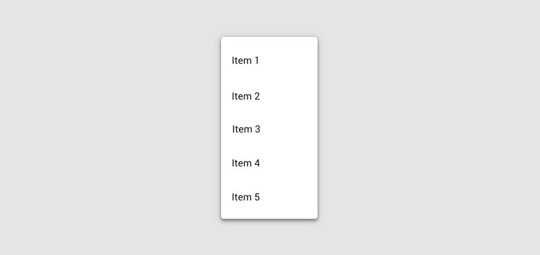
A dropdown menu is a compact way of displaying multiple choices. It appears upon interaction with an element (such as an icon or button) or when users perform a specific action.
Common
@Composable
expect fun DropdownMenu(
    expanded: Boolean,
    onDismissRequest: () -> Unit,
    modifier: Modifier = Modifier,
    offset: DpOffset = DpOffset(0.dp, 0.dp),
    scrollState: ScrollState = rememberScrollState(),
    properties: PopupProperties = DefaultMenuProperties,
    content: @Composable ColumnScope.() -> Unit,
)
Parameters
| expanded | whether the menu is expanded or not |
| onDismissRequest | called when the user requests to dismiss the menu, such as by tapping outside the menu's bounds |
| modifier | Modifier to be applied to the menu's content |
| offset | DpOffset from the original position of the menu. The offset respects the LayoutDirection, so the offset's x position will be added in LTR and subtracted in RTL. |
| scrollState | a ScrollState to used by the menu's content for items vertical scrolling |
| properties | PopupProperties for further customization of this popup's behavior |
| content | the content of this dropdown menu, typically a DropdownMenuItem |
Android
Deprecated Replaced by a DropdownMenu function with a ScrollState parameter
@Composable
fun DropdownMenu(
    expanded: Boolean,
    onDismissRequest: () -> Unit,
    modifier: Modifier = Modifier,
    offset: DpOffset = DpOffset(0.dp, 0.dp),
    properties: PopupProperties = PopupProperties(focusable = true),
    content: @Composable ColumnScope.() -> Unit,
) =
    DropdownMenu(
        expanded = expanded,
        onDismissRequest = onDismissRequest,
        modifier = modifier,
        offset = offset,
        scrollState = rememberScrollState(),
        properties = properties,
        content = content,
    )
Android
@Composable
actual fun DropdownMenu(
    expanded: Boolean,
    onDismissRequest: () -> Unit,
    modifier: Modifier,
    offset: DpOffset,
    scrollState: ScrollState,
    properties: PopupProperties,
    content: @Composable ColumnScope.() -> Unit,
)
Code Examples
MenuSample
@Composable
fun MenuSample() {
    var expanded by remember { mutableStateOf(false) }
    Box(modifier = Modifier.fillMaxSize().wrapContentSize(Alignment.TopStart)) {
        IconButton(onClick = { expanded = true }) {
            Icon(Icons.Default.MoreVert, contentDescription = "Localized description")
        }
        DropdownMenu(expanded = expanded, onDismissRequest = { expanded = false }) {
            DropdownMenuItem(onClick = { /* Handle refresh! */ }) { Text("Refresh") }
            DropdownMenuItem(onClick = { /* Handle settings! */ }) { Text("Settings") }
            Divider()
            DropdownMenuItem(onClick = { /* Handle send feedback! */ }) { Text("Send Feedback") }
        }
    }
}
MenuWithScrollStateSample
@Composable
fun MenuWithScrollStateSample() {
    var expanded by remember { mutableStateOf(false) }
    val scrollState = rememberScrollState()
    Box(modifier = Modifier.fillMaxSize().wrapContentSize(Alignment.TopStart)) {
        IconButton(onClick = { expanded = true }) {
            Icon(Icons.Default.MoreVert, contentDescription = "Localized description")
        }
        DropdownMenu(
            expanded = expanded,
            onDismissRequest = { expanded = false },
            scrollState = scrollState,
        ) {
            repeat(30) {
                DropdownMenuItem(onClick = { /* Handle item! */ }) { Text("Item ${it + 1}") }
            }
        }
        LaunchedEffect(expanded) {
            if (expanded) {
                // Scroll to show the bottom menu items.
                scrollState.scrollTo(scrollState.maxValue)
            }
        }
    }
}
