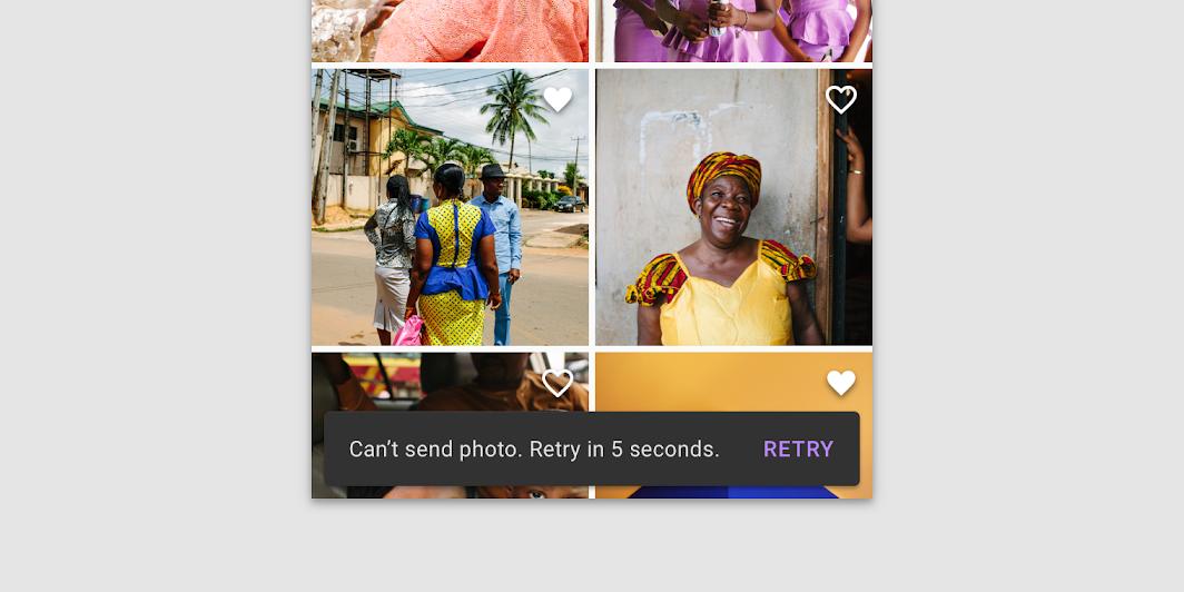
Snackbar
Composable Component
Snackbars provide brief messages about app processes at the bottom of the screen.

Common
@Composable
fun Snackbar(
    modifier: Modifier = Modifier,
    action: @Composable (() -> Unit)? = null,
    actionOnNewLine: Boolean = false,
    shape: Shape = MaterialTheme.shapes.small,
    backgroundColor: Color = SnackbarDefaults.backgroundColor,
    contentColor: Color = MaterialTheme.colors.surface,
    elevation: Dp = 6.dp,
    content: @Composable () -> Unit,
)
Parameters
| modifier | modifiers for the Snackbar layout |
| action | action / button component to add as an action to the snackbar. Consider using SnackbarDefaults.primaryActionColor as the color for the action, if you do not have a predefined color you wish to use instead. |
| actionOnNewLine | whether or not action should be put on the separate line. Recommended for action with long action text |
| shape | Defines the Snackbar's shape as well as its shadow |
| backgroundColor | background color of the Snackbar |
| contentColor | color of the content to use inside the snackbar. Defaults to either the matching content color for backgroundColor, or, if it is not a color from the theme, this will keep the same value set above this Surface. |
| elevation | The z-coordinate at which to place the SnackBar. This controls the size of the shadow below the SnackBar |
| content | content to show information about a process that an app has performed or will perform |
Common
@Composable
fun Snackbar(
    snackbarData: SnackbarData,
    modifier: Modifier = Modifier,
    actionOnNewLine: Boolean = false,
    shape: Shape = MaterialTheme.shapes.small,
    backgroundColor: Color = SnackbarDefaults.backgroundColor,
    contentColor: Color = MaterialTheme.colors.surface,
    actionColor: Color = SnackbarDefaults.primaryActionColor,
    elevation: Dp = 6.dp,
)
Parameters
| snackbarData | data about the current snackbar showing via SnackbarHostState |
| modifier | modifiers for the Snackbar layout |
| actionOnNewLine | whether or not action should be put on the separate line. Recommended for action with long action text |
| shape | Defines the Snackbar's shape as well as its shadow |
| backgroundColor | background color of the Snackbar |
| contentColor | color of the content to use inside the snackbar. Defaults to either the matching content color for backgroundColor, or, if it is not a color from the theme, this will keep the same value set above this Surface. |
| actionColor | color of the action |
| elevation | The z-coordinate at which to place the SnackBar. This controls the size of the shadow below the SnackBar |
Code Examples
ScaffoldWithSimpleSnackbar
@Composable
fun ScaffoldWithSimpleSnackbar() {
    val scaffoldState = rememberScaffoldState()
    val scope = rememberCoroutineScope()
    Scaffold(
        scaffoldState = scaffoldState,
        floatingActionButton = {
            var clickCount by remember { mutableStateOf(0) }
            ExtendedFloatingActionButton(
                text = { Text("Show snackbar") },
                onClick = {
                    // show snackbar as a suspend function
                    scope.launch {
                        scaffoldState.snackbarHostState.showSnackbar("Snackbar # ${++clickCount}")
                    }
                },
            )
        },
        contentWindowInsets = ScaffoldDefaults.contentWindowInsets,
        content = { innerPadding ->
            Text(
                text = "Body content",
                modifier = Modifier.padding(innerPadding).fillMaxSize().wrapContentSize(),
            )
        },
    )
}
ScaffoldWithCustomSnackbar
@Composable
fun ScaffoldWithCustomSnackbar() {
    val scaffoldState = rememberScaffoldState()
    val scope = rememberCoroutineScope()
    Scaffold(
        scaffoldState = scaffoldState,
        snackbarHost = {
            // reuse default SnackbarHost to have default animation and timing handling
            SnackbarHost(it) { data ->
                // custom snackbar with the custom border
                Snackbar(
                    modifier = Modifier.border(2.dp, MaterialTheme.colors.secondary),
                    snackbarData = data,
                )
            }
        },
        floatingActionButton = {
            var clickCount by remember { mutableStateOf(0) }
            ExtendedFloatingActionButton(
                text = { Text("Show snackbar") },
                onClick = {
                    scope.launch {
                        scaffoldState.snackbarHostState.showSnackbar("Snackbar # ${++clickCount}")
                    }
                },
            )
        },
        contentWindowInsets = ScaffoldDefaults.contentWindowInsets,
        content = { innerPadding ->
            Text(
                text = "Custom Snackbar Demo",
                modifier = Modifier.padding(innerPadding).fillMaxSize().wrapContentSize(),
            )
        },
    )
}