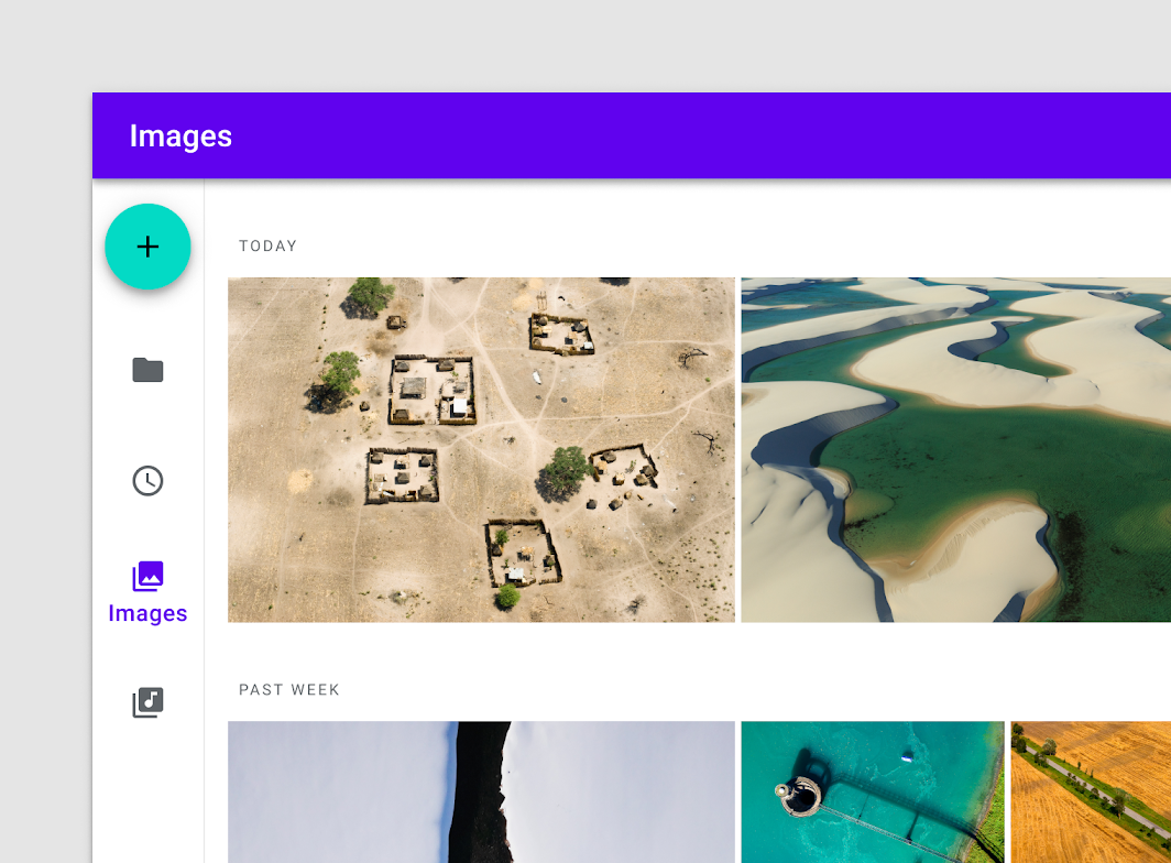
NavigationRail
Composable Component
A Navigation Rail is a side navigation component that allows movement between primary
destinations in an app. A navigation rail should be used to display three to seven app
destinations and, optionally, a FloatingActionButton or a logo inside header. Each
destination is typically represented by an icon and an optional text label.

Common
@Composable
fun NavigationRail(
    windowInsets: WindowInsets,
    modifier: Modifier = Modifier,
    backgroundColor: Color = MaterialTheme.colors.surface,
    contentColor: Color = contentColorFor(backgroundColor),
    elevation: Dp = NavigationRailDefaults.Elevation,
    header: @Composable (ColumnScope.() -> Unit)? = null,
    content: @Composable ColumnScope.() -> Unit,
)
Parameters
| windowInsets | a window insets that navigation rail will respect |
| modifier | optional Modifier for this NavigationRail |
| backgroundColor | The background color for this NavigationRail |
| contentColor | The preferred content color provided by this NavigationRail to its children. Defaults to either the matching content color for backgroundColor, or if backgroundColor is not a color from the theme, this will keep the same value set above this NavigationRail. |
| elevation | elevation for this NavigationRail |
| header | an optional header that may hold a FloatingActionButton or a logo |
| content | destinations inside this NavigationRail, this should contain multiple NavigationRailItems |
Common
@Composable
fun NavigationRail(
    modifier: Modifier = Modifier,
    backgroundColor: Color = MaterialTheme.colors.surface,
    contentColor: Color = contentColorFor(backgroundColor),
    elevation: Dp = NavigationRailDefaults.Elevation,
    header: @Composable (ColumnScope.() -> Unit)? = null,
    content: @Composable ColumnScope.() -> Unit,
)
Parameters
| modifier | optional Modifier for this NavigationRail |
| backgroundColor | The background color for this NavigationRail |
| contentColor | The preferred content color provided by this NavigationRail to its children. Defaults to either the matching content color for backgroundColor, or if backgroundColor is not a color from the theme, this will keep the same value set above this NavigationRail. |
| elevation | elevation for this NavigationRail |
| header | an optional header that may hold a FloatingActionButton or a logo |
| content | destinations inside this NavigationRail, this should contain multiple NavigationRailItems |
Code Examples
NavigationRailSample
@Composable
fun NavigationRailSample() {
    var selectedItem by remember { mutableStateOf(0) }
    val items = listOf("Home", "Search", "Settings")
    val icons = listOf(Icons.Filled.Home, Icons.Filled.Search, Icons.Filled.Settings)
    NavigationRail(windowInsets = NavigationRailDefaults.windowInsets) {
        items.forEachIndexed { index, item ->
            NavigationRailItem(
                icon = { Icon(icons[index], contentDescription = item) },
                label = { Text(item) },
                selected = selectedItem == index,
                onClick = { selectedItem = index },
            )
        }
    }
}