TabRow
Composable Component
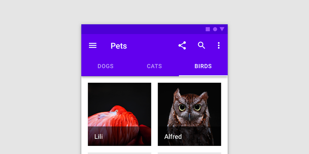
Fixed tabs display all tabs in a set simultaneously. They are best for switching between related content quickly, such as between transportation methods in a map. To navigate between fixed tabs, tap an individual tab, or swipe left or right in the content area.
Common
@Composable
fun TabRow(
    selectedTabIndex: Int,
    modifier: Modifier = Modifier,
    backgroundColor: Color = MaterialTheme.colors.primarySurface,
    contentColor: Color = contentColorFor(backgroundColor),
    indicator: @Composable @UiComposable (tabPositions: List<TabPosition>) -> Unit =
        @Composable { tabPositions ->
            TabRowDefaults.Indicator(Modifier.tabIndicatorOffset(tabPositions[selectedTabIndex]))
        },
    divider: @Composable @UiComposable () -> Unit = @Composable { TabRowDefaults.Divider() },
    tabs: @Composable @UiComposable () -> Unit,
)
Parameters
| selectedTabIndex | the index of the currently selected tab |
| modifier | optional Modifier for this TabRow |
| backgroundColor | The background color for the TabRow. Use Color.Transparent to have no color. |
| contentColor | The preferred content color provided by this TabRow to its children. Defaults to either the matching content color for backgroundColor, or if backgroundColor is not a color from the theme, this will keep the same value set above this TabRow. |
| indicator | the indicator that represents which tab is currently selected. By default this will be a TabRowDefaults.Indicator, using a TabRowDefaults.tabIndicatorOffset modifier to animate its position. Note that this indicator will be forced to fill up the entire TabRow, so you should use TabRowDefaults.tabIndicatorOffset or similar to animate the actual drawn indicator inside this space, and provide an offset from the start. |
| divider | the divider displayed at the bottom of the TabRow. This provides a layer of separation between the TabRow and the content displayed underneath. |
| tabs | the tabs inside this TabRow. Typically this will be multiple Tabs. Each element inside this lambda will be measured and placed evenly across the TabRow, each taking up equal space. |
Code Examples
TextTabs
@Composable
fun TextTabs() {
    var state by remember { mutableStateOf(0) }
    val titles = listOf("TAB 1", "TAB 2", "TAB 3 WITH LOTS OF TEXT")
    Column {
        TabRow(selectedTabIndex = state) {
            titles.forEachIndexed { index, title ->
                Tab(text = { Text(title) }, selected = state == index, onClick = { state = index })
            }
        }
        Text(
            modifier = Modifier.align(Alignment.CenterHorizontally),
            text = "Text tab ${state + 1} selected",
            style = MaterialTheme.typography.body1,
        )
    }
}
FancyTabs
@Composable
fun FancyTabs() {
    var state by remember { mutableStateOf(0) }
    val titles = listOf("TAB 1", "TAB 2", "TAB 3")
    Column {
        TabRow(selectedTabIndex = state) {
            titles.forEachIndexed { index, title ->
                FancyTab(title = title, onClick = { state = index }, selected = (index == state))
            }
        }
        Text(
            modifier = Modifier.align(Alignment.CenterHorizontally),
            text = "Fancy tab ${state + 1} selected",
            style = MaterialTheme.typography.body1,
        )
    }
}
FancyTab
@Composable
fun FancyTab(title: String, onClick: () -> Unit, selected: Boolean) {
    Tab(selected, onClick) {
        Column(
            Modifier.padding(10.dp).height(50.dp).fillMaxWidth(),
            verticalArrangement = Arrangement.SpaceBetween,
        ) {
            Box(
                Modifier.size(10.dp)
                    .align(Alignment.CenterHorizontally)
                    .background(color = if (selected) Color.Red else Color.White)
            )
            Text(
                text = title,
                style = MaterialTheme.typography.body1,
                modifier = Modifier.align(Alignment.CenterHorizontally),
            )
        }
    }
}
FancyIndicator
@Composable
fun FancyIndicator(color: Color, modifier: Modifier = Modifier) {
    // Draws a rounded rectangular with border around the Tab, with a 5.dp padding from the edges
    // Color is passed in as a parameter [color]
    Box(
        modifier
            .padding(5.dp)
            .fillMaxSize()
            .border(BorderStroke(2.dp, color), RoundedCornerShape(5.dp))
    )
}
FancyIndicatorTabs
@Composable
fun FancyIndicatorTabs() {
    var state by remember { mutableStateOf(0) }
    val titles = listOf("TAB 1", "TAB 2", "TAB 3")
    // Reuse the default offset animation modifier, but use our own indicator
    val indicator =
        @Composable { tabPositions: List<TabPosition> ->
            FancyIndicator(Color.White, Modifier.tabIndicatorOffset(tabPositions[state]))
        }
    Column {
        TabRow(selectedTabIndex = state, indicator = indicator) {
            titles.forEachIndexed { index, title ->
                Tab(text = { Text(title) }, selected = state == index, onClick = { state = index })
            }
        }
        Text(
            modifier = Modifier.align(Alignment.CenterHorizontally),
            text = "Fancy indicator tab ${state + 1} selected",
            style = MaterialTheme.typography.body1,
        )
    }
}
FancyAnimatedIndicator
@Composable
fun FancyAnimatedIndicator(tabPositions: List<TabPosition>, selectedTabIndex: Int) {
    val colors = listOf(Color.Yellow, Color.Red, Color.Green)
    val transition = updateTransition(selectedTabIndex)
    val indicatorStart by
        transition.animateDp(
            transitionSpec = {
                // Handle directionality here, if we are moving to the right, we
                // want the right side of the indicator to move faster, if we are
                // moving to the left, we want the left side to move faster.
                if (initialState < targetState) {
                    spring(dampingRatio = 1f, stiffness = 50f)
                } else {
                    spring(dampingRatio = 1f, stiffness = 1000f)
                }
            }
        ) {
            tabPositions[it].left
        }
    val indicatorEnd by
        transition.animateDp(
            transitionSpec = {
                // Handle directionality here, if we are moving to the right, we
                // want the right side of the indicator to move faster, if we are
                // moving to the left, we want the left side to move faster.
                if (initialState < targetState) {
                    spring(dampingRatio = 1f, stiffness = 1000f)
                } else {
                    spring(dampingRatio = 1f, stiffness = 50f)
                }
            }
        ) {
            tabPositions[it].right
        }
    val indicatorColor by transition.animateColor { colors[it % colors.size] }
    FancyIndicator(
        // Pass the current color to the indicator
        indicatorColor,
        modifier =
            Modifier
                // Fill up the entire TabRow, and place the indicator at the start
                .fillMaxSize()
                .wrapContentSize(align = Alignment.BottomStart)
                // Apply an offset from the start to correctly position the indicator around the tab
                .offset(x = indicatorStart)
                // Make the width of the indicator follow the animated width as we move between tabs
                .width(indicatorEnd - indicatorStart),
    )
}
FancyIndicatorContainerTabs
@Composable
fun FancyIndicatorContainerTabs() {
    var state by remember { mutableStateOf(0) }
    val titles = listOf("TAB 1", "TAB 2", "TAB 3")
    val indicator =
        @Composable { tabPositions: List<TabPosition> ->
            FancyAnimatedIndicator(tabPositions = tabPositions, selectedTabIndex = state)
        }
    Column {
        TabRow(selectedTabIndex = state, indicator = indicator) {
            titles.forEachIndexed { index, title ->
                Tab(text = { Text(title) }, selected = state == index, onClick = { state = index })
            }
        }
        Text(
            modifier = Modifier.align(Alignment.CenterHorizontally),
            text = "Fancy transition tab ${state + 1} selected",
            style = MaterialTheme.typography.body1,
        )
    }
}
