BottomAppBar
Composable Component
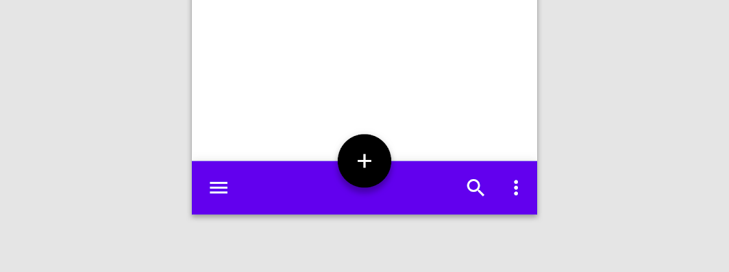
A bottom app bar displays navigation and key actions at the bottom of screens.
Common
@Composable
fun BottomAppBar(
    windowInsets: WindowInsets,
    modifier: Modifier = Modifier,
    backgroundColor: Color = MaterialTheme.colors.primarySurface,
    contentColor: Color = contentColorFor(backgroundColor),
    cutoutShape: Shape? = null,
    elevation: Dp = AppBarDefaults.BottomAppBarElevation,
    contentPadding: PaddingValues = AppBarDefaults.ContentPadding,
    content: @Composable RowScope.() -> Unit,
)
Parameters
| windowInsets | a window insets that app bar will respect. |
| modifier | The Modifier to be applied to this BottomAppBar |
| backgroundColor | The background color for the BottomAppBar. Use Color.Transparent to have no color. |
| contentColor | The preferred content color provided by this BottomAppBar to its children. Defaults to either the matching content color for backgroundColor, or if backgroundColor is not a color from the theme, this will keep the same value set above this BottomAppBar. |
| cutoutShape | the shape of the cutout that will be added to the BottomAppBar - this should typically be the same shape used inside the FloatingActionButton, when BottomAppBar and FloatingActionButton are being used together in Scaffold. This shape will be drawn with an offset around all sides. If null, where will be no cutout. |
| elevation | the elevation of this BottomAppBar. |
| contentPadding | the padding applied to the content of this BottomAppBar |
| content | the content of this BottomAppBar. The default layout here is a Row, so content inside will be placed horizontally. |
Common
@Composable
fun BottomAppBar(
    modifier: Modifier = Modifier,
    backgroundColor: Color = MaterialTheme.colors.primarySurface,
    contentColor: Color = contentColorFor(backgroundColor),
    cutoutShape: Shape? = null,
    elevation: Dp = AppBarDefaults.BottomAppBarElevation,
    contentPadding: PaddingValues = AppBarDefaults.ContentPadding,
    content: @Composable RowScope.() -> Unit,
)
Parameters
| modifier | The Modifier to be applied to this BottomAppBar |
| backgroundColor | The background color for the BottomAppBar. Use Color.Transparent to have no color. |
| contentColor | The preferred content color provided by this BottomAppBar to its children. Defaults to either the matching content color for backgroundColor, or if backgroundColor is not a color from the theme, this will keep the same value set above this BottomAppBar. |
| cutoutShape | the shape of the cutout that will be added to the BottomAppBar - this should typically be the same shape used inside the FloatingActionButton, when BottomAppBar and FloatingActionButton are being used together in Scaffold. This shape will be drawn with an offset around all sides. If null, where will be no cutout. |
| elevation | the elevation of this BottomAppBar. |
| contentPadding | the padding applied to the content of this BottomAppBar |
| content | the content of this BottomAppBar. The default layout here is a Row, so content inside will be placed horizontally. |
Code Examples
SimpleBottomAppBar
@Composable
fun SimpleBottomAppBar() {
    BottomAppBar(windowInsets = AppBarDefaults.bottomAppBarWindowInsets) {
        // Leading icons should typically have a high content alpha
        CompositionLocalProvider(LocalContentAlpha provides ContentAlpha.high) {
            IconButton(onClick = { /* doSomething() */ }) {
                Icon(Icons.Filled.Menu, contentDescription = "Localized description")
            }
        }
        // The actions should be at the end of the BottomAppBar. They use the default medium
        // content alpha provided by BottomAppBar
        Spacer(Modifier.weight(1f, true))
        IconButton(onClick = { /* doSomething() */ }) {
            Icon(Icons.Filled.Favorite, contentDescription = "Localized description")
        }
        IconButton(onClick = { /* doSomething() */ }) {
            Icon(Icons.Filled.Favorite, contentDescription = "Localized description")
        }
    }
}
Create your own Component Library
Material Components are meant to be used as is and they do not allow customizations. To build your own Jetpack Compose component library use Compose Unstyled

