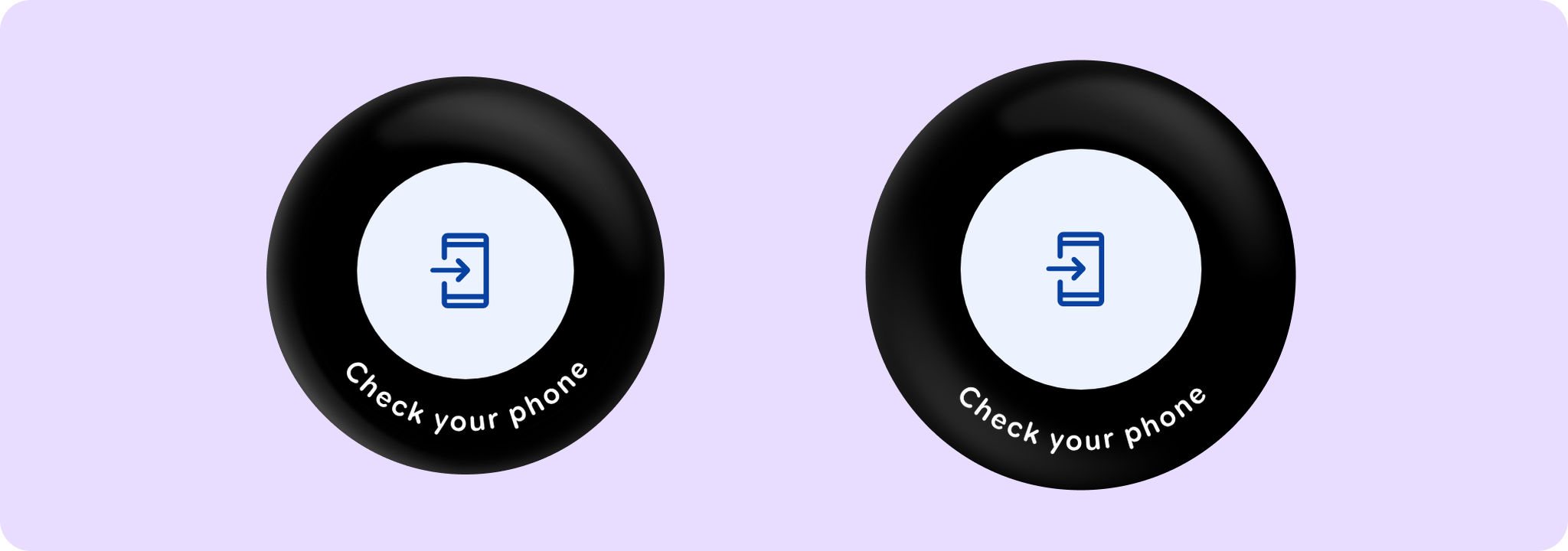
OpenOnPhoneDialogContent
Source set: Android
@Composable
public fun OpenOnPhoneDialogContent(
    curvedText: (CurvedScope.() -> Unit)?,
    durationMillis: Long,
    modifier: Modifier = Modifier,
    colors: OpenOnPhoneDialogColors = OpenOnPhoneDialogDefaults.colors(),
    content: @Composable () -> Unit,
): Unit
Parameters
| curvedText | A slot for displaying curved text content which will be shown along the bottom edge of the dialog. We recommend using openOnPhoneDialogCurvedText for this parameter, which will give the default sweep angle and padding, and OpenOnPhoneDialogDefaults.curvedTextStyle as the style. |
| durationMillis | The duration in milliseconds for which the progress indicator inside of this content is animated. This value should be previously adjusted by the accessibility manager according to the content displayed. See OpenOnPhoneDialog implementation for more details. |
| modifier | Modifier to be applied to the openOnPhone content. |
| colors | OpenOnPhoneDialogColors that will be used to resolve the colors used for this OpenOnPhoneDialog. |
| content | A slot for displaying an icon inside the open on phone dialog, which can be animated. Defaults to OpenOnPhoneDialogDefaults.Icon. |
