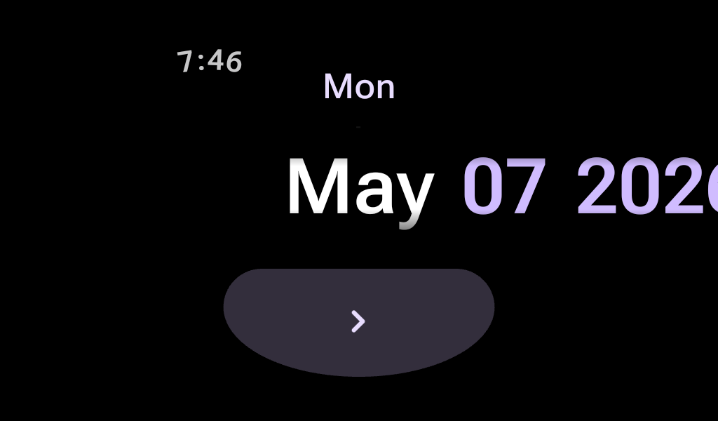
DatePicker
Source set: Android
@RequiresApi(Build.VERSION_CODES.O)
@Composable
public fun DatePicker(
    initialDate: LocalDate,
    onDatePicked: (LocalDate) -> Unit,
    modifier: Modifier = Modifier,
    minValidDate: LocalDate? = null,
    maxValidDate: LocalDate? = null,
    datePickerType: DatePickerType = DatePickerDefaults.datePickerType,
    colors: DatePickerColors = DatePickerDefaults.datePickerColors(),
)
Parameters
| initialDate | The initial value to be displayed in the DatePicker. |
| onDatePicked | The callback that is called when the user confirms the date selection. It provides the selected date as LocalDate |
| modifier | Modifier to be applied to the Box containing the UI elements. |
| minValidDate | Optional minimum date that can be selected in the DatePicker (inclusive). |
| maxValidDate | Optional maximum date that can be selected in the DatePicker (inclusive). |
| datePickerType | The different DatePickerType supported by this DatePicker. |
| colors | DatePickerColors to be applied to the DatePicker. |
