public object ButtonDefaultsContains the default values used by Button
Properties
shape
public val shape: RoundedCornerShapeRecommended RoundedCornerShape for Button.
compactButtonShape
Deprecated
Use CompactButtonDefaults.shape instead
public val compactButtonShape: RoundedCornerShapeRecommended RoundedCornerShape for CompactButton.
ButtonHorizontalPadding
public val ButtonHorizontalPadding: DpThe recommended horizontal content padding used by Button by default
ButtonLargeIconStartPadding
public val ButtonLargeIconStartPadding: DpThe recommended start padding to be used with Button with a large icon
ButtonExtraLargeIconStartPadding
public val ButtonExtraLargeIconStartPadding: DpThe recommended start padding to be used with Button with an extra large icon
ButtonVerticalPadding
public val ButtonVerticalPadding: DpThe recommended vertical content padding used by Button by default
ContentPadding
public val ContentPadding: PaddingValuesThe default content padding used by Button
ButtonWithLargeIconContentPadding
public val ButtonWithLargeIconContentPadding: PaddingValuesThe default content padding used by Button with a large icon
ButtonWithExtraLargeIconContentPadding
public val ButtonWithExtraLargeIconContentPadding: PaddingValuesThe default content padding used by Button with an extra large icon
minimumVerticalListContentPadding
public val minimumVerticalListContentPadding: DpThe minimum vertical content padding for the list when a Button is placed at the top or bottom edge. Recommended for use with androidx.wear.compose.foundation.lazy.TransformingLazyColumnItemScope's androidx.wear.compose.foundation.lazy.TransformingLazyColumnItemScope.minimumVerticalContentPadding, which allows items to choose a preferred content padding for the list. TransformingLazyColumn takes its contentPadding as the maximum of the preferred content padding values and its own contentPadding parameter.
ExtraSmallIconSize
Deprecated
Use CompactButtonDefaults.ExtraSmallIconSize instead
public val ExtraSmallIconSize: DpThe recommended icon size when used in CompactButtons containing both icon and text.
SmallIconSize
Deprecated
Use CompactButtonDefaults.SmallIconSize instead
public val SmallIconSize: DpThe recommended icon size when used in CompactButtons containing icon-only content.
IconSize
public val IconSize: DpThe recommended default size for icons when used inside a Button.
LargeIconSize
public val LargeIconSize: DpThe recommended icon size when used in Buttons for icons such as an app icon
ExtraLargeIconSize
public val ExtraLargeIconSize: DpThe recommended icon size when used in Buttons for icons such as an avatar icon
Height
public val Height: DpThe default height applied for the Button. Note that you can override it by applying Modifier.heightIn directly on Button.
CompactButtonHorizontalPadding
Deprecated
Use CompactButtonDefaults.HorizontalPadding instead
public val CompactButtonHorizontalPadding: DpCompactButtonVerticalPadding
Deprecated
Use CompactButtonDefaults.VerticalPadding instead
public val CompactButtonVerticalPadding: DpCompactButtonContentPadding
Deprecated
Use CompactButtonDefaults.ContentPadding instead
public val CompactButtonContentPadding: PaddingValuesThe default content padding used by CompactButton
CompactButtonHeight
Deprecated
Use CompactButtonDefaults.Height instead
public val CompactButtonHeight: DpThe height applied for the CompactButton. This includes a visible button height of 32.dp and 8.dp of padding above and below the button in order to meet accessibility guidelines that request a minimum of 48.dp height and width of tappable area.
Note that you can override it by adjusting Modifier.height and Modifier.padding directly on CompactButton.
CompactButtonTapTargetPadding
Deprecated
Use CompactButtonDefaults.TapTargetPadding instead
public val CompactButtonTapTargetPadding: PaddingValuesThe default padding to be provided around a CompactButton in order to ensure that its tappable area meets minimum UX guidance.
IconSpacing
public val IconSpacing: DpThe default size of the spacing between an icon and a text when they are used inside a Button or CompactButton.
DisabledContainerAlpha
public val DisabledContainerAlpha: FloatThe default alpha applied to the container when the button is disabled.
scrimGradientStartColor
public val scrimGradientStartColor: ColorThe default gradient start color when drawing a scrim over an image to ensure that the text text drawn over the image is legible.
scrimGradientEndColor
public val scrimGradientEndColor: ColorThe default gradient end color when drawing a scrim over an image to ensure that the text text drawn over the image is legible.
Functions
filledTonalButtonColors
@Composable
public fun filledTonalButtonColors(): ButtonColors
Creates a ButtonColors with a muted background and contrasting content color, the defaults for medium emphasis buttons like FilledTonalButton. Use filledTonalButtonColors for important actions that don't distract from other onscreen elements, such as final or unblocking actions in a flow with less emphasis than buttonColors.
If a button is disabled then the content will have an alpha(DisabledContentAlpha) value applied and container will have alpha (DisabledContainerAlpha) value applied.
filledTonalButtonColors
@Composable
public fun filledTonalButtonColors(
    containerColor: Color = Color.Unspecified,
    contentColor: Color = Color.Unspecified,
    secondaryContentColor: Color = Color.Unspecified,
    iconColor: Color = Color.Unspecified,
    disabledContainerColor: Color = Color.Unspecified,
    disabledContentColor: Color = Color.Unspecified,
    disabledSecondaryContentColor: Color = Color.Unspecified,
    disabledIconColor: Color = Color.Unspecified,
): ButtonColors
Creates a ButtonColors with a muted background and contrasting content color, the defaults for medium emphasis buttons like FilledTonalButton. Use filledTonalButtonColors for important actions that don't distract from other onscreen elements, such as final or unblocking actions in a flow with less emphasis than buttonColors.
If a button is disabled then the content will have an alpha(DisabledContentAlpha) value applied and container will have alpha (DisabledContainerAlpha) value applied.
Parameters
| containerColor | The background color of this Button when enabled |
| contentColor | The content color of this Button when enabled |
| secondaryContentColor | The secondary content color of this Button when enabled, used for secondaryLabel content |
| iconColor | The icon color of this Button when enabled, used for icon content |
| disabledContainerColor | The background color of this Button when not enabled |
| disabledContentColor | The content color of this Button when not enabled |
| disabledSecondaryContentColor | The secondary content color of this Button when not enabled |
| disabledIconColor | The content color of this Button when not enabled |
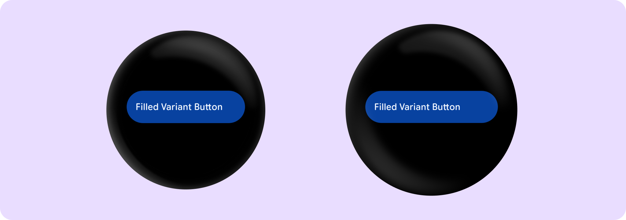
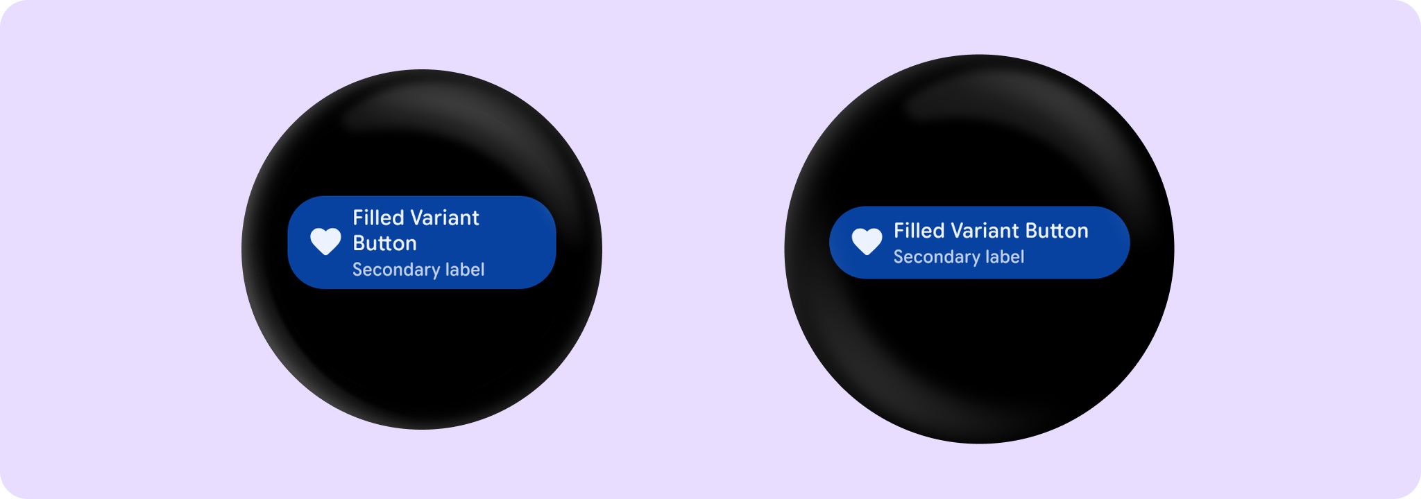
filledVariantButtonColors
@Composable
public fun filledVariantButtonColors(): ButtonColors
Creates a ButtonColors as an alternative to the filledTonalButtonColors, giving a surface with more chroma to indicate selected or highlighted states that are not primary calls-to-action. If the icon button is disabled then the colors will default to the MaterialTheme onSurface color with suitable alpha values applied.
If a button is disabled then the content will have an alpha(DisabledContentAlpha) value applied and container will have alpha (DisabledContainerAlpha) value applied.
Example of a Button with filledVariantButtonColors:
filledVariantButtonColors
@Composable
public fun filledVariantButtonColors(
    containerColor: Color = Color.Unspecified,
    contentColor: Color = Color.Unspecified,
    secondaryContentColor: Color = Color.Unspecified,
    iconColor: Color = Color.Unspecified,
    disabledContainerColor: Color = Color.Unspecified,
    disabledContentColor: Color = Color.Unspecified,
    disabledSecondaryContentColor: Color = Color.Unspecified,
    disabledIconColor: Color = Color.Unspecified,
): ButtonColors
Creates a ButtonColors as an alternative to the filledTonalButtonColors, giving a surface with more chroma to indicate selected or highlighted states that are not primary calls-to-action. If the icon button is disabled then the colors will default to the MaterialTheme onSurface color with suitable alpha values applied.
If a button is disabled then the content will have an alpha(DisabledContentAlpha) value applied and container will have alpha (DisabledContainerAlpha) value applied.
Example of a Button with filledVariantButtonColors:
Parameters
| containerColor | The background color of this Button when enabled |
| contentColor | The content color of this Button when enabled |
| secondaryContentColor | The secondary content color of this Button when enabled, used for secondaryLabel content |
| iconColor | The icon color of this Button when enabled, used for icon content |
| disabledContainerColor | The background color of this Button when not enabled |
| disabledContentColor | The content color of this Button when not enabled |
| disabledSecondaryContentColor | The secondary content color of this Button when not enabled |
| disabledIconColor | The content color of this Button when not enabled |
outlinedButtonColors
@Composable
public fun outlinedButtonColors(): ButtonColors
Creates a ButtonColors with a transparent background (typically paired with ButtonDefaults.outlinedButtonBorder), the defaults for medium emphasis buttons like OutlinedButton, for important, non-primary actions that need attention.
If a button is disabled then the content will have an alpha(DisabledContentAlpha) value applied and container will have an alpha(DisabledContainerAlpha) applied.
outlinedButtonColors
@Composable
public fun outlinedButtonColors(
    contentColor: Color = Color.Unspecified,
    secondaryContentColor: Color = Color.Unspecified,
    iconColor: Color = Color.Unspecified,
    disabledContentColor: Color = Color.Unspecified,
    disabledSecondaryContentColor: Color = Color.Unspecified,
    disabledIconColor: Color = Color.Unspecified,
): ButtonColors
Creates a ButtonColors with a transparent background (typically paired with ButtonDefaults.outlinedButtonBorder), the defaults for medium emphasis buttons like OutlinedButton, for important, non-primary actions that need attention.
If a button is disabled then the content will have an alpha(DisabledContentAlpha) value applied and container will have an alpha(DisabledContainerAlpha) applied.
Parameters
| contentColor | The content color of this Button when enabled |
| secondaryContentColor | The secondary content color of this Button when enabled, used for secondaryLabel content |
| iconColor | The icon color of this Button when enabled, used for icon content |
| disabledContentColor | The content color of this Button when not enabled |
| disabledSecondaryContentColor | The secondary content color of this Button when not enabled |
| disabledIconColor | The content color of this Button when not enabled |
childButtonColors
@Composable
public fun childButtonColors(): ButtonColors
Creates a ButtonColors with transparent background, the defaults for low emphasis buttons like ChildButton. Use childButtonColors for optional or supplementary actions with the least amount of prominence.
If a button is disabled then the content will have an alpha(DisabledContentAlpha) value applied and container will have an alpha(DisabledContainerAlpha) value applied.
childButtonColors
@Composable
public fun childButtonColors(
    contentColor: Color = Color.Unspecified,
    secondaryContentColor: Color = Color.Unspecified,
    iconColor: Color = Color.Unspecified,
    disabledContentColor: Color = Color.Unspecified,
    disabledSecondaryContentColor: Color = Color.Unspecified,
    disabledIconColor: Color = Color.Unspecified,
): ButtonColors
Creates a ButtonColors with transparent background, the defaults for low emphasis buttons like ChildButton. Use childButtonColors for optional or supplementary actions with the least amount of prominence.
If a button is disabled then the content will have an alpha(DisabledContentAlpha) value applied and container will have an alpha(DisabledContainerAlpha) value applied.
Parameters
| contentColor | The content color of this Button when enabled |
| secondaryContentColor | The secondary content color of this Button when enabled, used for secondaryLabel content |
| iconColor | The icon color of this Button when enabled, used for icon content |
| disabledContentColor | The content color of this Button when not enabled |
| disabledSecondaryContentColor | The secondary content color of this Button when not enabled |
| disabledIconColor | The content color of this Button when not enabled |
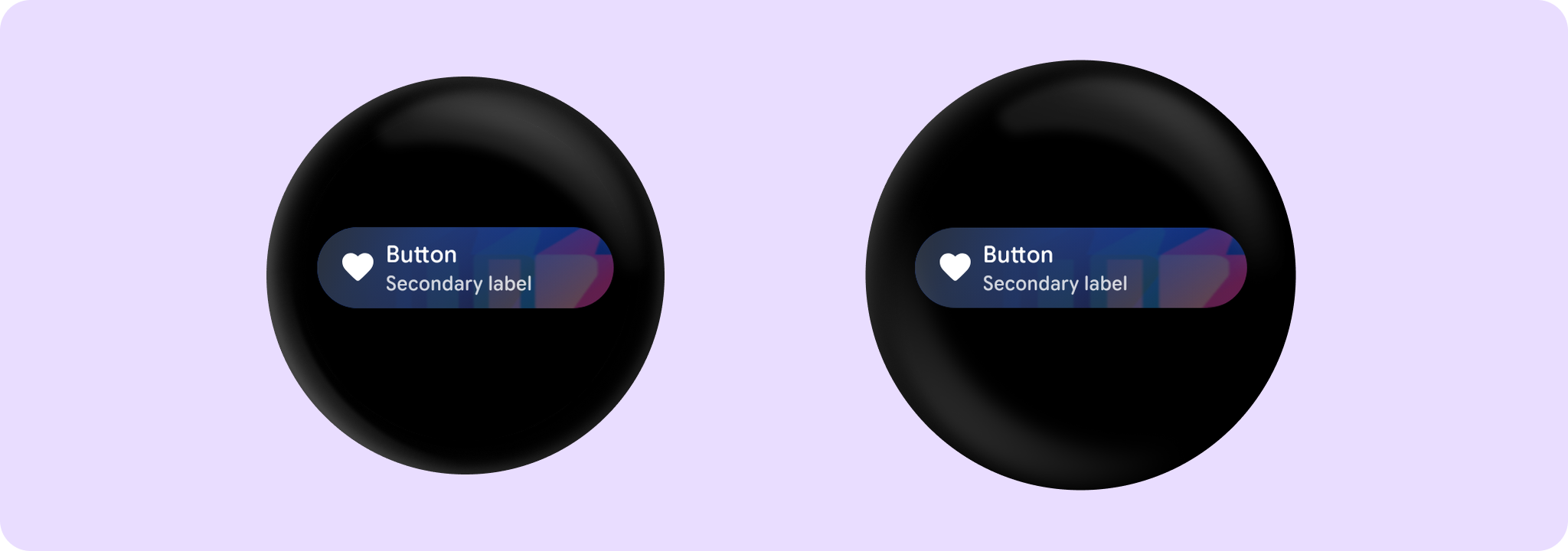
buttonWithContainerPainterColors
@Composable
public fun buttonWithContainerPainterColors(): ButtonColors
Creates a ButtonColors for the content in a Button with an image container painter.
buttonWithContainerPainterColors
@Composable
public fun buttonWithContainerPainterColors(
    contentColor: Color = Color.Unspecified,
    secondaryContentColor: Color = Color.Unspecified,
    iconColor: Color = Color.Unspecified,
    disabledContentColor: Color = Color.Unspecified,
    disabledSecondaryContentColor: Color = Color.Unspecified,
    disabledIconColor: Color = Color.Unspecified,
): ButtonColors
Creates a ButtonColors for the content in a Button with an image container painter.
Example of a Button with an image background:
Parameters
| contentColor | The content color of this Button when enabled |
| secondaryContentColor | The secondary content color of this Button when enabled, used for secondaryLabel content |
| iconColor | The icon color of this Button when enabled, used for icon content |
| disabledContentColor | The content color of this Button when disabled |
| disabledSecondaryContentColor | The secondary content color of this Button when disabled, used for secondary label content |
| disabledIconColor | The icon color of this Button when disabled, used for icon content |
containerPainter
@Composable
public fun containerPainter(
    image: Painter,
    scrim: Brush? = scrimBrush(),
    sizeToIntrinsics: Boolean = false,
    alignment: Alignment = Alignment.Center,
    contentScale: ContentScale = ContentScale.Fit,
    alpha: Float = DefaultAlpha,
): Painter
Creates a Painter for the background of a Button with container painter, that displays an image with a scrim on top to make sure that any content above the background will be legible.
An Image background is a means to reinforce the meaning of information in a Button. Buttons should have a content color that contrasts with the background image and scrim.
Example of a Button with an image background:
Parameters
| image | The Painter to use to draw the container background of the Button. |
| scrim | The Brush to use to paint a scrim over the container image to ensure that any text drawn over the image is legible. |
| sizeToIntrinsics | When false (the default), fills the available space within the container. Pass true to retain the size of the image. |
| alignment | Specifies alignment of the container image painter relative to the container. |
| contentScale | Strategy for scaling the painter if its size does not match the container. |
| alpha | Opacity of the container image painter and scrim. |
disabledContainerPainter
public fun disabledContainerPainter(containerPainter: Painter): PainterCreates a Painter for the disabled background of a Button with container painter - draws the containerPainter with an alpha applied to achieve a disabled effect.
An Image background is a means to reinforce the meaning of information in a Button. Buttons should have a content color that contrasts with the background image and scrim.
Parameters
| containerPainter | The Painter to use to draw the container background of the Button when enabled. An alpha will be applied to this to achieve a disabled effect. |
scrimBrush
@Composable
public fun scrimBrush(): Brush
Creates a Brush for the recommended scrim drawn on top of image container backgrounds.
outlinedButtonBorder
@Composable
public fun outlinedButtonBorder(
    enabled: Boolean,
    borderColor: Color = OutlinedButtonTokens.ContainerBorderColor.value,
    disabledBorderColor: Color =
        OutlinedButtonTokens.DisabledContainerBorderColor.value.toDisabledColor(
            disabledAlpha = OutlinedButtonTokens.DisabledContainerBorderOpacity
        ),
    borderWidth: Dp = OutlinedButtonTokens.ContainerBorderWidth,
): BorderStroke
Creates a BorderStroke, such as for an OutlinedButton
Parameters
| enabled | Controls the color of the border based on the enabled/disabled state of the button |
| borderColor | The color to use for the border for this outline when enabled |
| disabledBorderColor | The color to use for the border for this outline when disabled |
| borderWidth | The width to use for the border for this outline. It is strongly recommended to use the default width as this outline is a key characteristic of Wear Material3. |
buttonColors
@Composable
public fun buttonColors(): ButtonColors
Creates a ButtonColors that represents the default background and content colors used in a Button.
buttonColors
@Composable
public fun buttonColors(
    containerColor: Color = Color.Unspecified,
    contentColor: Color = Color.Unspecified,
    secondaryContentColor: Color = Color.Unspecified,
    iconColor: Color = Color.Unspecified,
    disabledContainerColor: Color = Color.Unspecified,
    disabledContentColor: Color = Color.Unspecified,
    disabledSecondaryContentColor: Color = Color.Unspecified,
    disabledIconColor: Color = Color.Unspecified,
): ButtonColors
Creates a ButtonColors that represents the default background and content colors used in a Button.
Parameters
| containerColor | The background color of this Button when enabled |
| contentColor | The content color of this Button when enabled |
| secondaryContentColor | The content color of this Button when enabled |
| iconColor | The content color of this Button when enabled |
| disabledContainerColor | The background color of this Button when not enabled |
| disabledContentColor | The content color of this Button when not enabled |
| disabledSecondaryContentColor | The content color of this Button when not enabled |
| disabledIconColor | The content color of this Button when not enabled |
