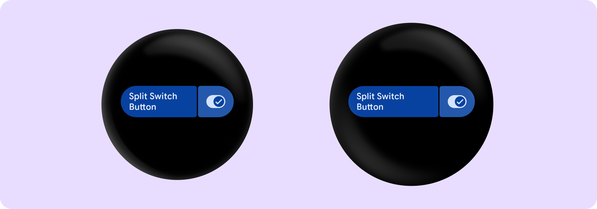
SplitSwitchButton
Source set: Android
@Composable
public fun SplitSwitchButton(
    checked: Boolean,
    onCheckedChange: (Boolean) -> Unit,
    toggleContentDescription: String?,
    onContainerClick: () -> Unit,
    modifier: Modifier = Modifier,
    enabled: Boolean = true,
    shape: Shape = SwitchButtonDefaults.splitSwitchButtonShape,
    colors: SplitSwitchButtonColors = SwitchButtonDefaults.splitSwitchButtonColors(),
    toggleInteractionSource: MutableInteractionSource? = null,
    containerInteractionSource: MutableInteractionSource? = null,
    transformation: SurfaceTransformation? = null,
    containerClickLabel: String? = null,
    contentPadding: PaddingValues = SwitchButtonDefaults.ContentPadding,
    secondaryLabel: @Composable (RowScope.() -> Unit)? = null,
    label: @Composable RowScope.() -> Unit,
)
Parameters
| checked | Boolean flag indicating whether this button is currently checked. |
| onCheckedChange | Callback to be invoked when this buttons checked status is changed. |
| toggleContentDescription | The content description for the switch control part of the component. |
| onContainerClick | Click listener called when the user clicks the main body of the button, the area behind the labels. |
| modifier | Modifier to be applied to the button. |
| enabled | Controls the enabled state of the button. When false, this button will not be clickable. |
| shape | Defines the button's shape. It is strongly recommended to use the default as this shape is a key characteristic of the Wear Material Theme. |
| colors | SplitSwitchButtonColors that will be used to resolve the background and content color for this button in different states. |
| toggleInteractionSource | an optional hoisted MutableInteractionSource for observing and emitting Interactions for this button's "toggleable" tap area. You can use this to change the button's appearance or preview the button in different states. Note that if null is provided, interactions will still happen internally. |
| containerInteractionSource | an optional hoisted MutableInteractionSource for observing and emitting Interactions for this button's main body "clickable" tap area. You can use this to change the button's appearance or preview the button in different states. Note that if null is provided, interactions will still happen internally. |
| transformation | Transformation to be used when button appears inside a container that needs to dynamically change its content separately from the background. |
| containerClickLabel | Optional click label on the main body of the button for accessibility. |
| contentPadding | The spacing values to apply internally between the container and the content. |
| secondaryLabel | A slot for providing the button's secondary label. The contents are expected to be "start" aligned. |
| label | A slot for providing the button's main label. The contents are expected to be text which is "start" aligned. |
