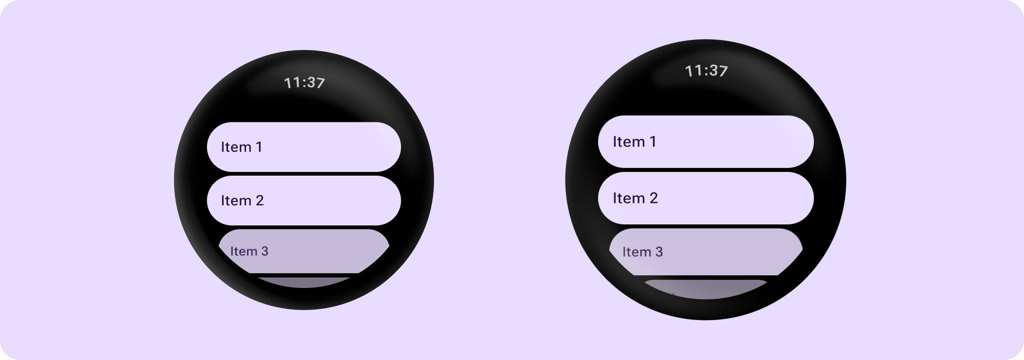

AppScaffold
Source set: Android
@Composable
public fun AppScaffold(
    modifier: Modifier = Modifier,
    containerColor: Color = MaterialTheme.colorScheme.background,
    contentColor: Color = contentColorFor(containerColor),
    content: @Composable BoxScope.() -> Unit,
): Unit
Parameters
| modifier | The modifier for the top level of the scaffold. |
| containerColor | The container color of the app drawn behind the content, i.e. the color of the background behind the content. |
| contentColor | The content color for the application content. |
| content | The main content for this application. |
AppScaffold
Source set: Android
@Composable
public fun AppScaffold(
    modifier: Modifier = Modifier,
    timeText: @Composable () -> Unit = AppScaffoldDefaults.timeText,
    containerColor: Color = MaterialTheme.colorScheme.background,
    contentColor: Color = contentColorFor(containerColor),
    content: @Composable BoxScope.() -> Unit,
)
Parameters
| modifier | The modifier for the top level of the scaffold. |
| timeText | The default time text to display across screens in this application. Defaults to AppScaffoldDefaults.timeText, which enables the system status bar overlay on supported Wear OS devices (API 35+). Passing any custom lambda disables the system status bar overlay and renders the provided composable locally instead. |
| containerColor | The container color of the app drawn behind the content, i.e. the color of the background behind the content. |
| contentColor | The content color for the application content. |
| content | The main content for this application. |
