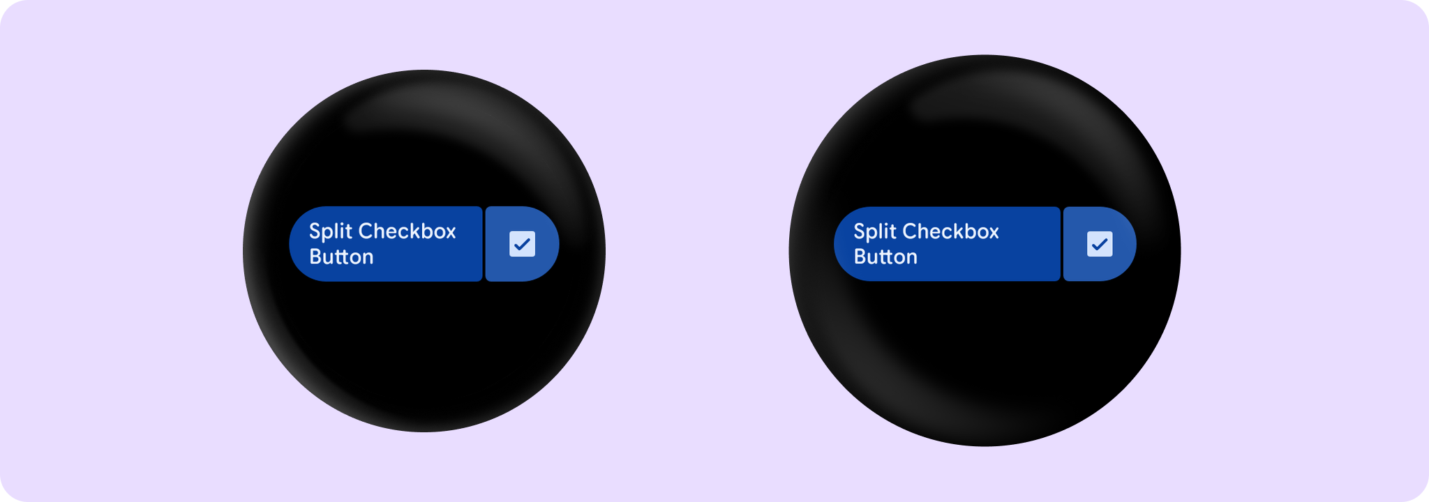


SplitCheckboxButtonSample
@Sampled
@Preview
@Composable
fun SplitCheckboxButtonSample() {
    var checked by remember { mutableStateOf(true) }
    SplitCheckboxButton(
        label = { Text("Split Checkbox Button", maxLines = 3, overflow = TextOverflow.Ellipsis) },
        checked = checked,
        onCheckedChange = { checked = it },
        toggleContentDescription = "Split Checkbox Button Sample",
        onContainerClick = { /* Do something */ },
        containerClickLabel = "click",
        enabled = true,
    )
}