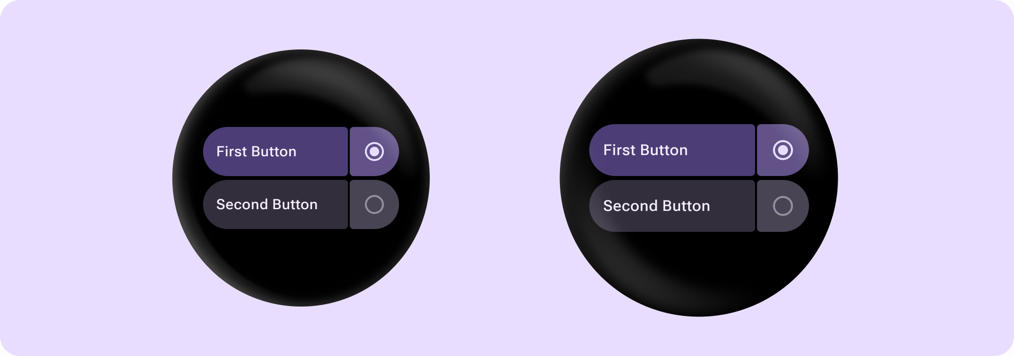
@Sampled
@Preview
@Composable
fun SplitRadioButtonSample() {
    Column(modifier = Modifier.selectableGroup().padding(horizontal = 10.dp)) {
        var selectedButton by remember { mutableStateOf(0) }
        // SplitRadioButton uses the Radio selection control by default.
        SplitRadioButton(
            label = { Text("First Button", maxLines = 3, overflow = TextOverflow.Ellipsis) },
            selected = selectedButton == 0,
            onSelectionClick = { selectedButton = 0 },
            selectionContentDescription = "First",
            onContainerClick = { /* Do something */ },
            containerClickLabel = "click",
            modifier = Modifier.fillMaxWidth(),
            enabled = true,
        )
        Spacer(modifier = Modifier.height(4.dp))
        SplitRadioButton(
            label = { Text("Second Button", maxLines = 3, overflow = TextOverflow.Ellipsis) },
            selected = selectedButton == 1,
            onSelectionClick = { selectedButton = 1 },
            selectionContentDescription = "Second",
            onContainerClick = { /* Do something */ },
            containerClickLabel = "click",
            modifier = Modifier.fillMaxWidth(),
            enabled = true,
        )
    }
}