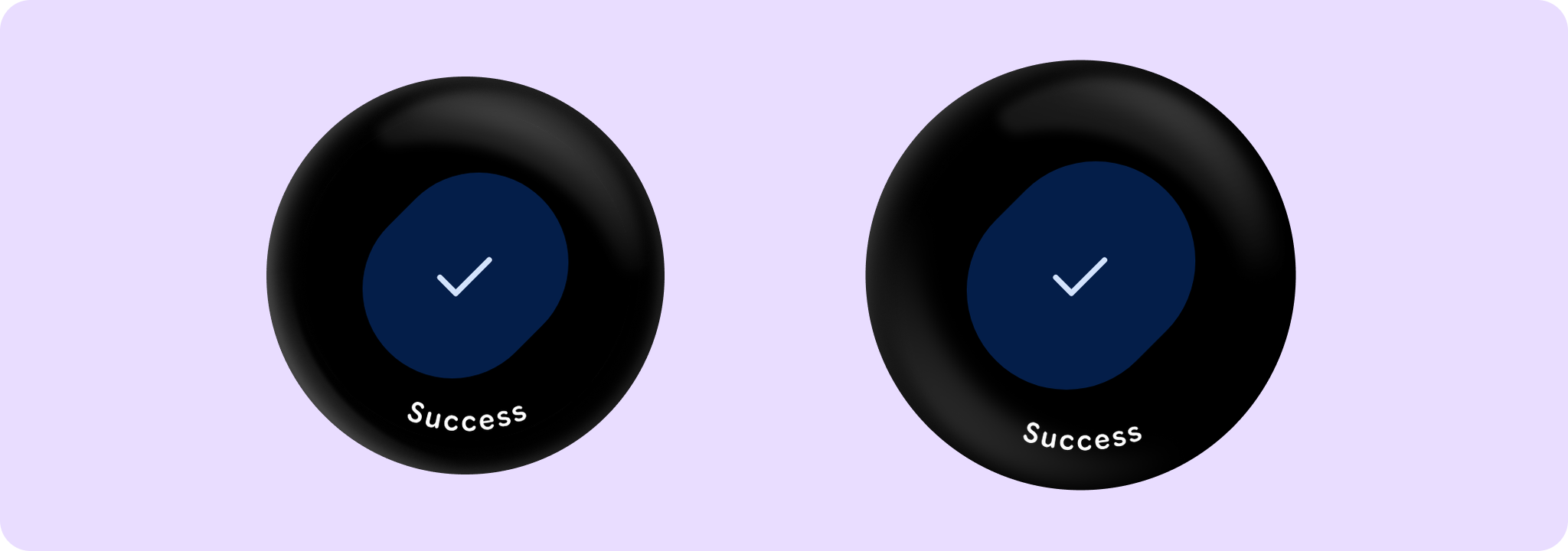
Shows a SuccessConfirmationDialog dialog with a success icon and optional short curved text.
SuccessConfirmationDialogSample
@Composable
fun SuccessConfirmationDialogSample() {
    var showConfirmation by remember { mutableStateOf(false) }
    Box(Modifier.fillMaxSize()) {
        FilledTonalButton(
            modifier = Modifier.align(Alignment.Center),
            onClick = { showConfirmation = true },
            label = { Text("Show Confirmation") },
        )
    }
    val text = "Success"
    val style = ConfirmationDialogDefaults.curvedTextStyle
    SuccessConfirmationDialog(
        visible = showConfirmation,
        onDismissRequest = { showConfirmation = false },
        curvedText = { confirmationDialogCurvedText(text, style) },
    )
}