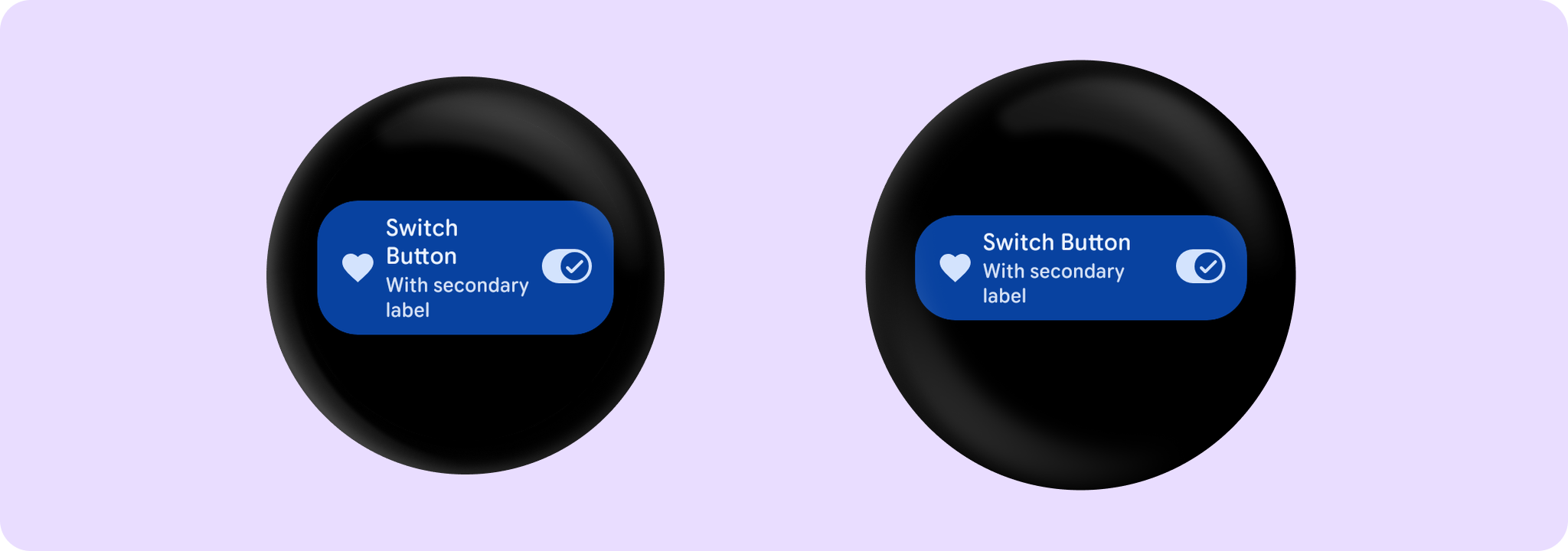
The Wear Material SwitchButton offers three slots and a specific layout for an icon, a label, and a secondaryLabel.
@Preview
@Composable
fun SwitchButtonSample() {
    var checked by remember { mutableStateOf(true) }
    SwitchButton(
        label = { Text("Switch Button", maxLines = 3, overflow = TextOverflow.Ellipsis) },
        secondaryLabel = {
            Text("With secondary label", maxLines = 2, overflow = TextOverflow.Ellipsis)
        },
        checked = checked,
        onCheckedChange = { checked = it },
        icon = { Icon(Icons.Filled.Favorite, contentDescription = "Favorite icon") },
        enabled = true,
    )
}