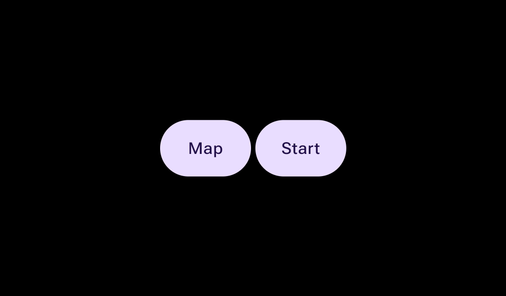
ButtonGroup

Layout component to implement an expressive group of buttons in a row, that react to touch by growing the touched button, (while the neighbor(s) shrink to accommodate and keep the group width constant).

Android
@Composable
public fun ButtonGroup(
    modifier: Modifier = Modifier,
    spacing: Dp = ButtonGroupDefaults.Spacing,
    expansionWidth: Dp = ButtonGroupDefaults.ExpansionWidth,
    contentPadding: PaddingValues = ButtonGroupDefaults.fullWidthPaddings(),
    verticalAlignment: Alignment.Vertical = Alignment.CenterVertically,
    transformation: SurfaceTransformation? = null,
    content: @Composable ButtonGroupScope.() -> Unit,
)

Parameters

modifier Modifier to be applied to the button group
spacing the amount of spacing between buttons
expansionWidth how much buttons grow when pressed
contentPadding The spacing values to apply internally between the container and the content
verticalAlignment the vertical alignment of the button group's children.
transformation The transformation for the ButtonGroup when it's inside a dynamically changing container. To prevent a "double transformation" (on both the group and its buttons), individual Buttons inside this group must have their own container transformations disabled; only their content should be transformed.
content the content and properties of each button. The Ux guidance is to use no more than 3 buttons within a ButtonGroup. Note that this content is on the ButtonGroupScope, to provide access to 3 new modifiers to configure the buttons.
Android
Deprecated This overload is deprecated. Please use the new overload with the transformation parameter.
@Composable
public fun ButtonGroup(
    modifier: Modifier = Modifier,
    spacing: Dp = ButtonGroupDefaults.Spacing,
    expansionWidth: Dp = ButtonGroupDefaults.ExpansionWidth,
    contentPadding: PaddingValues = ButtonGroupDefaults.fullWidthPaddings(),
    verticalAlignment: Alignment.Vertical = Alignment.CenterVertically,
    content: @Composable ButtonGroupScope.() -> Unit,
)

Parameters

modifier Modifier to be applied to the button group
spacing the amount of spacing between buttons
expansionWidth how much buttons grow when pressed
contentPadding The spacing values to apply internally between the container and the content
verticalAlignment the vertical alignment of the button group's children.
content the content and properties of each button. The Ux guidance is to use no more than 3 buttons within a ButtonGroup. Note that this content is on the ButtonGroupScope, to provide access to 3 new modifiers to configure the buttons.

Code Examples

ButtonGroupSample

@Composable
fun ButtonGroupSample() {
    val interactionSource1 = remember { MutableInteractionSource() }
    val interactionSource2 = remember { MutableInteractionSource() }
    Box(contentAlignment = Alignment.Center) {
        ButtonGroup(Modifier.fillMaxWidth()) {
            Button(
                onClick = {},
                modifier = Modifier.animateWidth(interactionSource1),
                interactionSource = interactionSource1,
            ) {
                Box(Modifier.fillMaxWidth(), contentAlignment = Alignment.Center) { Text("L") }
            }
            Button(
                onClick = {},
                modifier = Modifier.animateWidth(interactionSource2),
                interactionSource = interactionSource2,
            ) {
                Box(Modifier.fillMaxWidth(), contentAlignment = Alignment.Center) { Text("R") }
            }
        }
    }
}

ButtonGroupThreeButtonsSample

@Composable
fun ButtonGroupThreeButtonsSample() {
    val interactionSource1 = remember { MutableInteractionSource() }
    val interactionSource2 = remember { MutableInteractionSource() }
    val interactionSource3 = remember { MutableInteractionSource() }
    var rtl by remember { mutableStateOf(false) }
    Box(Modifier.fillMaxSize()) {
        CompositionLocalProvider(
            LocalLayoutDirection provides if (rtl) LayoutDirection.Rtl else LayoutDirection.Ltr
        ) {
            ButtonGroup(Modifier.fillMaxWidth().align(Alignment.Center)) {
                Button(
                    onClick = {},
                    modifier = Modifier.animateWidth(interactionSource1),
                    interactionSource = interactionSource1,
                ) {
                    Box(Modifier.fillMaxWidth(), contentAlignment = Alignment.Center) { Text("A") }
                }
                Button(
                    onClick = {},
                    modifier = Modifier.weight(1.5f).animateWidth(interactionSource2),
                    interactionSource = interactionSource2,
                ) {
                    Box(Modifier.fillMaxWidth(), contentAlignment = Alignment.Center) { Text("B") }
                }
                Button(
                    onClick = {},
                    modifier = Modifier.animateWidth(interactionSource3),
                    interactionSource = interactionSource3,
                ) {
                    Box(Modifier.fillMaxWidth(), contentAlignment = Alignment.Center) { Text("C") }
                }
            }
        }
        Button(modifier = Modifier.align(Alignment.BottomCenter), onClick = { rtl = !rtl }) {
            Text(if (rtl) "RTL" else "LTR")
        }
    }
}