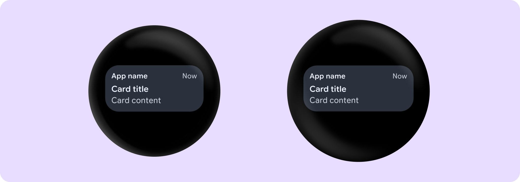
AppCardSample
@Sampled
@Composable
fun AppCardSample() {
    AppCard(
        onClick = { /* Do something */ },
        appName = { Text("App name") },
        title = { Text("Card title") },
        time = { Text("Now") },
    ) {
        Text("Card content")
    }
}
AppCardWithIconSample
@Sampled
@Composable
fun AppCardWithIconSample() {
    AppCard(
        onClick = { /* Do something */ },
        appName = { Text("App name") },
        appImage = {
            Icon(
                painter = painterResource(id = android.R.drawable.star_big_off),
                contentDescription = "Star icon",
                modifier =
                    Modifier.size(CardDefaults.AppImageSize)
                        .wrapContentSize(align = Alignment.Center),
                tint = MaterialTheme.colorScheme.primary,
            )
        },
        title = { Text("Card title") },
        time = { Text("Now") },
    ) {
        Text("Card content")
    }
}
AppCardWithImageSample
@Sampled
@Composable
fun AppCardWithImageSample() {
    val configuration = LocalConfiguration.current
    // Add padding to the end of the image in order to maintain the correct proportions
    // between the image and the card.
    val imageEndPaddingDp = (0.15f * configuration.screenWidthDp).dp
    AppCard(
        onClick = { /* Do something */ },
        appName = { Text("App name") },
        appImage = {
            Icon(
                painter = painterResource(id = android.R.drawable.star_big_off),
                contentDescription = "Star icon",
                modifier =
                    Modifier.size(CardDefaults.AppImageSize)
                        .wrapContentSize(align = Alignment.Center),
                tint = MaterialTheme.colorScheme.primary,
            )
        },
        title = { Text("With image") },
        time = { Text("Now") },
    ) {
        Spacer(modifier = Modifier.height(4.dp))
        Row(modifier = Modifier.fillMaxWidth()) {
            Image(
                modifier =
                    Modifier.weight(1f).aspectRatio(16f / 9f).clip(RoundedCornerShape(16.dp)),
                painter = painterResource(id = R.drawable.card_content_image),
                contentScale = ContentScale.Crop,
                contentDescription = null,
            )
            Spacer(modifier = Modifier.width(imageEndPaddingDp))
        }
    }
}
OutlinedAppCardSample
@Sampled
@Composable
fun OutlinedAppCardSample() {
    AppCard(
        onClick = { /* Do something */ },
        appName = { Text("App name") },
        appImage = {
            Icon(
                Icons.Filled.Favorite,
                contentDescription = "Favorite icon",
                modifier = Modifier.size(CardDefaults.AppImageSize),
            )
        },
        title = { Text("App card") },
        time = { Text("Now") },
        colors = CardDefaults.outlinedCardColors(),
        border = CardDefaults.outlinedCardBorder(),
    ) {
        Text("Card content")
    }
}
NonClickableAppCardSample
@Sampled
@Composable
fun NonClickableAppCardSample() {
    AppCard(
        appName = { Text("App name") },
        title = { Text("Card title") },
        time = { Text("Now") },
    ) {
        Text("Non clickable card content")
    }
}