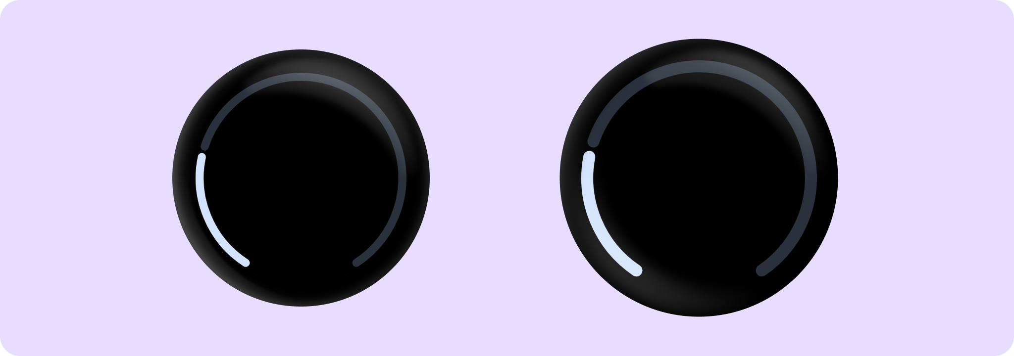
Material Design circular progress indicator.
FullScreenProgressIndicatorSample
@Composable
fun FullScreenProgressIndicatorSample() {
    Box(
        modifier =
            Modifier.background(MaterialTheme.colorScheme.background)
                .padding(CircularProgressIndicatorDefaults.FullScreenPadding)
                .fillMaxSize()
    ) {
        CircularProgressIndicator(progress = { 0.25f }, startAngle = 120f, endAngle = 60f)
    }
}
IndeterminateProgressIndicatorSample
@Composable
fun IndeterminateProgressIndicatorSample() {
    Box(modifier = Modifier.fillMaxSize()) {
        CircularProgressIndicator(modifier = Modifier.align(Alignment.Center))
    }
}
@Composable
fun MediaButtonProgressIndicatorSample() {
    var isPlaying by remember { mutableStateOf(false) }
    val buttonPadding = 4.dp
    val progressStrokeWidth = 4.dp
    val progress = 0.75f
    Box(modifier = Modifier.fillMaxSize().background(MaterialTheme.colorScheme.background)) {
        // The CircularProgressIndicator should be around the IconButton, with an extra gap between
        // then of 'buttonPadding'. We multiply by 2 because the size includes progressStrokeWidth
        // at top and bottom and the buttonPadding at top and bottom.
        CircularProgressIndicator(
            modifier =
                Modifier.align(Alignment.Center)
                    .size(
                        IconButtonDefaults.DefaultButtonSize +
                            progressStrokeWidth * 2 +
                            buttonPadding * 2
                    ),
            progress = { progress },
            strokeWidth = progressStrokeWidth,
        )
        IconButton(
            modifier =
                Modifier.align(Alignment.Center)
                    .semantics {
                        // Set custom progress semantics for accessibility.
                        contentDescription =
                            String.format(
                                "Play/pause button, track progress: %.0f%%",
                                progress * 100,
                            )
                    }
                    .clip(CircleShape)
                    .background(MaterialTheme.colorScheme.surfaceContainerLow),
            onClick = { isPlaying = !isPlaying },
        ) {
            Icon(
                imageVector = if (isPlaying) Icons.Filled.Close else Icons.Filled.PlayArrow,
                contentDescription = null,
            )
        }
    }
}
OverflowProgressIndicatorSample
@Composable
fun OverflowProgressIndicatorSample() {
    Box(
        modifier =
            Modifier.background(MaterialTheme.colorScheme.background)
                .padding(CircularProgressIndicatorDefaults.FullScreenPadding)
                .fillMaxSize()
    ) {
        CircularProgressIndicator(
            // Overflow value of 120%
            progress = { 1.2f },
            allowProgressOverflow = true,
            startAngle = 120f,
            endAngle = 60f,
        )
    }
}
SmallValuesProgressIndicatorSample
@Composable
fun SmallValuesProgressIndicatorSample() {
    Box {
        CircularProgressIndicator(
            // Small progress values like 2% will be rounded up to at least the stroke width.
            progress = { 0.02f },
            modifier =
                Modifier.fillMaxSize().padding(CircularProgressIndicatorDefaults.FullScreenPadding),
            startAngle = 120f,
            endAngle = 60f,
            strokeWidth = 10.dp,
            colors =
                ProgressIndicatorDefaults.colors(
                    indicatorColor = Color.Green,
                    trackColor = Color.White,
                ),
        )
    }
}