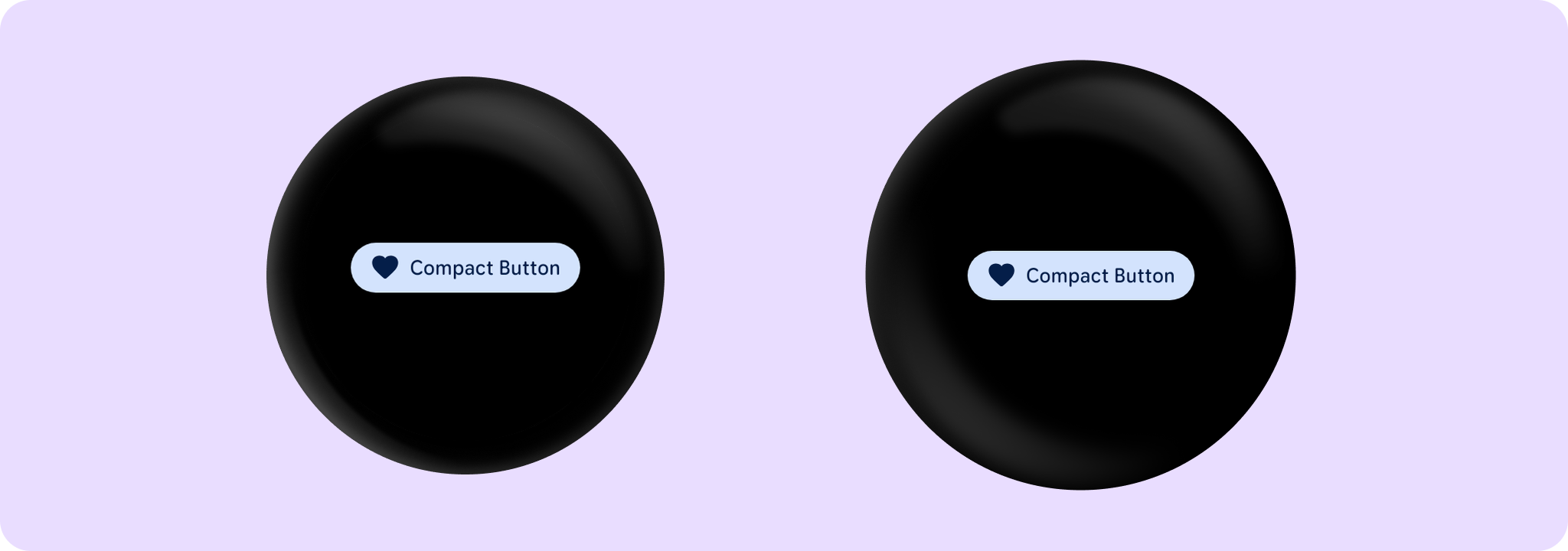
A Wear Material3 CompactButton that offers two slots and a specific layout for an icon and label.
@Composable
fun CompactButtonSample(modifier: Modifier = Modifier) {
    CompactButton(
        onClick = { /* Do something */ },
        icon = {
            Icon(
                painter = painterResource(R.drawable.ic_favorite_rounded),
                contentDescription = "Favorite icon",
                modifier = Modifier.size(CompactButtonDefaults.ExtraSmallIconSize),
            )
        },
        modifier = modifier,
    ) {
        Text("Compact Button", maxLines = 1, overflow = TextOverflow.Ellipsis)
    }
}
@Composable
fun CompactButtonWithOnLongClickSample(
    onClickHandler: () -> Unit,
    onLongClickHandler: () -> Unit,
    modifier: Modifier = Modifier,
) {
    CompactButton(
        onClick = onClickHandler,
        onLongClick = onLongClickHandler,
        onLongClickLabel = "Long click",
        label = { Text("Long clickable") },
        modifier =
            modifier.semantics {
                // Also override the 'click label' to say 'Double tap to press' instead of
                // the usual 'Double tap to activate'.
                onClick("press") { false }
            },
    )
}
@Composable
fun FilledTonalCompactButtonSample(modifier: Modifier = Modifier) {
    CompactButton(
        onClick = { /* Do something */ },
        icon = {
            Icon(
                painter = painterResource(R.drawable.ic_favorite_rounded),
                contentDescription = "Favorite icon",
                modifier = Modifier.size(CompactButtonDefaults.ExtraSmallIconSize),
            )
        },
        colors = ButtonDefaults.filledTonalButtonColors(),
        modifier = modifier,
    ) {
        Text("Filled Tonal Compact Button", maxLines = 1, overflow = TextOverflow.Ellipsis)
    }
}
@Composable
fun OutlinedCompactButtonSample(modifier: Modifier = Modifier) {
    Column(horizontalAlignment = Alignment.CenterHorizontally) {
        var expanded by remember { mutableStateOf(false) }
        if (expanded) {
            Text("A multiline string showing two lines")
        } else {
            Text("One line text")
        }
        Spacer(Modifier.height(ButtonDefaults.IconSpacing))
        CompactButton(
            onClick = { expanded = !expanded },
            colors = ButtonDefaults.outlinedButtonColors(),
            border = ButtonDefaults.outlinedButtonBorder(enabled = true),
            modifier = modifier,
        ) {
            if (expanded) {
                Text("Show Less", maxLines = 1, overflow = TextOverflow.Ellipsis)
            } else {
                Text("Show More", maxLines = 1, overflow = TextOverflow.Ellipsis)
            }
            Spacer(Modifier.width(ButtonDefaults.IconSpacing))
            if (expanded) {
                Icon(
                    Icons.Filled.KeyboardArrowUp,
                    contentDescription = "Collapse",
                    modifier = Modifier.size(CompactButtonDefaults.ExtraSmallIconSize),
                )
            } else {
                Icon(
                    Icons.Filled.KeyboardArrowDown,
                    contentDescription = "Expand",
                    modifier = Modifier.size(CompactButtonDefaults.ExtraSmallIconSize),
                )
            }
        }
    }
}