Composable Component

EdgeButton

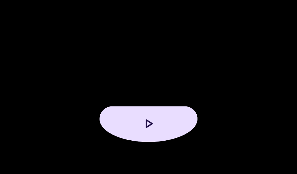
Wear Material3 EdgeButton that offers a single slot to take any content.

EdgeButtonListSample

@Preview
@Composable
fun EdgeButtonListSample() {
    val state = rememberScalingLazyListState()
    val horizontalPadding = LocalConfiguration.current.screenWidthDp.dp * 0.052f
    val verticalPadding = LocalConfiguration.current.screenHeightDp.dp * 0.16f
    val colors =
        listOf(
            "Filled" to ButtonDefaults.buttonColors(),
            "Filled Variant" to ButtonDefaults.filledVariantButtonColors(),
            "Filled Tonal" to ButtonDefaults.filledTonalButtonColors(),
            "Outlined" to ButtonDefaults.outlinedButtonColors(),
            "Disabled" to ButtonDefaults.buttonColors(),
        )
    var selectedColor by remember { mutableIntStateOf(0) }
    val types = listOf("Icon only" to 0, "Text only" to 1)
    var selectedType by remember { mutableIntStateOf(0) }
    ScreenScaffold(
        scrollState = state,
        contentPadding = PaddingValues(horizontal = horizontalPadding, vertical = verticalPadding),
        edgeButton = {
            EdgeButton(
                modifier =
                    Modifier.scrollable(
                        state,
                        orientation = Orientation.Vertical,
                        reverseDirection = true,
                        // An overscroll effect should be applied to the EdgeButton for proper
                        // scrolling behavior.
                        overscrollEffect = rememberOverscrollEffect(),
                    ),
                onClick = {},
                buttonSize = EdgeButtonSize.Medium,
                colors = colors[selectedColor].second,
                border =
                    if (colors[selectedColor].first == "Outlined")
                        ButtonDefaults.outlinedButtonBorder(true)
                    else null,
                enabled = colors[selectedColor].first != "Disabled",
            ) {
                if (selectedType == 0) {
                    // Remove extra spacing around the icon so it integrates better into the scroll.
                    CheckIcon(Modifier.size(21.dp).wrapContentSize(unbounded = true).size(32.dp))
                } else {
                    Text("Ok")
                }
            }
        },
    ) { contentPadding ->
        ScalingLazyColumn(
            state = state,
            modifier = Modifier.fillMaxSize().selectableGroup(),
            autoCentering = null,
            contentPadding = contentPadding,
            horizontalAlignment = Alignment.CenterHorizontally,
        ) {
            item { Text("Color") }
            items(colors.size) { ix ->
                RadioButton(
                    label = { Text(colors[ix].first) },
                    selected = selectedColor == ix,
                    onSelect = { selectedColor = ix },
                    modifier = Modifier.fillMaxWidth(),
                )
            }
            item { Text("Type") }
            items(types.size) { ix ->
                RadioButton(
                    label = { Text(types[ix].first) },
                    selected = selectedType == ix,
                    onSelect = { selectedType = ix },
                    modifier = Modifier.fillMaxWidth(),
                )
            }
        }
    }
}

EdgeButtonSample

@Composable
fun EdgeButtonSample() {
    val sizes =
        listOf(
            EdgeButtonSize.ExtraSmall,
            EdgeButtonSize.Small,
            EdgeButtonSize.Medium,
            EdgeButtonSize.Large,
        )
    val sizeNames = listOf("XS", "S", "M", "L")
    var size by remember { mutableIntStateOf(0) }
    Box(Modifier.fillMaxSize()) {
        Column(
            Modifier.align(Alignment.TopCenter).fillMaxSize().padding(top = 0.dp),
            verticalArrangement = Arrangement.spacedBy(0.dp),
            horizontalAlignment = Alignment.CenterHorizontally,
        ) {
            Column(modifier = Modifier.weight(1f)) {
                Row { Spacer(modifier = Modifier.height(16.dp)) }
                Row {
                    Text("Sizes", modifier = Modifier.fillMaxWidth(), textAlign = TextAlign.Center)
                }
                Row(
                    modifier = Modifier.fillMaxWidth(),
                    horizontalArrangement = Arrangement.Center,
                ) {
                    repeat(sizeNames.size) {
                        TextButton(
                            onClick = { size = it },
                            modifier = Modifier.size(TextButtonDefaults.SmallButtonSize),
                        ) {
                            Text(sizeNames[it])
                        }
                    }
                }
            }
            EdgeButton(onClick = { /* Do something */ }, buttonSize = sizes[size]) {
                Icon(
                    Icons.Filled.Check,
                    contentDescription = "Check icon",
                    modifier = Modifier.size(ButtonDefaults.IconSize),
                )
            }
        }
    }
}

ScaffoldWithTLCEdgeButtonSample

@Preview
@Composable
fun ScaffoldWithTLCEdgeButtonSample() {
    // Declare just one [AppScaffold] per app such as in the activity.
    // [AppScaffold] allows static screen elements (i.e. [TimeText]) to remain visible
    // during in-app transitions such as swipe-to-dismiss.
    AppScaffold(modifier = Modifier.background(Color.Black)) {
        // Define the navigation hierarchy within the AppScaffold,
        // such as using SwipeDismissableNavHost.
        // For this sample, we will define a single screen inline.
        val listState = rememberTransformingLazyColumnState()
        // By default, ScreenScaffold will handle transitions showing/hiding ScrollIndicator,
        // showing/hiding/scrolling away TimeText and optionally hosting the EdgeButton.
        ScreenScaffold(
            scrollState = listState,
            // Define custom spacing between [EdgeButton] and [ScalingLazyColumn].
            edgeButtonSpacing = 15.dp,
            edgeButton = {
                EdgeButton(
                    onClick = {},
                    modifier =
                        // In case user starts scrolling from the EdgeButton.
                        Modifier.scrollable(
                            listState,
                            orientation = Orientation.Vertical,
                            reverseDirection = true,
                            // An overscroll effect should be applied to the EdgeButton for proper
                            // scrolling behavior.
                            overscrollEffect = rememberOverscrollEffect(),
                        ),
                ) {
                    Text("Clear All")
                }
            },
        ) { contentPadding ->
            TransformingLazyColumn(
                state = listState,
                modifier = Modifier.fillMaxSize(),
                // Bottom spacing is derived from [ScreenScaffold.edgeButtonSpacing].
                contentPadding = contentPadding,
            ) {
                items(10) { Button(onClick = {}, label = { Text("Item ${it + 1}") }) }
            }
        }
    }
}