Determinate Material Design circular progress indicator.
CircularProgressIndicatorFullscreenWithGap
@Composable
public fun CircularProgressIndicatorFullscreenWithGap() {
    CircularProgressIndicator(
        modifier = Modifier.fillMaxSize().padding(all = 1.dp).clearAndSetSemantics {},
        startAngle = 295.5f,
        endAngle = 245.5f,
        progress = 0.3f,
        strokeWidth = ProgressIndicatorDefaults.FullScreenStrokeWidth,
    )
}
CircularProgressIndicatorWithAnimation
@Composable
public fun CircularProgressIndicatorWithAnimation() {
    var progress by remember { mutableStateOf(0.1f) }
    val animatedProgress by
        animateFloatAsState(
            targetValue = progress,
            animationSpec = ProgressIndicatorDefaults.ProgressAnimationSpec,
        )
    Column(horizontalAlignment = Alignment.CenterHorizontally) {
        CircularProgressIndicator(progress = animatedProgress)
        Spacer(Modifier.requiredHeight(10.dp))
        CompactChip(
            modifier = Modifier.width(90.dp),
            onClick = { if (progress < 1f) progress += 0.1f },
            label = { Text("Increase") },
        )
    }
}
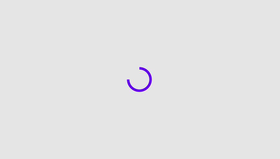
IndeterminateCircularProgressIndicator
@Composable
public fun IndeterminateCircularProgressIndicator() {
    CircularProgressIndicator()
}