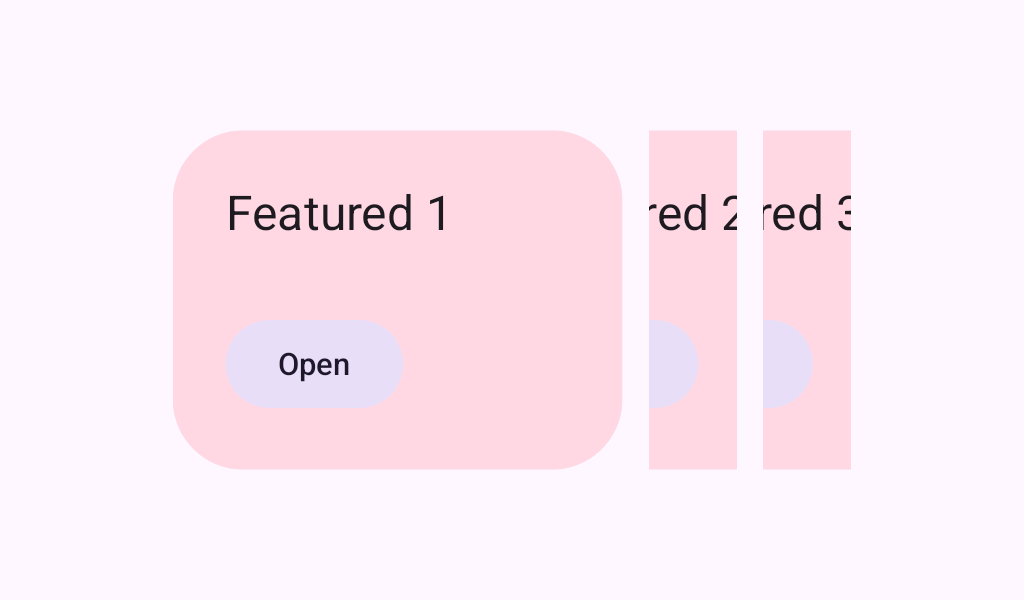
HorizontalCenteredHeroCarousel
Source set: Common
@Composable
fun HorizontalCenteredHeroCarousel(
    state: CarouselState,
    modifier: Modifier = Modifier,
    maxItemWidth: Dp = Dp.Unspecified,
    itemSpacing: Dp = 0.dp,
    flingBehavior: TargetedFlingBehavior =
        CarouselDefaults.singleAdvanceFlingBehavior(state = state),
    userScrollEnabled: Boolean = true,
    minSmallItemWidth: Dp = CarouselDefaults.MinSmallItemSize,
    maxSmallItemWidth: Dp = CarouselDefaults.MaxSmallItemSize,
    contentPadding: PaddingValues = PaddingValues(0.dp),
    content: @Composable CarouselItemScope.(itemIndex: Int) -> Unit,
)
Parameters
| state | The state object to be used to control the carousel's state |
| modifier | A modifier instance to be applied to this carousel container |
| maxItemWidth | The max width a large item should be in dp. The default value of Dp.Unspecified allows one large item to grow to fill the entire viewport minus space for two surrounding small items. Values other than unspecified will add additional large items as space allows. To allow items to grow up to a certain aspect ratio, use the carousel's cross axis size * a multiplier (e.g. 220.dp * 2 for a max aspect ratio of 2:1). |
| itemSpacing | The amount of space used to separate items in the carousel |
| flingBehavior | The TargetedFlingBehavior to be used for post scroll gestures |
| userScrollEnabled | whether the scrolling via the user gestures or accessibility actions is allowed. |
| minSmallItemWidth | The minimum allowable width of small items in dp |
| maxSmallItemWidth | The maximum allowable width of small items in dp |
| contentPadding | a padding around the whole content. This will add padding for the content after it has been clipped. You can use it to add a padding before the first item or after the last one. Use itemSpacing to add spacing between the items. |
| content | The carousel's content Composable |
