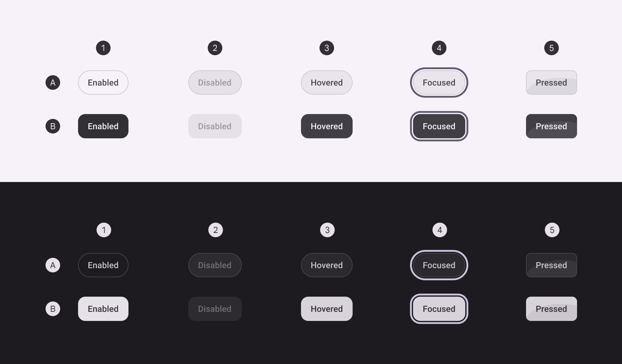

OutlinedToggleButton
Source set: Common
@Composable
public fun OutlinedToggleButton(
    checked: Boolean,
    onCheckedChange: (Boolean) -> Unit,
    modifier: Modifier = Modifier,
    buttonSize: ToggleButtonSize = OutlinedToggleButtonDefaults.size,
    enabled: Boolean = true,
    icon: @Composable (() -> Unit)? = null,
    shapes: ToggleButtonShapes = OutlinedToggleButtonDefaults.shapesFor(buttonSize),
    colors: ToggleButtonColors = OutlinedToggleButtonDefaults.colors(),
    elevation: ToggleButtonElevation? = null,
    border: BorderStroke? = OutlinedToggleButtonDefaults.border(enabled, checked),
    contentPadding: PaddingValues =
        OutlinedToggleButtonDefaults.contentPaddingFor(buttonSize, hasStartIcon = icon != null),
    interactionSource: MutableInteractionSource? = null,
    content: @Composable RowScope.() -> Unit,
)
Parameters
| checked | whether the toggle button is toggled on or off. |
| onCheckedChange | called when the toggle button is clicked. |
| modifier | the Modifier to be applied to the toggle button. |
| buttonSize | the ToggleButtonSize of this toggle button, controlling its height, padding, and icon sizing. |
| enabled | controls the enabled state of this toggle button. When false, this component will not respond to user input, and it will appear visually disabled and disabled to accessibility services. |
| icon | optional icon to be placed before the content. |
| shapes | the ToggleButtonShapes used for this toggle button. |
| colors | ToggleButtonColors used for this toggle button. See OutlinedToggleButtonDefaults.colors. |
| elevation | ToggleButtonElevation used for this button. |
| border | the border to draw around the container. See OutlinedToggleButtonDefaults.border. |
| contentPadding | the spacing values to apply internally. |
| interactionSource | an optional hoisted MutableInteractionSource for observing and emitting Interactions for this toggle button. You can use this to change the toggle button's appearance or preview the toggle button in different states. Note that if null is provided, interactions will still happen internally. |
| content | The content displayed on the toggle button. |
