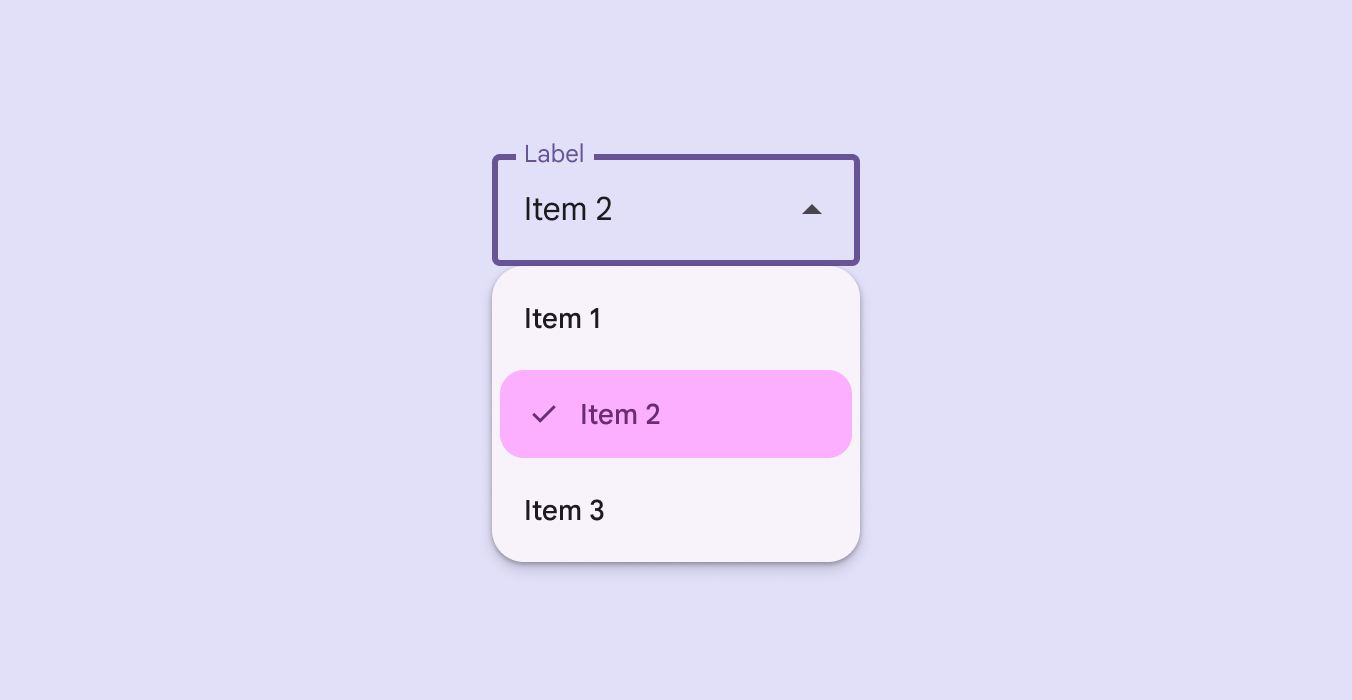

DropdownMenuItemLegacy
Source set: Common
@Deprecated("Maintained for binary compatibility.", level = DeprecationLevel.HIDDEN)
@Composable
public fun DropdownMenuItemLegacy(
    checked: Boolean,
    onCheckedChange: (Boolean) -> Unit,
    text: @Composable () -> Unit,
    shapes: MenuItemShapes,
    modifier: Modifier = Modifier,
    leadingIcon: @Composable (() -> Unit)? = null,
    checkedLeadingIcon: @Composable (() -> Unit)? = null,
    trailingIcon: @Composable (() -> Unit)? = null,
    supportingText: @Composable (() -> Unit)? = null,
    enabled: Boolean = true,
    colors: MenuItemColors = MenuDefaults.selectableItemColorsLegacy(),
    horizontalArrangement: Arrangement.Horizontal =
        MenuDefaults.DropdownMenuItemHorizontalArrangement,
    contentPadding: PaddingValues = MenuDefaults.DropdownMenuSelectableItemContentPadding,
    interactionSource: MutableInteractionSource? = null,
)
Parameters
| checked | whether this menu item is currently checked |
| onCheckedChange | called when this menu item is clicked, with the new checked state |
| text | text of the menu item |
| shapes | MenuItemShapes that will be used to resolve the shapes for this menu item |
| modifier | the Modifier to be applied to this menu item |
| leadingIcon | optional leading icon to be displayed when the item is unchecked |
| checkedLeadingIcon | optional leading icon to be displayed when the item is checked |
| trailingIcon | optional trailing icon to be displayed at the end of the item's text |
| supportingText | optional supporting text of the menu item |
| enabled | controls the enabled state of this menu item |
| colors | MenuItemColors that will be used to resolve the colors for this menu item |
| horizontalArrangement | the horizontal arrangement of the menu item's children |
| contentPadding | the padding applied to the content of this menu item |
| interactionSource | an optional hoisted MutableInteractionSource for observing and emitting Interactions for this menu item |
DropdownMenuItemLegacy
Source set: Common
@Deprecated("Maintained for binary compatibility.", level = DeprecationLevel.HIDDEN)
@Composable
public fun DropdownMenuItemLegacy(
    selected: Boolean,
    onClick: () -> Unit,
    text: @Composable () -> Unit,
    shapes: MenuItemShapes,
    modifier: Modifier = Modifier,
    leadingIcon: @Composable (() -> Unit)? = null,
    selectedLeadingIcon: @Composable (() -> Unit)? = null,
    trailingIcon: @Composable (() -> Unit)? = null,
    supportingText: @Composable (() -> Unit)? = null,
    enabled: Boolean = true,
    colors: MenuItemColors = MenuDefaults.selectableItemColorsLegacy(),
    horizontalArrangement: Arrangement.Horizontal =
        MenuDefaults.DropdownMenuItemHorizontalArrangement,
    contentPadding: PaddingValues = MenuDefaults.DropdownMenuSelectableItemContentPadding,
    interactionSource: MutableInteractionSource? = null,
)
Parameters
| selected | whether this menu item is currently selected |
| onClick | called when this menu item is clicked |
| text | text of the menu item |
| shapes | MenuItemShapes that will be used to resolve the shapes for this menu item |
| modifier | the Modifier to be applied to this menu item |
| leadingIcon | optional leading icon to be displayed when the item is unchecked |
| selectedLeadingIcon | optional leading icon to be displayed when the item is selected |
| trailingIcon | optional trailing icon to be displayed at the end of the item's text |
| supportingText | optional supporting text of the menu item |
| enabled | controls the enabled state of this menu item |
| colors | MenuItemColors that will be used to resolve the colors for this menu item |
| horizontalArrangement | the horizontal arrangement of the menu item's children |
| contentPadding | the padding applied to the content of this menu item |
| interactionSource | an optional hoisted MutableInteractionSource for observing and emitting Interactions for this menu item |
