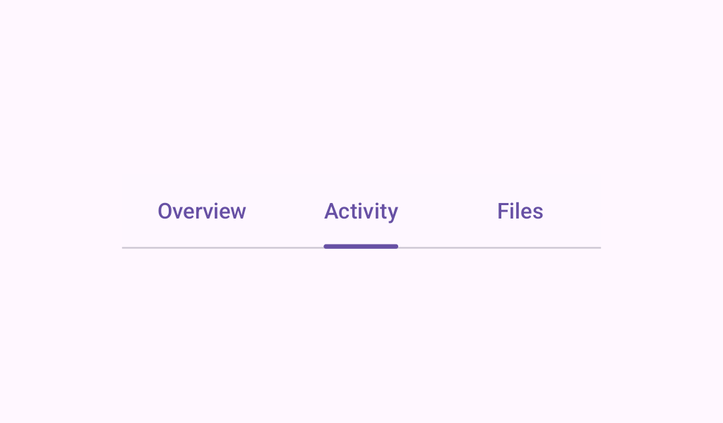
PrimaryTabRow
Source set: Common
@Composable
fun PrimaryTabRow(
    selectedTabIndex: Int,
    modifier: Modifier = Modifier,
    containerColor: Color = TabRowDefaults.primaryContainerColor,
    contentColor: Color = TabRowDefaults.primaryContentColor,
    indicator: @Composable TabIndicatorScope.() -> Unit = {
        TabRowDefaults.PrimaryIndicator(
            modifier = Modifier.tabIndicatorOffset(selectedTabIndex, matchContentSize = true),
            width = Dp.Unspecified,
        )
    },
    divider: @Composable () -> Unit = @Composable { HorizontalDivider() },
    tabs: @Composable () -> Unit,
)
Parameters
| selectedTabIndex | the index of the currently selected tab |
| modifier | the Modifier to be applied to this tab row |
| containerColor | the color used for the background of this tab row. Use Color.Transparent to have no color. |
| contentColor | the preferred color for content inside this tab row. Defaults to either the matching content color for containerColor, or to the current LocalContentColor if containerColor is not a color from the theme. |
| indicator | the indicator that represents which tab is currently selected. By default this will be a TabRowDefaults.PrimaryIndicator, using a TabRowDefaults.tabIndicatorOffset modifier to animate its position. |
| divider | the divider displayed at the bottom of the tab row. This provides a layer of separation between the tab row and the content displayed underneath. |
| tabs | the tabs inside this tab row. Typically this will be multiple Tabs. Each element inside this lambda will be measured and placed evenly across the row, each taking up equal space. |
