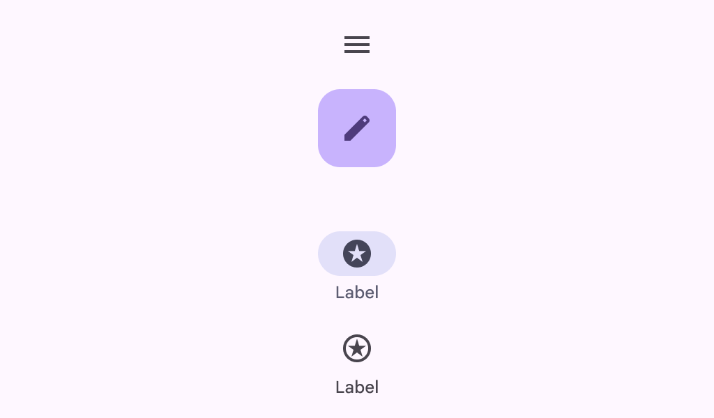
WideNavigationRail
Source set: Common
@Composable
fun WideNavigationRail(
    modifier: Modifier = Modifier,
    state: WideNavigationRailState = rememberWideNavigationRailState(),
    shape: Shape = WideNavigationRailDefaults.shape,
    colors: WideNavigationRailColors = WideNavigationRailDefaults.colors(),
    header: @Composable (() -> Unit)? = null,
    windowInsets: WindowInsets = WideNavigationRailDefaults.windowInsets,
    arrangement: Arrangement.Vertical = WideNavigationRailDefaults.arrangement,
    contentPadding: PaddingValues = WideNavigationRailDefaults.ContentPadding,
    content: @Composable () -> Unit,
)
Parameters
| modifier | the Modifier to be applied to this wide navigation rail |
| state | the WideNavigationRailState of this wide navigation rail |
| shape | defines the shape of this wide navigation rail's container. |
| colors | WideNavigationRailColors that will be used to resolve the colors used for this wide navigation rail. See WideNavigationRailDefaults.colors |
| header | optional header that may hold a FloatingActionButton or a logo |
| windowInsets | a window insets of the wide navigation rail |
| arrangement | the Arrangement.Vertical of this wide navigation rail for its content. Note that if there's a header present, the items will be arranged on the remaining space below it, except for the center arrangement which considers the entire height of the container |
| contentPadding | the spacing values to apply internally between the container and the content |
| content | the content of this wide navigation rail, typically WideNavigationRailItems |
WideNavigationRail
Deprecated
Deprecated in favor of function with contentPadding parameter
Source set: Common
@Composable
fun WideNavigationRail(
    modifier: Modifier = Modifier,
    state: WideNavigationRailState = rememberWideNavigationRailState(),
    shape: Shape = WideNavigationRailDefaults.shape,
    colors: WideNavigationRailColors = WideNavigationRailDefaults.colors(),
    header: @Composable (() -> Unit)? = null,
    windowInsets: WindowInsets = WideNavigationRailDefaults.windowInsets,
    arrangement: Arrangement.Vertical = WideNavigationRailDefaults.arrangement,
    content: @Composable () -> Unit,
)
Parameters
| modifier | the Modifier to be applied to this wide navigation rail |
| state | the WideNavigationRailState of this wide navigation rail |
| shape | defines the shape of this wide navigation rail's container. |
| colors | WideNavigationRailColors that will be used to resolve the colors used for this wide navigation rail. See WideNavigationRailDefaults.colors |
| header | optional header that may hold a FloatingActionButton or a logo |
| windowInsets | a window insets of the wide navigation rail |
| arrangement | the Arrangement.Vertical of this wide navigation rail for its content. Note that if there's a header present, the items will be arranged on the remaining space below it, except for the center arrangement which considers the entire height of the container |
| content | the content of this wide navigation rail, typically WideNavigationRailItems |
