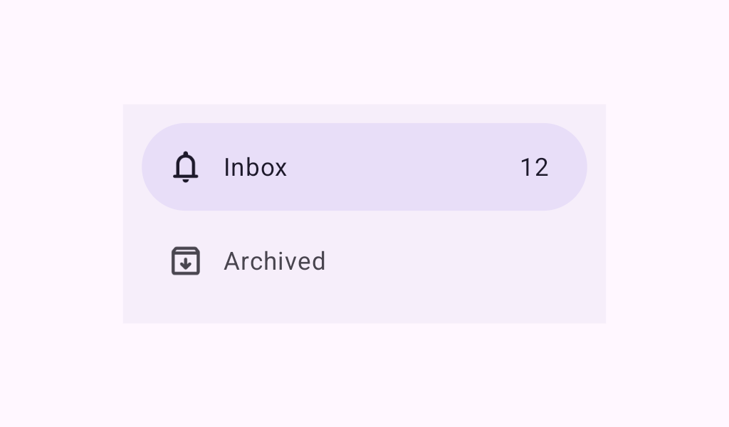
NavigationDrawerItem
Source set: Common
@Composable
fun NavigationDrawerItem(
    label: @Composable () -> Unit,
    selected: Boolean,
    onClick: () -> Unit,
    modifier: Modifier = Modifier,
    icon: (@Composable () -> Unit)? = null,
    badge: (@Composable () -> Unit)? = null,
    shape: Shape = NavigationDrawerTokens.ActiveIndicatorShape.value,
    colors: NavigationDrawerItemColors = NavigationDrawerItemDefaults.colors(),
    interactionSource: MutableInteractionSource? = null,
)
Parameters
| label | text label for this item |
| selected | whether this item is selected |
| onClick | called when this item is clicked |
| modifier | the Modifier to be applied to this item |
| icon | optional icon for this item, typically an Icon |
| badge | optional badge to show on this item from the end side |
| shape | optional shape for the active indicator |
| colors | NavigationDrawerItemColors that will be used to resolve the colors used for this item in different states. See NavigationDrawerItemDefaults.colors. |
| interactionSource | an optional hoisted MutableInteractionSource for observing and emitting Interactions for this item. You can use this to change the item's appearance or preview the item in different states. Note that if null is provided, interactions will still happen internally. |
