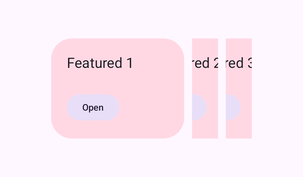

HorizontalCenteredHeroCarousel
Source set: Common
@Composable
public fun HorizontalCenteredHeroCarousel(
    state: CarouselState,
    modifier: Modifier = Modifier,
    preferredItemWidth: Dp = Dp.Unspecified,
    itemSpacing: Dp = CarouselDefaults.ItemSpacing,
    flingBehavior: TargetedFlingBehavior =
        CarouselDefaults.singleAdvanceFlingBehavior(state = state),
    userScrollEnabled: Boolean = true,
    minSmallItemWidth: Dp = CarouselDefaults.MinSmallItemSize,
    maxSmallItemWidth: Dp = CarouselDefaults.MaxSmallItemSize,
    contentPadding: PaddingValues = CarouselDefaults.ContentPadding,
    content: @Composable CarouselItemScope.(itemIndex: Int) -> Unit,
)
Parameters
| state | The state object to be used to control the carousel's state |
| modifier | A modifier instance to be applied to this carousel container |
| preferredItemWidth | The width large items aim for in dp. Carousel picks the arrangement whose large item width lands closest to this value, resizing small items between minSmallItemWidth and maxSmallItemWidth to fill the rest of the viewport, so the final width can differ. The default Dp.Unspecified targets the whole viewport, fitting one large item beside two small items; smaller values fit more large items. Large items always end up wider than the small items beside them, which are never narrower than minSmallItemWidth, so widths at or below that bound cannot be honored. To target an aspect ratio, use the carousel's cross axis size * a multiplier (e.g. 220.dp * 2 for a 2:1 ratio). |
| itemSpacing | The amount of space used to separate items in the carousel |
| flingBehavior | The TargetedFlingBehavior to be used for post scroll gestures |
| userScrollEnabled | whether the scrolling via the user gestures or accessibility actions is allowed. |
| minSmallItemWidth | The minimum allowable width of small items in dp |
| maxSmallItemWidth | The maximum allowable width of small items in dp |
| contentPadding | a padding around the whole content. This will add padding for the content after it has been clipped. You can use it to add a padding before the first item or after the last one. Use itemSpacing to add spacing between the items. |
| content | The carousel's content Composable |
