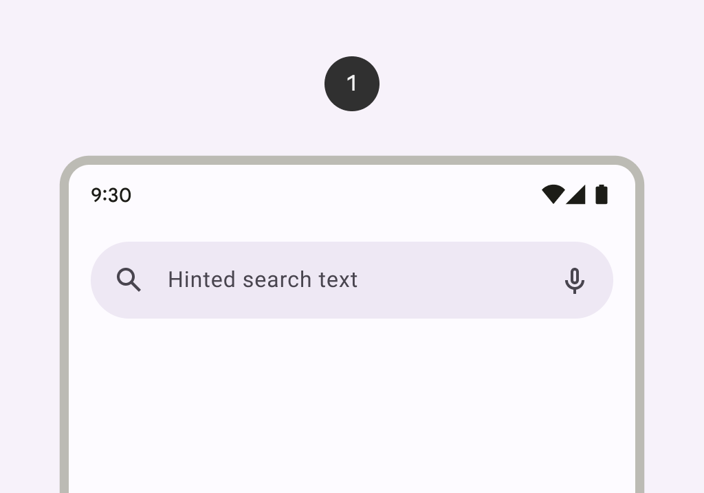
TopSearchBar
Deprecated
Renamed to AppBarWithSearch
Source set: Common
@ExperimentalMaterial3Api
@Composable
fun TopSearchBar(
    state: SearchBarState,
    inputField: @Composable () -> Unit,
    modifier: Modifier = Modifier,
    shape: Shape = SearchBarDefaults.inputFieldShape,
    colors: SearchBarColors = SearchBarDefaults.colors(),
    tonalElevation: Dp = SearchBarDefaults.TonalElevation,
    shadowElevation: Dp = SearchBarDefaults.ShadowElevation,
    windowInsets: WindowInsets = SearchBarDefaults.windowInsets,
    scrollBehavior: SearchBarScrollBehavior? = null,
)
Parameters
| state | the state of the search bar. This state should also be passed to the inputField and the expanded search bar. |
| inputField | the input field of this search bar that allows entering a query, typically a SearchBarDefaults.InputField. |
| modifier | the Modifier to be applied to this search bar when collapsed. |
| shape | the shape of this search bar when collapsed. |
| colors | SearchBarColors that will be used to resolve the colors used for this search bar in different states. See SearchBarDefaults.colors. |
| tonalElevation | when SearchBarColors.containerColor is ColorScheme.surface, a translucent primary color overlay is applied on top of the container. A higher tonal elevation value will result in a darker color in light theme and lighter color in dark theme. See also: Surface. |
| shadowElevation | the elevation for the shadow below this search bar. |
| windowInsets | the window insets that the search bar will respect when collapsed. |
| scrollBehavior | a SearchBarScrollBehavior which works in conjunction with a scrolled content to change the search bar appearance as the content scrolls. If null, the search bar will not automatically react to scrolling. |
