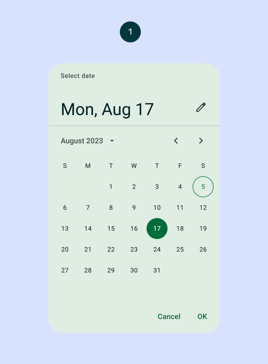
DatePicker
Source set: Common
@Composable
fun DatePicker(
    state: DatePickerState,
    modifier: Modifier = Modifier,
    dateFormatter: DatePickerFormatter = remember { DatePickerDefaults.dateFormatter() },
    colors: DatePickerColors = DatePickerDefaults.colors(),
    title: (@Composable () -> Unit)? = {
        DatePickerDefaults.DatePickerTitle(
            displayMode = state.displayMode,
            modifier = Modifier.padding(DatePickerTitlePadding),
            contentColor = colors.titleContentColor,
        )
    },
    headline: (@Composable () -> Unit)? = {
        DatePickerDefaults.DatePickerHeadline(
            selectedDateMillis = state.selectedDateMillis,
            displayMode = state.displayMode,
            dateFormatter = dateFormatter,
            modifier = Modifier.padding(DatePickerHeadlinePadding),
            contentColor = colors.headlineContentColor,
        )
    },
    showModeToggle: Boolean = true,
    focusRequester: FocusRequester? = remember { FocusRequester() },
)
Parameters
| state | state of the date picker. See rememberDatePickerState. |
| modifier | the Modifier to be applied to this date picker |
| dateFormatter | a DatePickerFormatter that provides formatting skeletons for dates display |
| colors | DatePickerColors that will be used to resolve the colors used for this date picker in different states. See DatePickerDefaults.colors. |
| title | the title to be displayed in the date picker |
| headline | the headline to be displayed in the date picker |
| showModeToggle | indicates if this DatePicker should show a mode toggle action that transforms it into a date input |
| focusRequester | a focus requester that will be used to focus the text field when the date picker is in an input mode. Pass null to not focus the text field if that's the desired behavior. |
