NavigationRail
Source set: Common
@Composable
fun NavigationRail(
    modifier: Modifier = Modifier,
    containerColor: Color = NavigationRailDefaults.ContainerColor,
    contentColor: Color = contentColorFor(containerColor),
    header: @Composable (ColumnScope.() -> Unit)? = null,
    windowInsets: WindowInsets = NavigationRailDefaults.windowInsets,
    content: @Composable ColumnScope.() -> Unit,
)
Parameters
| modifier | the Modifier to be applied to this navigation rail |
| containerColor | the color used for the background of this navigation rail. Use Color.Transparent to have no color. |
| contentColor | the preferred color for content inside this navigation rail. Defaults to either the matching content color for containerColor, or to the current LocalContentColor if containerColor is not a color from the theme. |
| header | optional header that may hold a FloatingActionButton or a logo |
| windowInsets | a window insets of the navigation rail. |
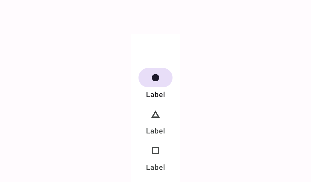
| content | the content of this navigation rail, typically 3-7 NavigationRailItems |
