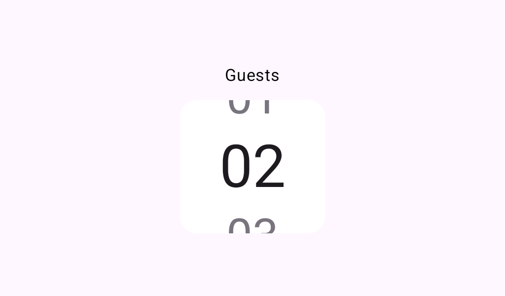

ScrollField
Source set: Common
@Composable
public fun ScrollField(
    state: ScrollFieldState,
    contentDescription: String?,
    modifier: Modifier = Modifier,
    enabled: Boolean = true,
    colors: ScrollFieldColors = ScrollFieldDefaults.colors(),
    fieldAccessibilityDescription: (index: Int) -> String = { index -> index.toLocalString() },
    interactionSource: MutableInteractionSource? = null,
    field: @Composable (index: Int, selected: Boolean, enabled: Boolean) -> Unit =
        { index, selected, enabled ->
            ScrollFieldDefaults.Item(
                index = index,
                selected = selected,
                enabled = enabled,
                colors = colors,
            )
        },
)
Parameters
| state | the state object to be used to control or observe the pager's state. |
| contentDescription | text used by accessibility services to describe what this field selects. This should include the available range when it is not obvious from context (e.g., "Select year between 2000 and 2025"). Because the wheel wraps around endlessly, this description is the only way for an accessibility user to learn the field's bounds. |
| modifier | the Modifier to be applied to the ScrollField container. |
| enabled | whether the ScrollField is enabled. When false the disabled colors from ScrollFieldColors will be used, and the ScrollField will not be interactable. |
| colors | ScrollFieldColors that will be used to resolve the colors used for this ScrollField in different states. |
| fieldAccessibilityDescription | returns the text accessibility services (e.g. TalkBack) announced for the option at the given index. It should match the text rendered by field. |
| interactionSource | MutableInteractionSource for observing and controlling the interactions with the scroll field. |
| field | the composable used to render each item in the wheel. |
