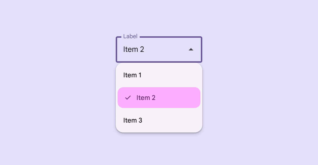
DropdownMenuGroup
Source set: Common
@Composable
fun DropdownMenuGroup(
    shapes: MenuGroupShapes,
    modifier: Modifier = Modifier,
    containerColor: Color = MenuDefaults.groupStandardContainerColor,
    tonalElevation: Dp = MenuDefaults.TonalElevation,
    shadowElevation: Dp = MenuDefaults.ShadowElevation,
    border: BorderStroke? = null,
    contentPadding: PaddingValues = MenuDefaults.DropdownMenuGroupContentPadding,
    interactionSource: MutableInteractionSource? = null,
    content: @Composable ColumnScope.() -> Unit,
)
Parameters
| shapes | the MenuGroupShapes of the menu group. The shapes provided should be determined by the number of groups in the menu as well as the group's position in the menu. There is a convenience function that can be used to easily determine the shape to be used at MenuDefaults.groupShape |
| modifier | Modifier to be applied to this menu group. |
| containerColor | the container color of the menu group. There are two predefined container colors at MenuDefaults.groupStandardContainerColor and MenuDefaults.groupVibrantContainerColor which you can use. |
| tonalElevation | when containerColor is ColorScheme.surface, a translucent primary color overlay is applied on top of the container. A higher tonal elevation value will result in a darker color in light theme and lighter color in dark theme. See also: Surface. |
| shadowElevation | the elevation for the shadow below the menu group. |
| border | the border to draw around the container of the menu group. |
| contentPadding | the padding applied to the content of this menu group. |
| interactionSource | an optional hoisted MutableInteractionSource for observing and emitting Interactions for this menu group. This is currently only used for hover interactions. |
| content | the content of this menu group, typically DropdownMenuItems. |
