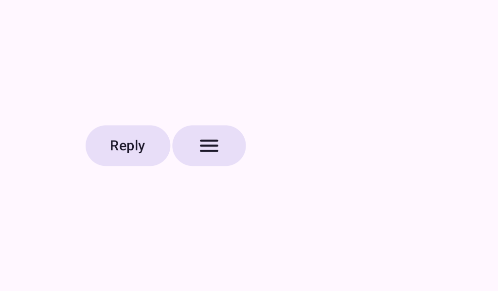


SplitButtonLayout
Source set: Common
@Composable
public fun SplitButtonLayout(
    leadingButton: @Composable () -> Unit,
    trailingButton: @Composable () -> Unit,
    modifier: Modifier = Modifier,
    spacing: Dp = SplitButtonDefaults.Spacing,
)
Parameters
| leadingButton | the leading button. You can specify your own composable or construct a SplitButtonDefaults.LeadingButton |
| trailingButton | the trailing button. You can specify your own composable or construct a SplitButtonDefaults.TrailingButton |
| modifier | the Modifier to be applied to this split button. |
| spacing | The spacing between the leadingButton and trailingButton |
