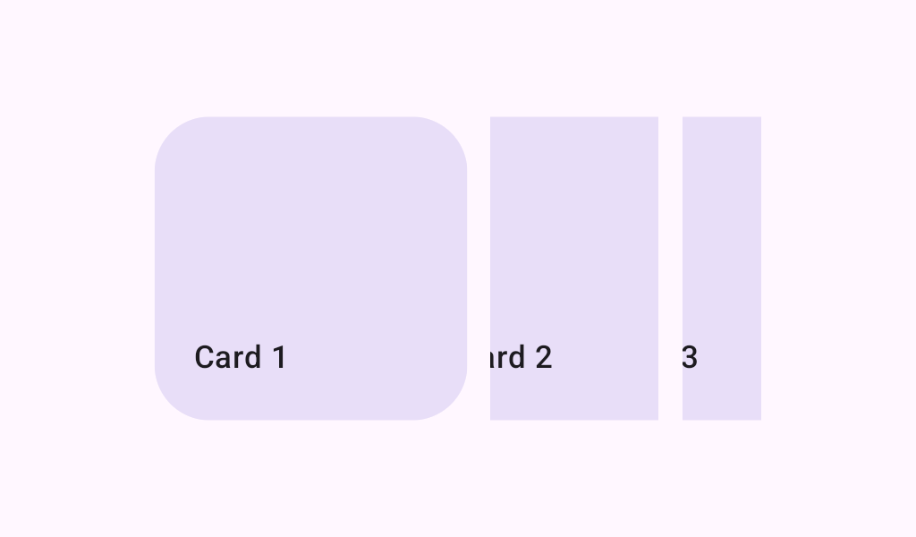
HorizontalMultiBrowseCarousel
Source set: Common
@Composable
fun HorizontalMultiBrowseCarousel(
    state: CarouselState,
    preferredItemWidth: Dp,
    modifier: Modifier = Modifier,
    itemSpacing: Dp = 0.dp,
    flingBehavior: TargetedFlingBehavior =
        CarouselDefaults.singleAdvanceFlingBehavior(state = state),
    userScrollEnabled: Boolean = true,
    minSmallItemWidth: Dp = CarouselDefaults.MinSmallItemSize,
    maxSmallItemWidth: Dp = CarouselDefaults.MaxSmallItemSize,
    contentPadding: PaddingValues = PaddingValues(0.dp),
    content: @Composable CarouselItemScope.(itemIndex: Int) -> Unit,
)
Parameters
| state | The state object to be used to control the carousel's state |
| preferredItemWidth | The width that large, fully visible items would like to be in the horizontal axis. This width is a target and will likely be adjusted by carousel in order to fit a whole number of items within the container. Carousel adjusts small items first (between the minSmallItemWidth and maxSmallItemWidth). Then medium items, when present, are adjusted to use a width anywhere between the small item width and large item width. Finally, large items are adjusted if necessary. |
| modifier | A modifier instance to be applied to this carousel container |
| itemSpacing | The amount of space used to separate items in the carousel |
| flingBehavior | The TargetedFlingBehavior to be used for post scroll gestures |
| userScrollEnabled | whether the scrolling via the user gestures or accessibility actions is allowed. |
| minSmallItemWidth | The minimum allowable width of small items in dp. Depending on the preferredItemWidth and the width of the carousel, the small item width will be chosen from a range of minSmallItemWidth and maxSmallItemWidth |
| maxSmallItemWidth | The maximum allowable width of small items in dp. Depending on the preferredItemWidth and the width of the carousel, the small item width will be chosen from a range of minSmallItemWidth and maxSmallItemWidth |
| contentPadding | a padding around the whole content. This will add padding for the content after it has been clipped. You can use it to add a padding before the first item or after the last one. Use itemSpacing to add spacing between the items. |
| content | The carousel's content Composable |
