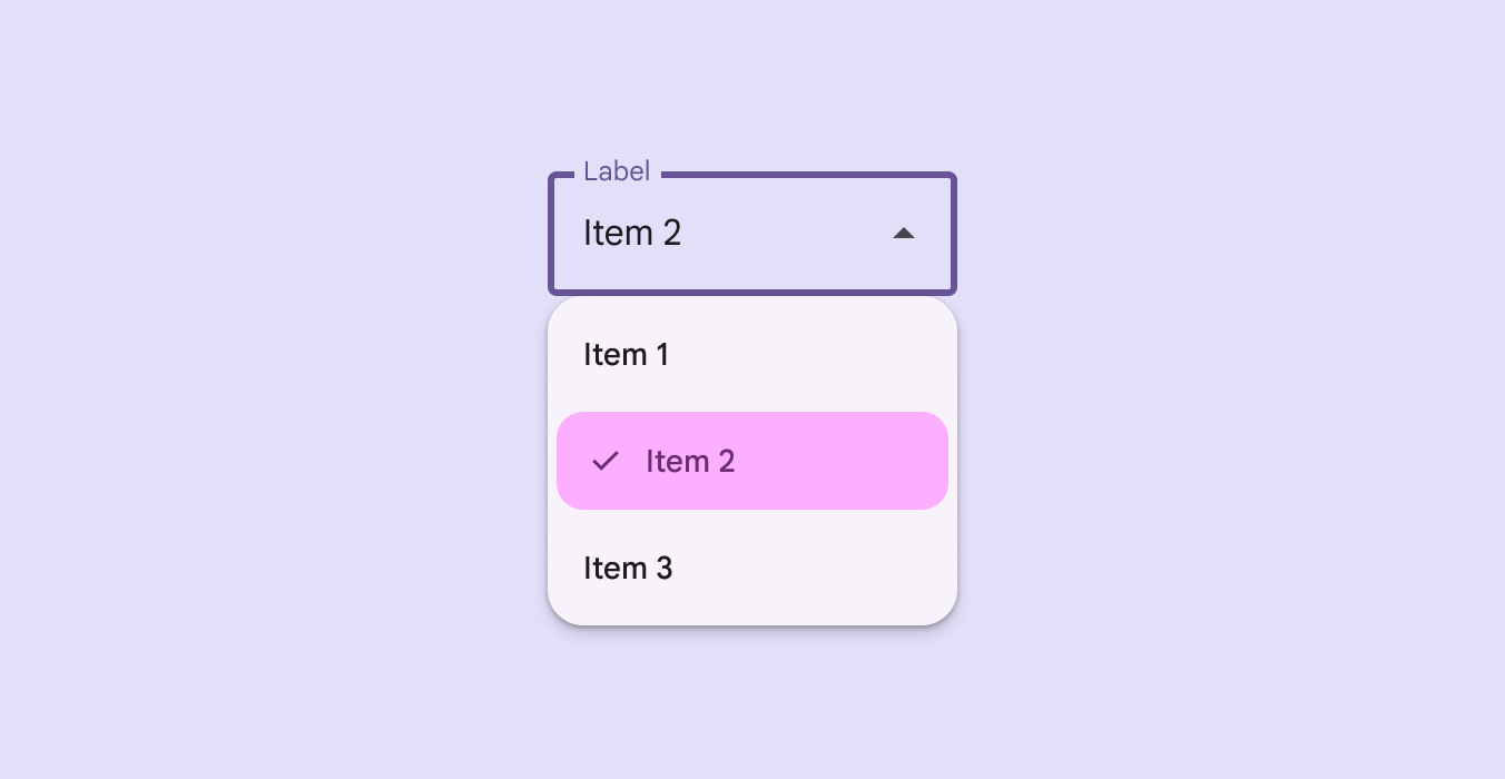

SelectableDropdownMenuItem
Source set: Common
@Composable
public fun SelectableDropdownMenuItem(
    selected: Boolean,
    onClick: () -> Unit,
    text: @Composable () -> Unit,
    shapes: MenuItemShapes,
    modifier: Modifier = Modifier,
    leadingIcon: @Composable (() -> Unit)? = null,
    selectedLeadingIcon: @Composable (() -> Unit)? = null,
    trailingContent: @Composable (() -> Unit)? = null,
    supportingText: @Composable (() -> Unit)? = null,
    enabled: Boolean = true,
    colors: SelectableMenuItemColors = MenuDefaults.selectableItemColors(),
    horizontalArrangement: Arrangement.Horizontal =
        MenuDefaults.DropdownMenuItemHorizontalArrangement,
    contentPadding: PaddingValues = MenuDefaults.DropdownMenuSelectableItemContentPadding,
    interactionSource: MutableInteractionSource? = null,
)
Parameters
| selected | whether this menu item is currently selected. |
| onClick | called when this menu item is clicked. |
| text | text of the menu item. |
| shapes | MenuItemShapes that will be used to resolve the shapes for this menu item. The shape of this item is determined by the value of selected. The shapes provided should be determined by the number of items in the group or menu as well as the item's position in the menu. There is a convenience function that can be used to easily determine the shape to be used at MenuDefaults.itemShape |
| modifier | the Modifier to be applied to this menu item. |
| leadingIcon | optional leading icon to be displayed when the item is unchecked. |
| selectedLeadingIcon | optional leading icon to be displayed when the item is selected. |
| trailingContent | optional trailing content to be displayed at the end of the item's text. |
| supportingText | optional supporting text of the menu item. |
| enabled | controls the enabled state of this menu item. When false, this component will not respond to user input. |
| colors | SelectableMenuItemColors that will be used to resolve the colors for this menu item. There are two predefined SelectableMenuItemColors at MenuDefaults.selectableItemColors and MenuDefaults.selectableItemVibrantColors which you can use or modify. |
| horizontalArrangement | the horizontal arrangement of the menu item's children. |
| contentPadding | the padding applied to the content of this menu item. |
| interactionSource | an optional hoisted MutableInteractionSource for observing and emitting Interactions for this menu item. |
