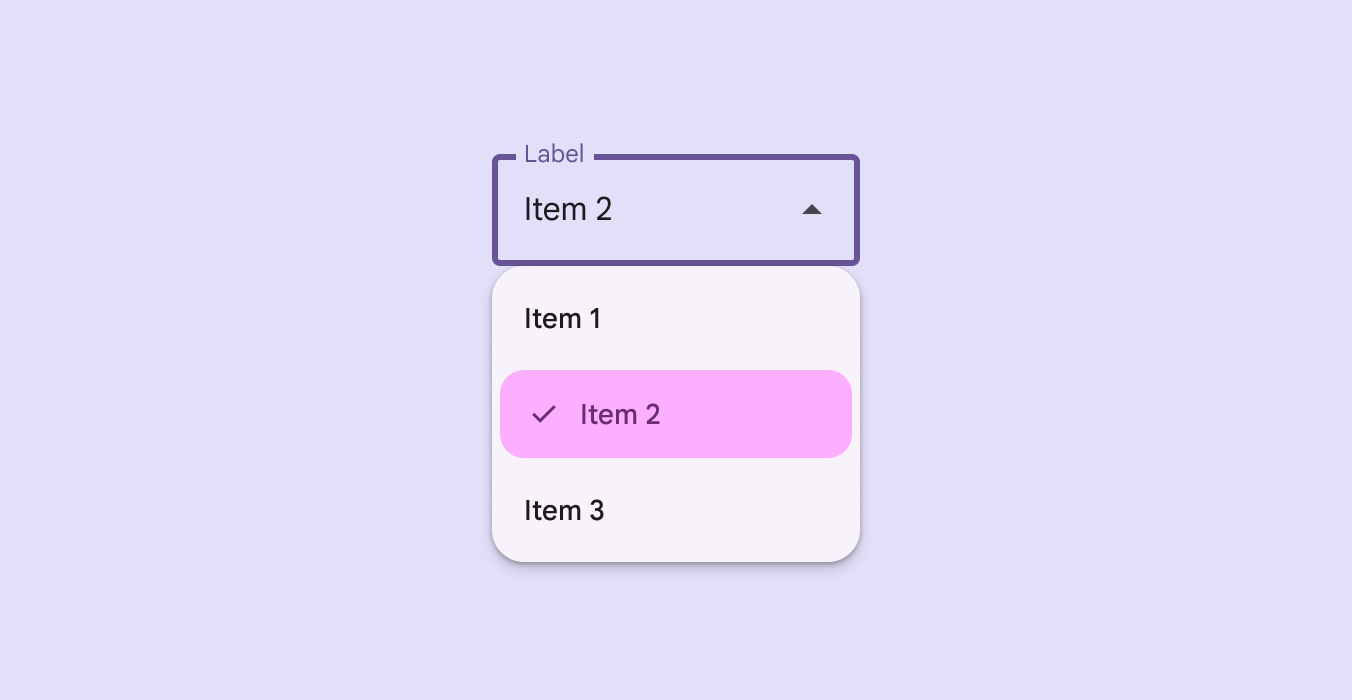

DropdownMenuPopup
Source set: Common
@Composable
public fun DropdownMenuPopup(
    expanded: Boolean,
    onDismissRequest: () -> Unit,
    modifier: Modifier = Modifier,
    popupPositionProvider: DropdownMenuPopupPositionProvider =
        MenuDefaults.rememberDropdownMenuPopupPositionProvider(MenuAnchorPosition.Below),
    properties: PopupProperties = MenuDefaults.DefaultMenuProperties,
    content: @Composable ColumnScope.() -> Unit,
)
Parameters
| expanded | whether the menu is expanded or not. |
| onDismissRequest | called when the user requests to dismiss the menu, such as by tapping outside the menu's bounds. |
| modifier | Modifier to be applied to the menu's content. |
| popupPositionProvider | DropdownMenuPopupPositionProvider to be used to position the menu. |
| properties | PopupProperties for further customization of this popup's behavior. |
| content | the content of this dropdown menu. |
