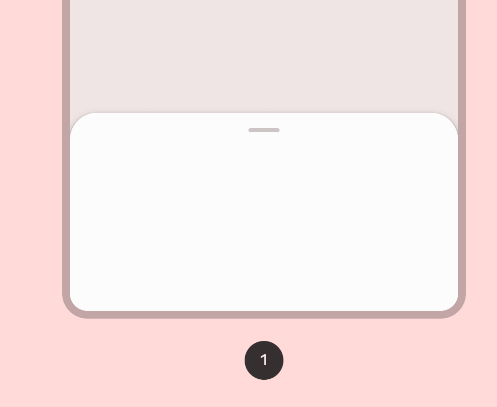
ModalBottomSheet
Source set: Common
@Composable
@ExperimentalMaterial3Api
fun ModalBottomSheet(
    onDismissRequest: () -> Unit,
    modifier: Modifier = Modifier,
    sheetState: SheetState = rememberBottomSheetState(initialValue = Hidden),
    sheetMaxWidth: Dp = BottomSheetDefaults.SheetMaxWidth,
    sheetGesturesEnabled: Boolean = true,
    shape: Shape = BottomSheetDefaults.ExpandedShape,
    containerColor: Color = BottomSheetDefaults.ContainerColor,
    contentColor: Color = contentColorFor(containerColor),
    tonalElevation: Dp = 0.dp,
    scrimColor: Color = BottomSheetDefaults.ScrimColor,
    dragHandle: @Composable (() -> Unit)? = { BottomSheetDefaults.DragHandle() },
    contentWindowInsets: @Composable () -> WindowInsets = { BottomSheetDefaults.modalWindowInsets },
    properties: ModalBottomSheetProperties = ModalBottomSheetProperties(),
    content: @Composable ColumnScope.() -> Unit,
)
Parameters
| onDismissRequest | Executes when the user clicks outside of the bottom sheet, after sheet animates to Hidden. |
| modifier | Optional Modifier for the bottom sheet. |
| sheetState | The state of the bottom sheet. |
| sheetMaxWidth | Dp that defines what the maximum width the sheet will take. Pass in Dp.Unspecified for a sheet that spans the entire screen width. |
| sheetGesturesEnabled | Whether the bottom sheet can be interacted with by gestures. |
| shape | The shape of the bottom sheet. |
| containerColor | The color used for the background of this bottom sheet |
| contentColor | The preferred color for content inside this bottom sheet. Defaults to either the matching content color for containerColor, or to the current LocalContentColor if containerColor is not a color from the theme. |
| tonalElevation | when containerColor is ColorScheme.surface, a translucent primary color overlay is applied on top of the container. A higher tonal elevation value will result in a darker color in light theme and lighter color in dark theme. See also: Surface. |
| scrimColor | Color of the scrim that obscures content when the bottom sheet is open. |
| dragHandle | Optional visual marker to swipe the bottom sheet. |
| contentWindowInsets | callback which provides window insets to be passed to the bottom sheet content via androidx.compose.foundation.layout.windowInsetsPadding. ModalBottomSheet will pre-emptively consume top insets based on it's current offset. This keeps content outside of the expected window insets at any position. By default, IME padding is handled through this parameter as part of the window insets. If the IME padding is required from a different scope (e.g. a different window opens a keyboard then launches ModalBottomSheet), then Modifier.imePadding should be applied to the modifier parameter. |
| properties | ModalBottomSheetProperties for further customization of this modal bottom sheet's window behavior. |
| content | The content to be displayed inside the bottom sheet. |
