Badge
Composable Component
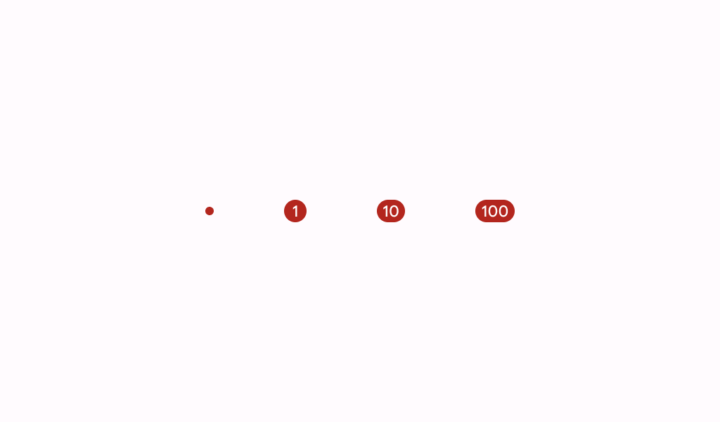
A badge represents dynamic information such as a number of pending requests in a navigation bar.
Common
@Composable
fun Badge(
    modifier: Modifier = Modifier,
    containerColor: Color = BadgeDefaults.containerColor,
    contentColor: Color = contentColorFor(containerColor),
    content: @Composable (RowScope.() -> Unit)? = null,
)
Parameters
| modifier | the Modifier to be applied to this badge |
| containerColor | the color used for the background of this badge |
| contentColor | the preferred color for content inside this badge. Defaults to either the matching content color for containerColor, or to the current LocalContentColor if containerColor is not a color from the theme. |
| content | optional content to be rendered inside this badge |
