LinearProgressIndicator
Composable Component
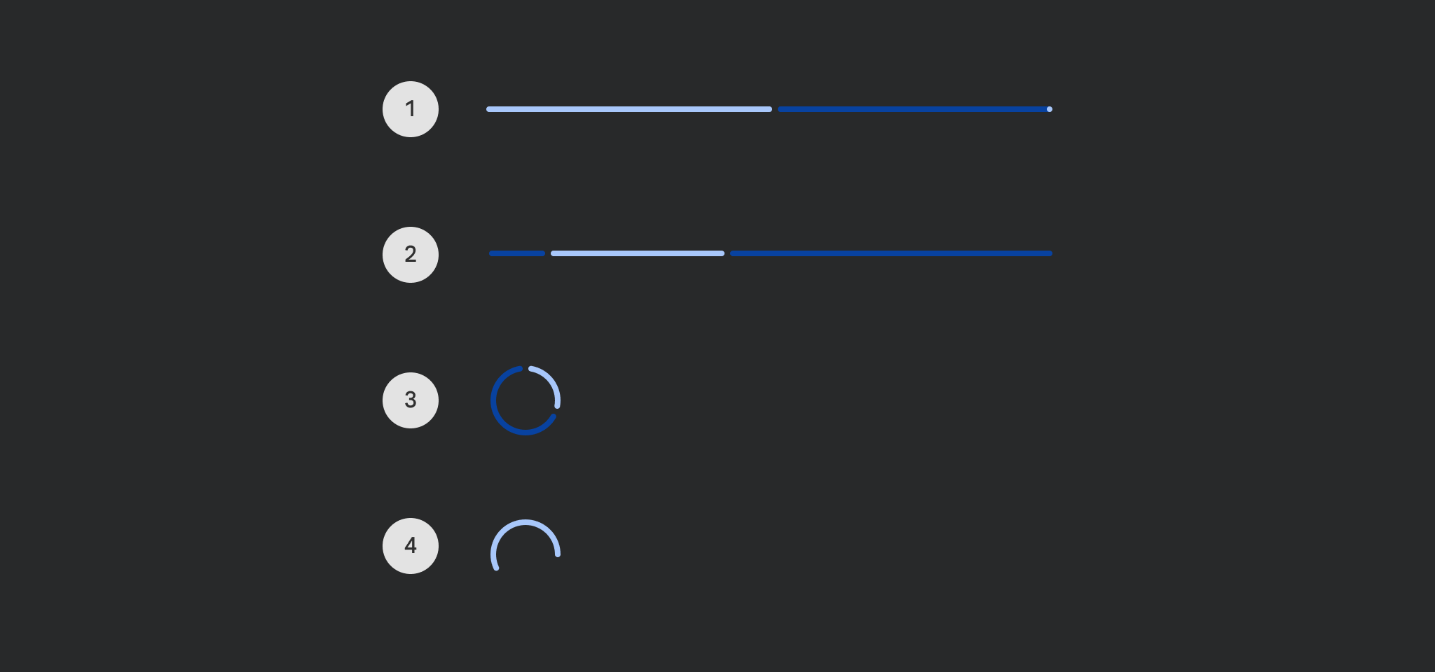
Progress indicators express an unspecified wait time or display the duration of a process.
Common
Deprecated Use the overload that takes
gapSizeanddrawStopIndicator, seeLegacyLinearProgressIndicatorSampleon how to restore the previous behavior
@Composable
fun LinearProgressIndicator(
    progress: () -> Float,
    modifier: Modifier = Modifier,
    color: Color = ProgressIndicatorDefaults.linearColor,
    trackColor: Color = ProgressIndicatorDefaults.linearTrackColor,
    strokeCap: StrokeCap = ProgressIndicatorDefaults.LinearStrokeCap,
)
Parameters
| progress | the progress of this progress indicator, where 0.0 represents no progress and 1.0 represents full progress. Values outside of this range are coerced into the range. |
| modifier | the Modifier to be applied to this progress indicator |
| color | color of this progress indicator |
| trackColor | color of the track behind the indicator, visible when the progress has not reached the area of the overall indicator yet |
| strokeCap | stroke cap to use for the ends of this progress indicator |
Common
@Composable
fun LinearProgressIndicator(
    progress: () -> Float,
    modifier: Modifier = Modifier,
    color: Color = ProgressIndicatorDefaults.linearColor,
    trackColor: Color = ProgressIndicatorDefaults.linearTrackColor,
    strokeCap: StrokeCap = ProgressIndicatorDefaults.LinearStrokeCap,
    gapSize: Dp = ProgressIndicatorDefaults.LinearIndicatorTrackGapSize,
    drawStopIndicator: DrawScope.() -> Unit = {
        drawStopIndicator(
            drawScope = this,
            stopSize = ProgressIndicatorDefaults.LinearTrackStopIndicatorSize,
            color = color,
            strokeCap = strokeCap,
        )
    },
)
Parameters
| progress | the progress of this progress indicator, where 0.0 represents no progress and 1.0 represents full progress. Values outside of this range are coerced into the range. |
| modifier | the Modifier to be applied to this progress indicator |
| color | color of this progress indicator |
| trackColor | color of the track behind the indicator, visible when the progress has not reached the area of the overall indicator yet |
| strokeCap | stroke cap to use for the ends of this progress indicator |
| gapSize | size of the gap between the progress indicator and the track |
| drawStopIndicator | lambda that will be called to draw the stop indicator |
Common
Deprecated Use the overload that takes
gapSize, seeLegacyIndeterminateLinearProgressIndicatorSampleon how to restore the previous behavior
@Composable
fun LinearProgressIndicator(
    modifier: Modifier = Modifier,
    color: Color = ProgressIndicatorDefaults.linearColor,
    trackColor: Color = ProgressIndicatorDefaults.linearTrackColor,
    strokeCap: StrokeCap = ProgressIndicatorDefaults.LinearStrokeCap,
)
Parameters
| modifier | the Modifier to be applied to this progress indicator |
| color | color of this progress indicator |
| trackColor | color of the track behind the indicator, visible when the progress has not reached the area of the overall indicator yet |
| strokeCap | stroke cap to use for the ends of this progress indicator |
Common
@Composable
fun LinearProgressIndicator(
    modifier: Modifier = Modifier,
    color: Color = ProgressIndicatorDefaults.linearColor,
    trackColor: Color = ProgressIndicatorDefaults.linearTrackColor,
    strokeCap: StrokeCap = ProgressIndicatorDefaults.LinearStrokeCap,
    gapSize: Dp = ProgressIndicatorDefaults.LinearIndicatorTrackGapSize,
)
Parameters
| modifier | the Modifier to be applied to this progress indicator |
| color | color of this progress indicator |
| trackColor | color of the track behind the indicator, visible when the progress has not reached the area of the overall indicator yet |
| strokeCap | stroke cap to use for the ends of this progress indicator |
| gapSize | size of the gap between the progress indicator and the track |
Common
Deprecated Use the overload that takes
progressas a lambda
@Composable
fun LinearProgressIndicator(
    progress: Float,
    modifier: Modifier = Modifier,
    color: Color = ProgressIndicatorDefaults.linearColor,
    trackColor: Color = ProgressIndicatorDefaults.linearTrackColor,
    strokeCap: StrokeCap = ProgressIndicatorDefaults.LinearStrokeCap,
) =
    LinearProgressIndicator(
        progress = { progress },
        modifier = modifier,
        color = color,
        trackColor = trackColor,
        strokeCap = strokeCap,
    )
Common
Deprecated Maintained for binary compatibility
@Composable
fun LinearProgressIndicator(
    progress: Float,
    modifier: Modifier = Modifier,
    color: Color = ProgressIndicatorDefaults.linearColor,
    trackColor: Color = ProgressIndicatorDefaults.linearTrackColor,
) =
    LinearProgressIndicator(
        progress,
        modifier,
        color,
        trackColor,
        strokeCap = ProgressIndicatorDefaults.LinearStrokeCap,
    )
Common
Deprecated Maintained for binary compatibility
@Composable
fun LinearProgressIndicator(
    modifier: Modifier = Modifier,
    color: Color = ProgressIndicatorDefaults.linearColor,
    trackColor: Color = ProgressIndicatorDefaults.linearTrackColor,
) =
    LinearProgressIndicator(
        modifier,
        color,
        trackColor,
        strokeCap = ProgressIndicatorDefaults.LinearStrokeCap,
    )
Code Examples
LinearProgressIndicatorSample
@Preview
@Composable
fun LinearProgressIndicatorSample() {
    var progress by remember { mutableFloatStateOf(0.1f) }
    val animatedProgress by
        animateFloatAsState(
            targetValue = progress,
            animationSpec = ProgressIndicatorDefaults.ProgressAnimationSpec,
        )
    Column(horizontalAlignment = Alignment.CenterHorizontally) {
        LinearProgressIndicator(progress = { animatedProgress })
        Spacer(Modifier.requiredHeight(30.dp))
        Text("Set progress:")
        Slider(
            modifier = Modifier.width(300.dp),
            value = progress,
            valueRange = 0f..1f,
            onValueChange = { progress = it },
        )
    }
}
IndeterminateLinearProgressIndicatorSample
@Preview
@Composable
fun IndeterminateLinearProgressIndicatorSample() {
    Column(horizontalAlignment = Alignment.CenterHorizontally) { LinearProgressIndicator() }
}
