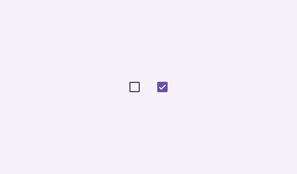
Checkbox
Composable Component
Checkboxes allow users to select one or more items from a set. Checkboxes can turn an option on or off.
Common
@Composable
fun Checkbox(
    checked: Boolean,
    onCheckedChange: ((Boolean) -> Unit)?,
    modifier: Modifier = Modifier,
    enabled: Boolean = true,
    colors: CheckboxColors = CheckboxDefaults.colors(),
    interactionSource: MutableInteractionSource? = null,
)
Parameters
| checked | whether this checkbox is checked or unchecked |
| onCheckedChange | called when this checkbox is clicked. If null, then this checkbox will not be interactable, unless something else handles its input events and updates its state. |
| modifier | the Modifier to be applied to this checkbox |
| enabled | controls the enabled state of this checkbox. When false, this component will not respond to user input, and it will appear visually disabled and disabled to accessibility services. |
| colors | CheckboxColors that will be used to resolve the colors used for this checkbox in different states. See CheckboxDefaults.colors. |
| interactionSource | an optional hoisted MutableInteractionSource for observing and emitting Interactions for this checkbox. You can use this to change the checkbox's appearance or preview the checkbox in different states. Note that if null is provided, interactions will still happen internally. |
Common
@Composable
fun Checkbox(
    checked: Boolean,
    onCheckedChange: ((Boolean) -> Unit)?,
    checkmarkStroke: Stroke,
    outlineStroke: Stroke,
    modifier: Modifier = Modifier,
    enabled: Boolean = true,
    colors: CheckboxColors = CheckboxDefaults.colors(),
    interactionSource: MutableInteractionSource? = null,
)
Parameters
| checked | whether this checkbox is checked or unchecked |
| onCheckedChange | called when this checkbox is clicked. If null, then this checkbox will not be interactable, unless something else handles its input events and updates its state. |
| checkmarkStroke | stroke for the checkmark. |
| outlineStroke | stroke for the checkmark's box outline. Note that this stroke is applied when drawing the outline's rounded rectangle, so attributions such as androidx.compose.ui.graphics.StrokeJoin will be ignored. |
| modifier | the Modifier to be applied to this checkbox |
| enabled | controls the enabled state of this checkbox. When false, this component will not respond to user input, and it will appear visually disabled and disabled to accessibility services. |
| colors | CheckboxColors that will be used to resolve the colors used for this checkbox in different states. See CheckboxDefaults.colors. |
| interactionSource | an optional hoisted MutableInteractionSource for observing and emitting Interactions for this checkbox. You can use this to change the checkbox's appearance or preview the checkbox in different states. Note that if null is provided, interactions will still happen internally. |
Code Examples
CheckboxSample
@Preview
@Composable
fun CheckboxSample() {
    val checkedState = remember { mutableStateOf(true) }
    Checkbox(checked = checkedState.value, onCheckedChange = { checkedState.value = it })
}
CheckboxWithTextSample
@Preview
@Composable
fun CheckboxWithTextSample() {
    val (checkedState, onStateChange) = remember { mutableStateOf(true) }
    Row(
        Modifier.fillMaxWidth()
            .height(56.dp)
            .toggleable(
                value = checkedState,
                onValueChange = { onStateChange(!checkedState) },
                role = Role.Checkbox,
            )
            .padding(horizontal = 16.dp),
        verticalAlignment = Alignment.CenterVertically,
    ) {
        Checkbox(
            checked = checkedState,
            onCheckedChange = null, // null recommended for accessibility with screenreaders
        )
        Text(
            text = "Option selection",
            style = MaterialTheme.typography.bodyLarge,
            modifier = Modifier.padding(start = 16.dp),
        )
    }
}
CheckboxRoundedStrokesSample
@Preview
@Composable
fun CheckboxRoundedStrokesSample() {
    val strokeWidthPx = with(LocalDensity.current) { floor(CheckboxDefaults.StrokeWidth.toPx()) }
    val checkmarkStroke =
        remember(strokeWidthPx) {
            Stroke(width = strokeWidthPx, cap = StrokeCap.Round, join = StrokeJoin.Round)
        }
    val outlineStroke = remember(strokeWidthPx) { Stroke(width = strokeWidthPx) }
    val checkedState = remember { mutableStateOf(true) }
    Checkbox(
        checked = checkedState.value,
        onCheckedChange = { checkedState.value = it },
        checkmarkStroke = checkmarkStroke,
        outlineStroke = outlineStroke,
    )
}
