ExposedDropdownMenuBox
Composable Component
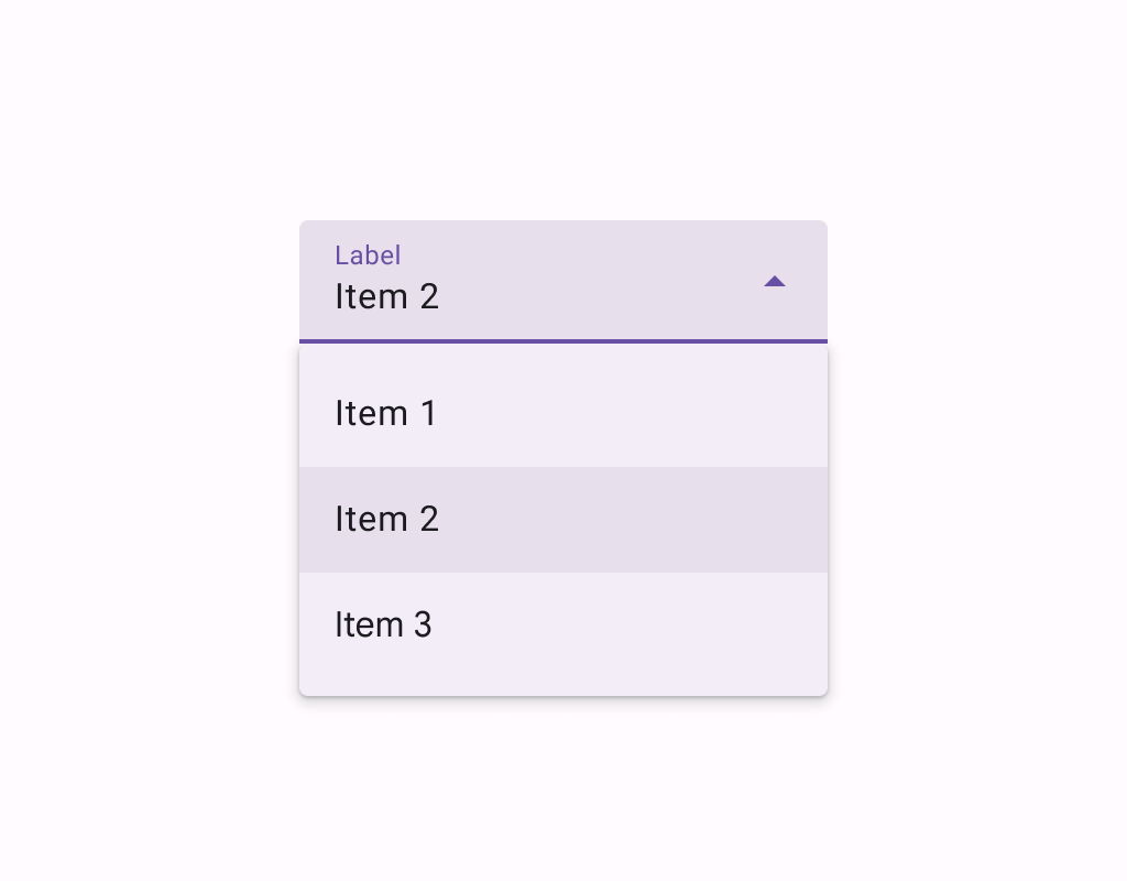
Menus display a list of choices on a temporary surface. They appear when users interact with a button, action, or other control.
Common
@ExperimentalMaterial3Api
@Composable
fun ExposedDropdownMenuBox(
    expanded: Boolean,
    onExpandedChange: (Boolean) -> Unit,
    modifier: Modifier = Modifier,
    content: @Composable ExposedDropdownMenuBoxScope.() -> Unit,
)
Parameters
| expanded | whether the menu is expanded or not |
| onExpandedChange | called when the exposed dropdown menu is clicked and the expansion state changes. |
| modifier | the Modifier to be applied to this ExposedDropdownMenuBox |
| content | the content of this ExposedDropdownMenuBox, typically a TextField and an ExposedDropdownMenu. |
Code Examples
ExposedDropdownMenuSample
@Preview
@Composable
fun ExposedDropdownMenuSample() {
    val options: List<String> = SampleData.take(5)
    var expanded by remember { mutableStateOf(false) }
    val textFieldState = rememberTextFieldState(options[0])
    ExposedDropdownMenuBox(expanded = expanded, onExpandedChange = { expanded = it }) {
        TextField(
            // The `menuAnchor` modifier must be passed to the text field to handle
            // expanding/collapsing the menu on click. A read-only text field has
            // the anchor type `PrimaryNotEditable`.
            modifier = Modifier.menuAnchor(ExposedDropdownMenuAnchorType.PrimaryNotEditable),
            state = textFieldState,
            readOnly = true,
            lineLimits = TextFieldLineLimits.SingleLine,
            label = { Text("Label") },
            trailingIcon = { ExposedDropdownMenuDefaults.TrailingIcon(expanded = expanded) },
            colors = ExposedDropdownMenuDefaults.textFieldColors(),
        )
        ExposedDropdownMenu(expanded = expanded, onDismissRequest = { expanded = false }) {
            options.forEach { option ->
                DropdownMenuItem(
                    text = { Text(option, style = MaterialTheme.typography.bodyLarge) },
                    onClick = {
                        textFieldState.setTextAndPlaceCursorAtEnd(option)
                        expanded = false
                    },
                    contentPadding = ExposedDropdownMenuDefaults.ItemContentPadding,
                )
            }
        }
    }
}
EditableExposedDropdownMenuSample
@Preview
@Composable
fun EditableExposedDropdownMenuSample() {
    val options: List<String> = SampleData
    val textFieldState = rememberTextFieldState()
    // The text that the user inputs into the text field can be used to filter the options.
    // This sample uses string subsequence matching.
    val filteredOptions = options.filteredBy(textFieldState.text)
    val (allowExpanded, setExpanded) = remember { mutableStateOf(false) }
    val expanded = allowExpanded && filteredOptions.isNotEmpty()
    ExposedDropdownMenuBox(expanded = expanded, onExpandedChange = setExpanded) {
        TextField(
            // The `menuAnchor` modifier must be passed to the text field to handle
            // expanding/collapsing the menu on click. An editable text field has
            // the anchor type `PrimaryEditable`.
            modifier =
                Modifier.width(280.dp).menuAnchor(ExposedDropdownMenuAnchorType.PrimaryEditable),
            state = textFieldState,
            lineLimits = TextFieldLineLimits.SingleLine,
            label = { Text("Label") },
            trailingIcon = {
                ExposedDropdownMenuDefaults.TrailingIcon(
                    expanded = expanded,
                    // If the text field is editable, it is recommended to make the
                    // trailing icon a `menuAnchor` of type `SecondaryEditable`. This
                    // provides a better experience for certain accessibility services
                    // to choose a menu option without typing.
                    modifier = Modifier.menuAnchor(ExposedDropdownMenuAnchorType.SecondaryEditable),
                )
            },
            colors = ExposedDropdownMenuDefaults.textFieldColors(),
        )
        ExposedDropdownMenu(
            modifier = Modifier.heightIn(max = 280.dp),
            expanded = expanded,
            onDismissRequest = { setExpanded(false) },
        ) {
            filteredOptions.forEach { option ->
                DropdownMenuItem(
                    text = { Text(option, style = MaterialTheme.typography.bodyLarge) },
                    onClick = {
                        textFieldState.setTextAndPlaceCursorAtEnd(option.text)
                        setExpanded(false)
                    },
                    contentPadding = ExposedDropdownMenuDefaults.ItemContentPadding,
                )
            }
        }
    }
}
MultiAutocompleteExposedDropdownMenuSample
@Preview
@Composable
fun MultiAutocompleteExposedDropdownMenuSample() {
    /**
     * Returns the TextRange of the current token around the cursor, where commas define token
     * boundaries.
     */
    fun TextFieldState.currentTokenRange(): TextRange? {
        if (!selection.collapsed) return null
        val cursor = selection.start
        var start = cursor
        while (start > 0 && text[start - 1] != ',') {
            start--
        }
        while (start < cursor && text[start] == ' ') {
            start++
        }
        var end = cursor
        while (end < text.length && text[end] != ',') {
            end++
        }
        return TextRange(start, end)
    }
    fun TextFieldState.replaceThenAddComma(start: Int, end: Int, text: CharSequence) = edit {
        replace(start, end, text)
        val afterText = start + text.length
        if (afterText == this.length || this.charAt(afterText) != ',') {
            insert(afterText, ", ")
            placeCursorBeforeCharAt(afterText + 2)
        } else {
            placeCursorAfterCharAt(afterText)
        }
    }
    val allOptions: List<String> = SampleData
    val textFieldState = rememberTextFieldState()
    val tokenSelection = textFieldState.currentTokenRange()
    val tokenAtCursor =
        if (tokenSelection != null) textFieldState.text.substring(tokenSelection) else ""
    val filteredOptions =
        if (tokenAtCursor.isBlank()) emptyList() else allOptions.filteredBy(tokenAtCursor)
    val (allowExpanded, setExpanded) = remember { mutableStateOf(false) }
    val expanded = allowExpanded && filteredOptions.isNotEmpty()
    ExposedDropdownMenuBox(expanded = expanded, onExpandedChange = setExpanded) {
        TextField(
            modifier =
                Modifier.width(280.dp).menuAnchor(ExposedDropdownMenuAnchorType.PrimaryEditable),
            state = textFieldState,
            lineLimits = TextFieldLineLimits.SingleLine,
            label = { Text("Label") },
            trailingIcon = {
                ExposedDropdownMenuDefaults.TrailingIcon(
                    expanded = expanded,
                    modifier = Modifier.menuAnchor(ExposedDropdownMenuAnchorType.SecondaryEditable),
                )
            },
            colors = ExposedDropdownMenuDefaults.textFieldColors(),
        )
        ExposedDropdownMenu(
            modifier = Modifier.heightIn(max = 280.dp),
            expanded = expanded,
            onDismissRequest = { setExpanded(false) },
        ) {
            filteredOptions.forEach { option ->
                DropdownMenuItem(
                    text = { Text(option, style = MaterialTheme.typography.bodyLarge) },
                    onClick = {
                        if (tokenSelection != null) {
                            textFieldState.replaceThenAddComma(
                                tokenSelection.start,
                                tokenSelection.end,
                                option,
                            )
                        }
                    },
                    contentPadding = ExposedDropdownMenuDefaults.ItemContentPadding,
                )
            }
        }
    }
}
