DatePicker
Composable Component
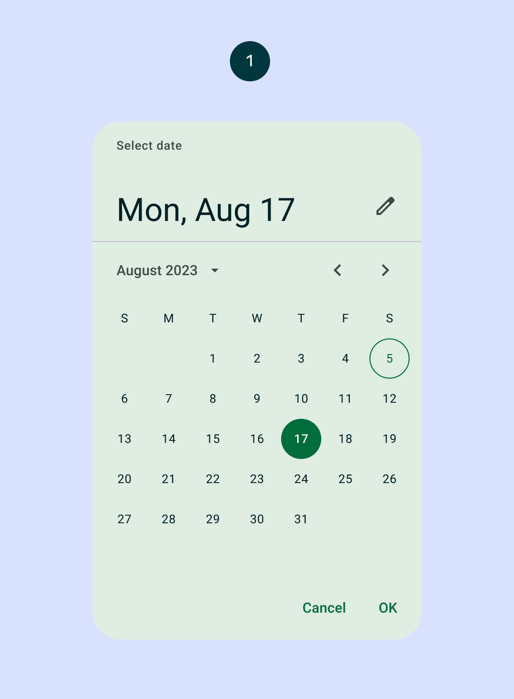
Date pickers let people select a date and preferably should be embedded into Dialogs. See
DatePickerDialog.
Common
@ExperimentalMaterial3Api
@Composable
fun DatePicker(
    state: DatePickerState,
    modifier: Modifier = Modifier,
    dateFormatter: DatePickerFormatter = remember { DatePickerDefaults.dateFormatter() },
    colors: DatePickerColors = DatePickerDefaults.colors(),
    title: (@Composable () -> Unit)? = {
        DatePickerDefaults.DatePickerTitle(
            displayMode = state.displayMode,
            modifier = Modifier.padding(DatePickerTitlePadding),
            contentColor = colors.titleContentColor,
        )
    },
    headline: (@Composable () -> Unit)? = {
        DatePickerDefaults.DatePickerHeadline(
            selectedDateMillis = state.selectedDateMillis,
            displayMode = state.displayMode,
            dateFormatter = dateFormatter,
            modifier = Modifier.padding(DatePickerHeadlinePadding),
            contentColor = colors.headlineContentColor,
        )
    },
    showModeToggle: Boolean = true,
    focusRequester: FocusRequester? = remember { FocusRequester() },
)
Parameters
| state | state of the date picker. See rememberDatePickerState. |
| modifier | the Modifier to be applied to this date picker |
| dateFormatter | a DatePickerFormatter that provides formatting skeletons for dates display |
| colors | DatePickerColors that will be used to resolve the colors used for this date picker in different states. See DatePickerDefaults.colors. |
| title | the title to be displayed in the date picker |
| headline | the headline to be displayed in the date picker |
| showModeToggle | indicates if this DatePicker should show a mode toggle action that transforms it into a date input |
| focusRequester | a focus requester that will be used to focus the text field when the date picker is in an input mode. Pass null to not focus the text field if that's the desired behavior. |
Common
Deprecated Maintained for binary compatibility. Use the DatePicker with the focusRequester parameter.
@ExperimentalMaterial3Api
@Composable
fun DatePicker(
    state: DatePickerState,
    modifier: Modifier = Modifier,
    dateFormatter: DatePickerFormatter = remember { DatePickerDefaults.dateFormatter() },
    colors: DatePickerColors = DatePickerDefaults.colors(),
    title: (@Composable () -> Unit)? = {
        DatePickerDefaults.DatePickerTitle(
            displayMode = state.displayMode,
            modifier = Modifier.padding(DatePickerTitlePadding),
            contentColor = colors.titleContentColor,
        )
    },
    headline: (@Composable () -> Unit)? = {
        DatePickerDefaults.DatePickerHeadline(
            selectedDateMillis = state.selectedDateMillis,
            displayMode = state.displayMode,
            dateFormatter = dateFormatter,
            modifier = Modifier.padding(DatePickerHeadlinePadding),
            contentColor = colors.headlineContentColor,
        )
    },
    showModeToggle: Boolean = true,
    requestFocus: Boolean = true,
) =
    DatePicker(
        state = state,
        modifier = modifier,
        dateFormatter = dateFormatter,
        colors = colors,
        title = title,
        headline = headline,
        showModeToggle = showModeToggle,
        focusRequester = if (requestFocus) remember { FocusRequester() } else null,
    )
Parameters
| state | state of the date picker. See rememberDatePickerState. |
| modifier | the Modifier to be applied to this date picker |
| dateFormatter | a DatePickerFormatter that provides formatting skeletons for dates display |
| colors | DatePickerColors that will be used to resolve the colors used for this date picker in different states. See DatePickerDefaults.colors. |
| title | the title to be displayed in the date picker |
| headline | the headline to be displayed in the date picker |
| showModeToggle | indicates if this DatePicker should show a mode toggle action that transforms it into a date input |
| requestFocus | have a focus request be sent to the text field when the date picker is in an input mode |
Code Examples
DatePickerSample
@OptIn(ExperimentalMaterial3Api::class)
@Preview
@Composable
fun DatePickerSample() {
    Column(
        modifier = Modifier.verticalScroll(rememberScrollState()),
        verticalArrangement = Arrangement.spacedBy(8.dp),
    ) {
        // Pre-select a date for January 4, 2020
        val datePickerState = rememberDatePickerState(initialSelectedDateMillis = 1578096000000)
        DatePicker(state = datePickerState, modifier = Modifier.padding(16.dp))
        Text(
            "Selected date timestamp: ${datePickerState.selectedDateMillis ?: "no selection"}",
            modifier = Modifier.align(Alignment.CenterHorizontally),
        )
    }
}
DateInputSample
@OptIn(ExperimentalMaterial3Api::class)
@Preview
@Composable
fun DateInputSample() {
    Column(verticalArrangement = Arrangement.spacedBy(8.dp)) {
        val state = rememberDatePickerState(initialDisplayMode = DisplayMode.Input)
        DatePicker(state = state, modifier = Modifier.padding(16.dp))
        Text(
            "Entered date timestamp: ${state.selectedDateMillis ?: "no input"}",
            modifier = Modifier.align(Alignment.CenterHorizontally),
        )
    }
}
DatePickerApi26Sample
@RequiresApi(Build.VERSION_CODES.O)
@OptIn(ExperimentalMaterial3Api::class)
@Preview
@Composable
fun DatePickerApi26Sample() {
    Column(
        modifier = Modifier.verticalScroll(rememberScrollState()),
        verticalArrangement = Arrangement.spacedBy(8.dp),
    ) {
        // Pre-select a date for April 15, 2023
        val datePickerState =
            rememberDatePickerState(initialSelectedDate = LocalDate.of(2023, 4, 15))
        DatePicker(state = datePickerState, modifier = Modifier.padding(16.dp))
        Text(
            "Selected date: ${datePickerState.getSelectedDate() ?: "no selection"}",
            modifier = Modifier.align(Alignment.CenterHorizontally),
        )
    }
}
DatePickerWithDateSelectableDatesSample
@OptIn(ExperimentalMaterial3Api::class)
@Preview
@Composable
fun DatePickerWithDateSelectableDatesSample() {
    val datePickerState =
        rememberDatePickerState(
            selectableDates =
                object : SelectableDates {
                    // Blocks Sunday and Saturday from being selected.
                    override fun isSelectableDate(utcTimeMillis: Long): Boolean {
                        return if (Build.VERSION.SDK_INT >= Build.VERSION_CODES.O) {
                            val dayOfWeek =
                                Instant.ofEpochMilli(utcTimeMillis)
                                    .atZone(ZoneId.of("UTC"))
                                    .toLocalDate()
                                    .dayOfWeek
                            dayOfWeek != DayOfWeek.SUNDAY && dayOfWeek != DayOfWeek.SATURDAY
                        } else {
                            val calendar = Calendar.getInstance(TimeZone.getTimeZone("UTC"))
                            calendar.timeInMillis = utcTimeMillis
                            calendar[Calendar.DAY_OF_WEEK] != Calendar.SUNDAY &&
                                calendar[Calendar.DAY_OF_WEEK] != Calendar.SATURDAY
                        }
                    }
                    // Allow selecting dates from year 2023 forward.
                    override fun isSelectableYear(year: Int): Boolean {
                        return year > 2022
                    }
                }
        )
    Column(
        modifier = Modifier.verticalScroll(rememberScrollState()),
        verticalArrangement = Arrangement.spacedBy(8.dp),
    ) {
        DatePicker(state = datePickerState)
        Text(
            "Selected date timestamp: ${datePickerState.selectedDateMillis ?: "no selection"}",
            modifier = Modifier.align(Alignment.CenterHorizontally),
        )
    }
}
