TwoRowsTopAppBar
Composable Component
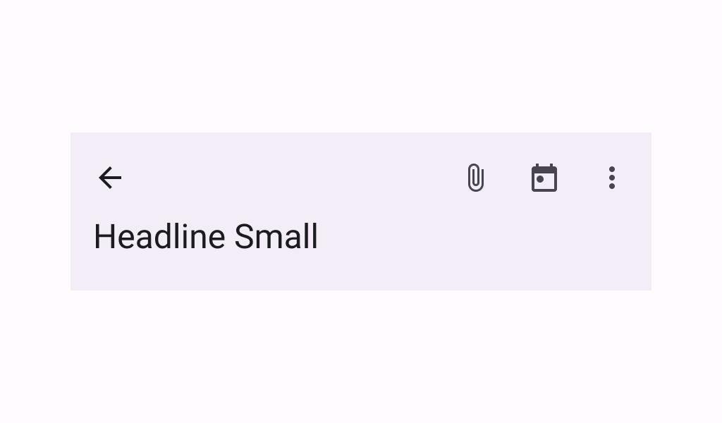
A basic two-rows Material Design top app bar.

Common
@ExperimentalMaterial3ExpressiveApi
@Composable
fun TwoRowsTopAppBar(
    title: @Composable (expanded: Boolean) -> Unit,
    modifier: Modifier = Modifier,
    subtitle: (@Composable (expanded: Boolean) -> Unit)? = null,
    navigationIcon: @Composable () -> Unit = {},
    actions: @Composable RowScope.() -> Unit = {},
    titleHorizontalAlignment: Alignment.Horizontal = Alignment.Start,
    collapsedHeight: Dp = Dp.Unspecified,
    expandedHeight: Dp = Dp.Unspecified,
    windowInsets: WindowInsets = TopAppBarDefaults.windowInsets,
    colors: TopAppBarColors = TopAppBarDefaults.topAppBarColors(),
    scrollBehavior: TopAppBarScrollBehavior? = null,
)
Parameters
| title | a lambda for providing a title to be displayed in the top app bar in collapsed and expanded states. By default a small-app-bar TextStyle is applied to the Composition, and you may override it by wrapping your provided component with a composition local. Note that unlike the large or medium top app bars, the TwoRowsTopAppBar does not append bottom padding to the expanded title Composable by default. Padding should be applied directly to the provided expanded title, or to the subtitle that appears below it. |
| modifier | the Modifier to be applied to this top app bar |
| subtitle | a lambda for providing an optional subtitle to be displayed in the top app bar in collapsed and expanded states. |
| navigationIcon | the navigation icon displayed at the start of the top app bar. This should typically be an IconButton or IconToggleButton. |
| actions | the actions displayed at the end of the top app bar. This should typically be IconButtons. The default layout here is a Row, so icons inside will be placed horizontally. |
| titleHorizontalAlignment | the horizontal alignment of the title and subtitle |
| collapsedHeight | the app bar's height in its collapsed state. Note that this value might be adjusted to support displaying larger fonts. In case the provided value is Dp.Unspecified or Dp.Infinity, the height will default to TopAppBarDefaults.MediumAppBarCollapsedHeight. |
| expandedHeight | this app bar's height in its expanded state. When a specified scrollBehavior causes the app bar to collapse or expand, this value will represent the total height that the app-bar will expand to. The expanded height is expected to be greater or equal to the collapsedHeight, and the function will throw an IllegalArgumentException otherwise. Note that this value might be adjusted to support displaying larger fonts. In case the provided value is Dp.Unspecified or Dp.Infinity, the height will default to TopAppBarDefaults.MediumFlexibleAppBarWithSubtitleExpandedHeight when an expandedSubtitle is provided, or to TopAppBarDefaults.MediumFlexibleAppBarWithoutSubtitleExpandedHeight when it's not. |
| windowInsets | a window insets that app bar will respect. |
| colors | TopAppBarColors that will be used to resolve the colors used for this top app bar in different states. See TopAppBarDefaults.topAppBarColors. |
| scrollBehavior | a TopAppBarScrollBehavior which holds various offset values that will be applied by this top app bar to set up its height and colors. A scroll behavior is designed to work in conjunction with a scrolled content to change the top app bar appearance as the content scrolls. See TopAppBarScrollBehavior.nestedScrollConnection. |
Code Examples
CustomTwoRowsTopAppBar
/**
 * A sample for a [TwoRowsTopAppBar] that collapses when the content is scrolled up, and appears
 * when the content is completely scrolled back down.
 */
@OptIn(ExperimentalMaterial3Api::class, ExperimentalMaterial3ExpressiveApi::class)
@Preview
@Composable
fun CustomTwoRowsTopAppBar() {
    val scrollBehavior = TopAppBarDefaults.exitUntilCollapsedScrollBehavior()
    Scaffold(
        modifier = Modifier.nestedScroll(scrollBehavior.nestedScrollConnection),
        topBar = {
            TwoRowsTopAppBar(
                title = { expanded ->
                    if (expanded) {
                        Text("Expanded TopAppBar", maxLines = 1, overflow = TextOverflow.Ellipsis)
                    } else {
                        Text("Collapsed TopAppBar", maxLines = 1, overflow = TextOverflow.Ellipsis)
                    }
                },
                subtitle = { expanded ->
                    if (expanded) {
                        Text(
                            "Expanded Subtitle",
                            maxLines = 1,
                            overflow = TextOverflow.Ellipsis,
                            modifier = Modifier.padding(bottom = 24.dp),
                        )
                    } else {
                        Text("Collapsed Subtitle", maxLines = 1, overflow = TextOverflow.Ellipsis)
                    }
                },
                collapsedHeight = 64.dp,
                expandedHeight = 156.dp,
                navigationIcon = {
                    IconButton(onClick = { /* doSomething() */ }) {
                        Icon(
                            imageVector = Icons.Filled.Menu,
                            contentDescription = "Localized description",
                        )
                    }
                },
                scrollBehavior = scrollBehavior,
            )
        },
        content = { innerPadding ->
            Column(
                Modifier.fillMaxWidth().padding(innerPadding).verticalScroll(rememberScrollState())
            ) {
                CompositionLocalProvider(
                    LocalTextStyle provides MaterialTheme.typography.bodyLarge
                ) {
                    Text(text = remember { LoremIpsum().values.first() })
                }
            }
        },
    )
}